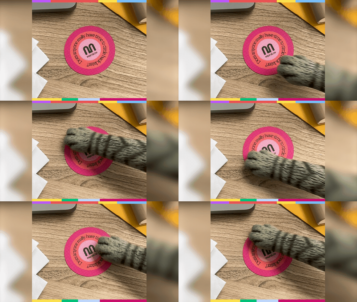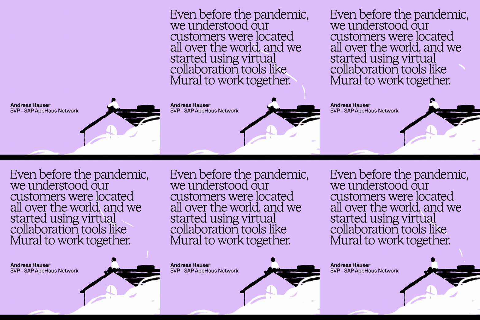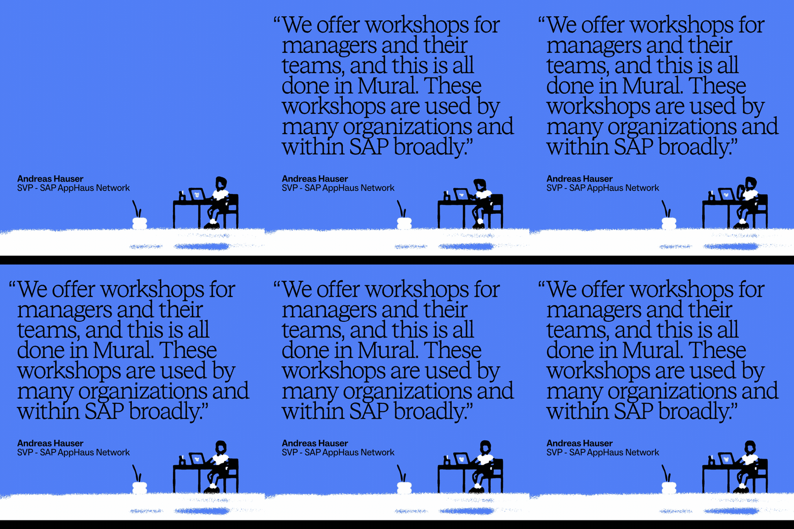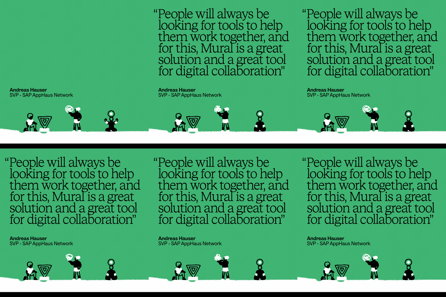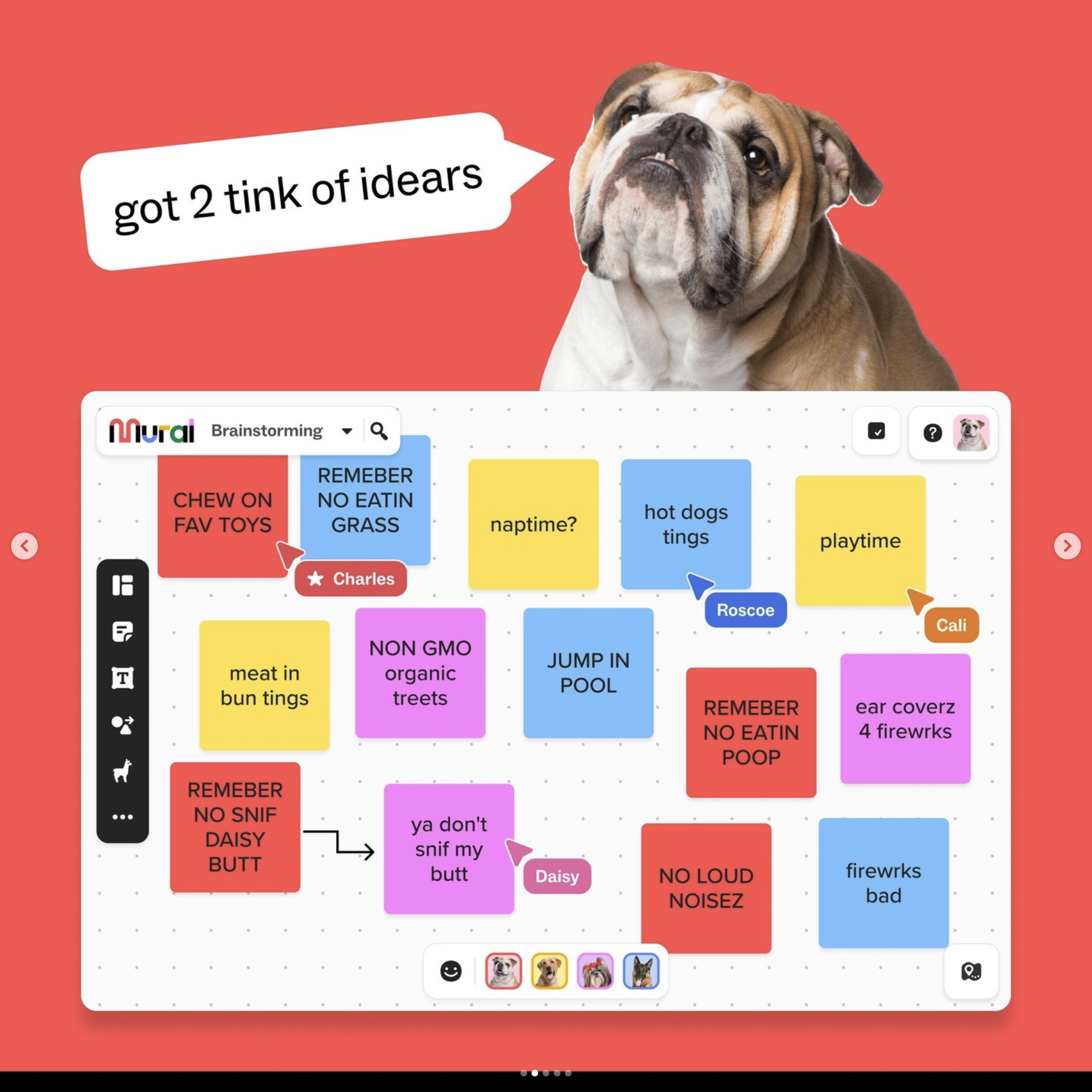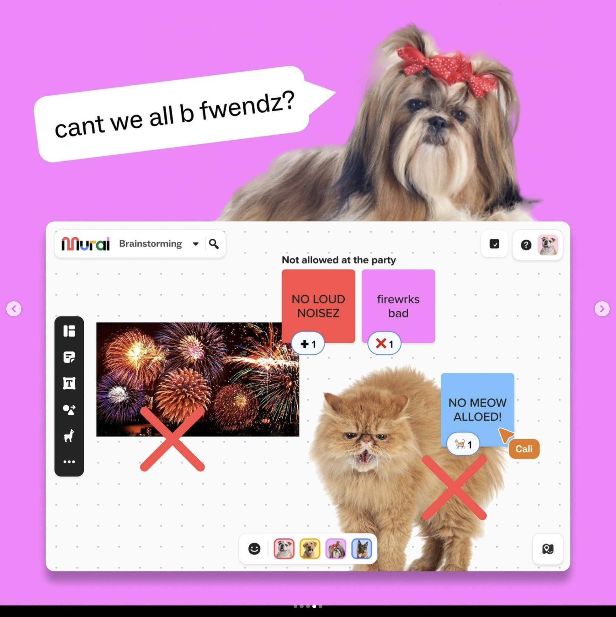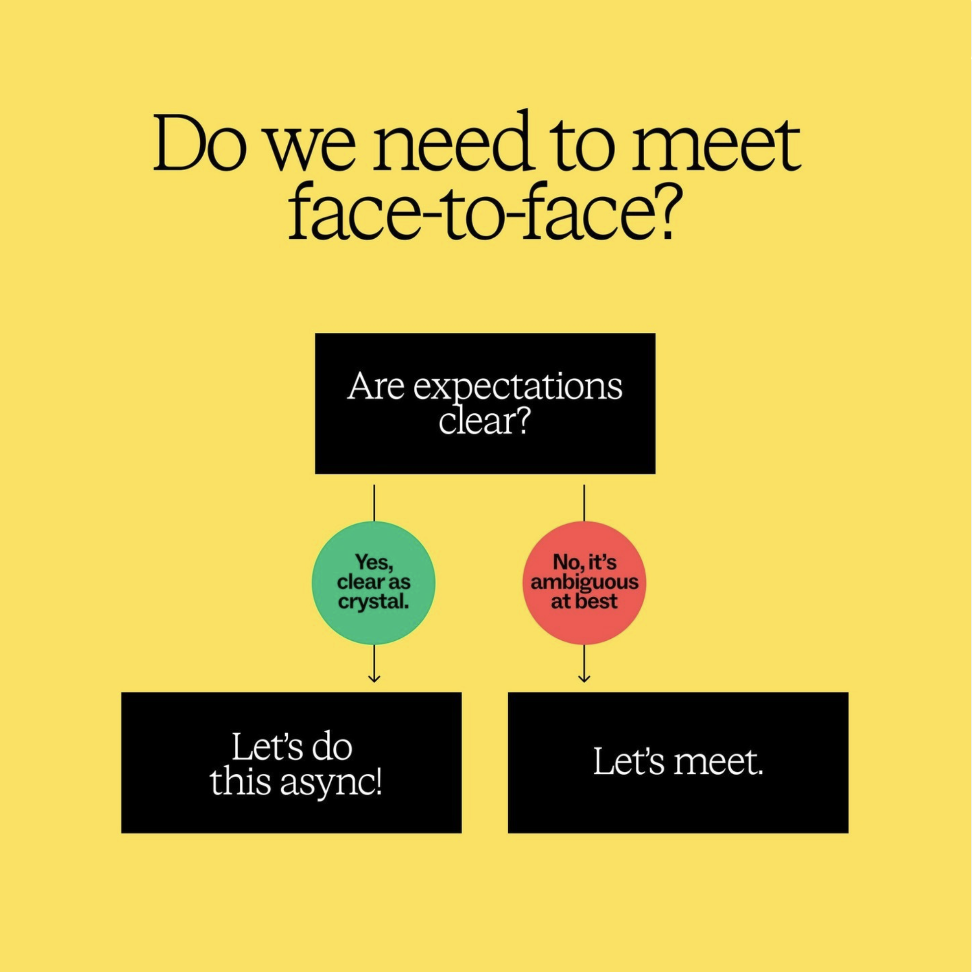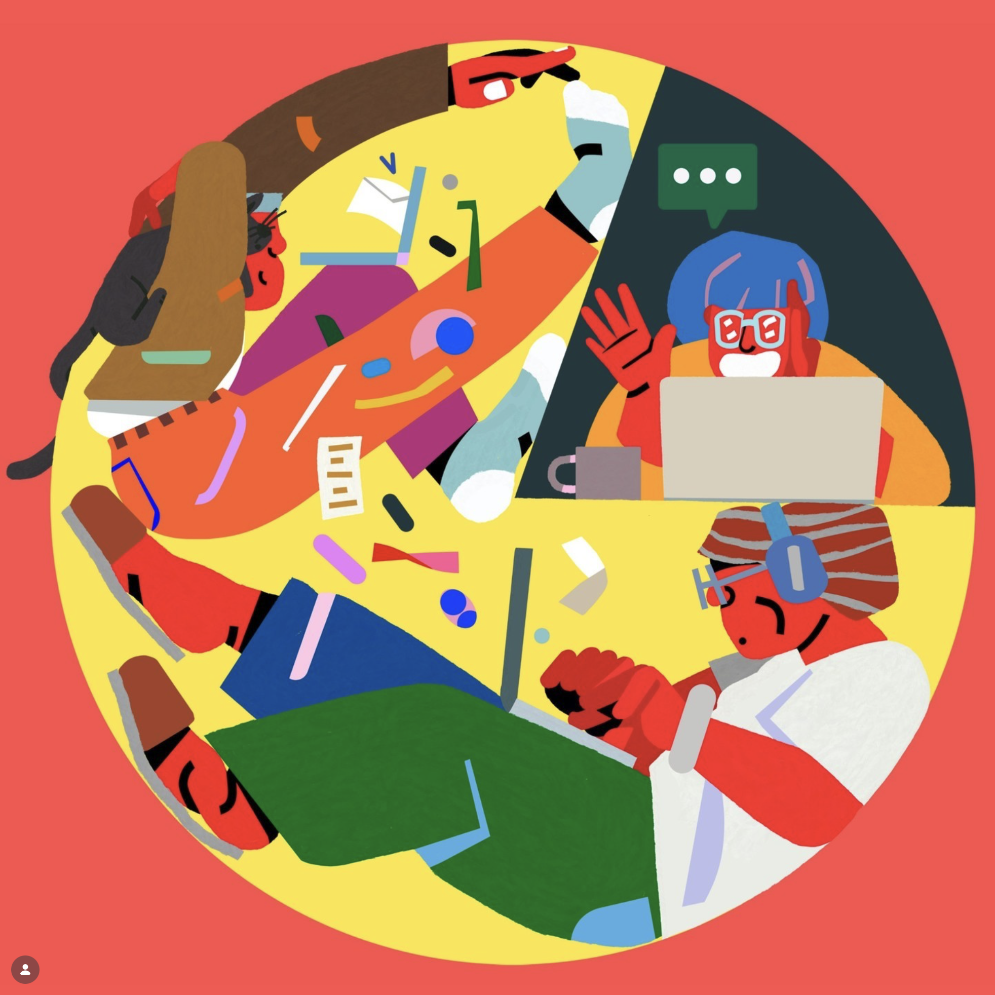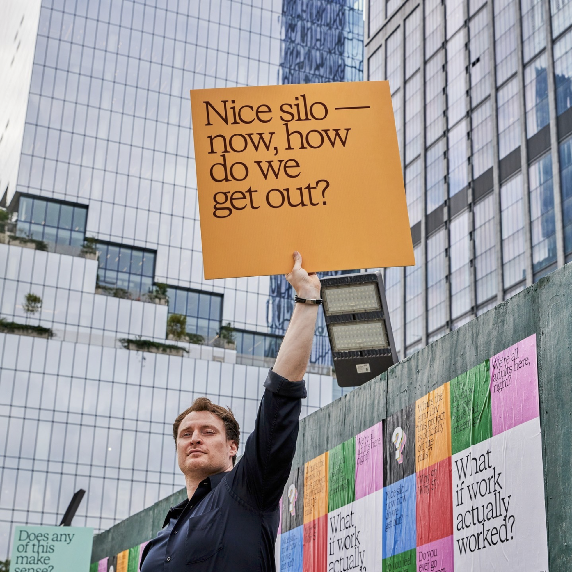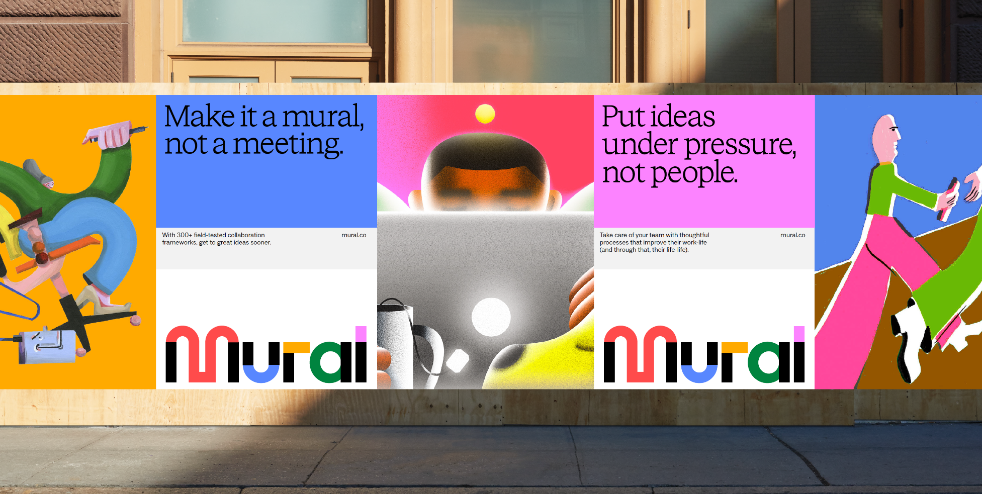

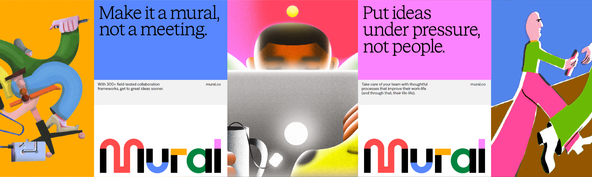
Mural needed to be a brand as imaginative as the people who use it. We partnered with Collins to build that identity. Then I gave it motion, leading the translation of brand principles and static concepts into a full motion and video language.
The work spanned a 200-page brand guideline and its motion companion, built shoulder-to-shoulder with our Principal Copywriter. It's the same design-and-copy duo this role calls for at Mint and Ultra.

My Team
Laying The Foundation
Work tools don't have to feel like work. Mural's motion system was built on structure and play, a language of surprise and delight made for joyful collaboration and aimed squarely at designers, dreamers, and the entrepreneurially restless. The pairing was deliberate. Structure earns trust. Play earns attention. A collaboration brand needs both.






Developing The Elements
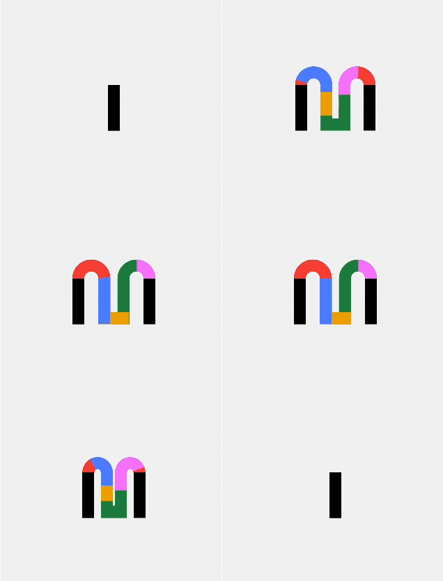
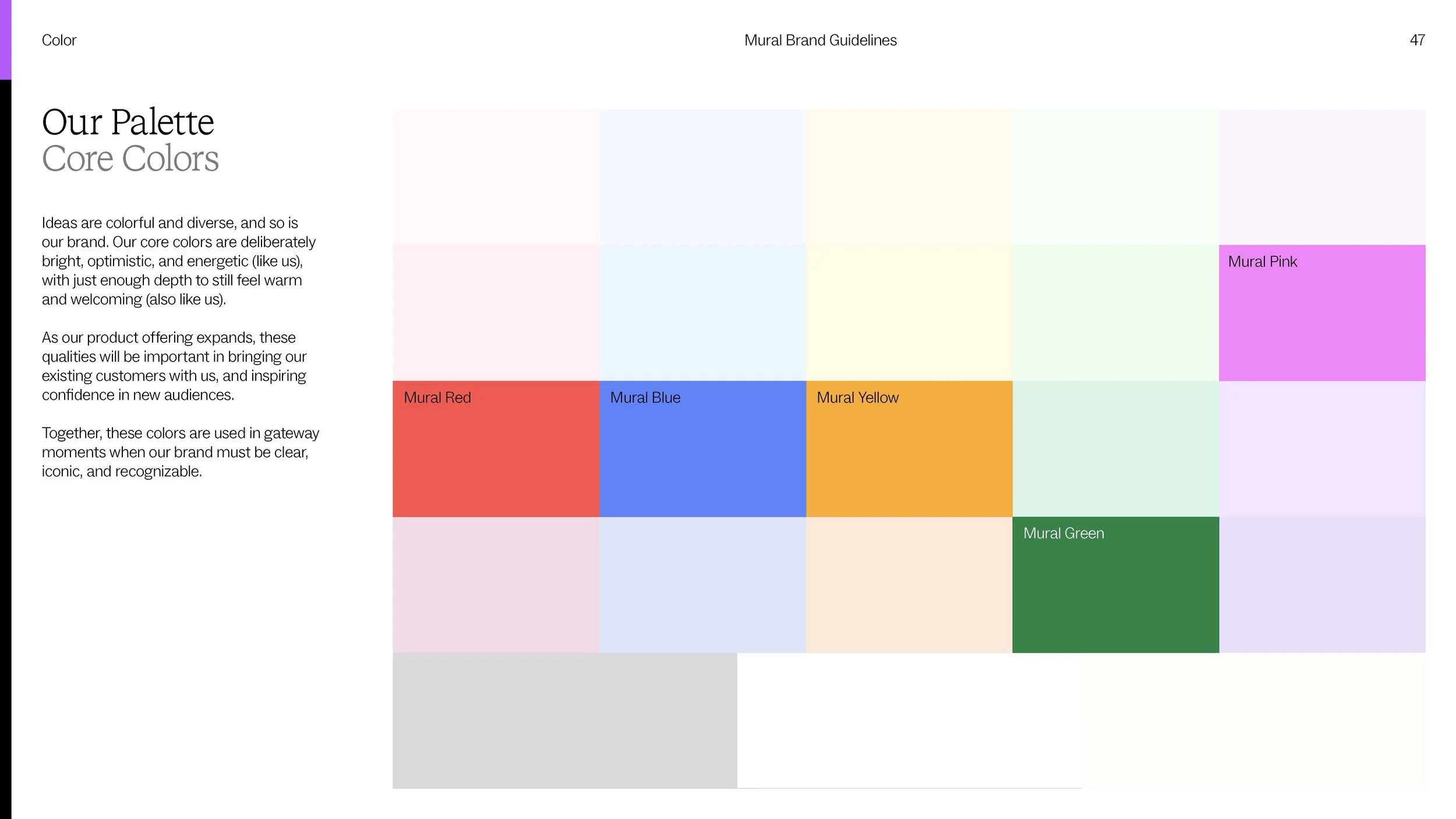
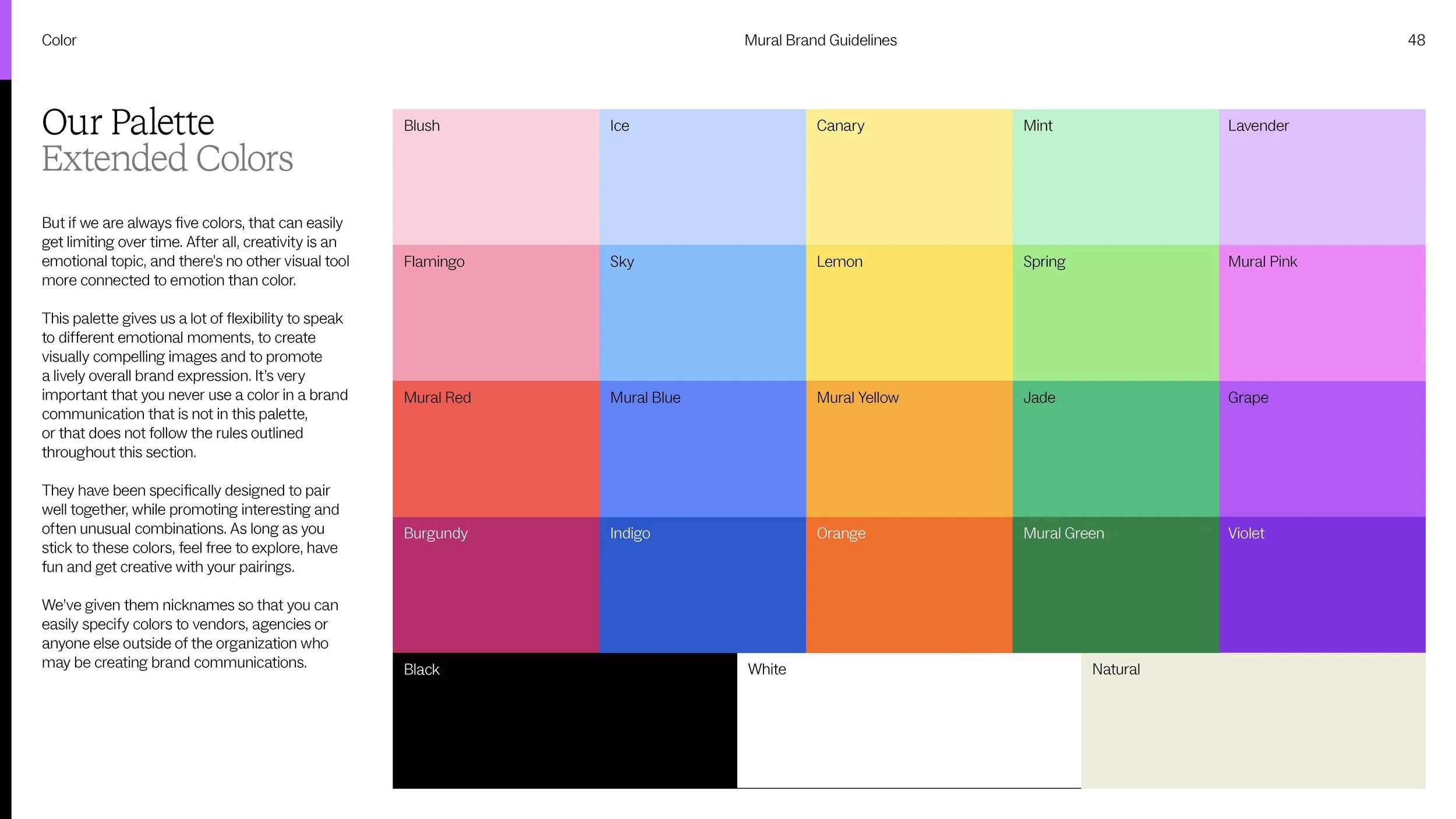
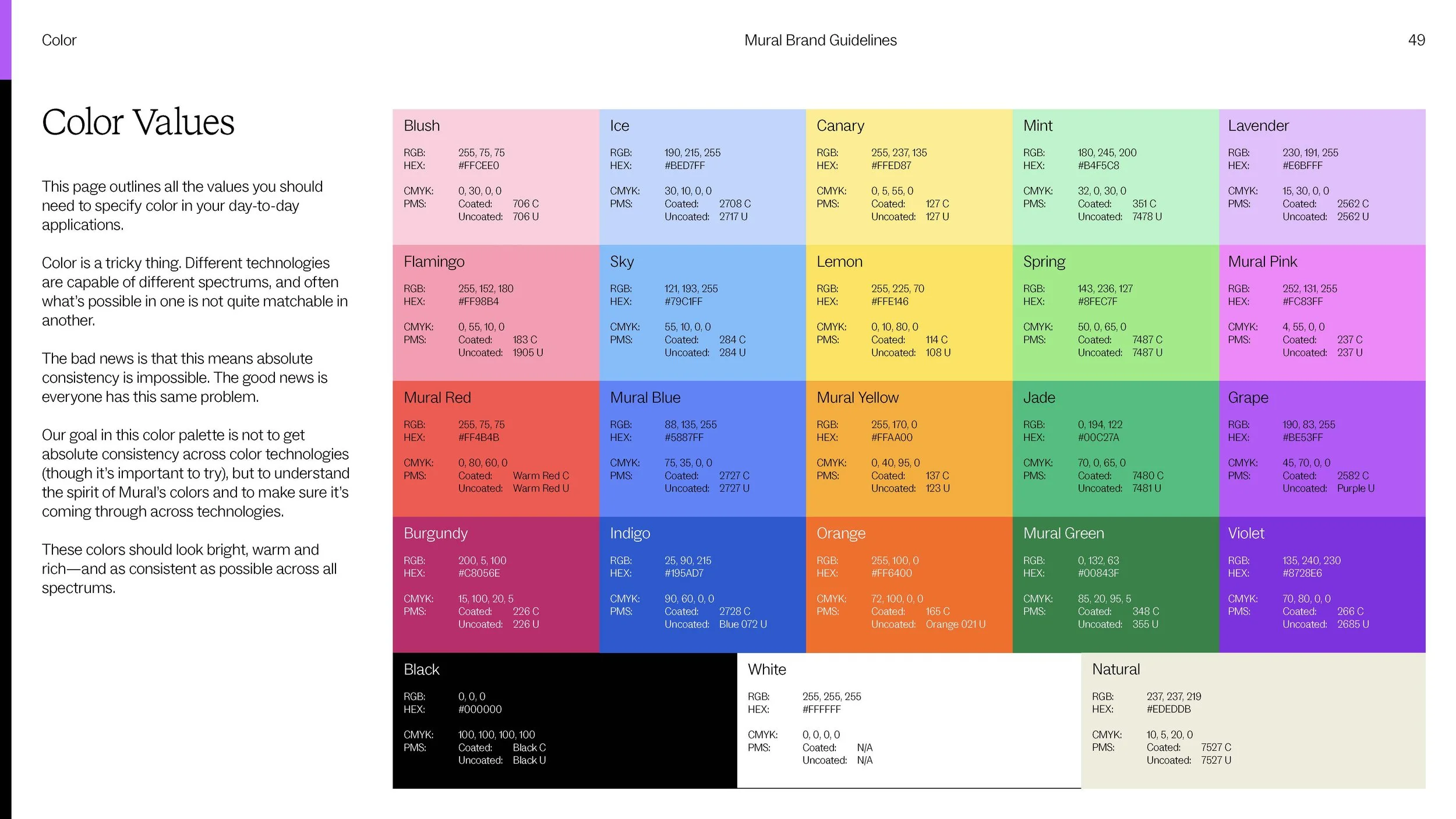
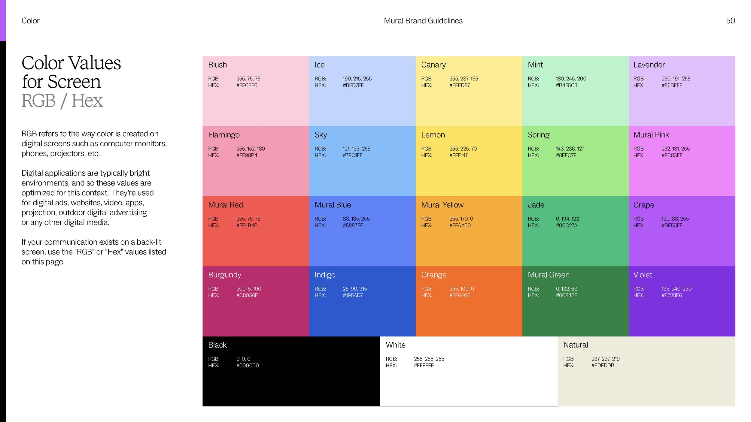
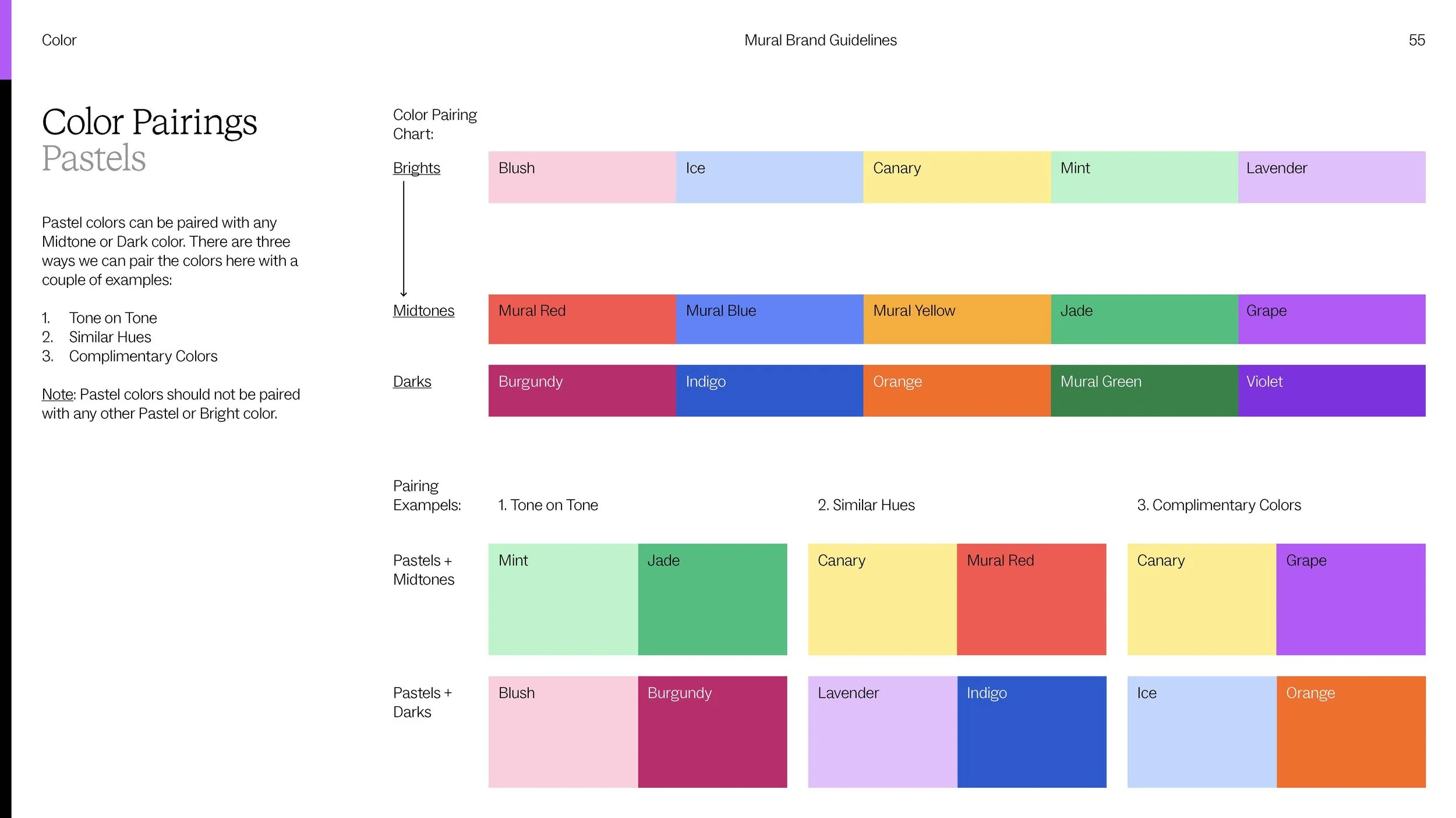
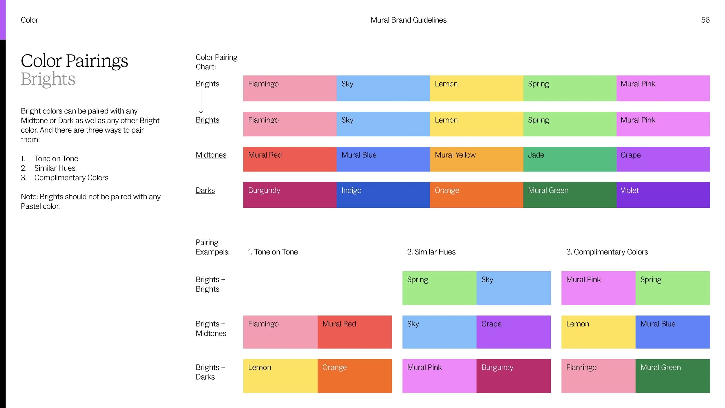
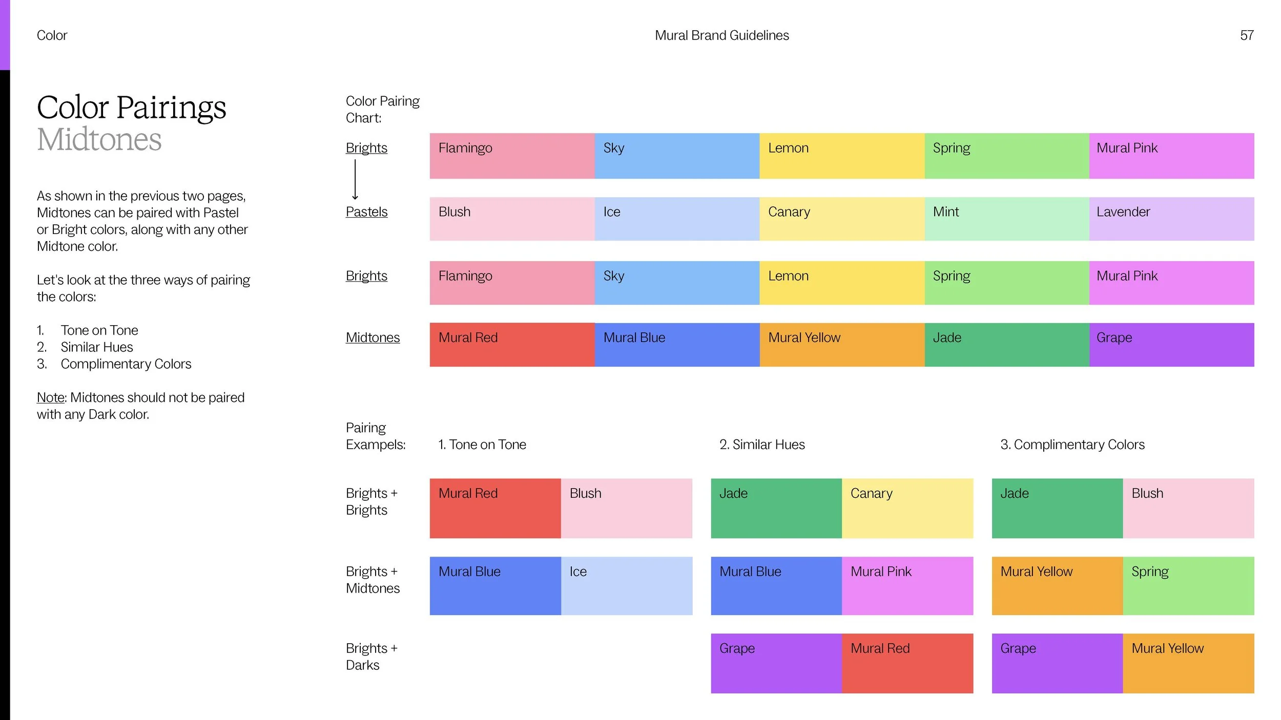
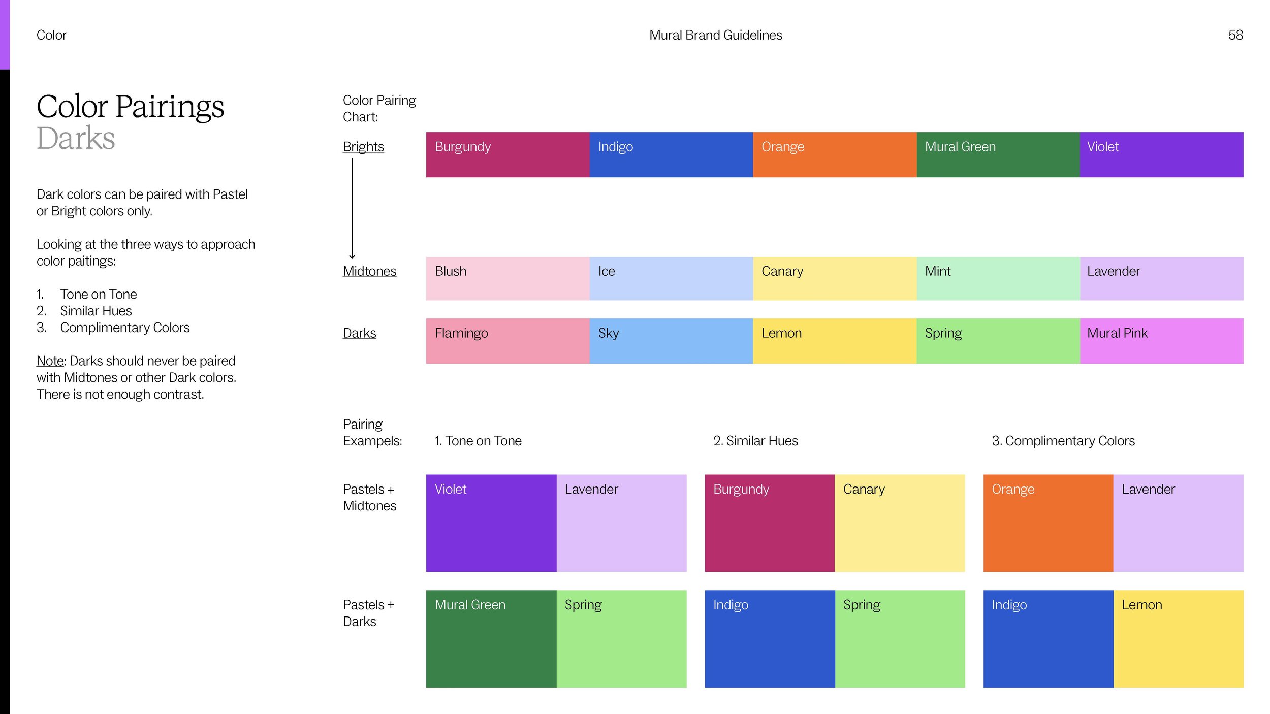
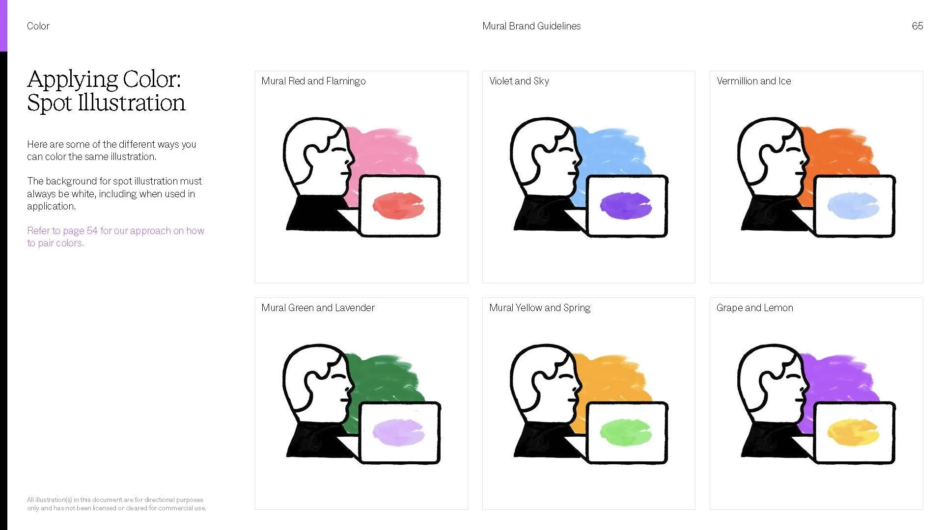
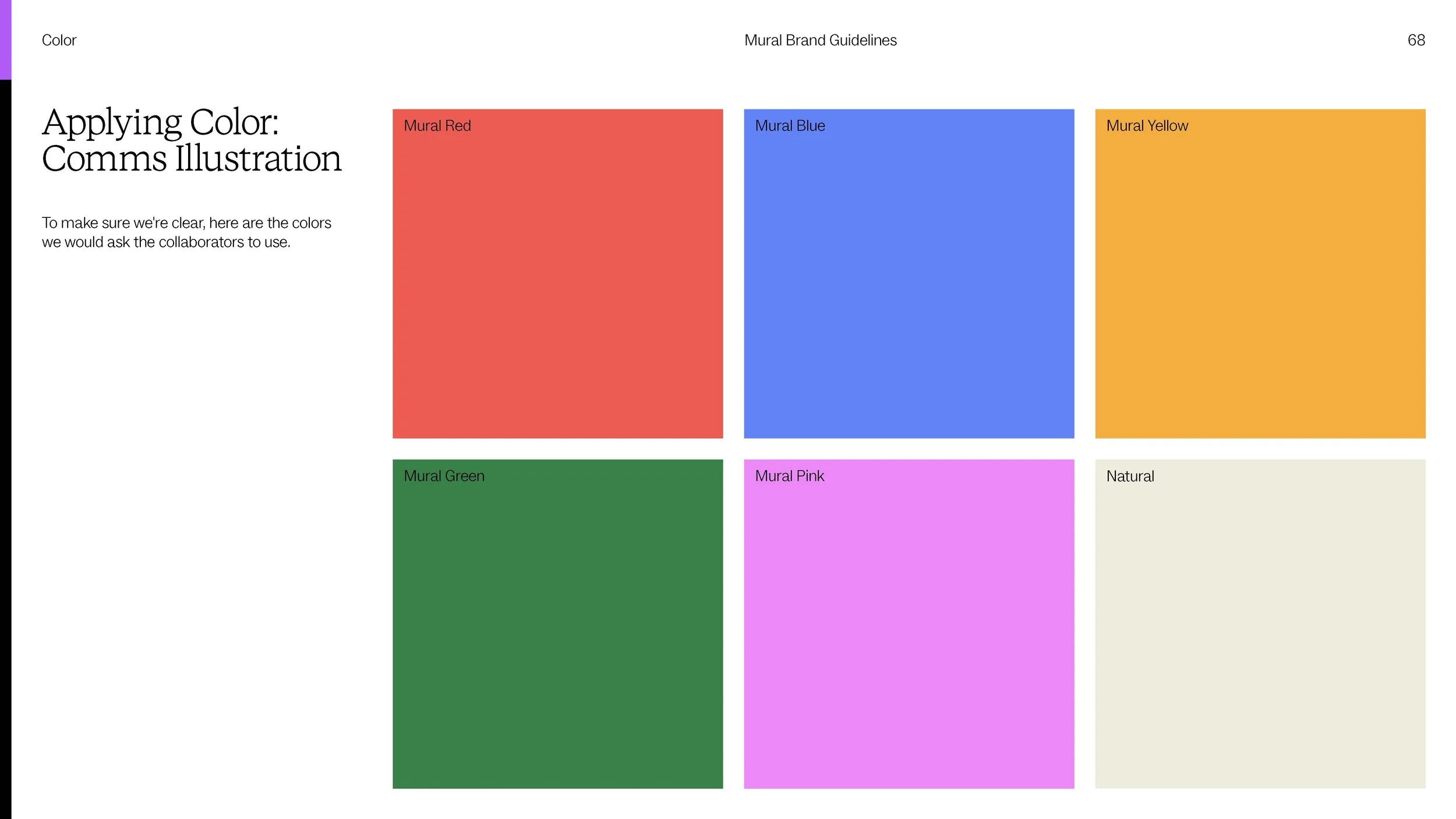
A dynamic wordmark. Hand-crafted animation principles. A color palette that refuses to sit still. Together they became one language spanning marketing motion and product UI. Enough structure to keep design and product teams consistent. Enough play to scale across web, product, and campaigns without going stale.


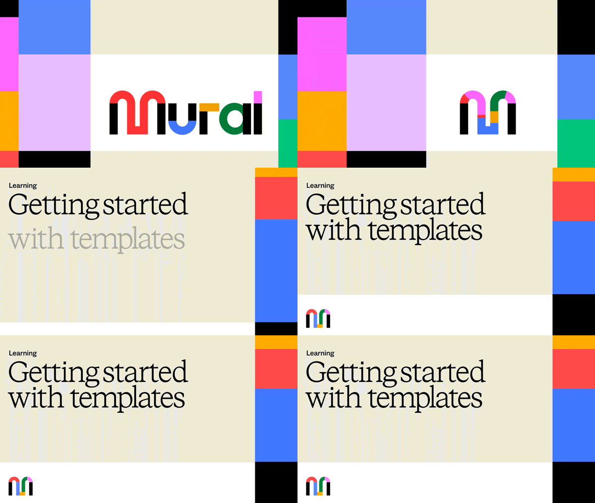



Building A House Style
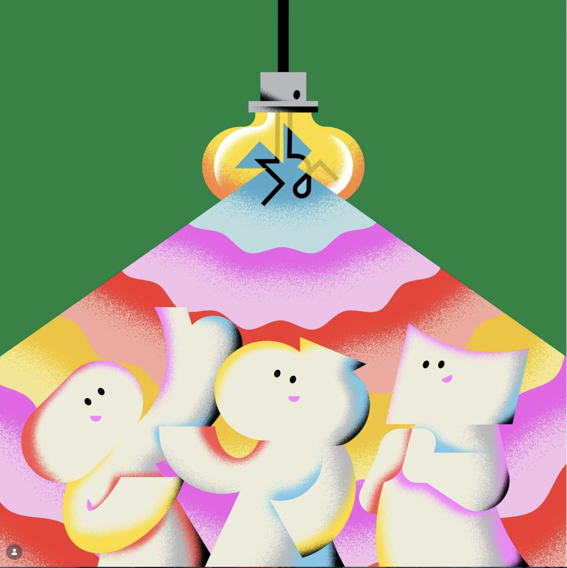
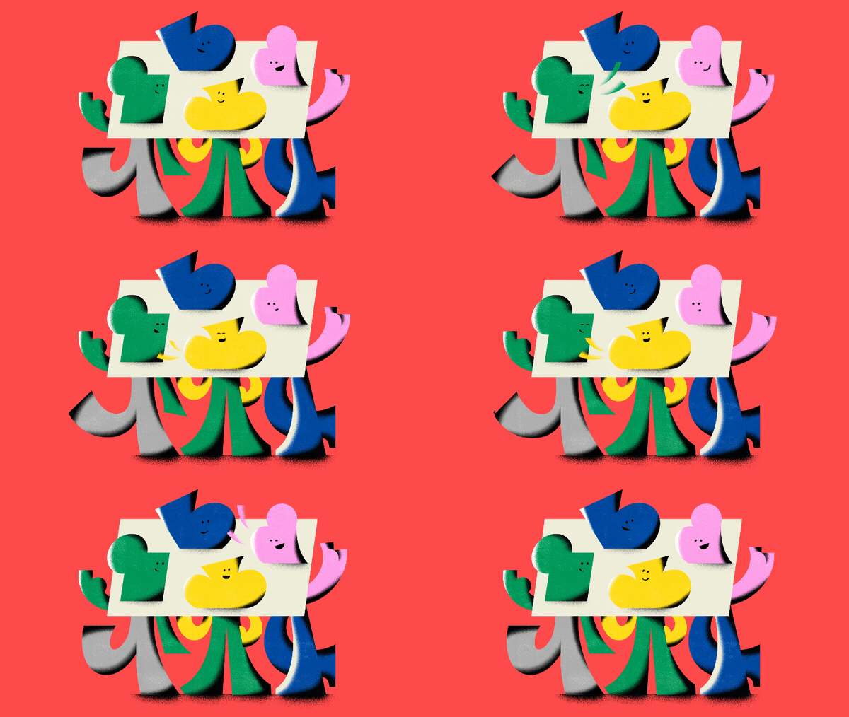
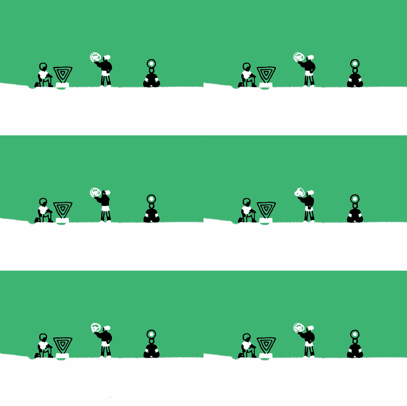
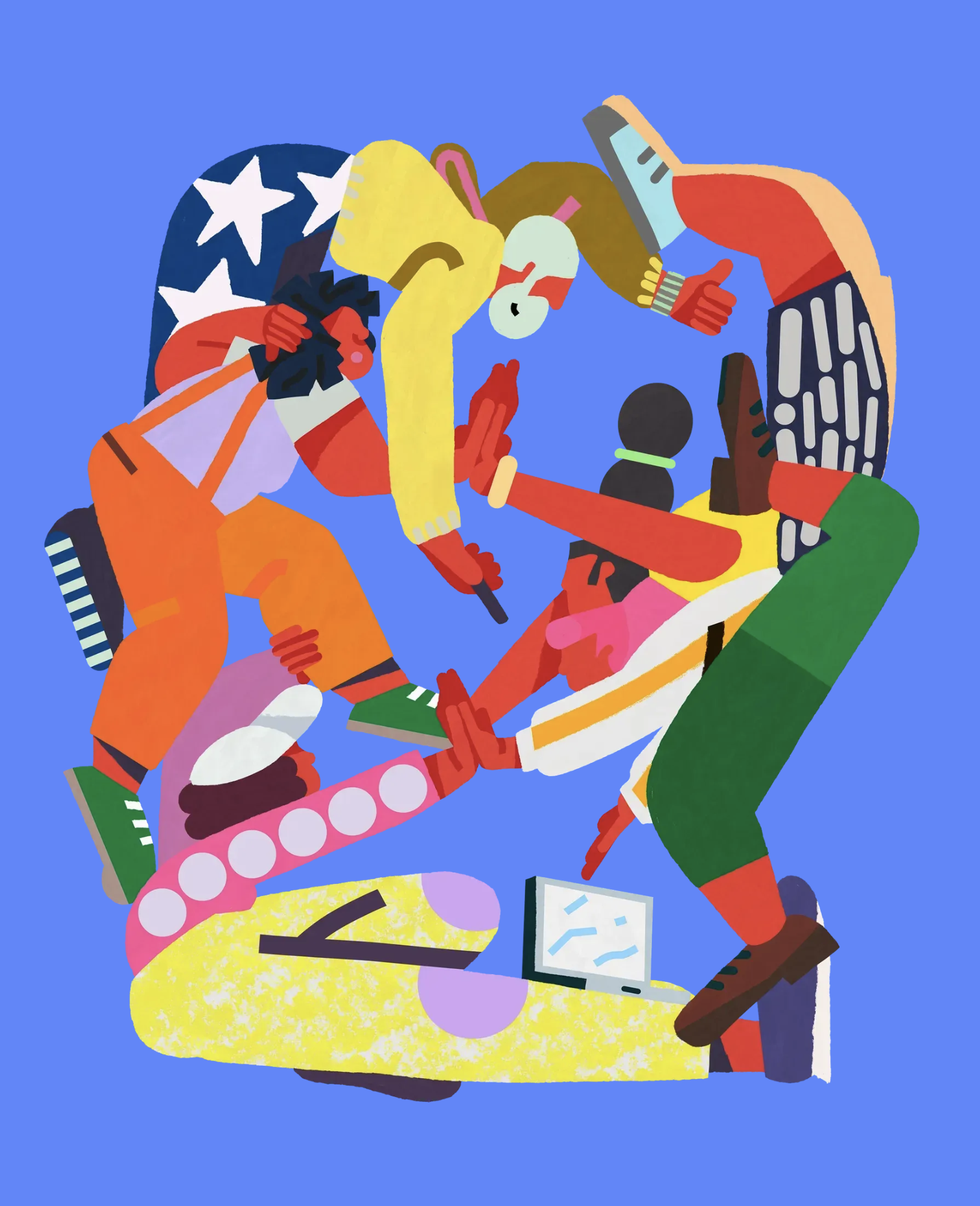
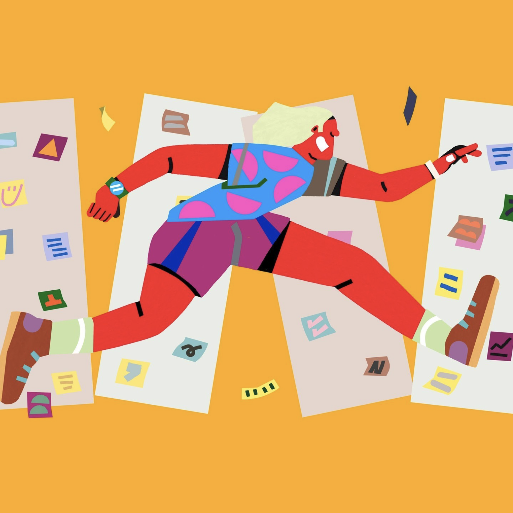
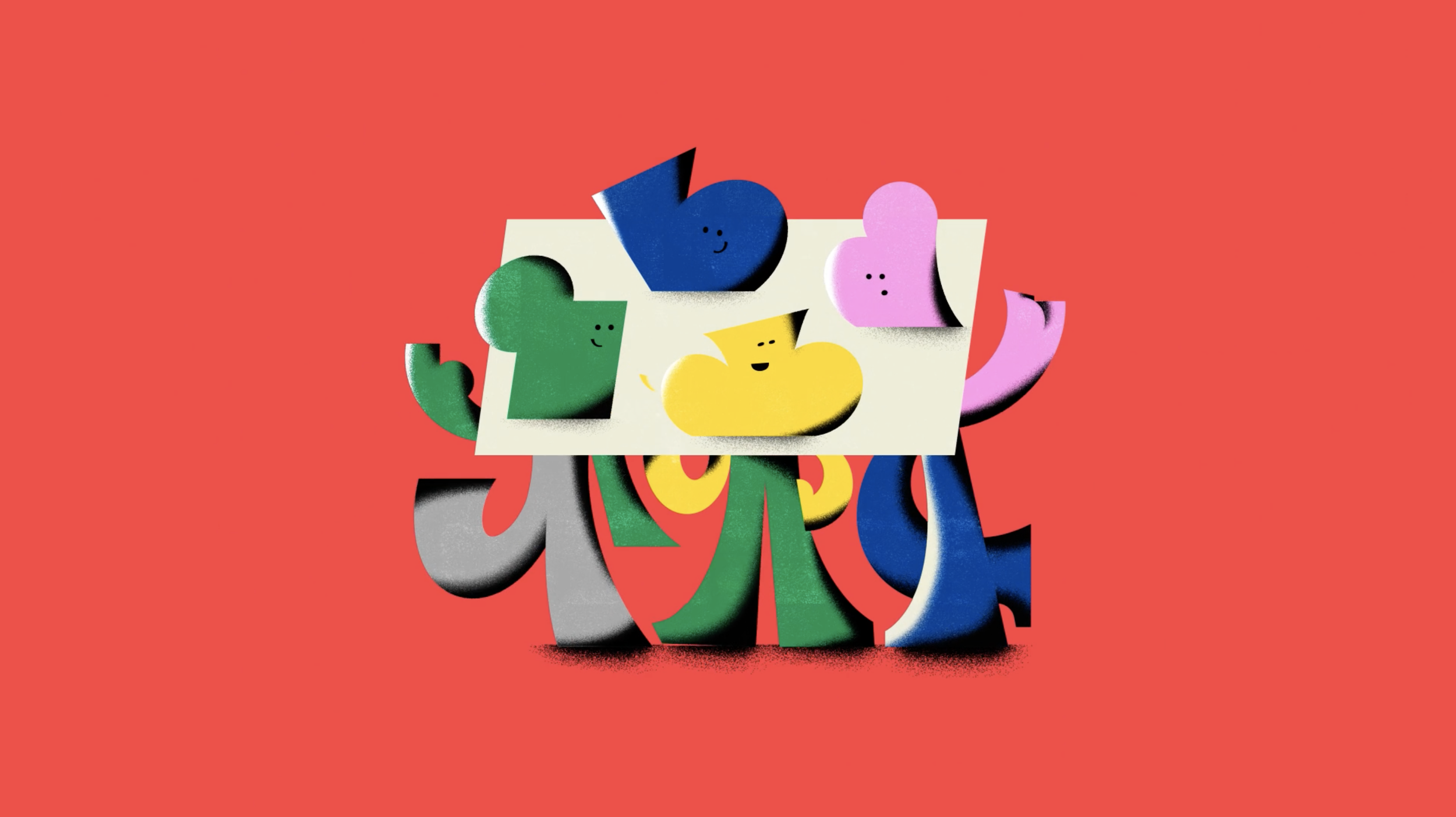
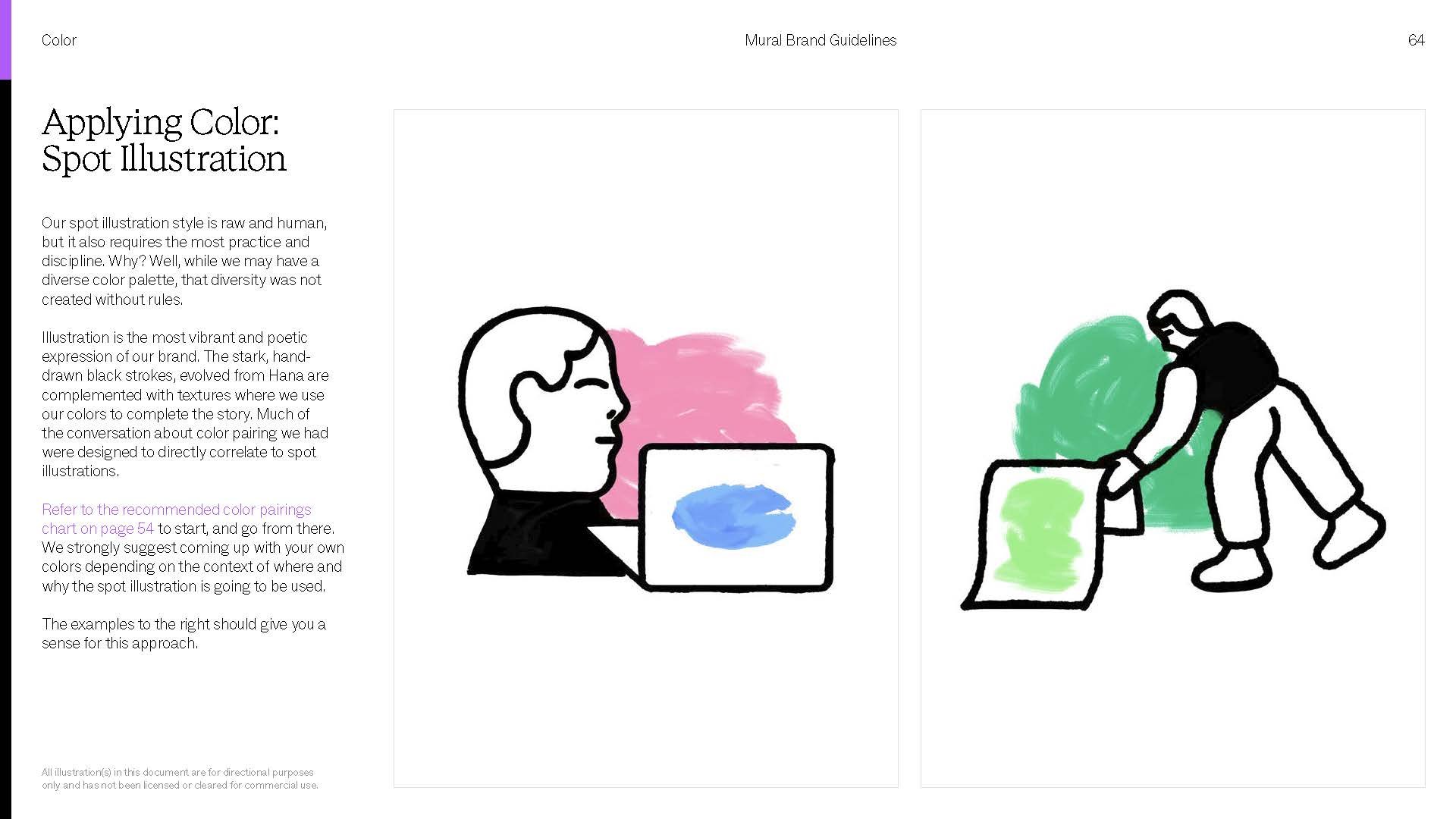
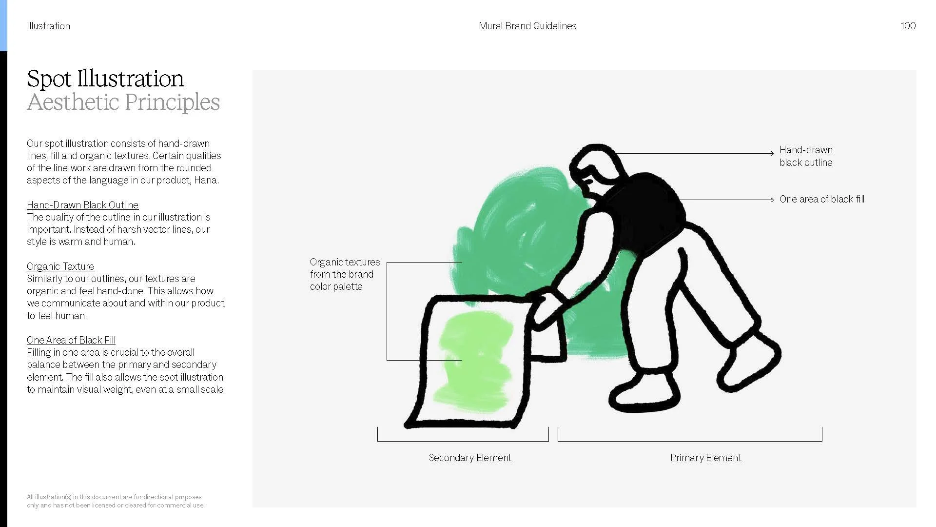
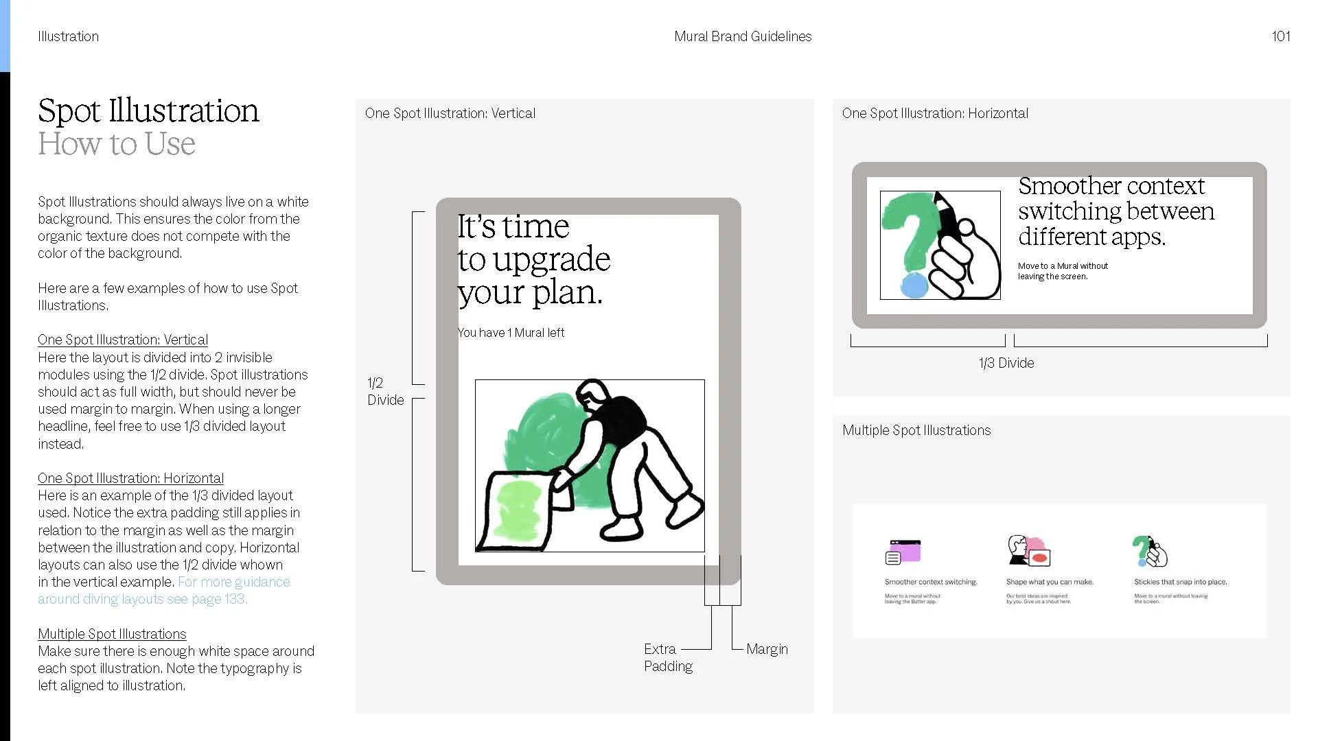
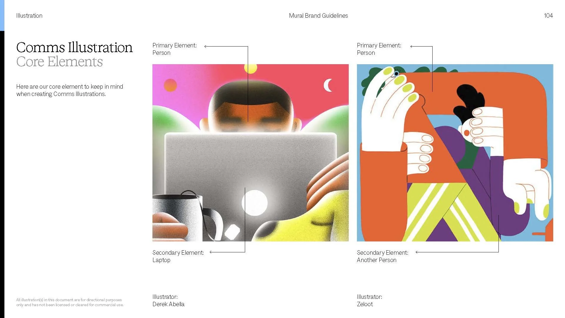
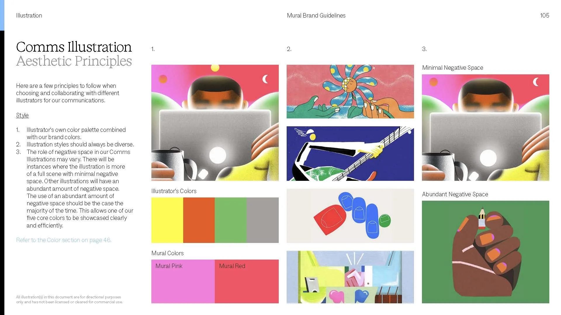
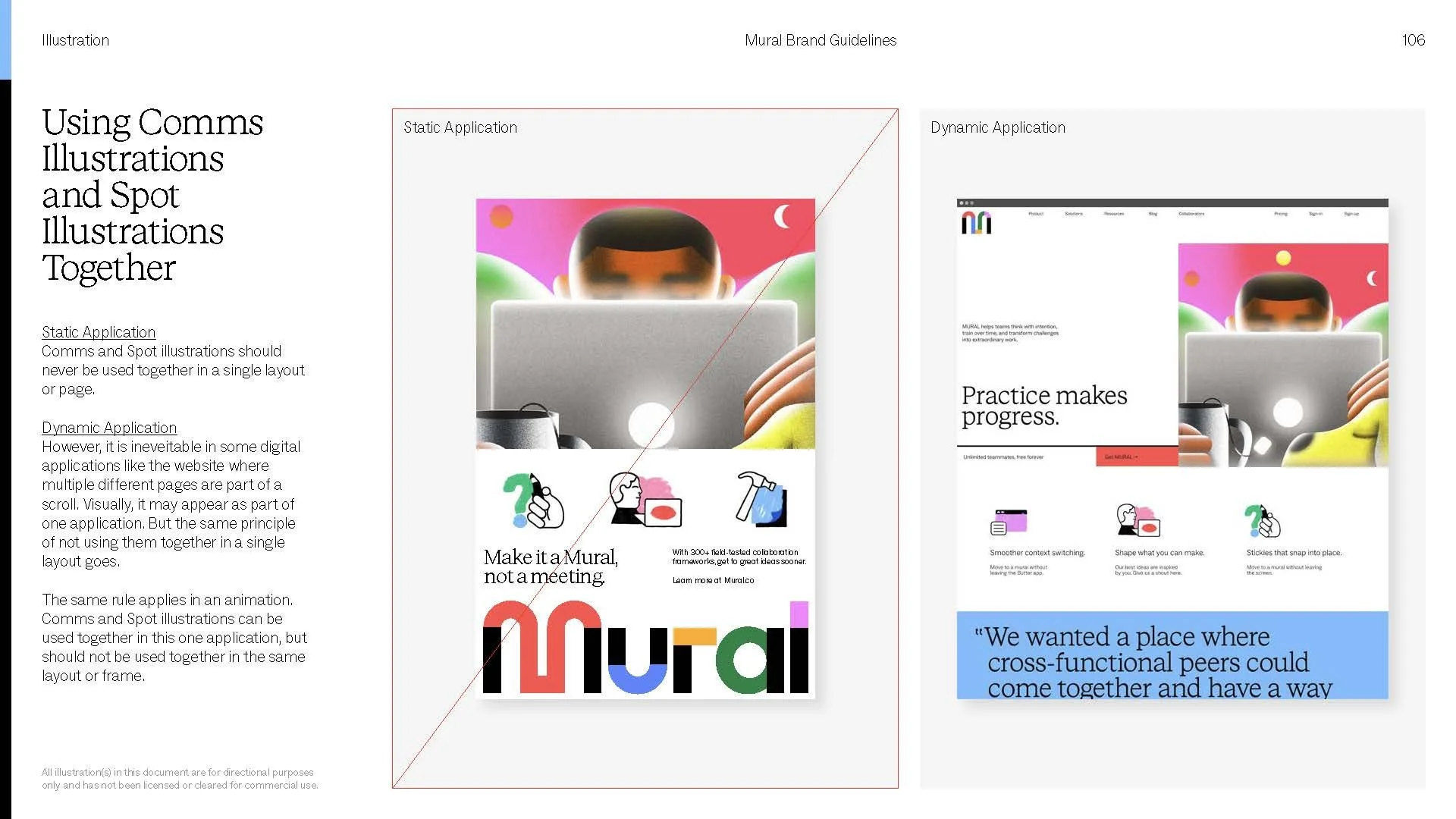
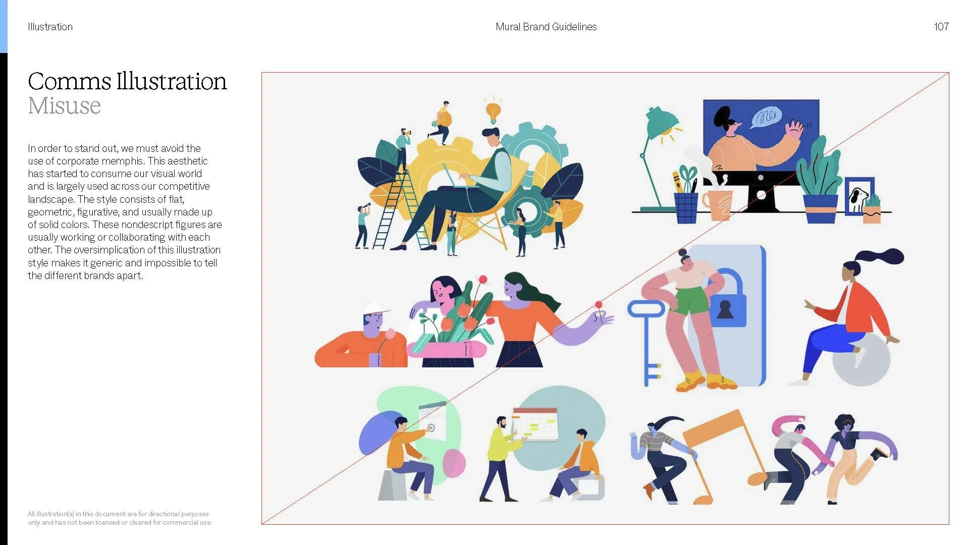
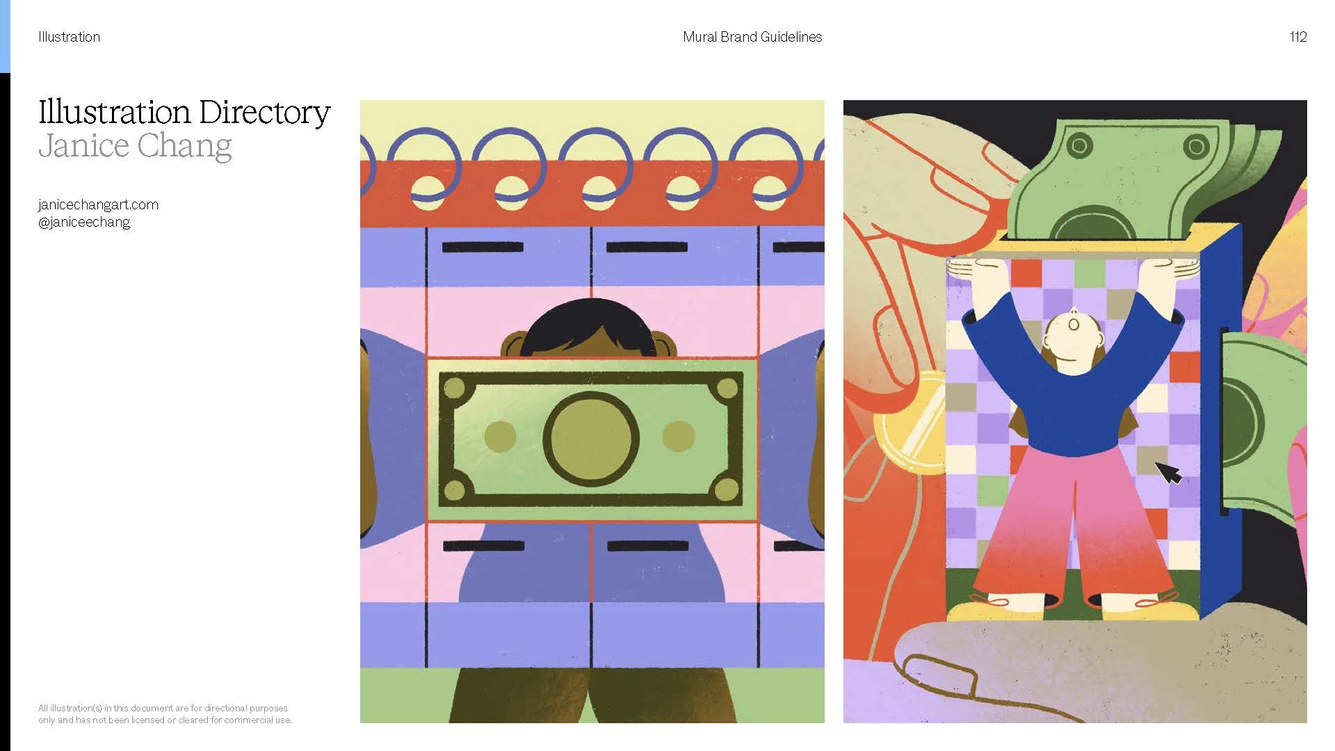
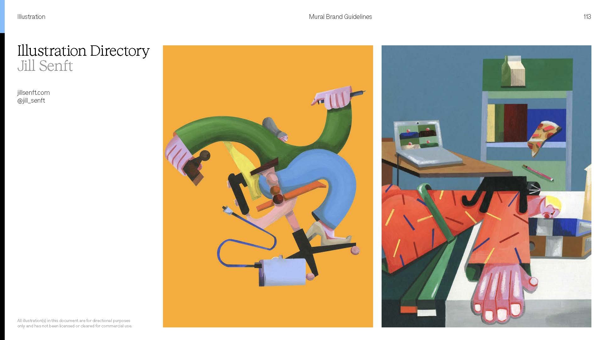
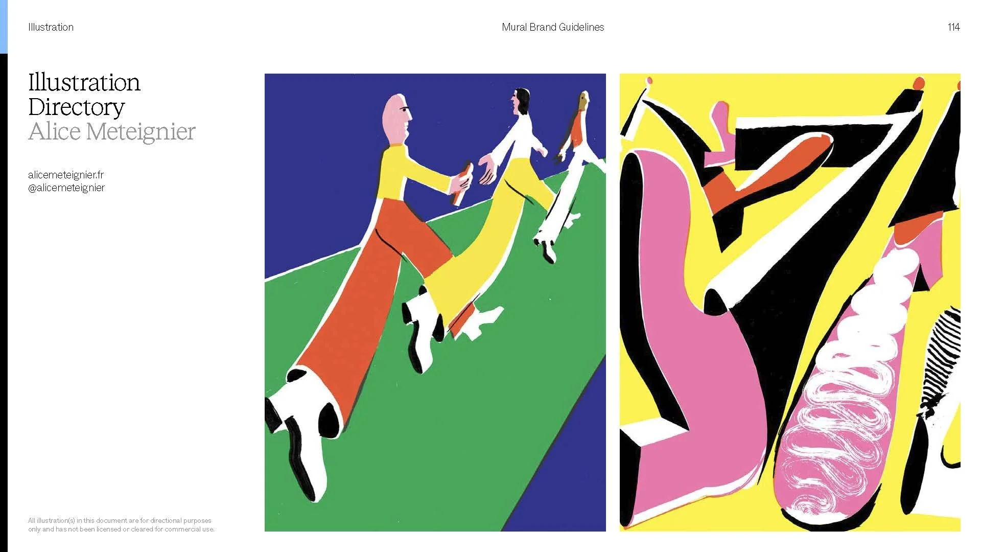
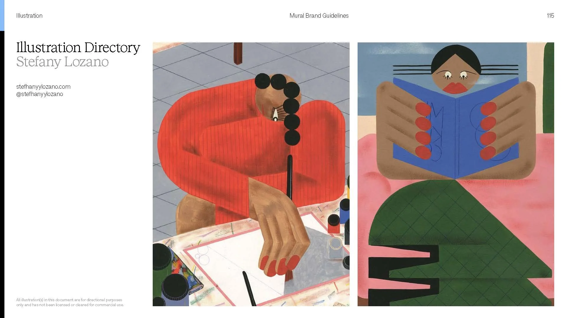
Our core brand needed a way of telling big ideas. A house style that could carry storytelling in video and across every touchpoint. We wanted anyone who came across Mural to see themselves in it, so the style reflects our customers: collaborative, diverse, and already dreaming up the next big thing.
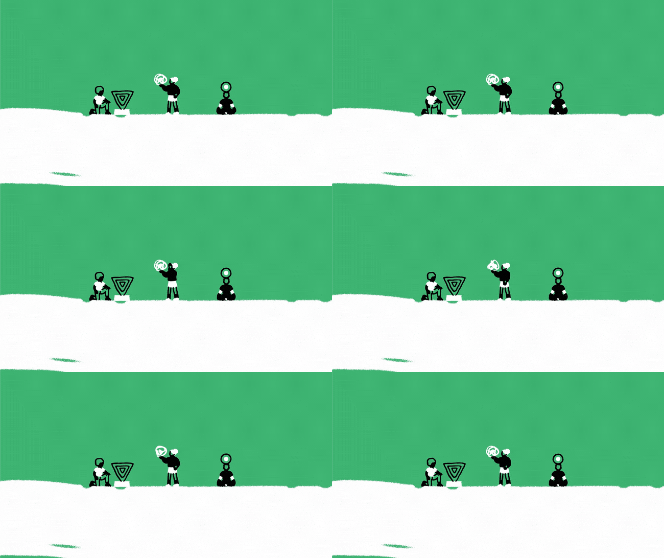
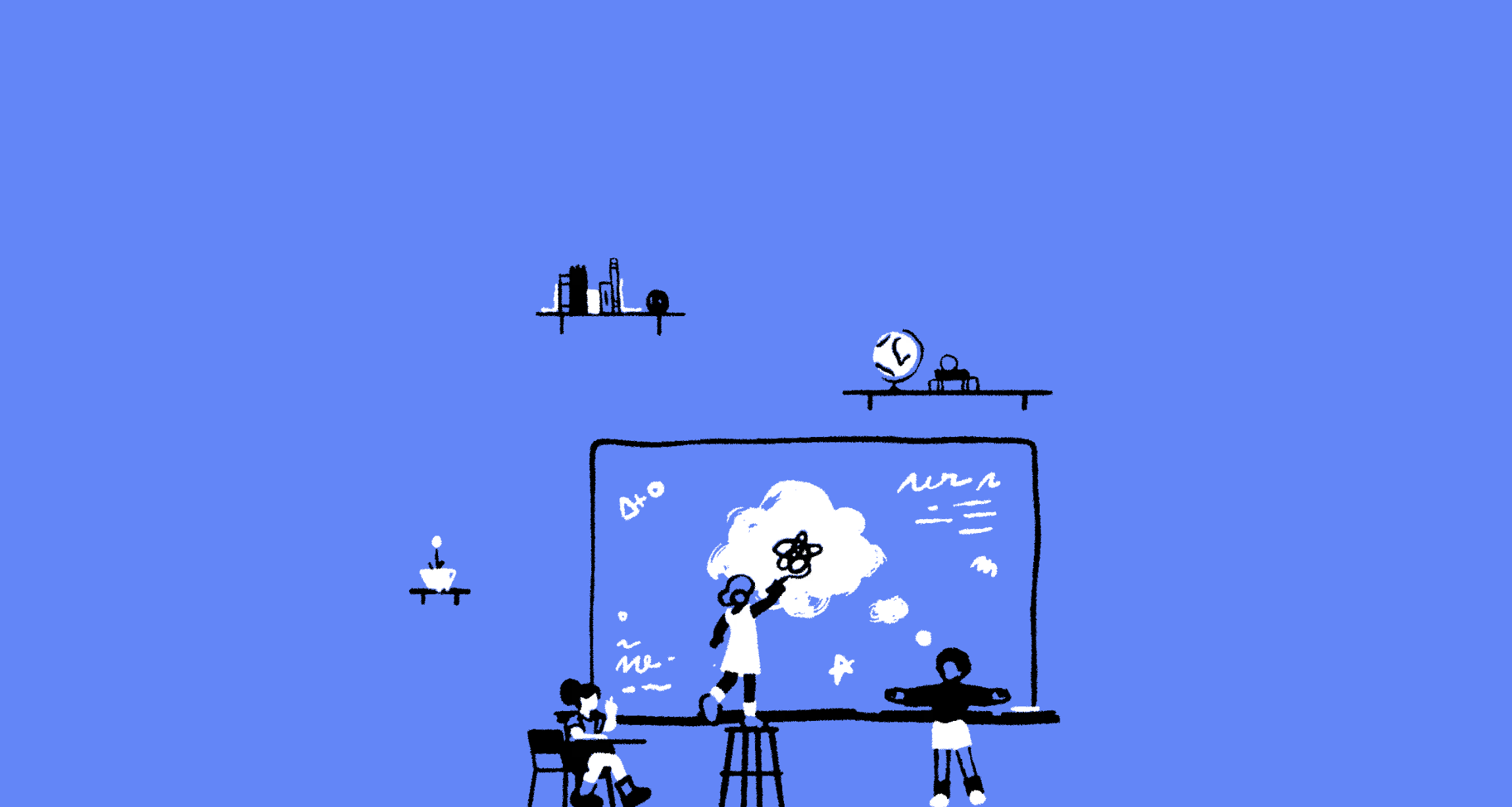
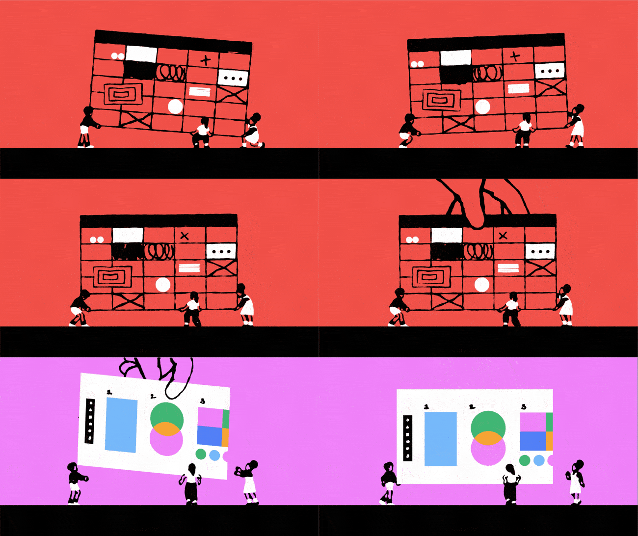
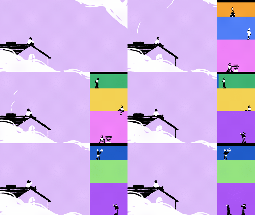
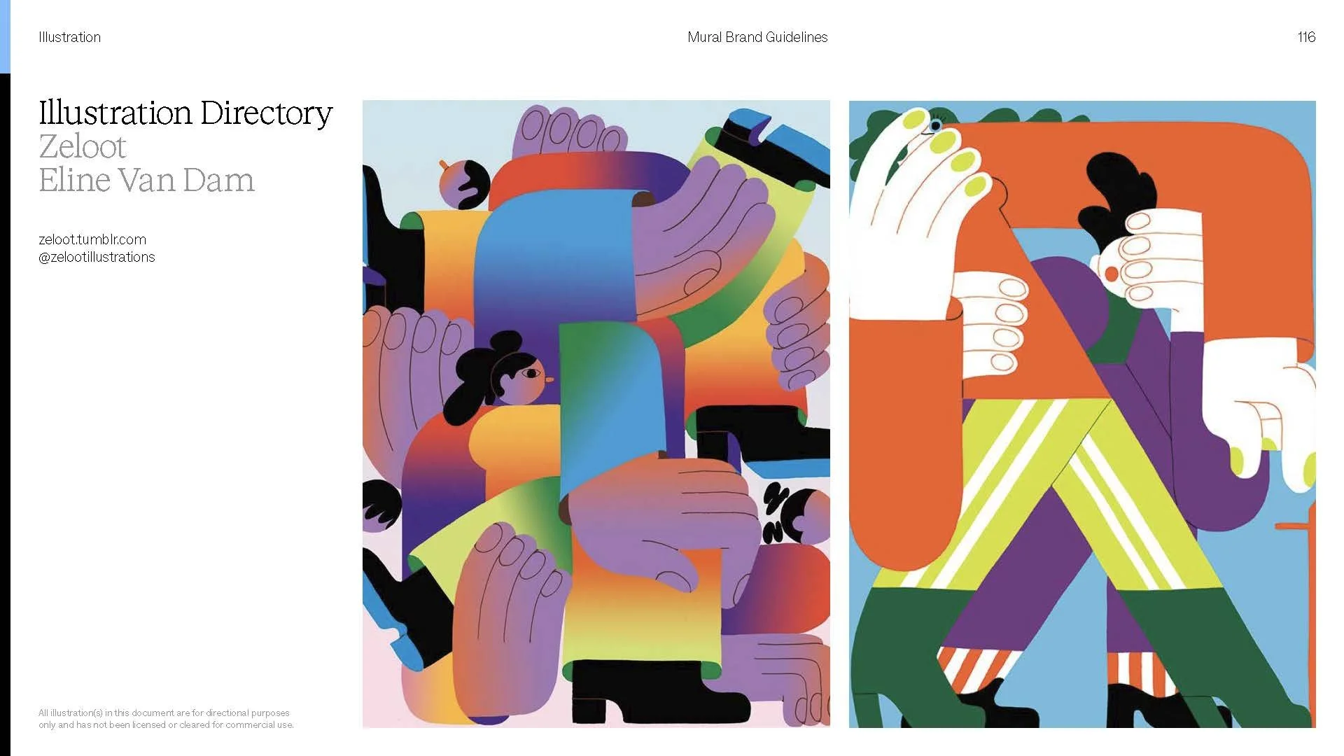
Celebrating Artists
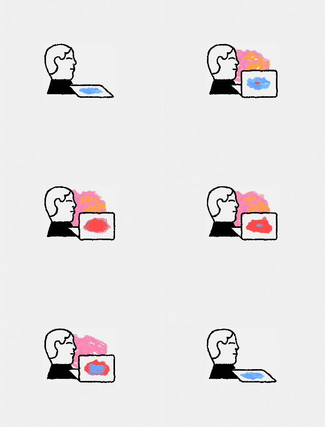
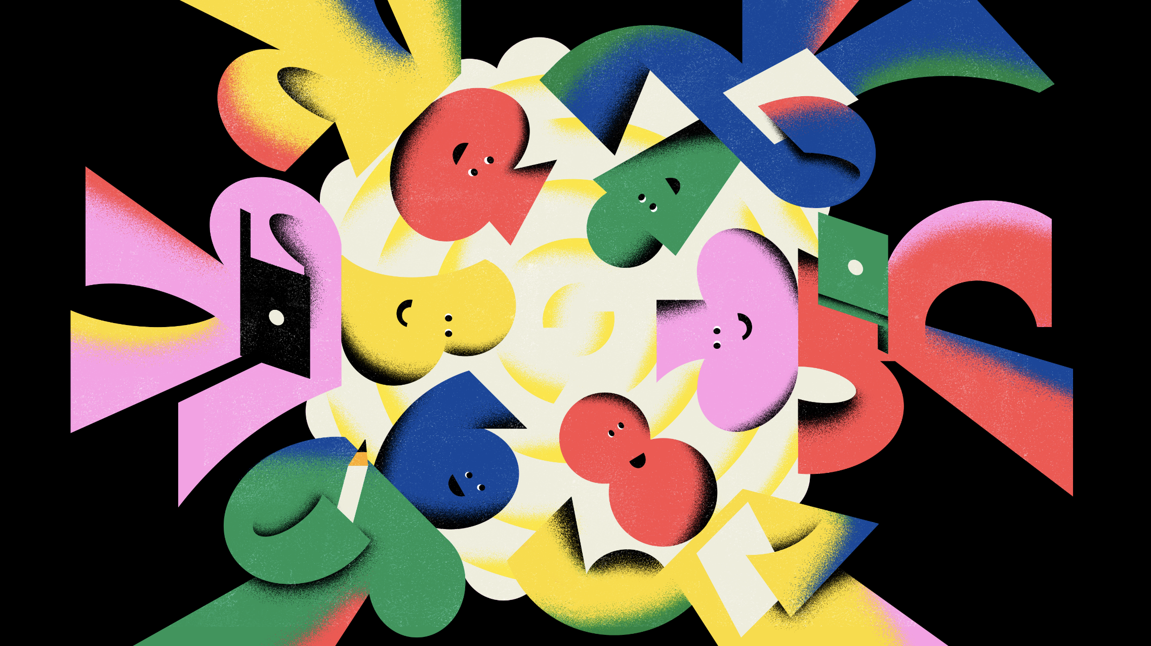
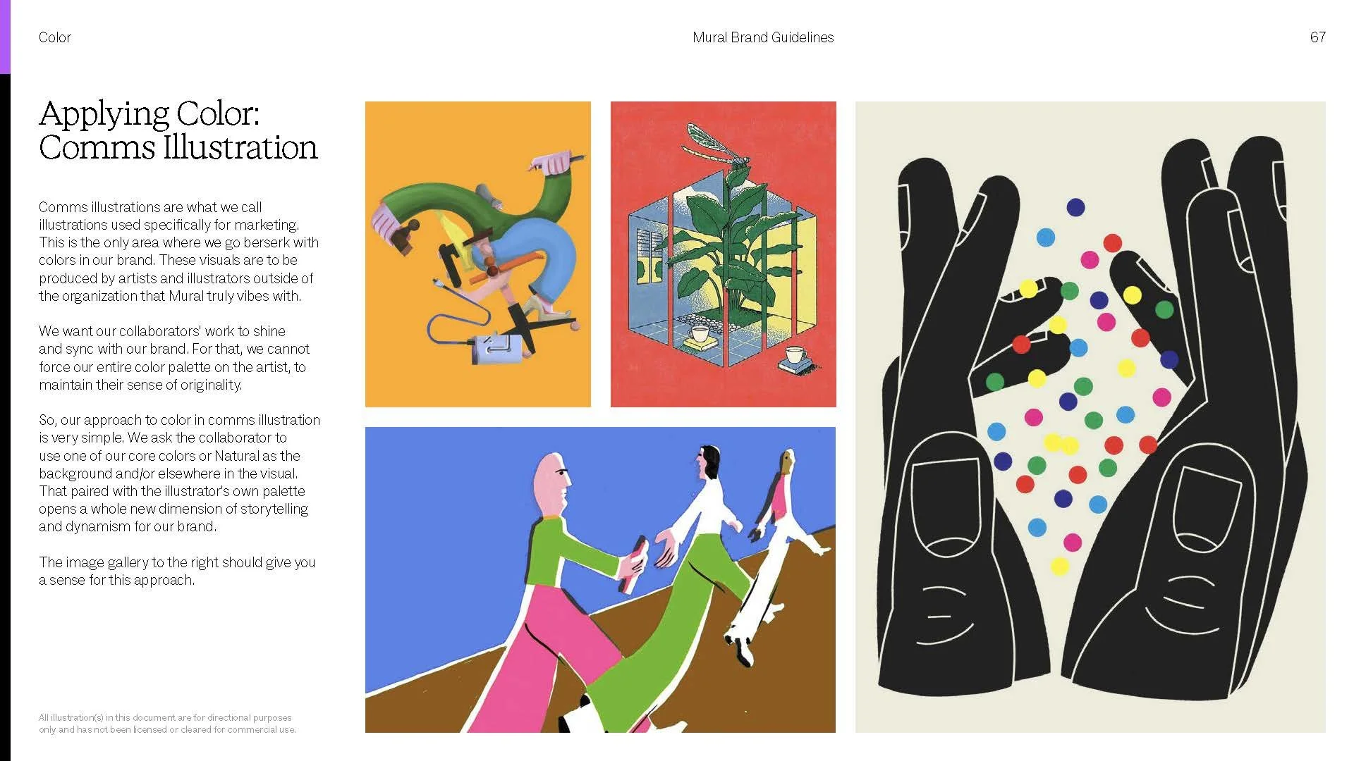
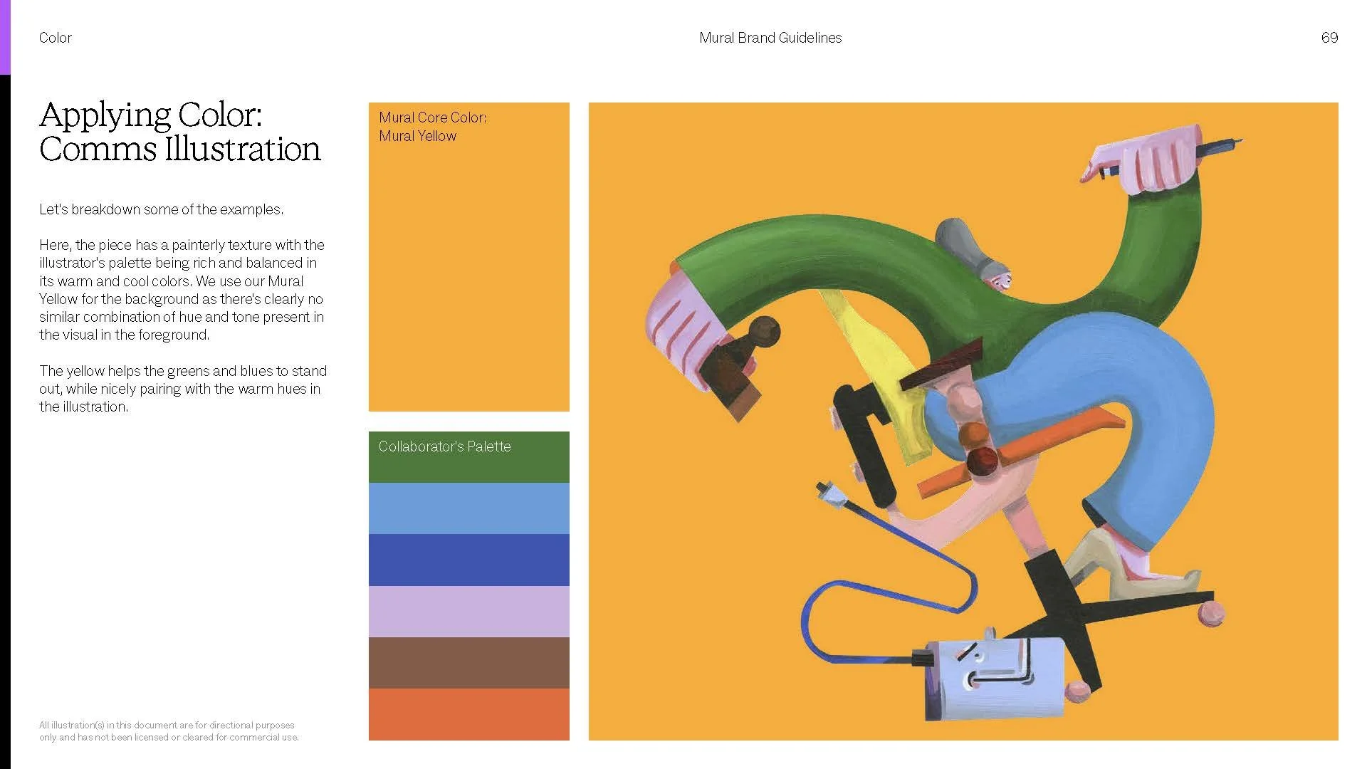
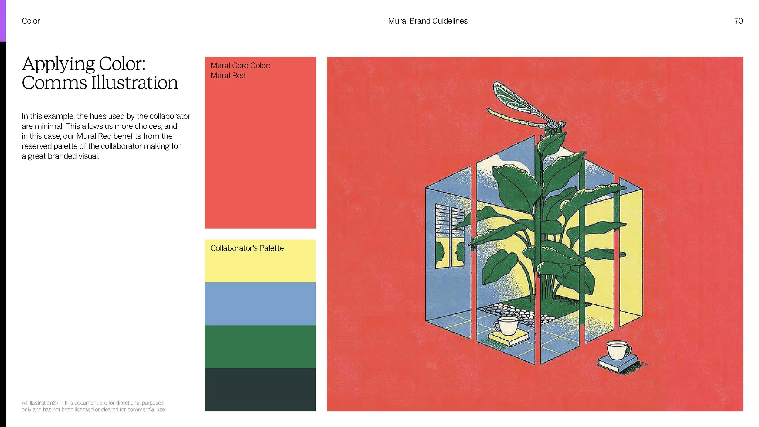
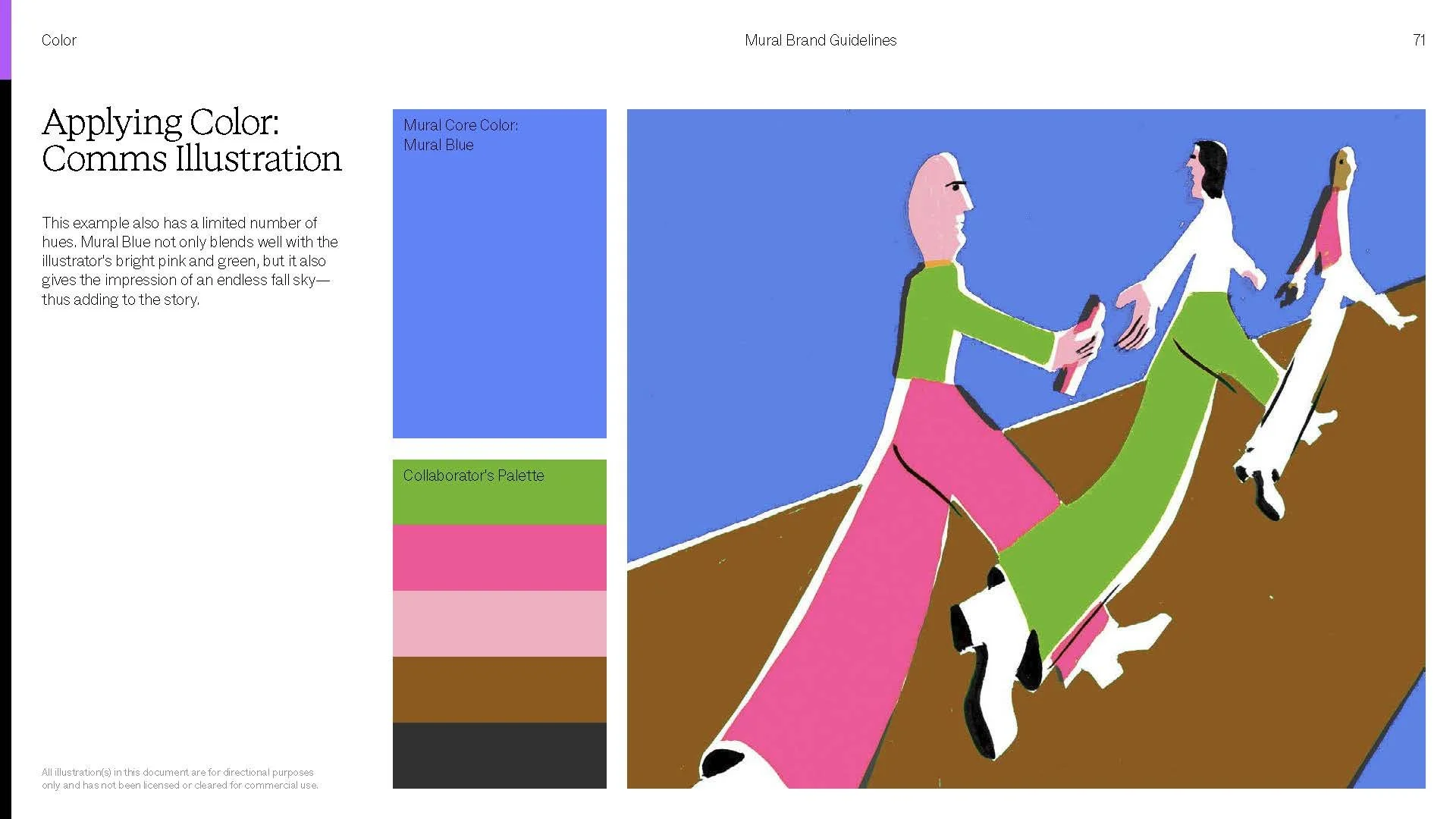
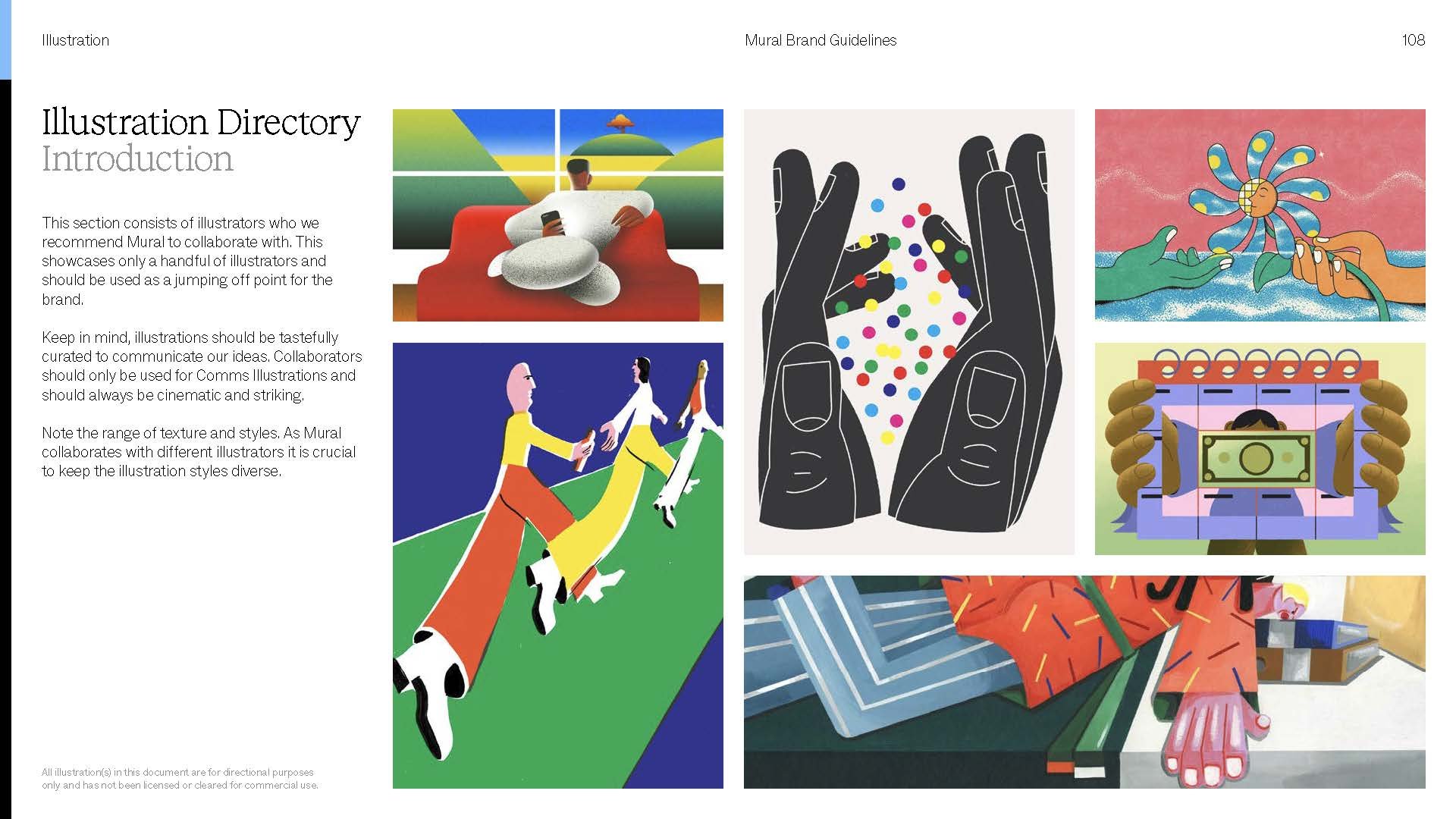
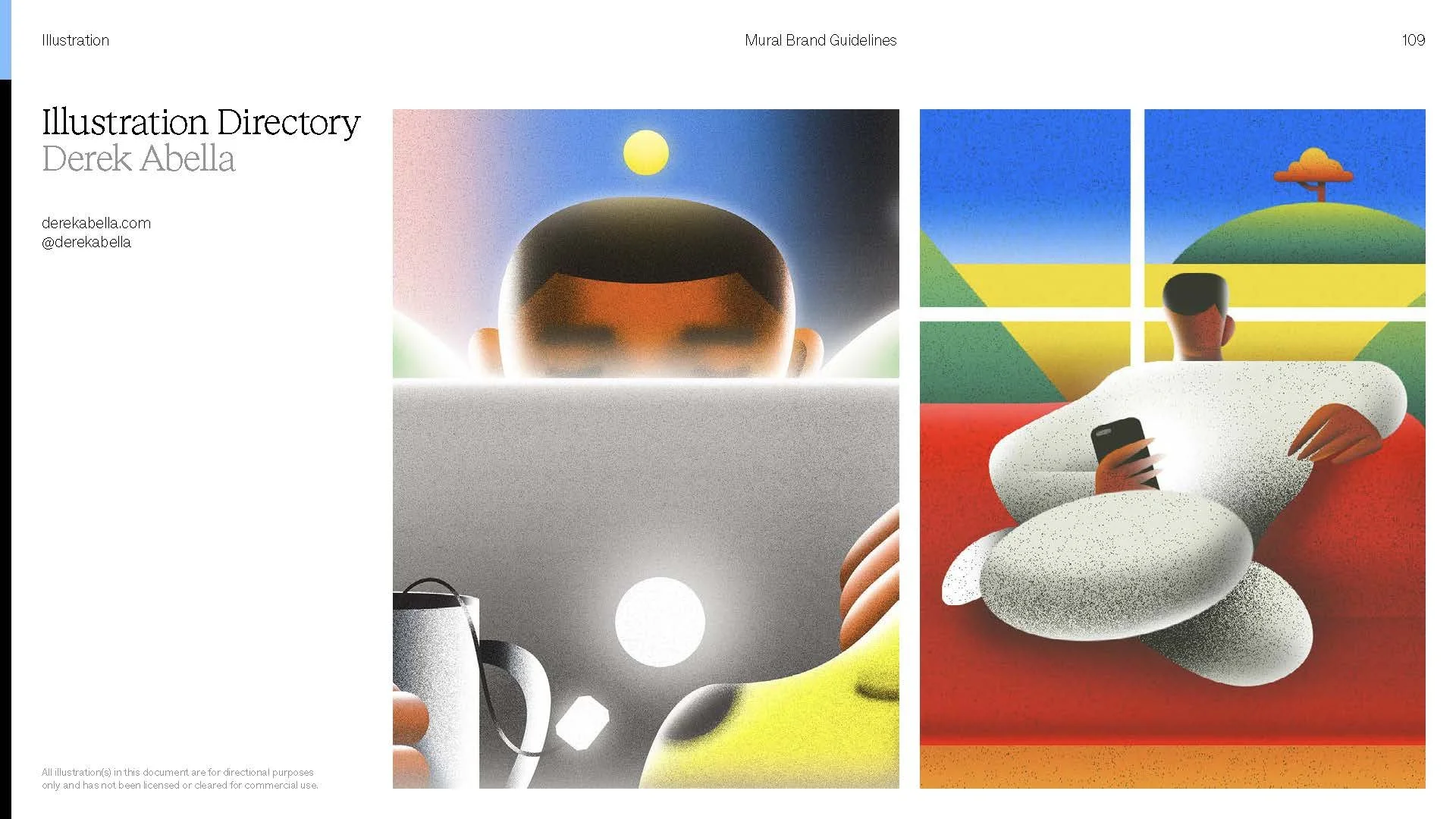
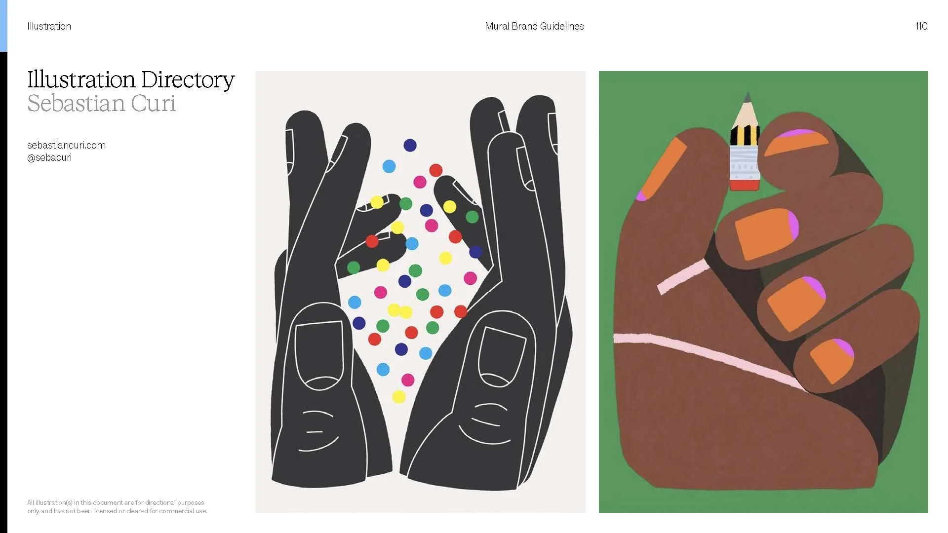
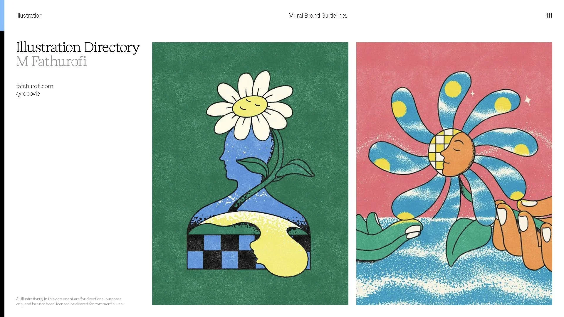
A brand for creative people should put creative people on stage. We built artist partnerships into the system itself, pairing each illustrator's work with our palette. The roster stayed deliberately diverse, in style and in perspective. Spotlighting artists doing remarkable work accomplished two things at once. It gave them a platform, and it associated Mural with the caliber of creativity our audience aspires to. Generosity turned out to be good strategy. Celebrate the community you serve, and the brand becomes a destination, not just a tool.
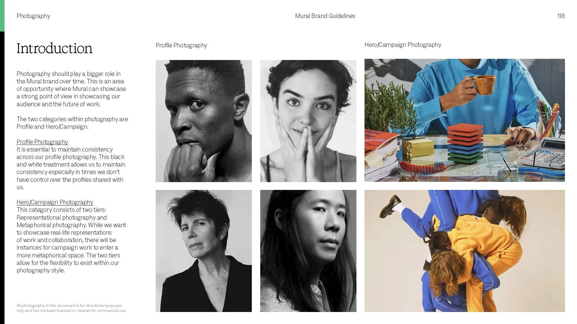
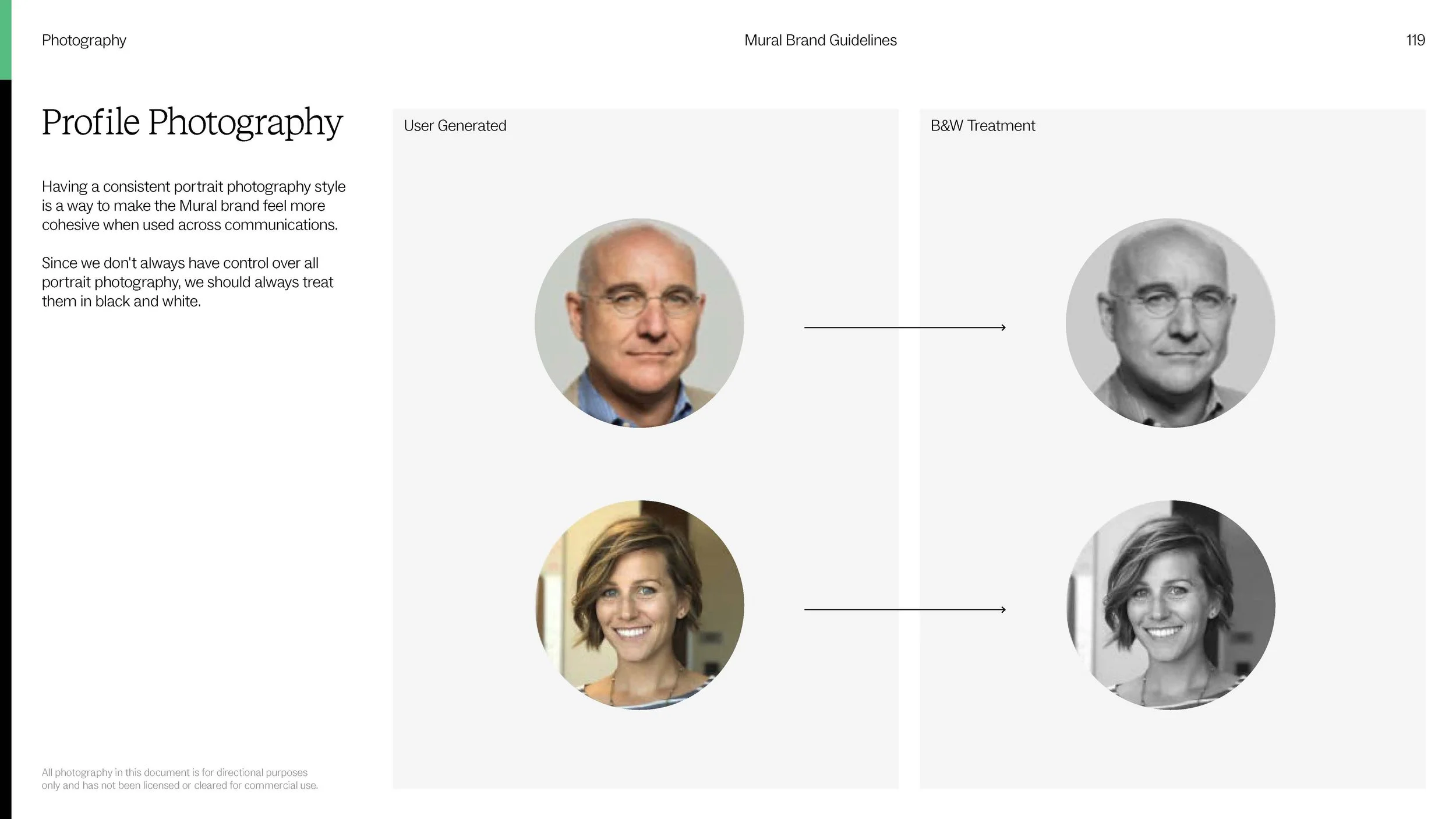
Photography
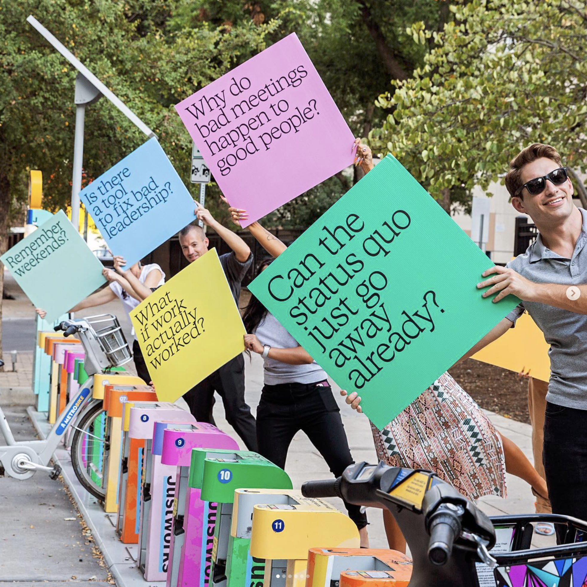
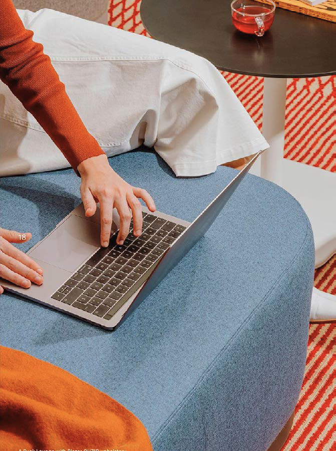
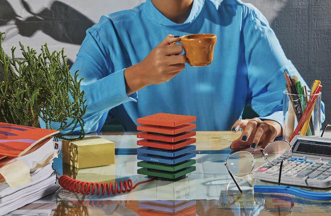
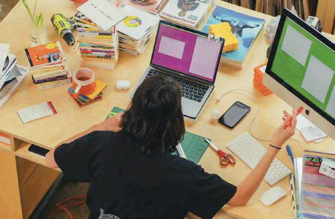
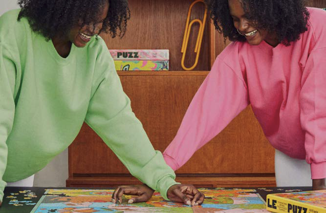
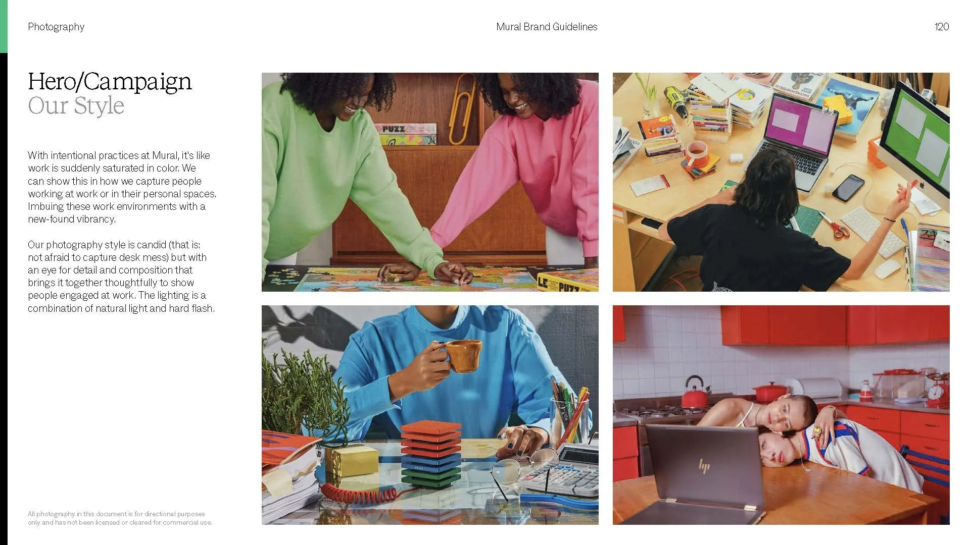
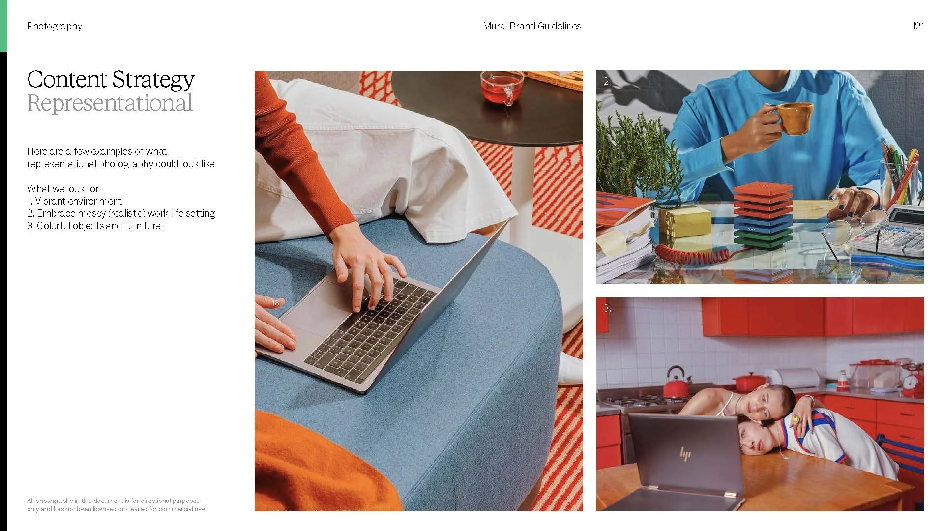
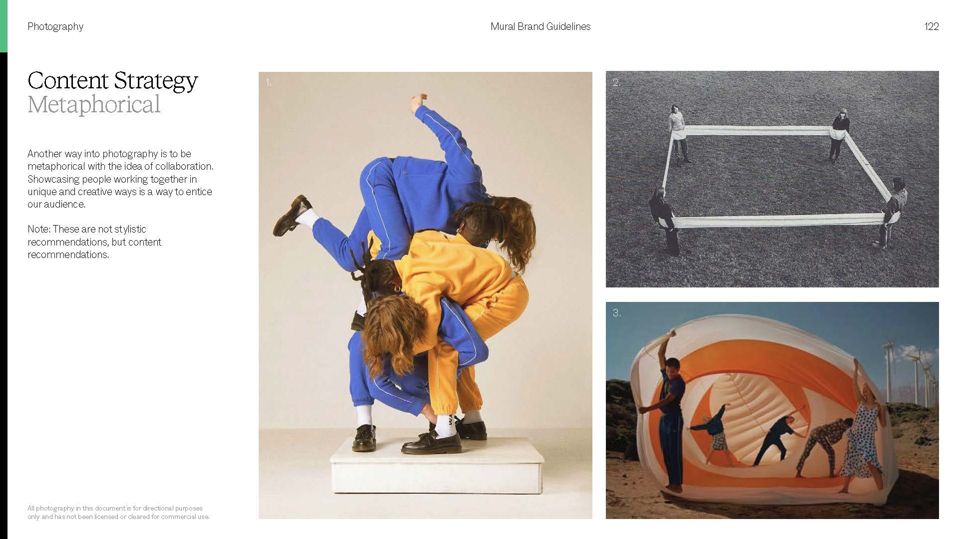
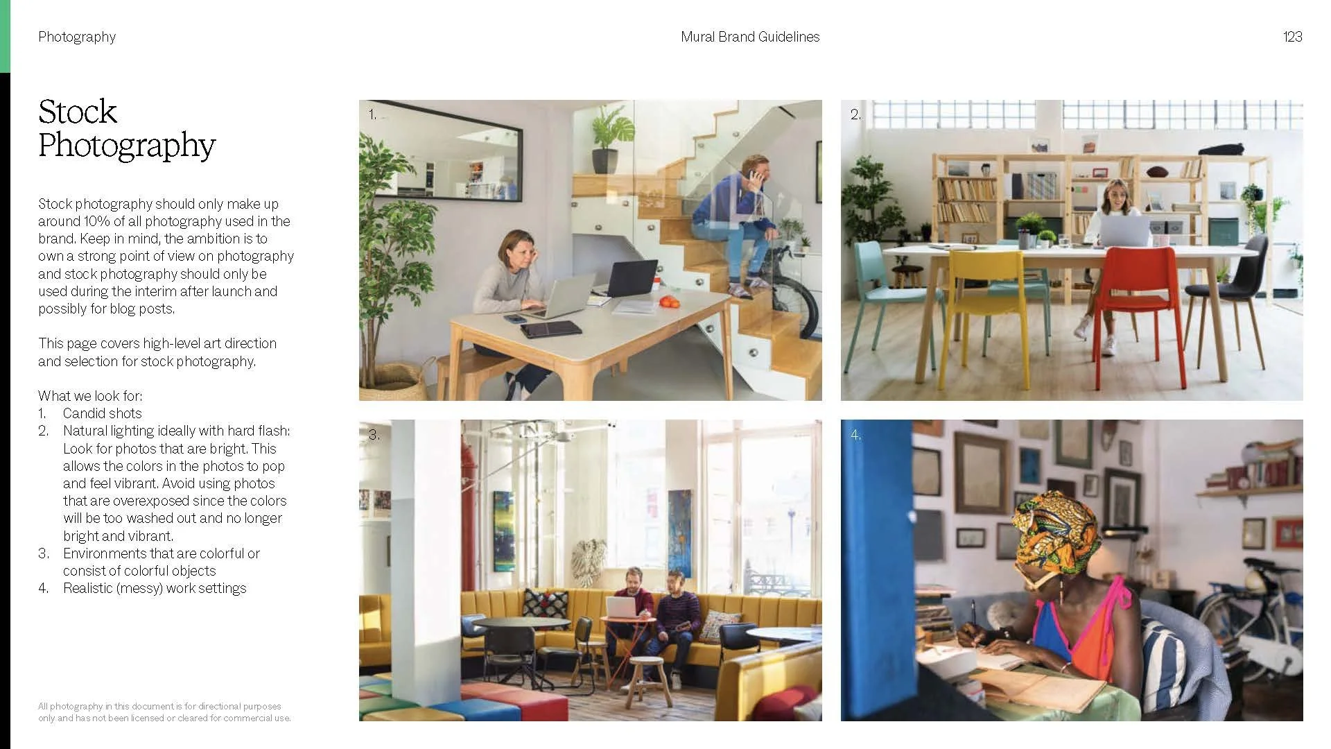
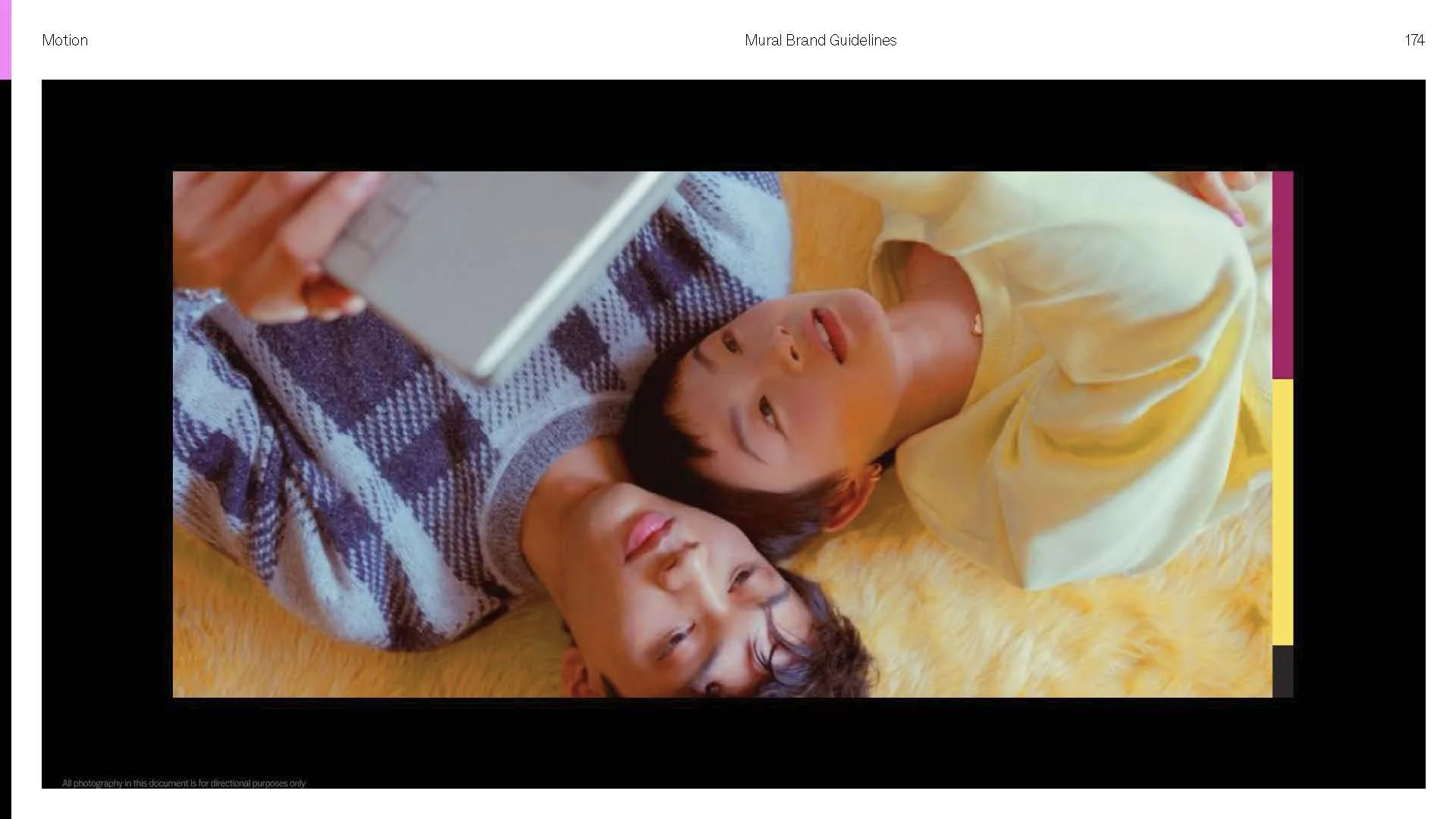
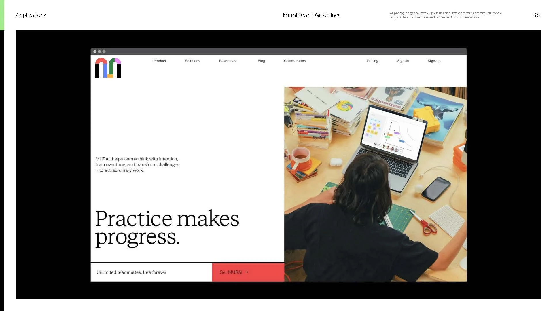
Our photography belongs to a world before cubicles and clinical offices. A world of craft and color, where every way of working is celebrated and creative mess is embraced. That's where the good ideas live. That photographic language became the reference for our cinematography, carrying its warmth straight into video.
Video Exploration
Our photography evokes a time before clinical offices and cubicles. A world of craft and color. A place where each person's way of working is celebrated and their creative mess embraced.
This same photography became the creative reference for our cinematography, setting the visual approach we carried into video.

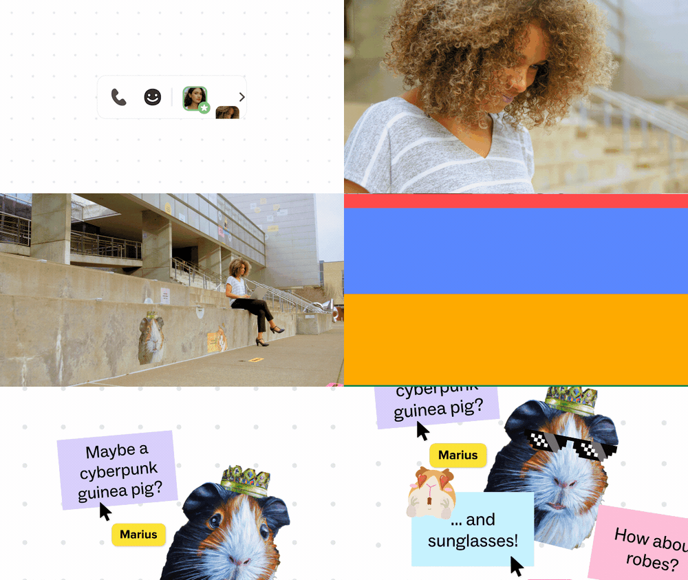

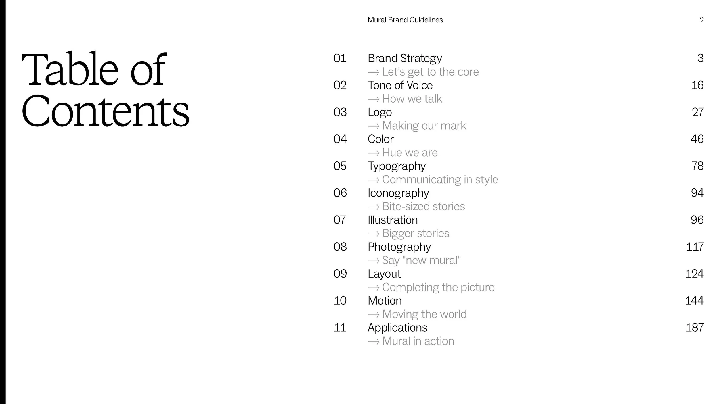
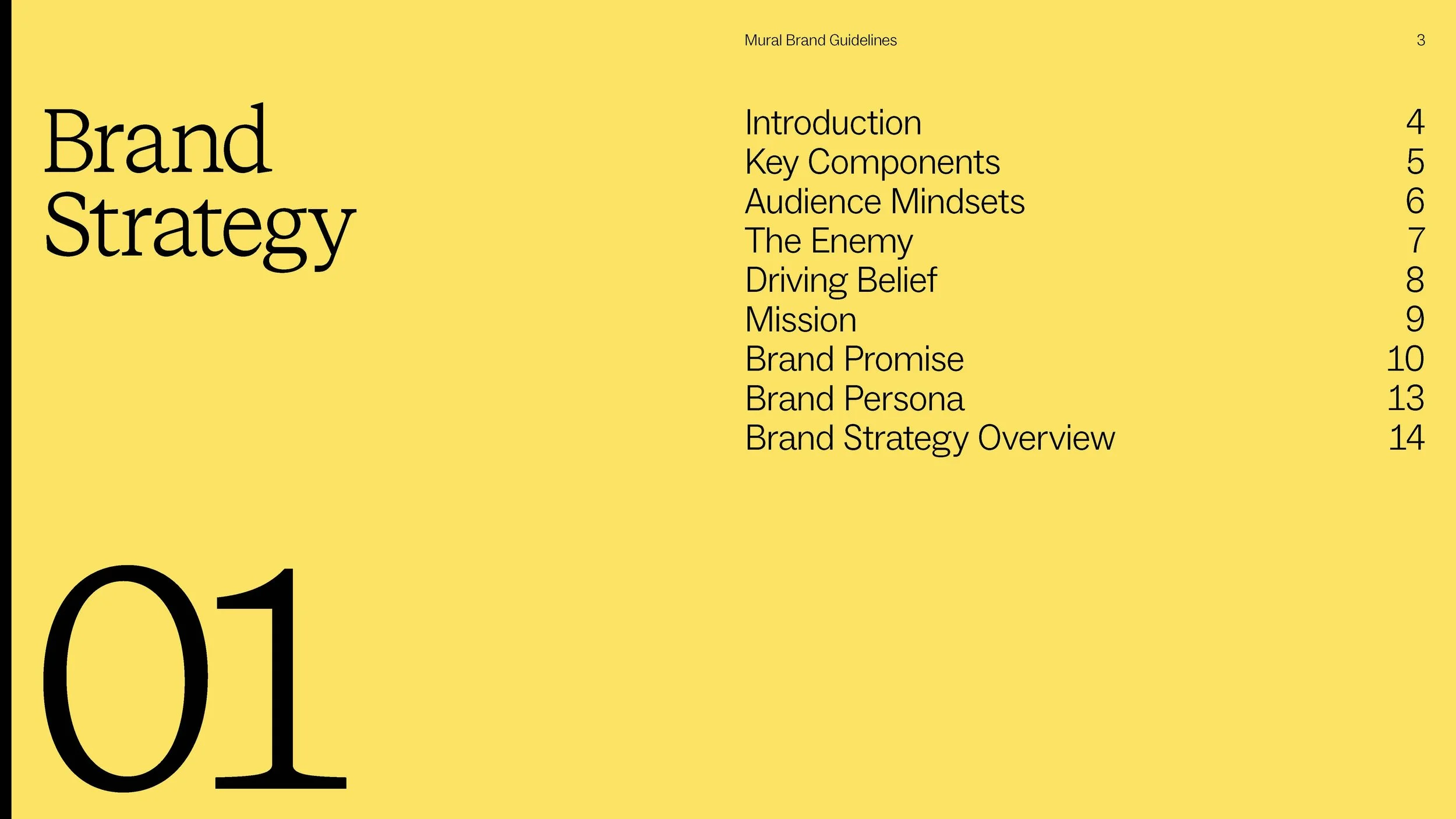
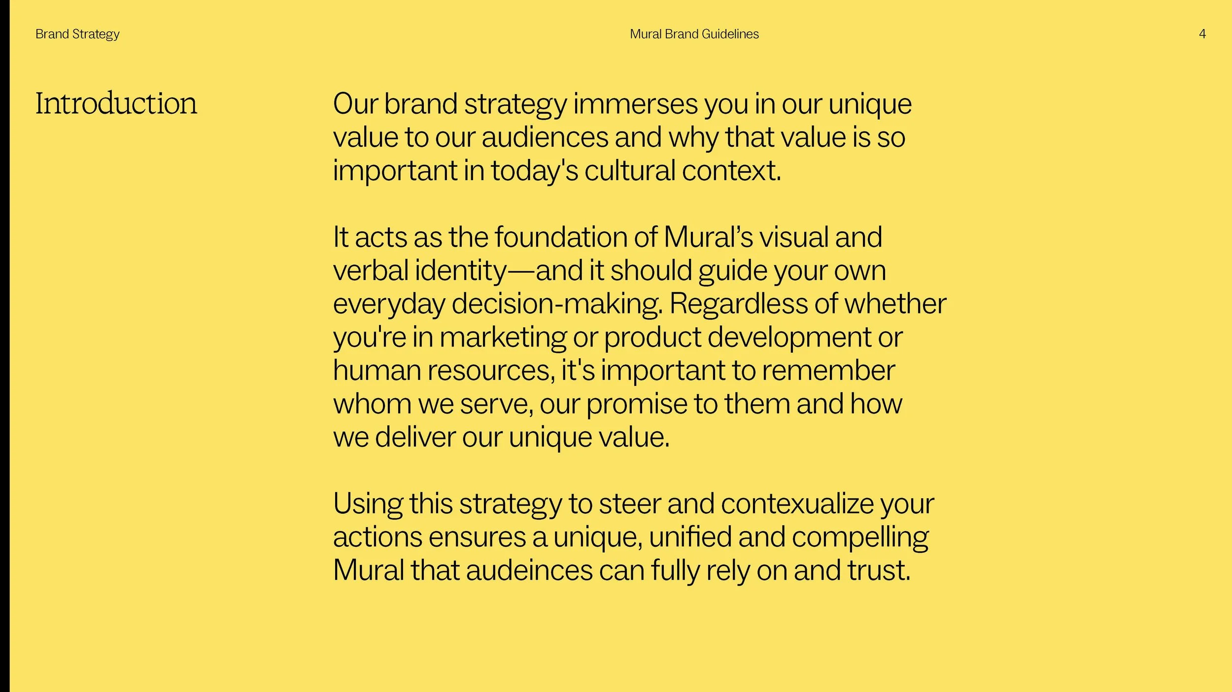
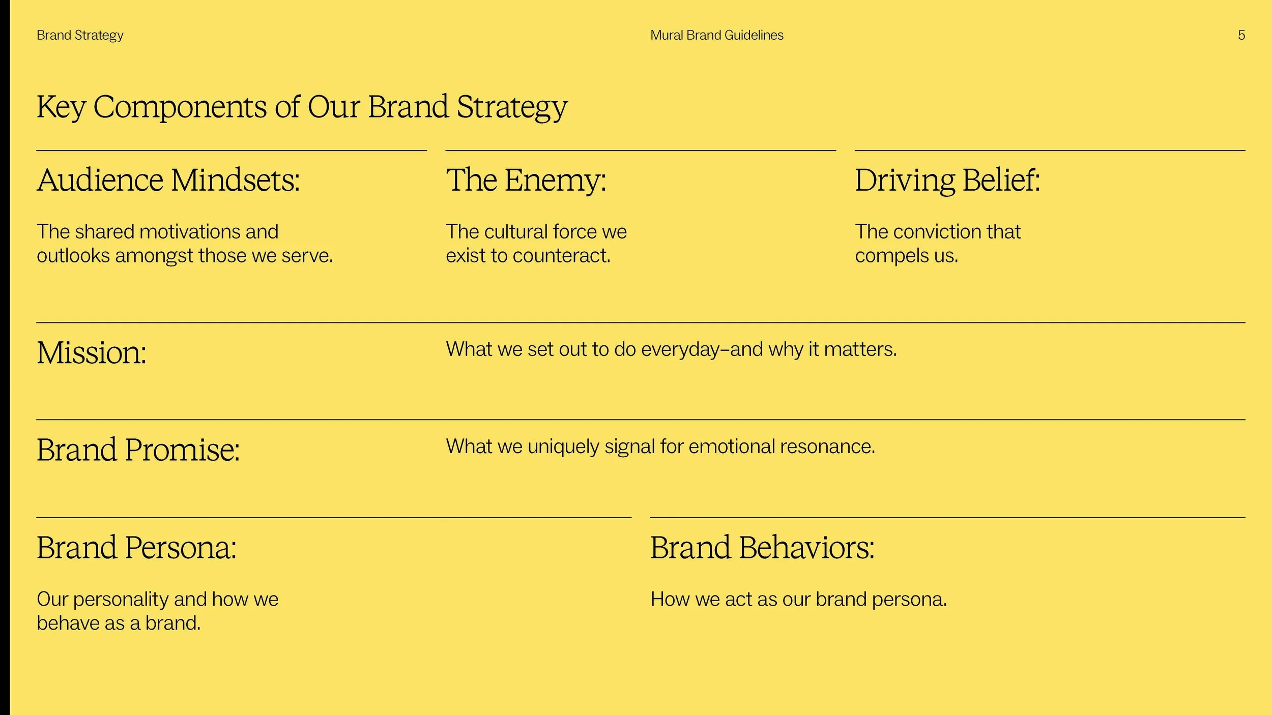
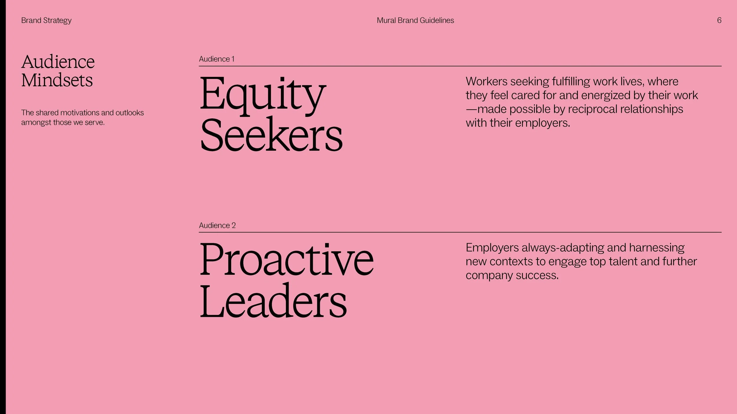
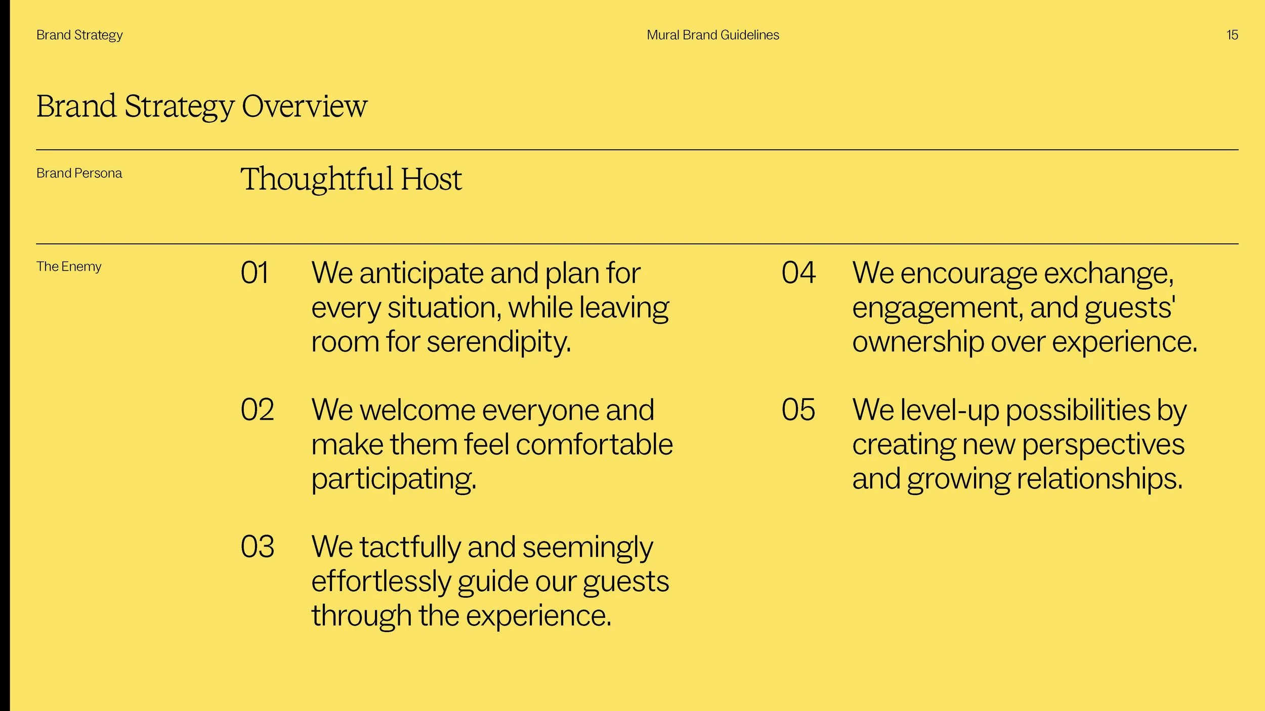
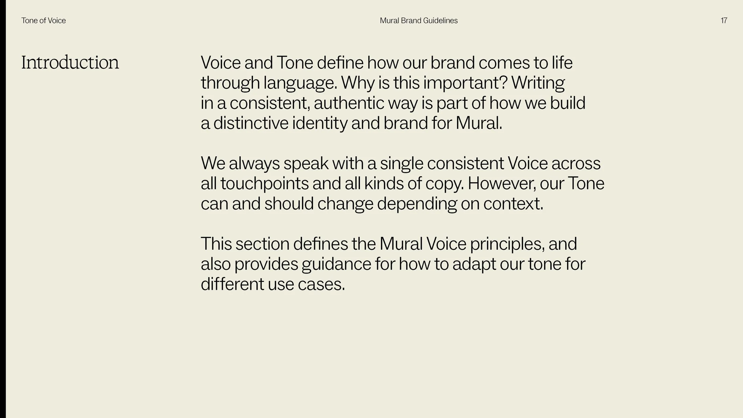
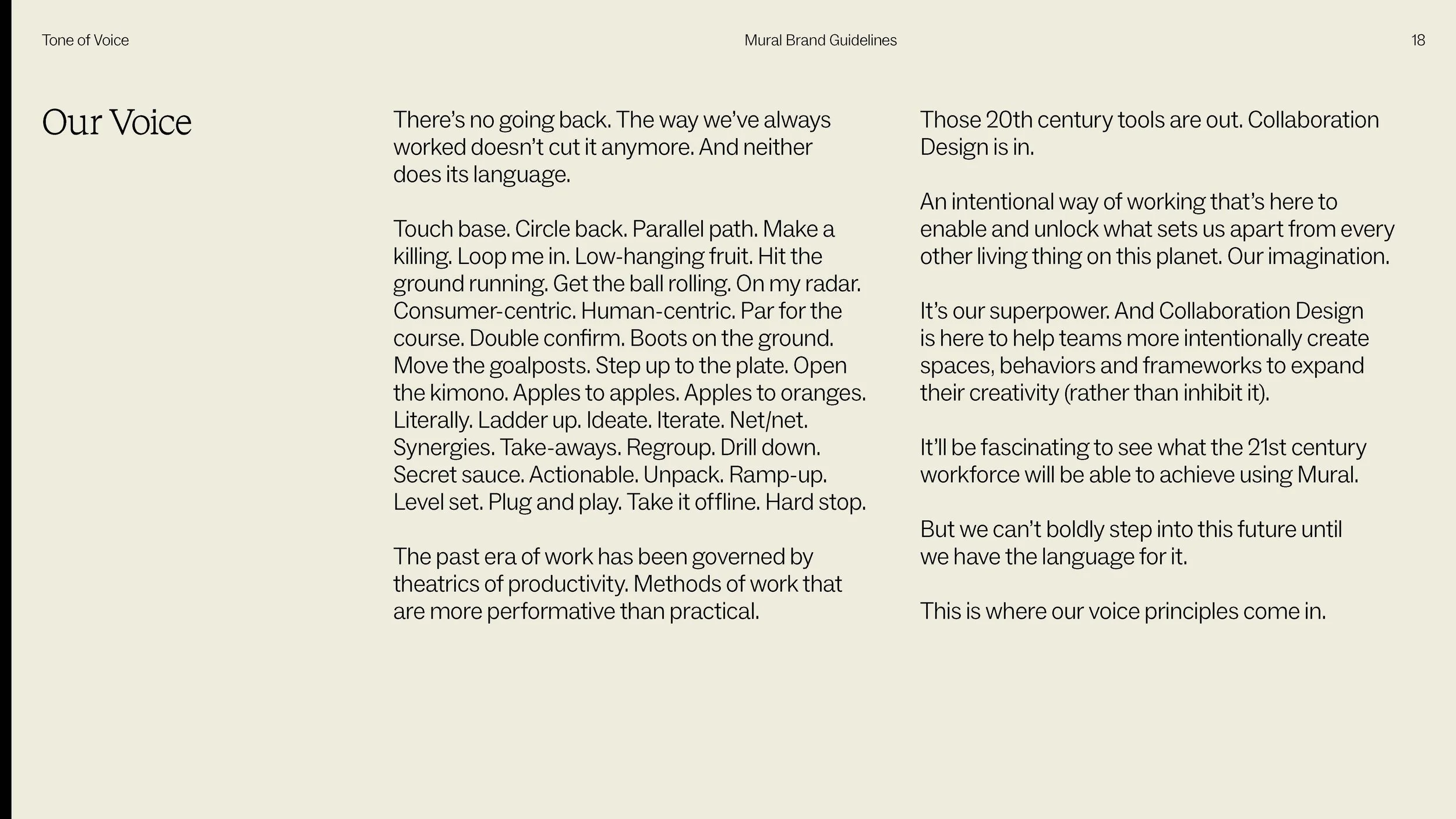
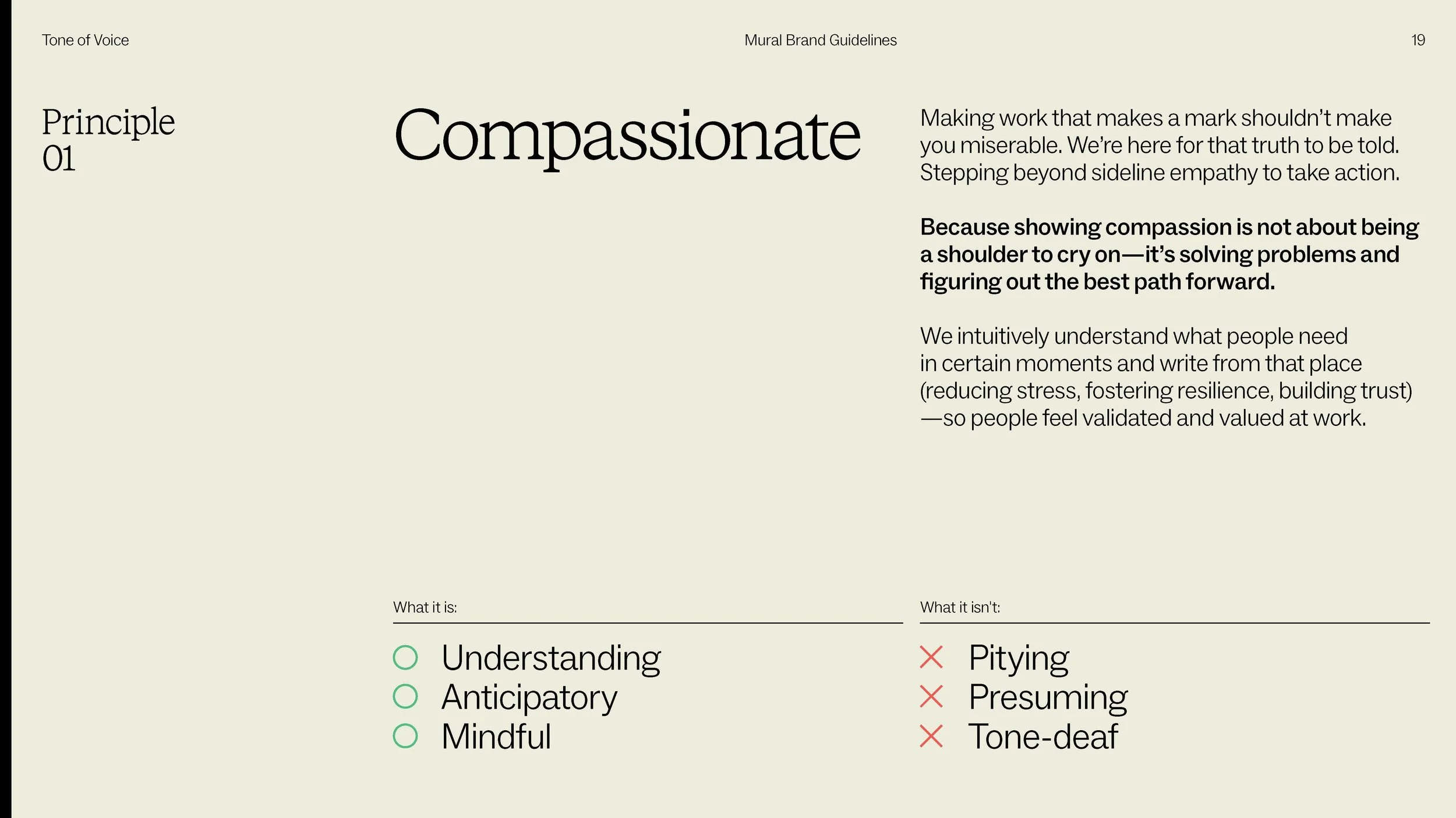
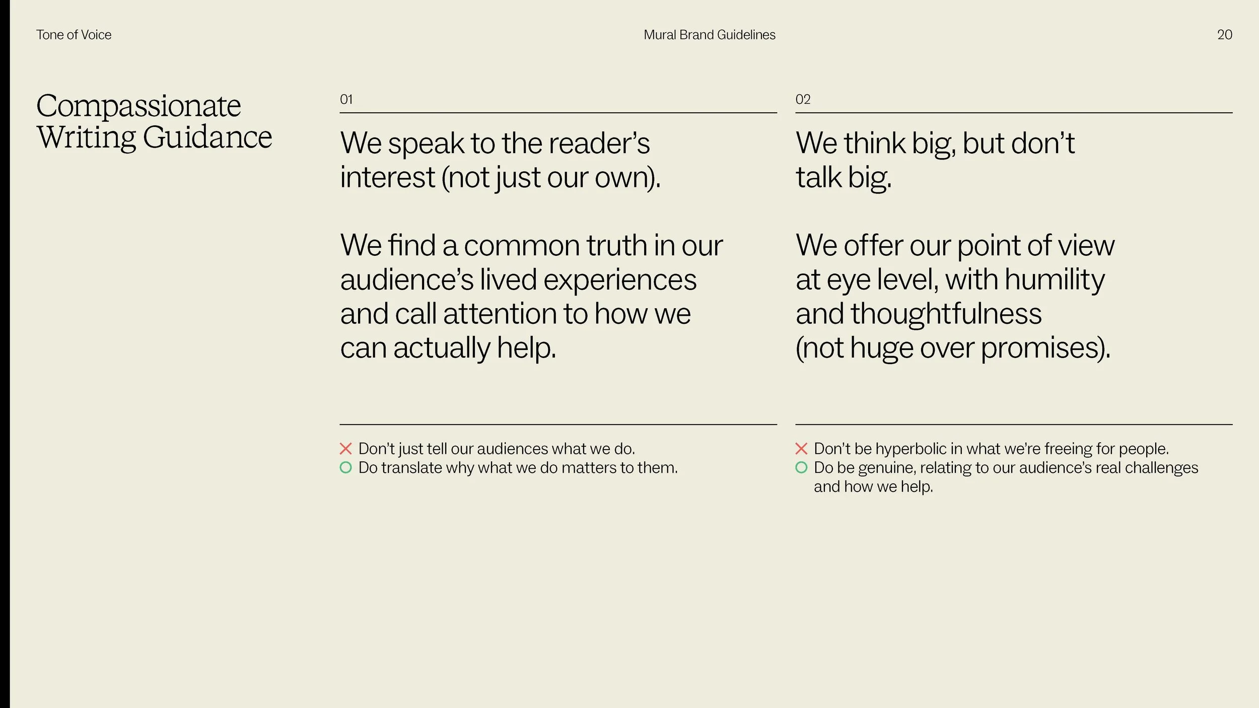
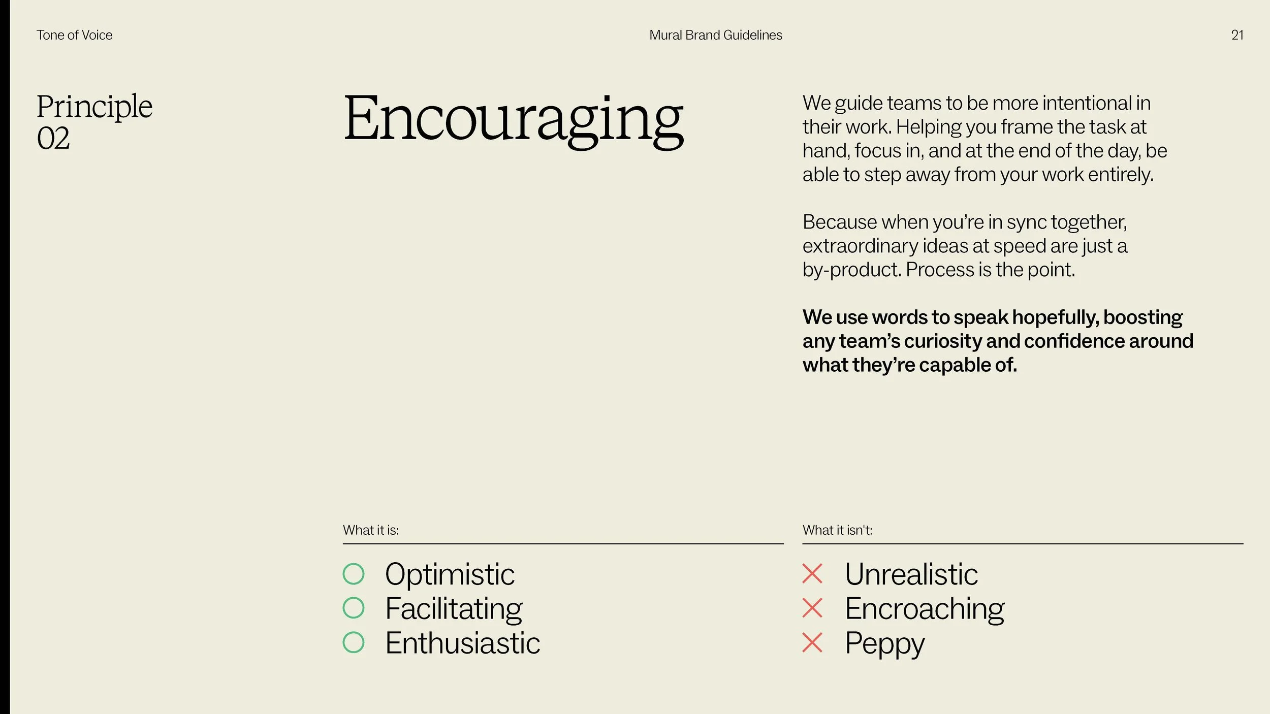
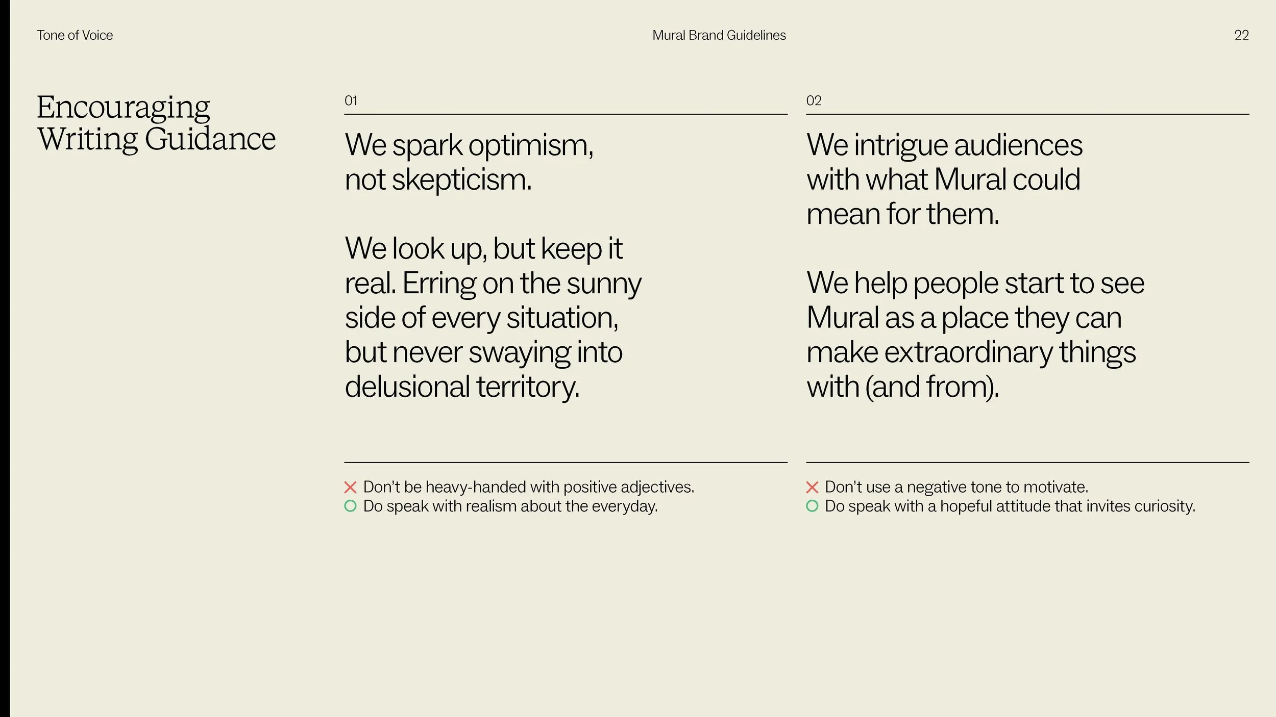
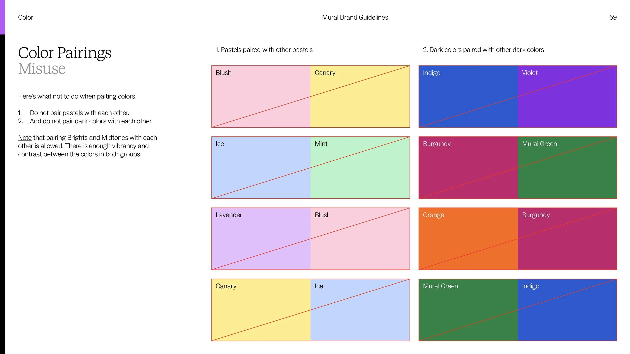
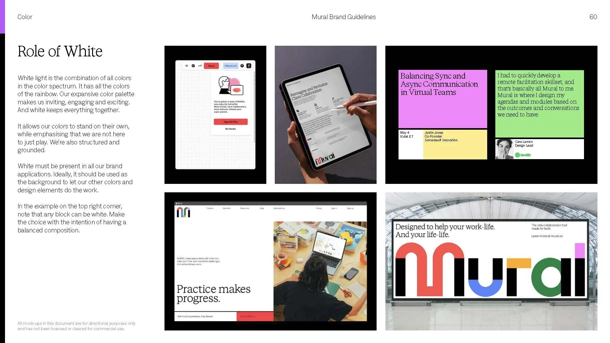
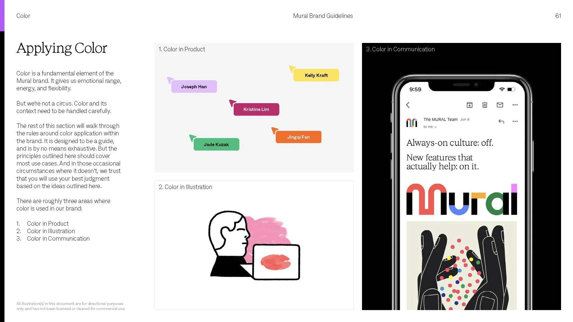
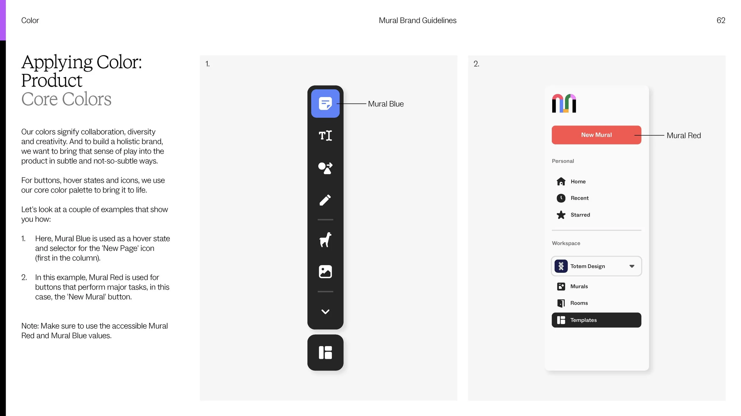
The Guidelines
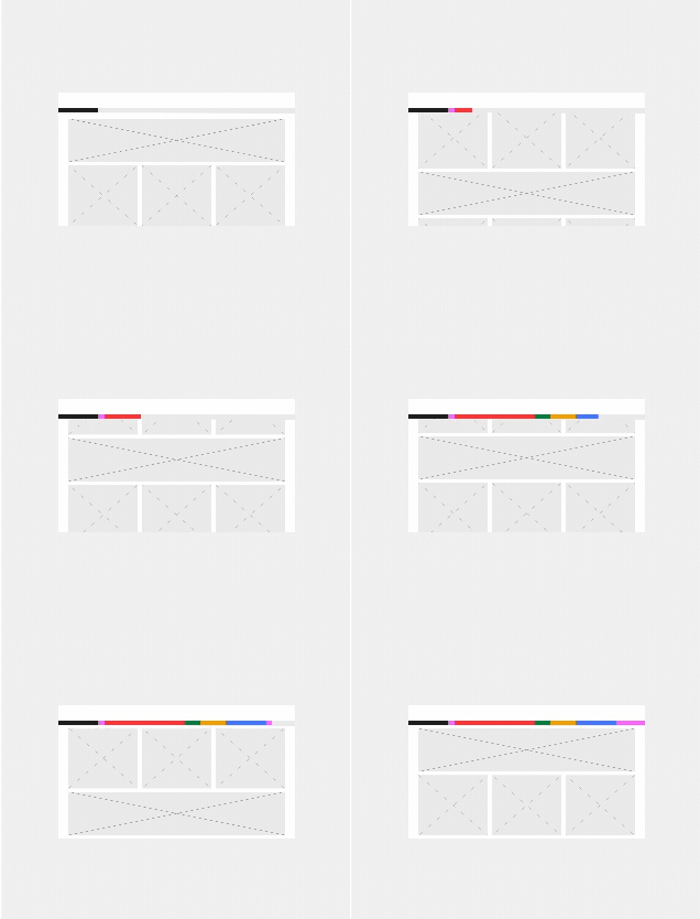
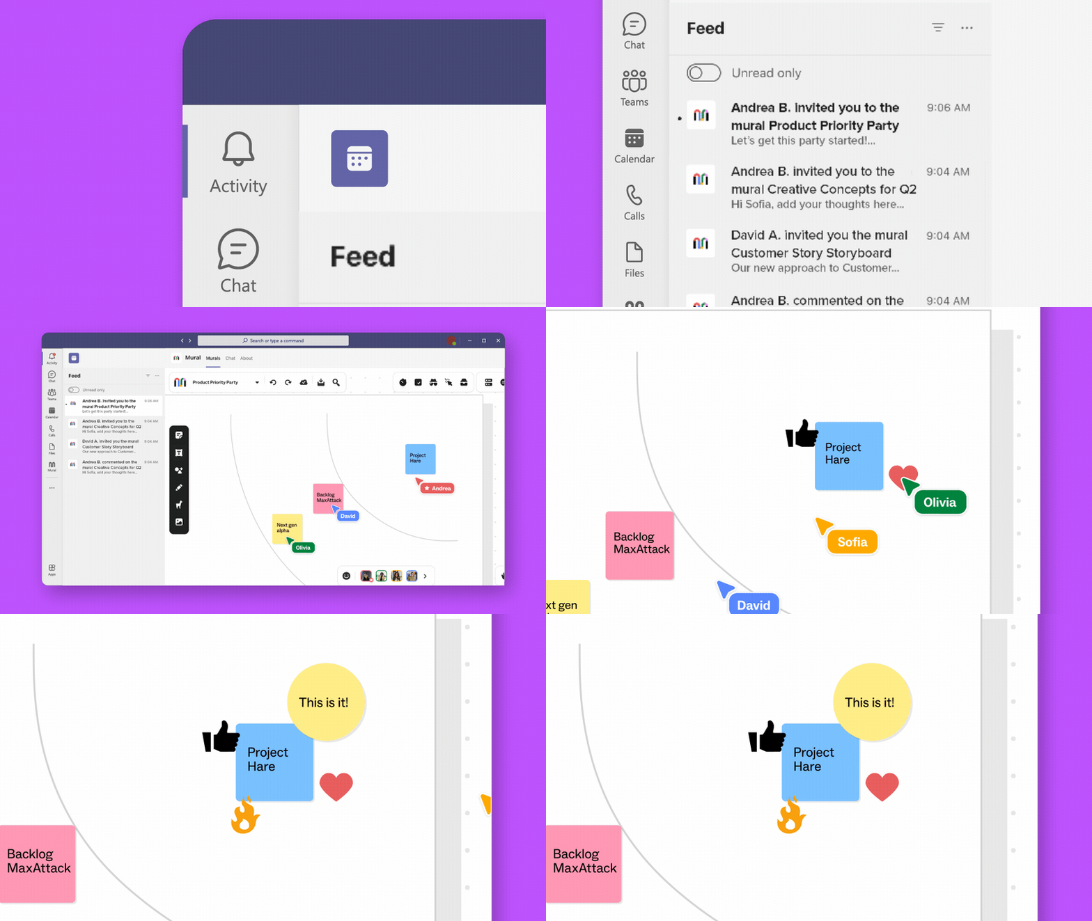
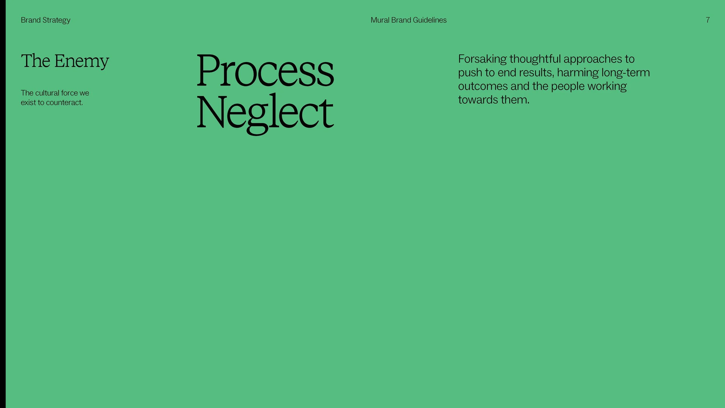
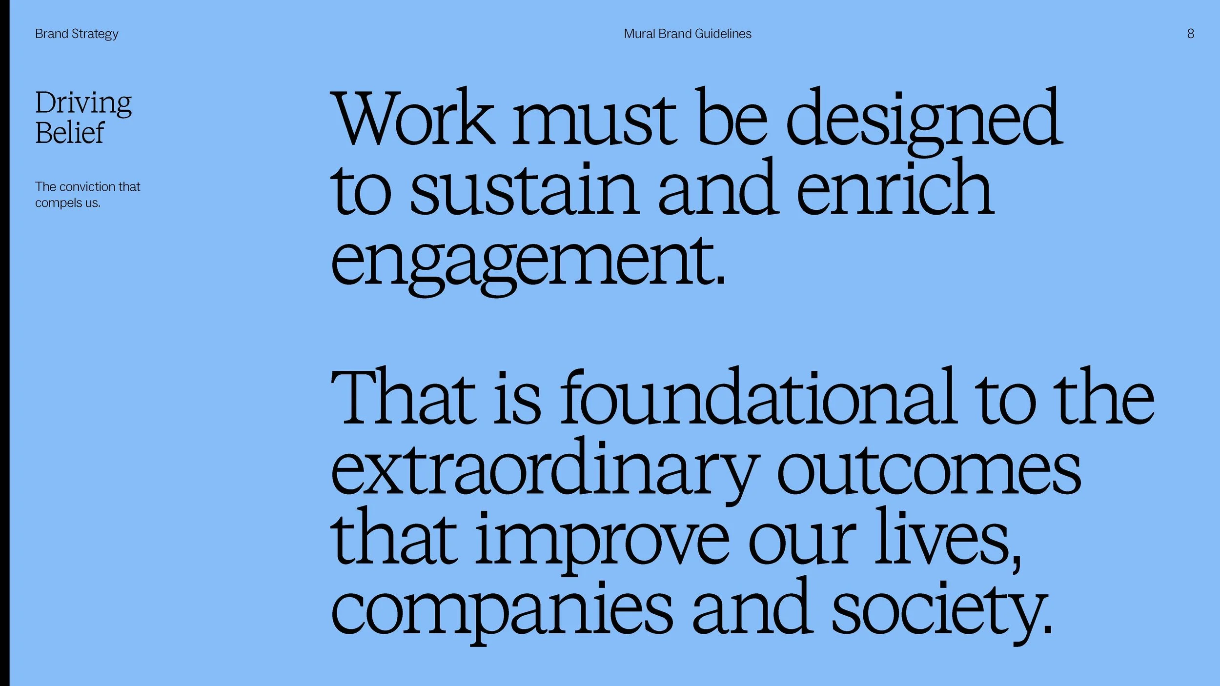
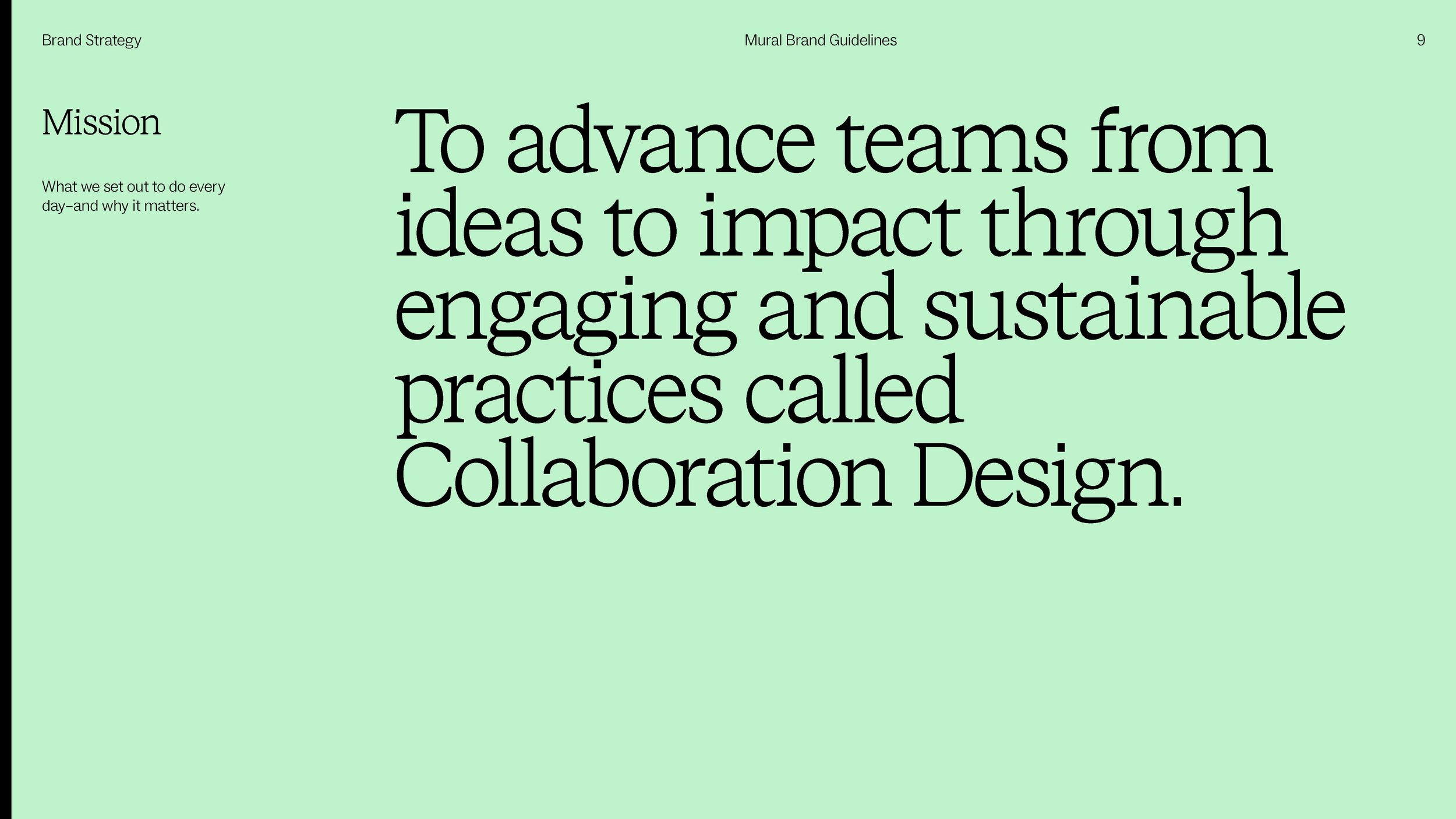
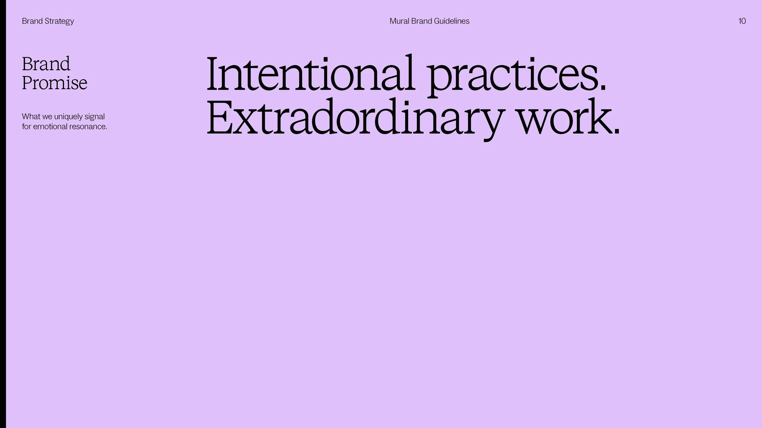
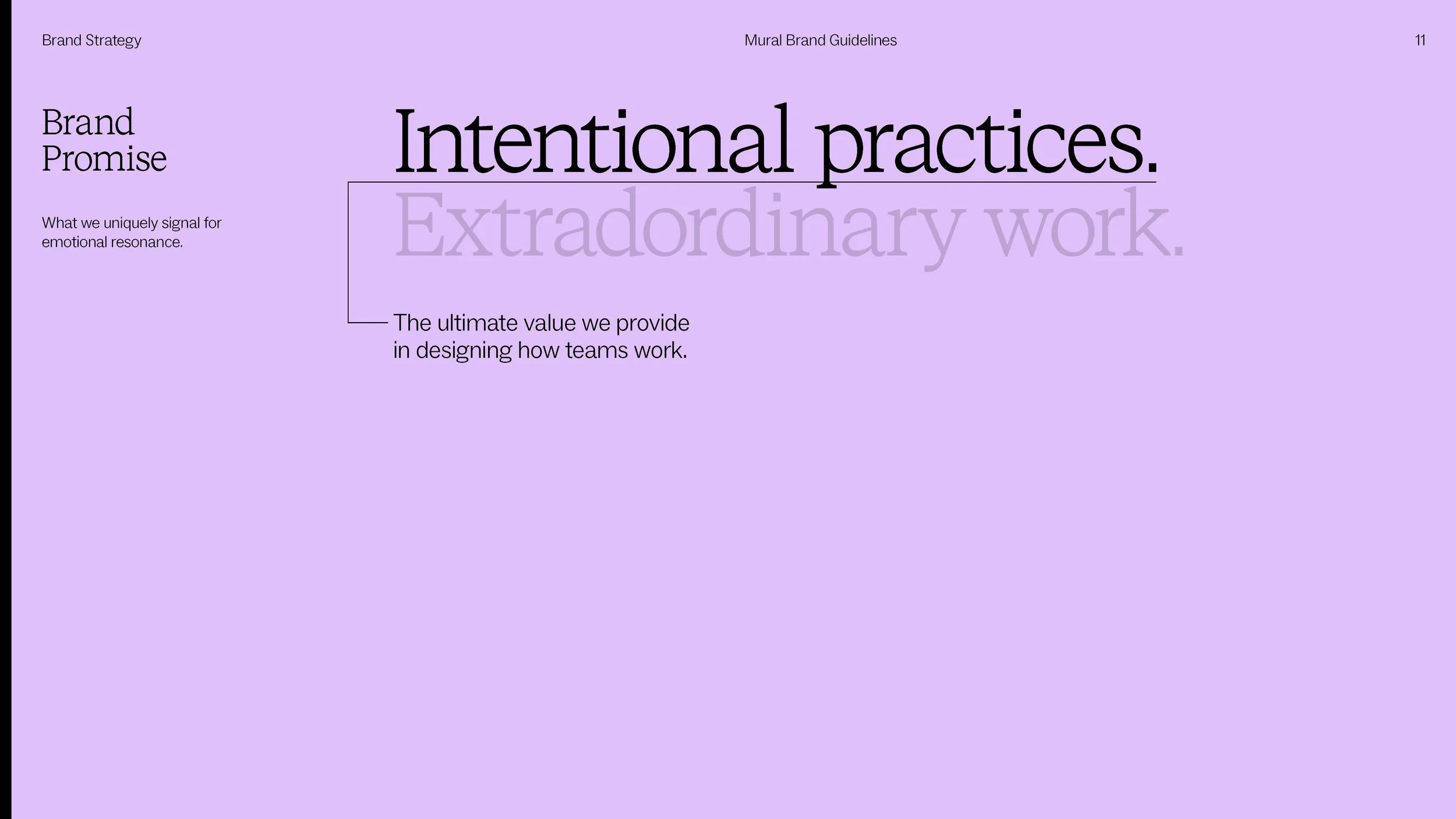
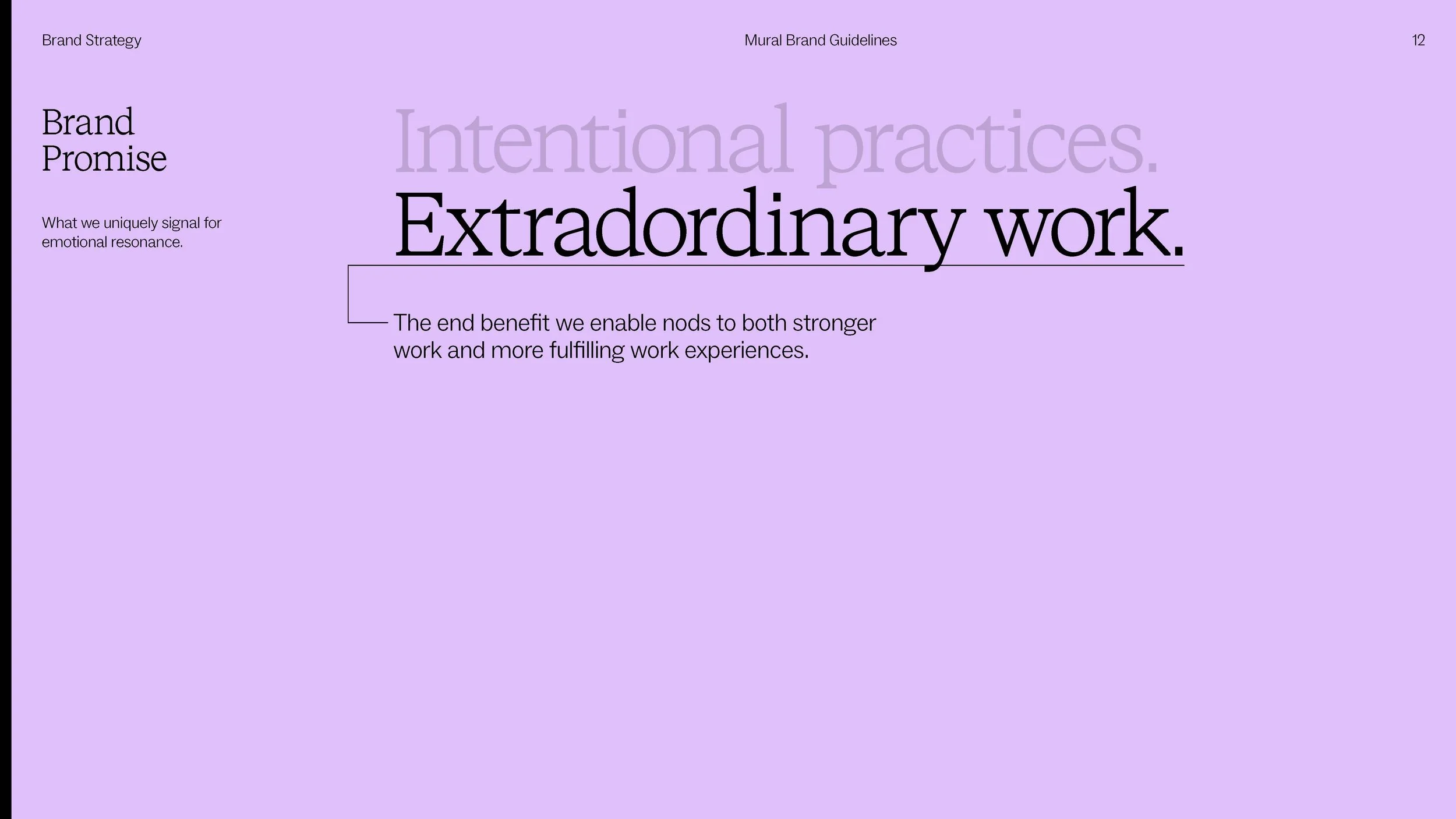
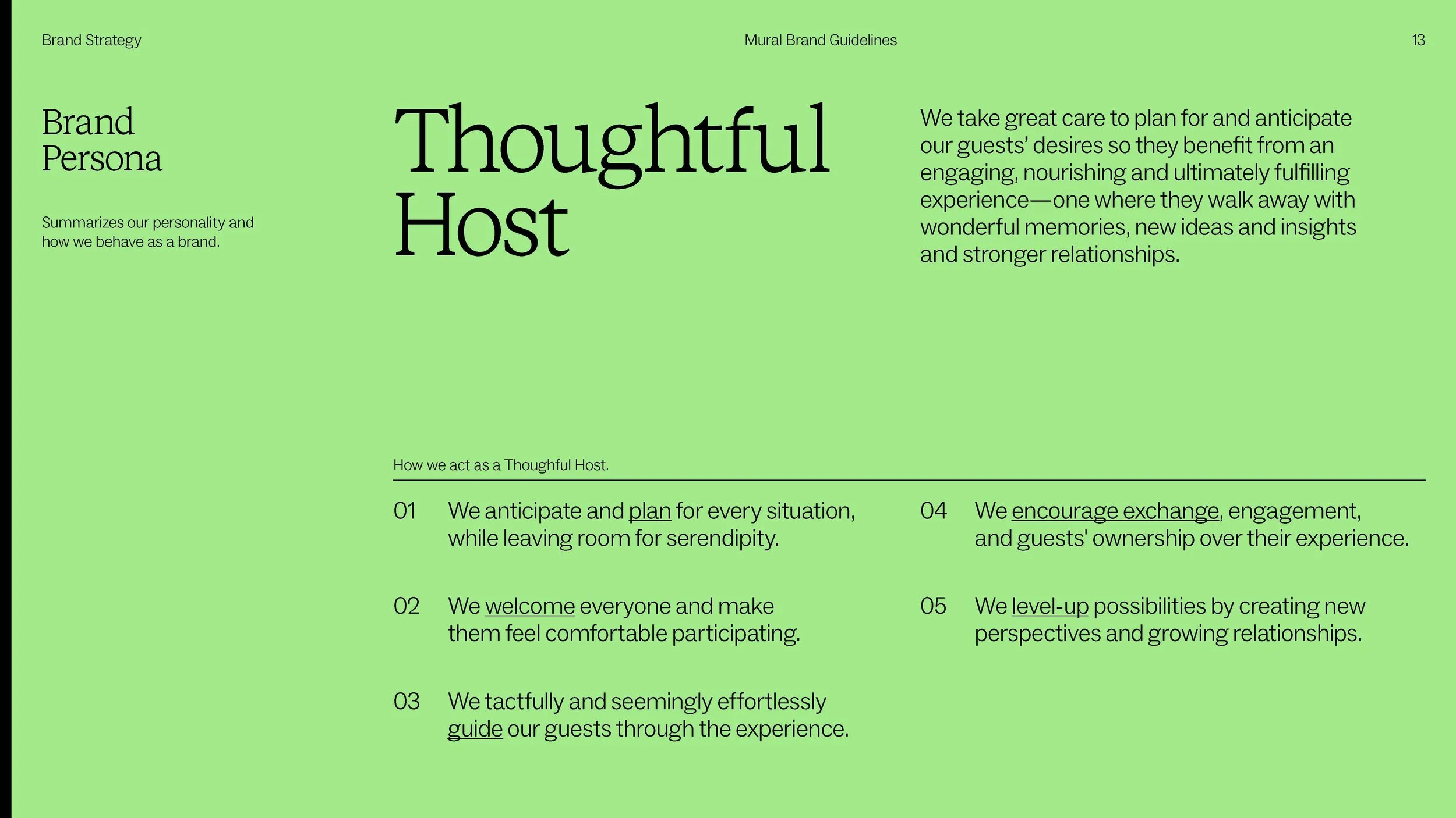
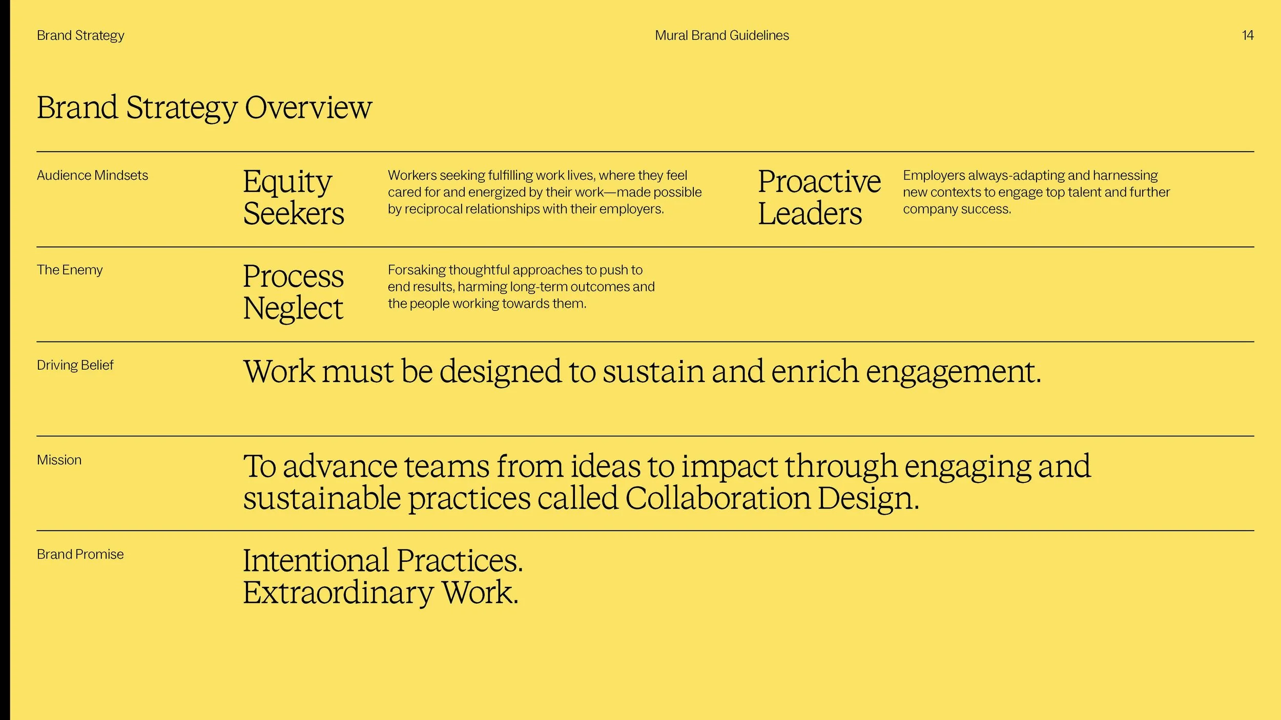
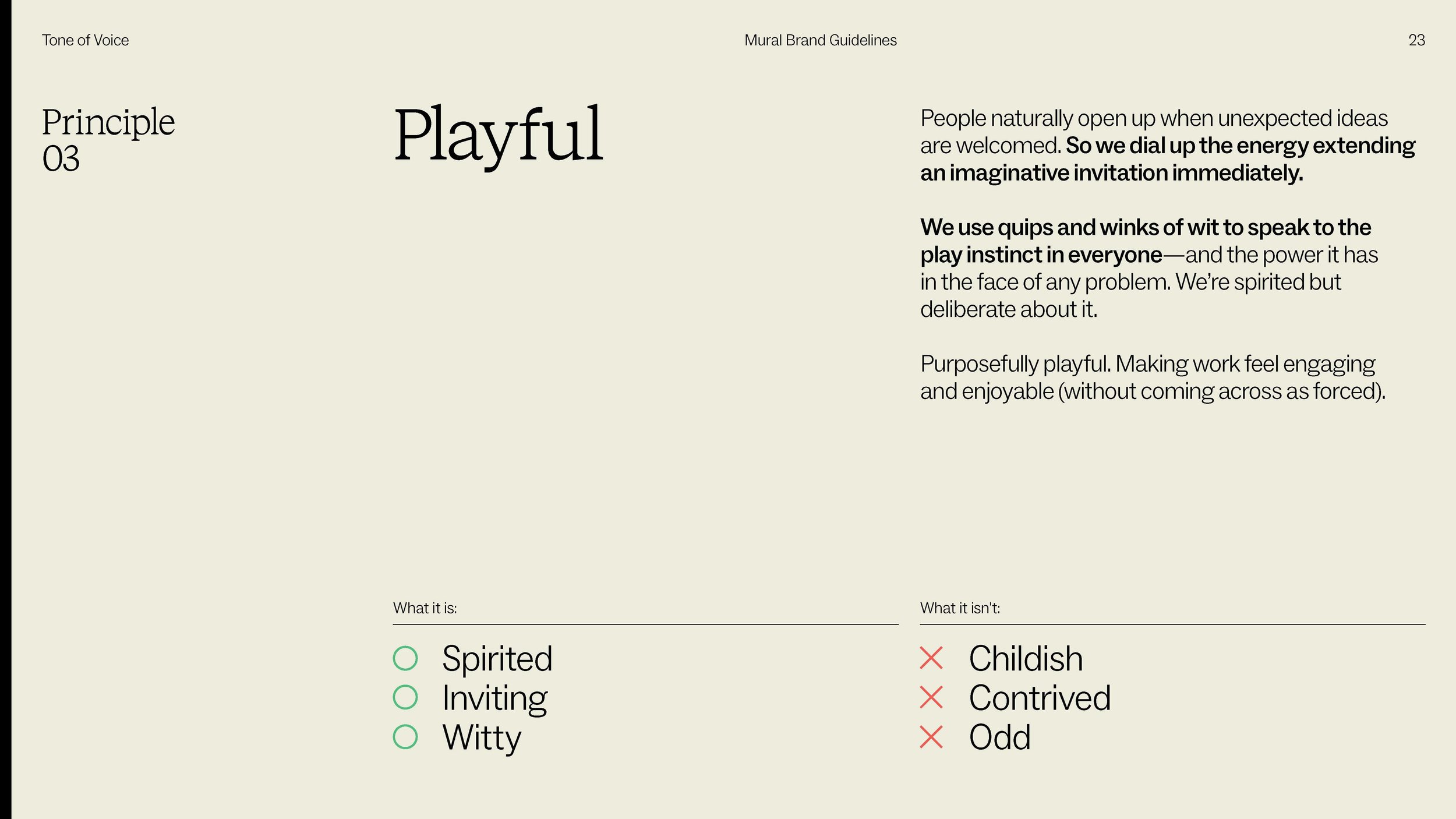
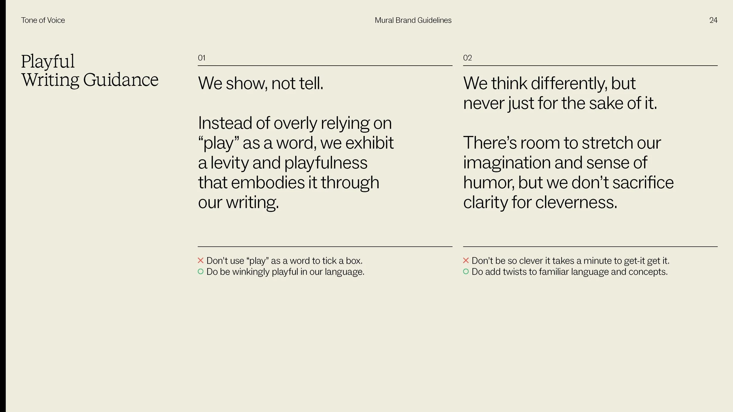
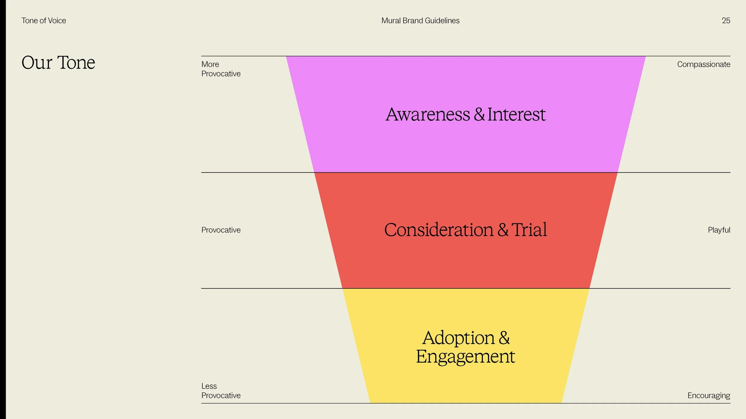
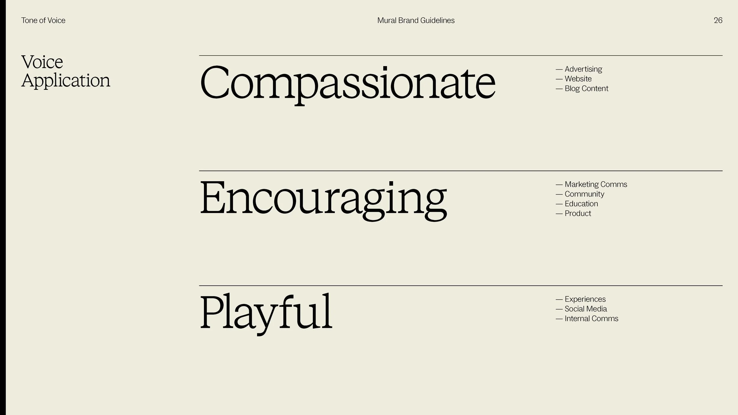
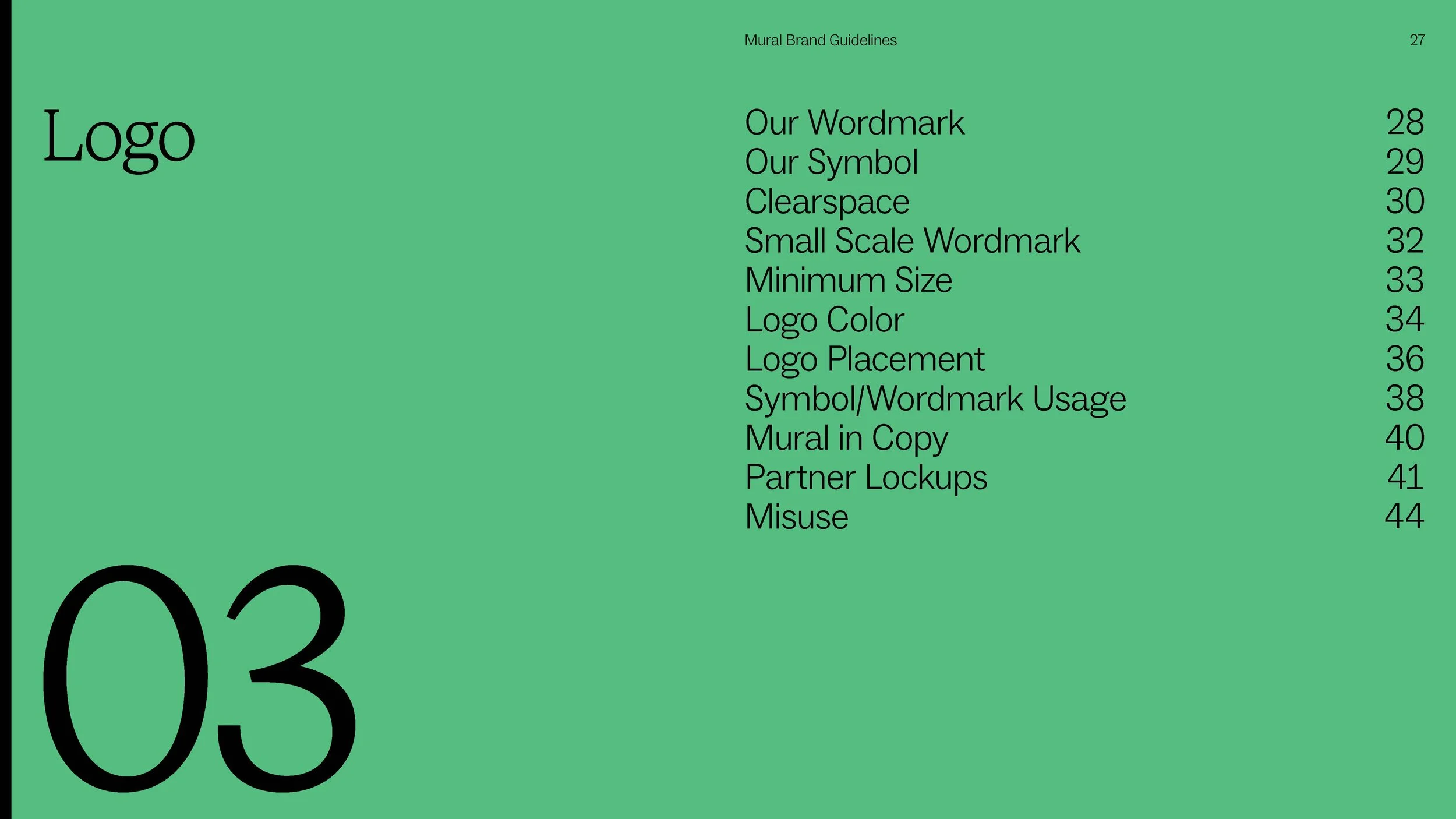
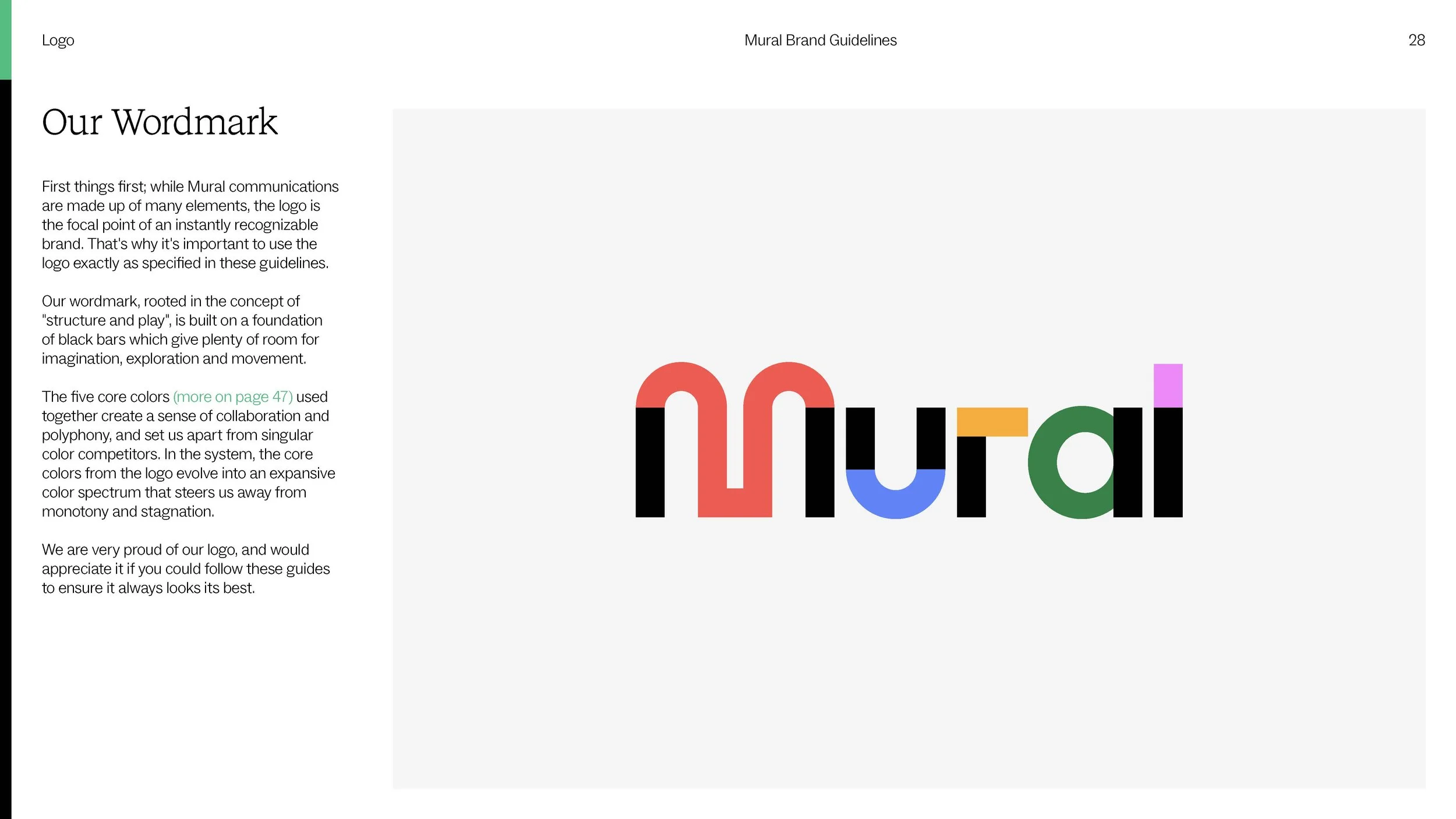
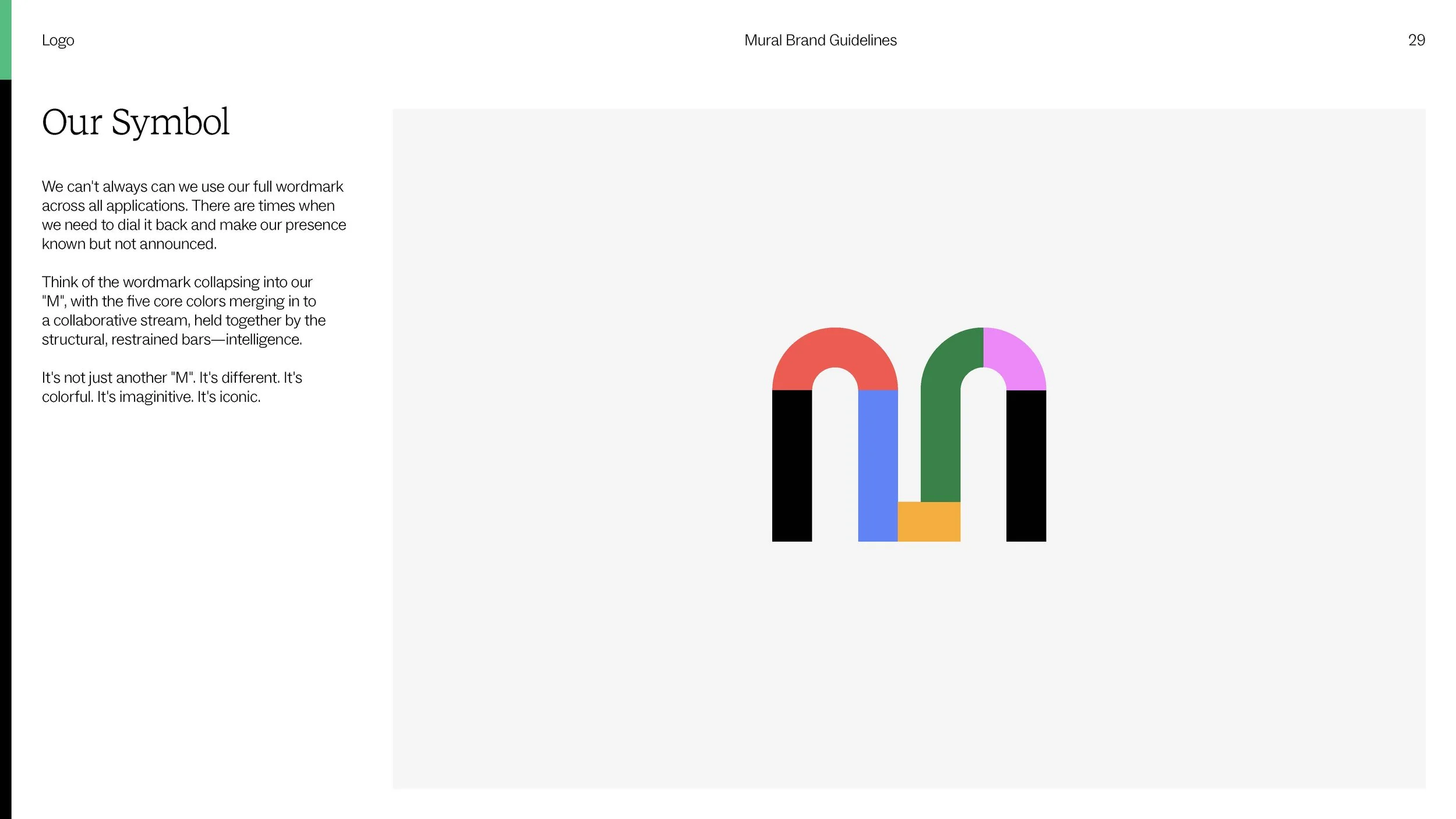
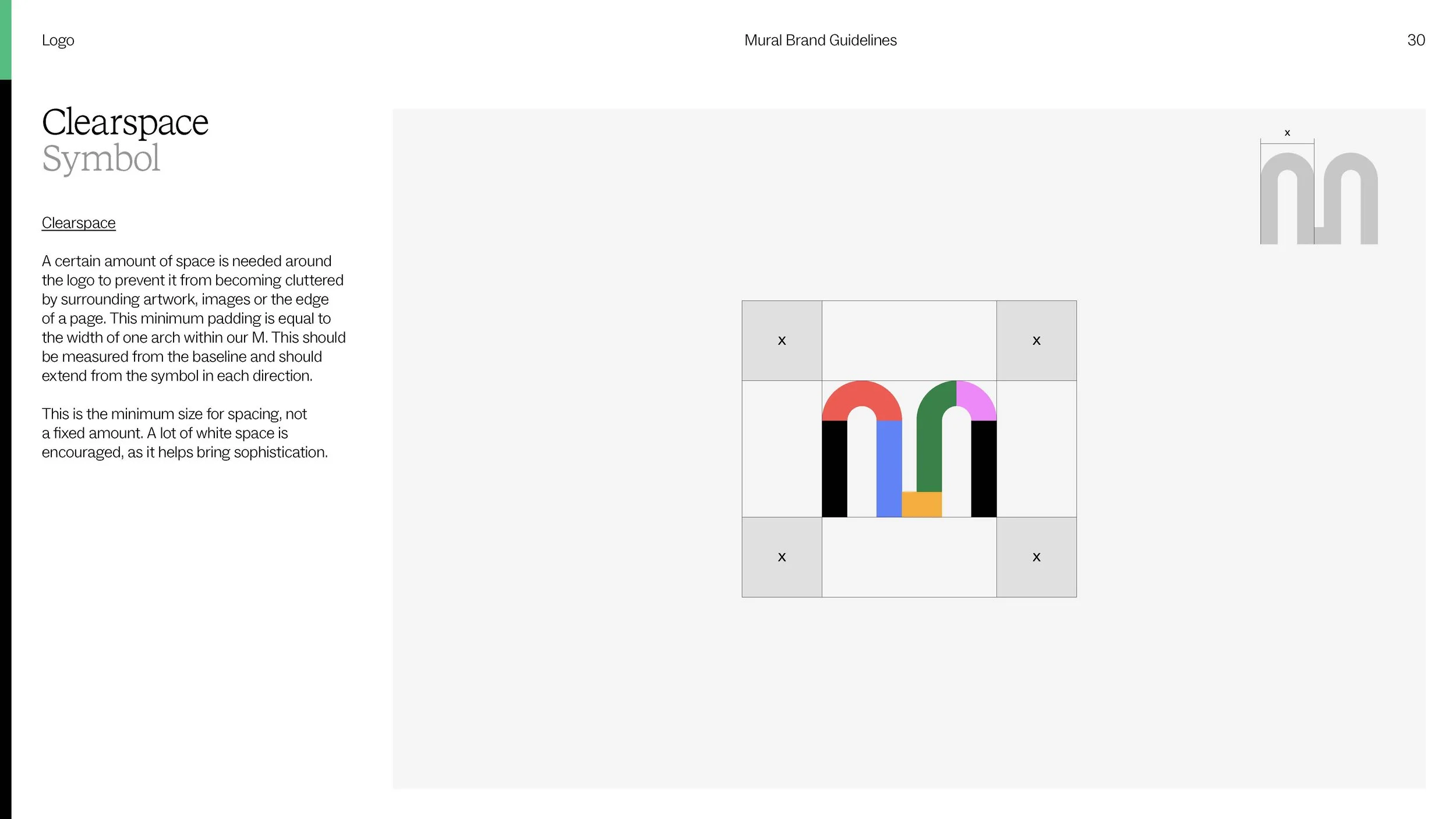
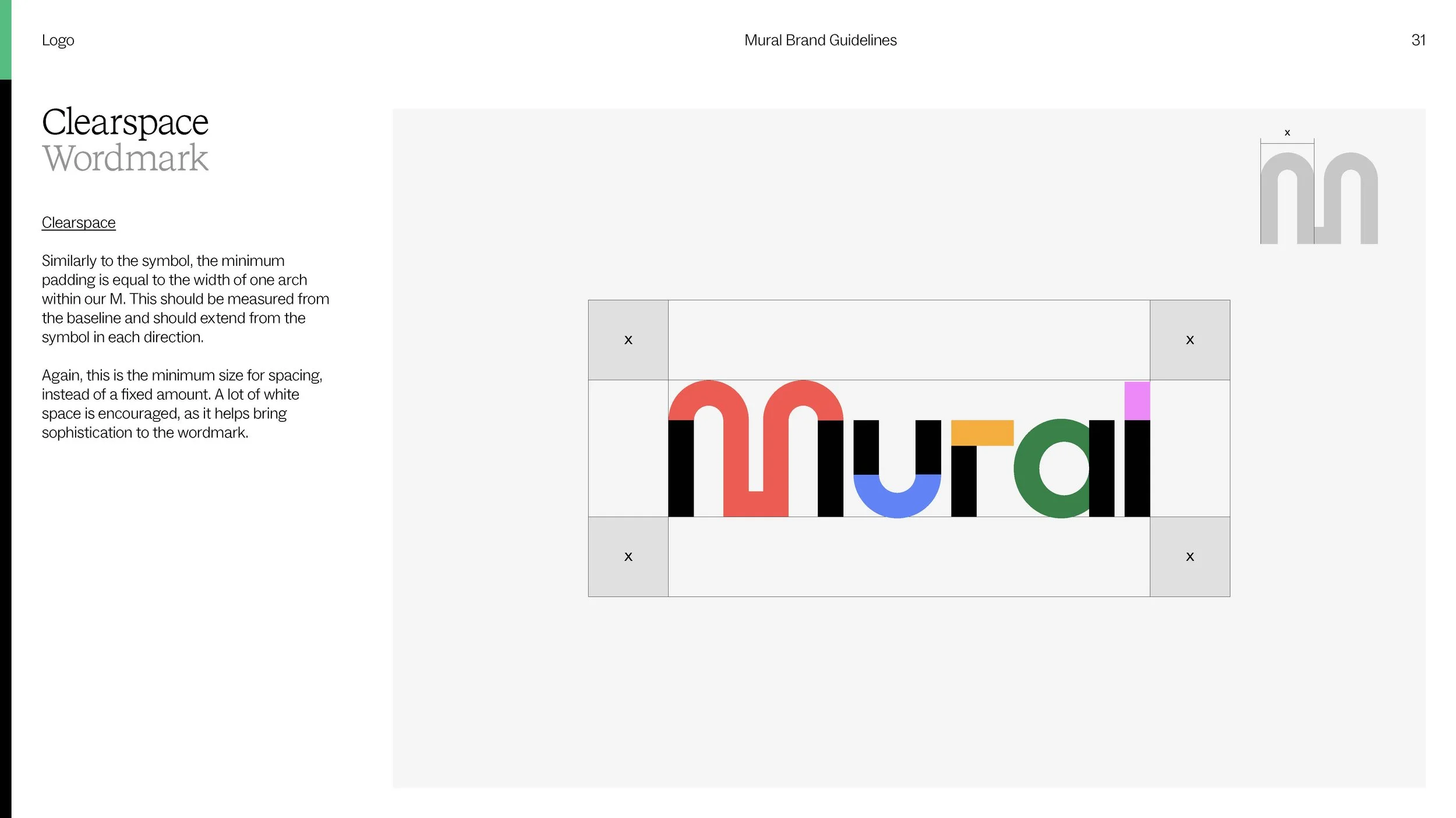
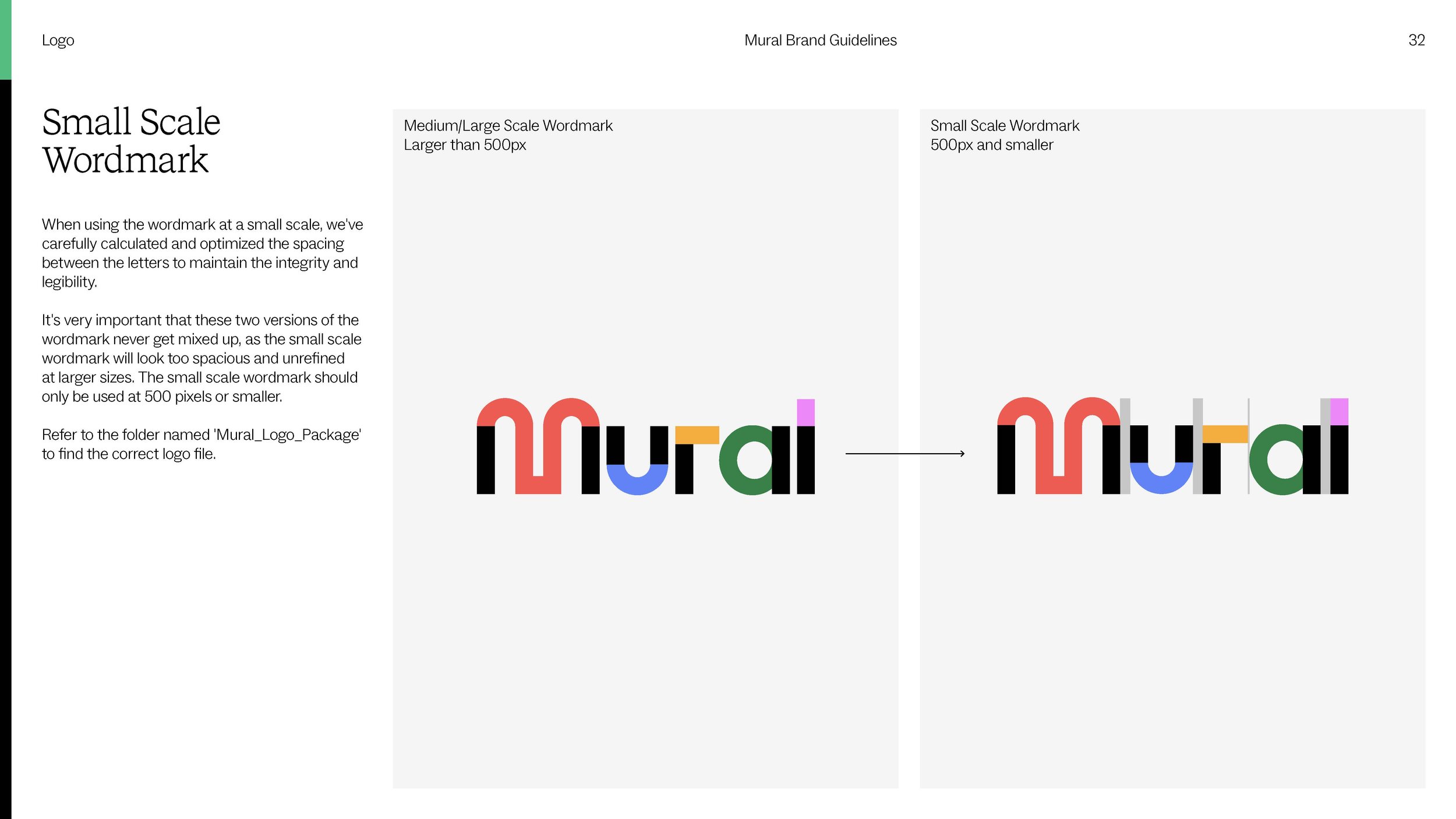
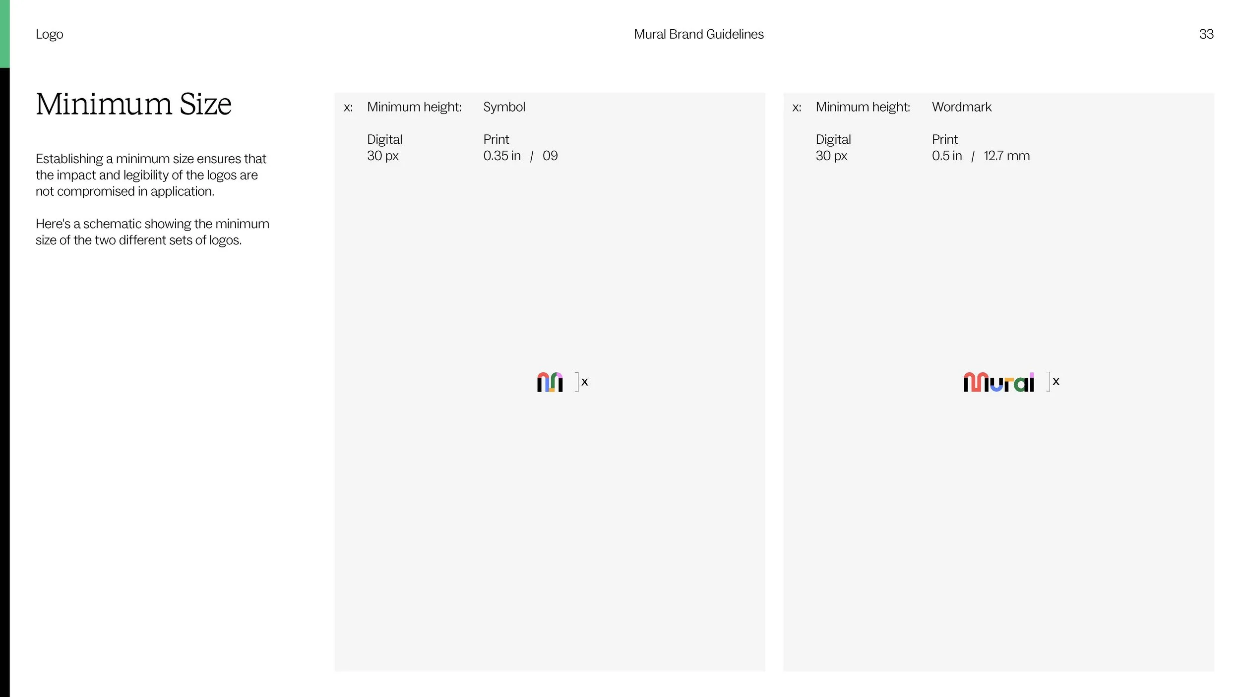
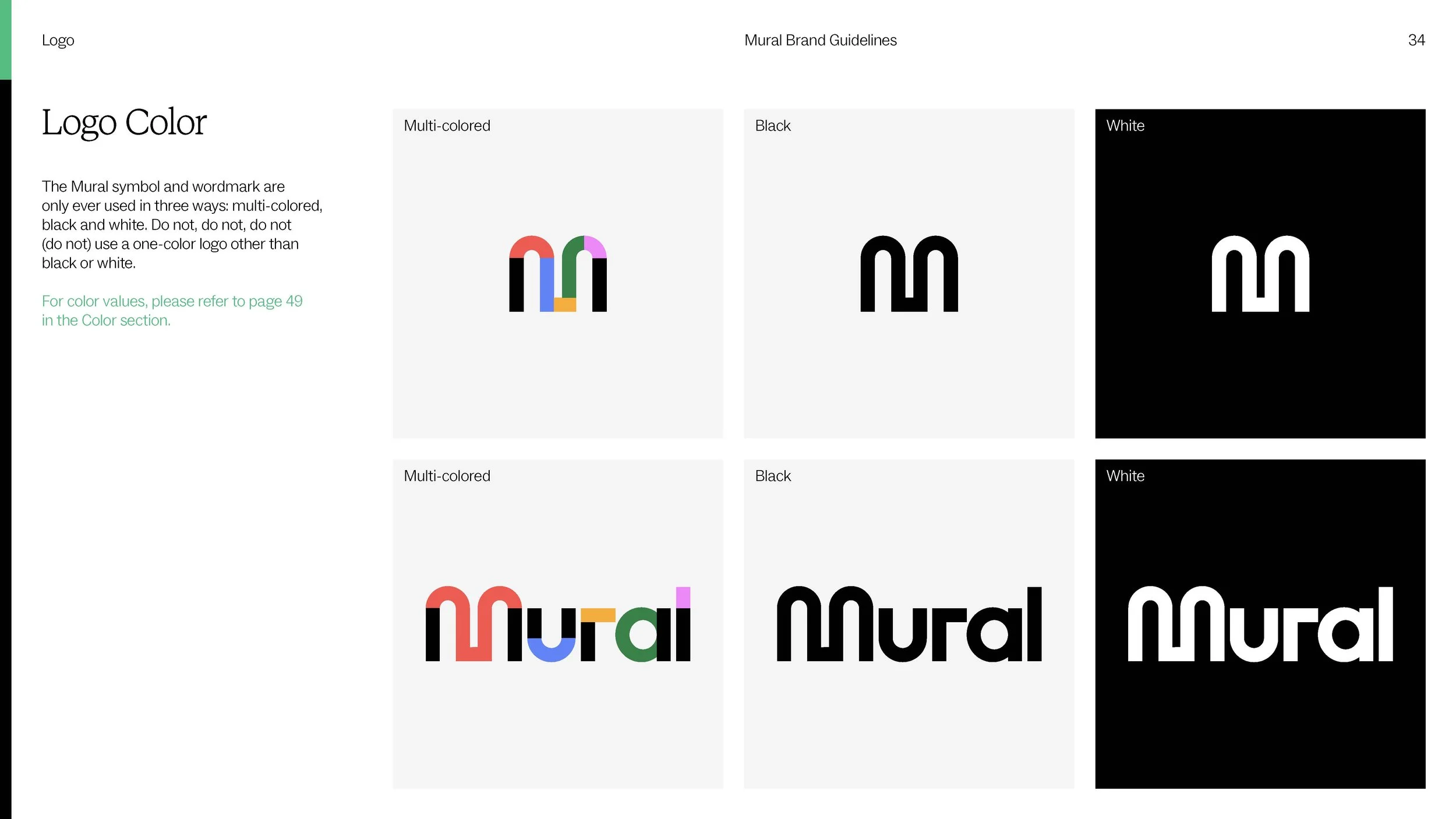
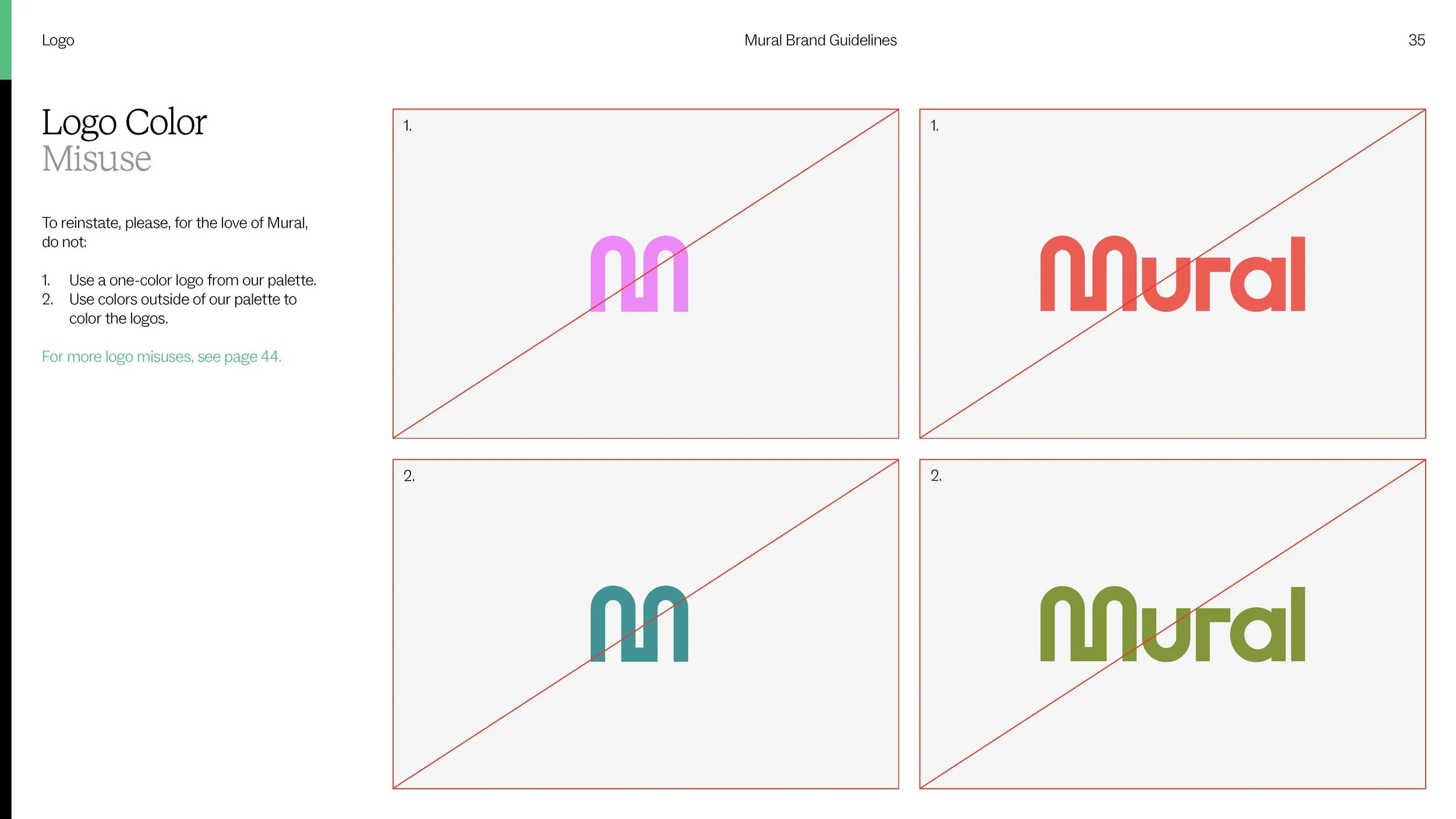
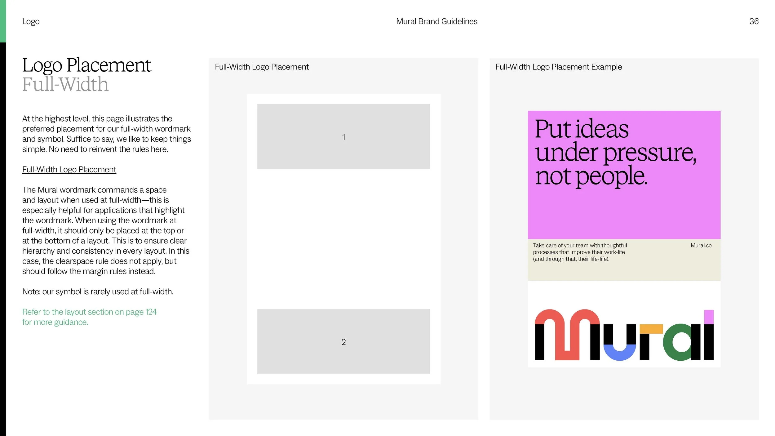
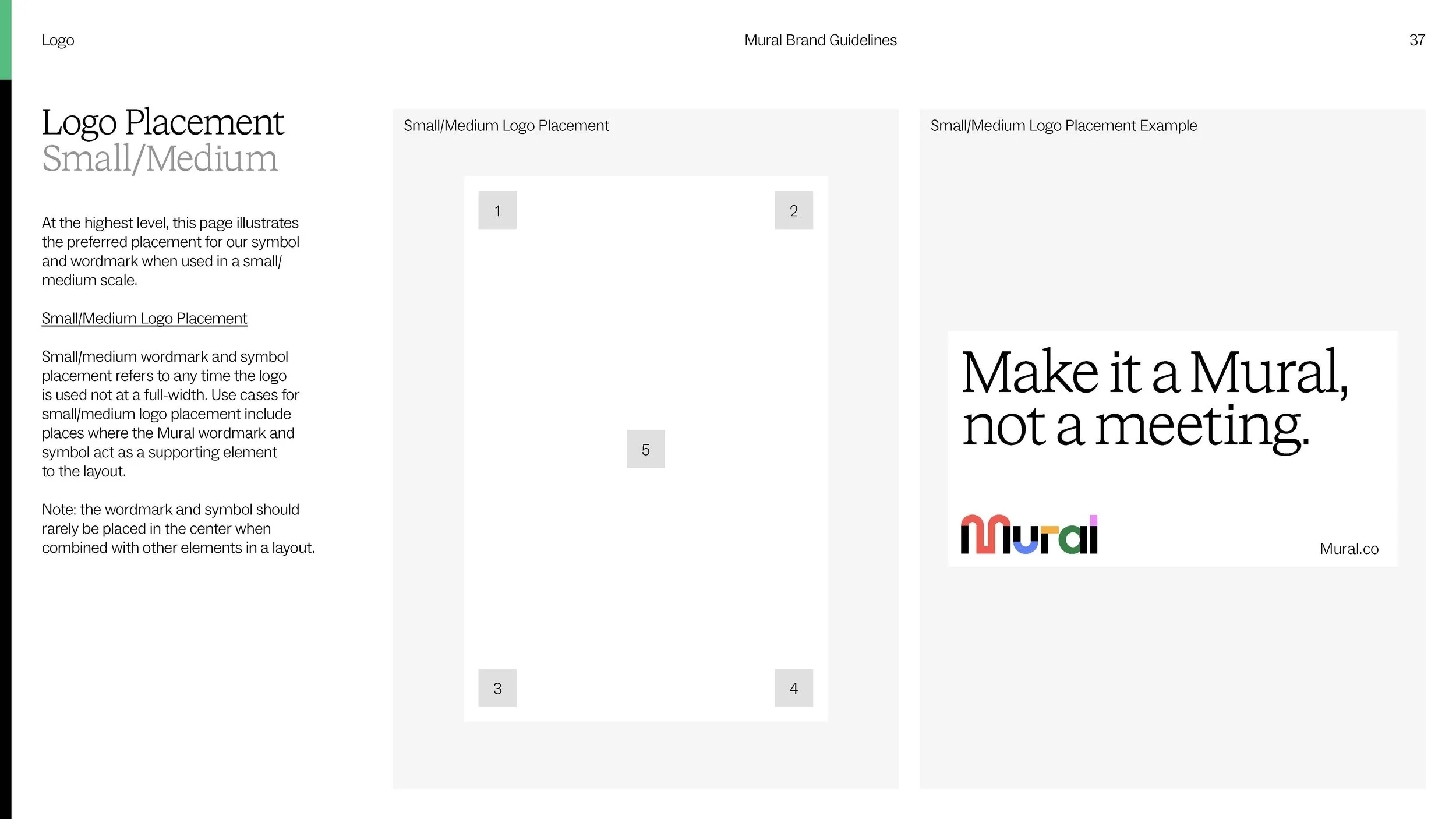
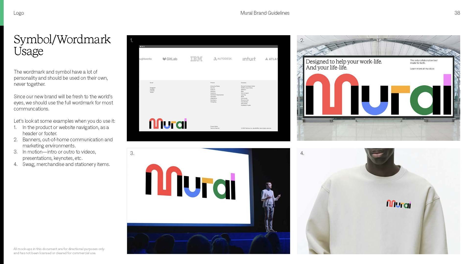
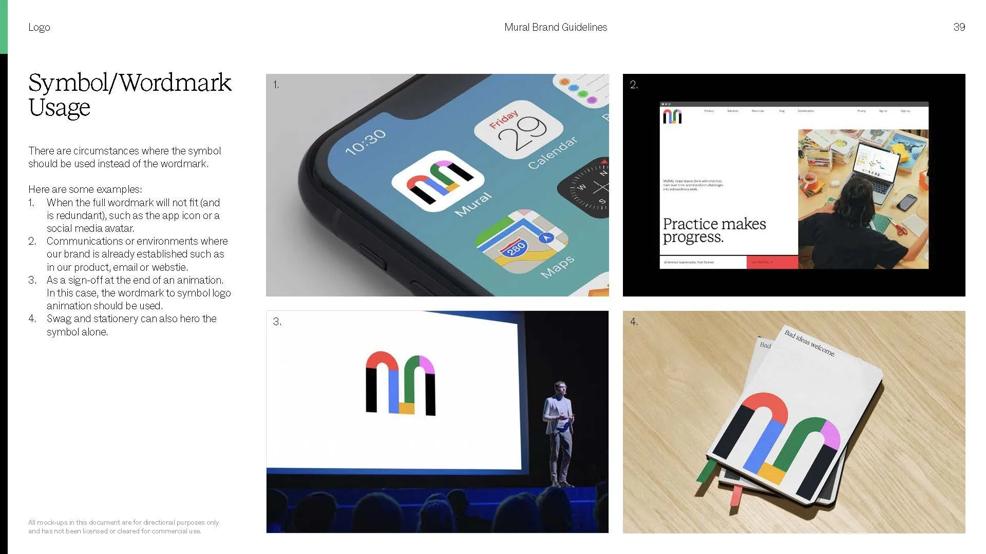
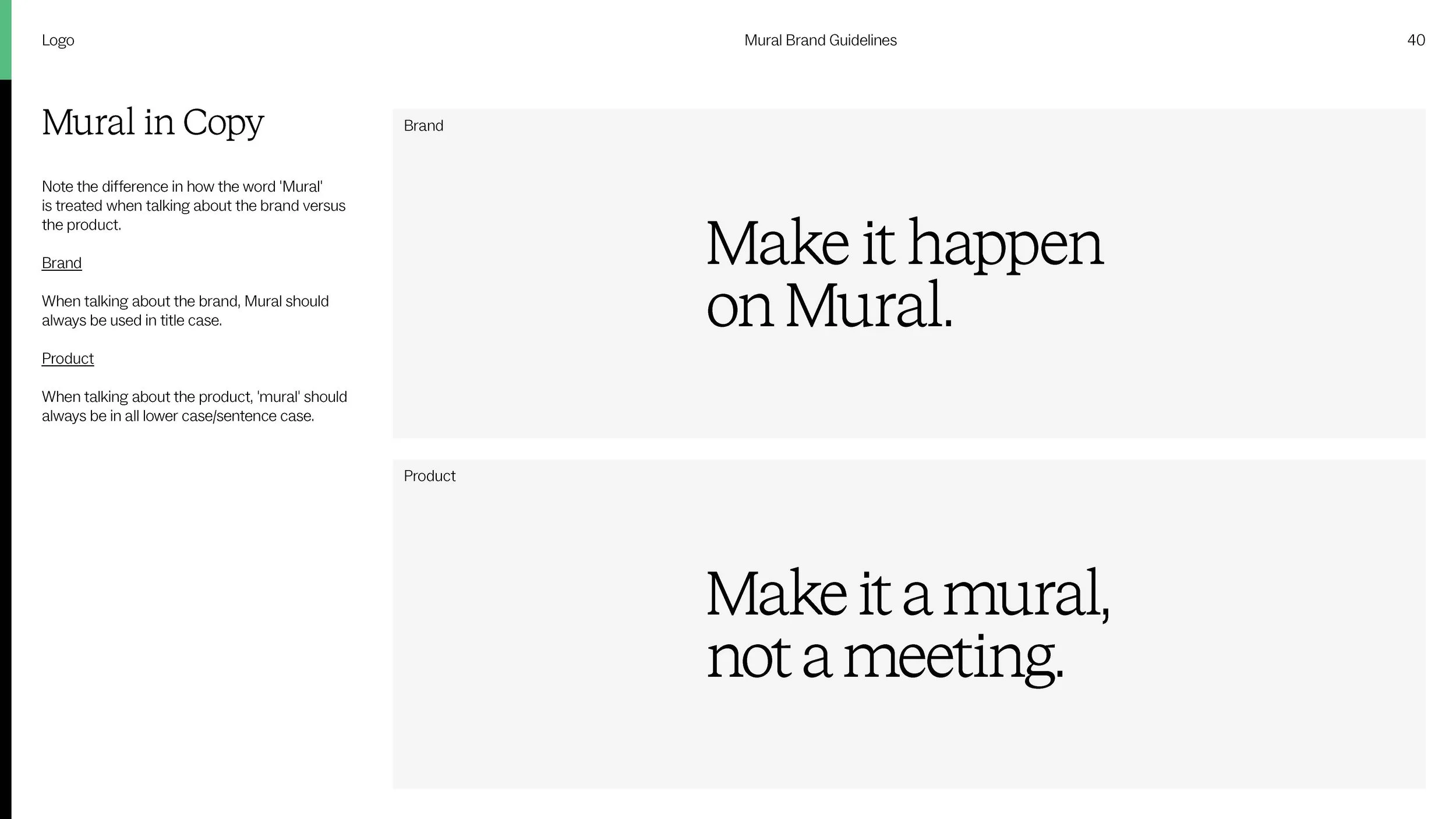
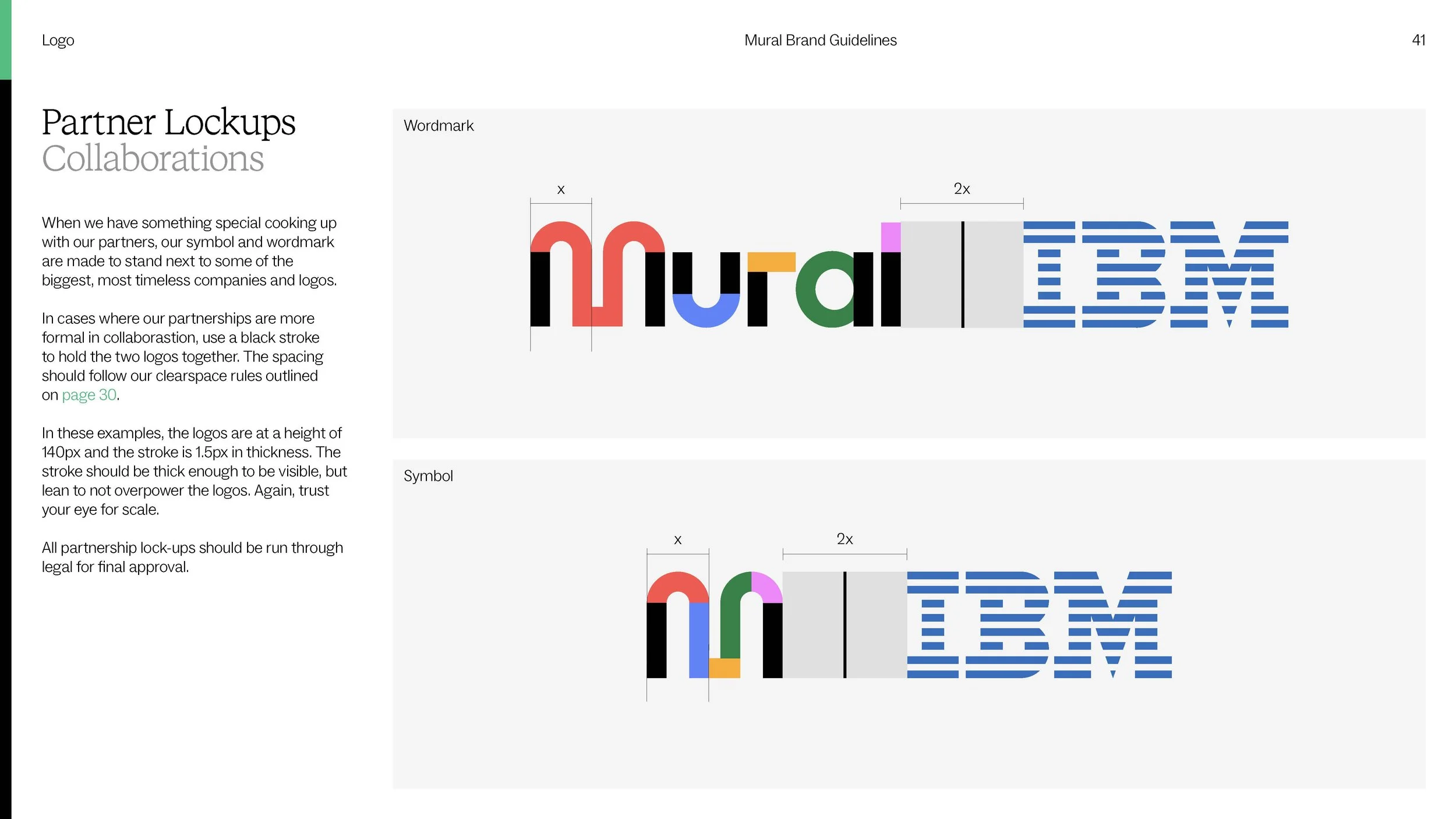
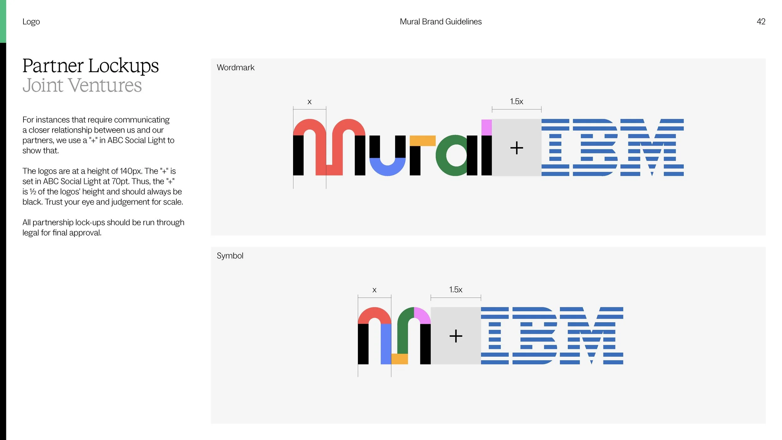
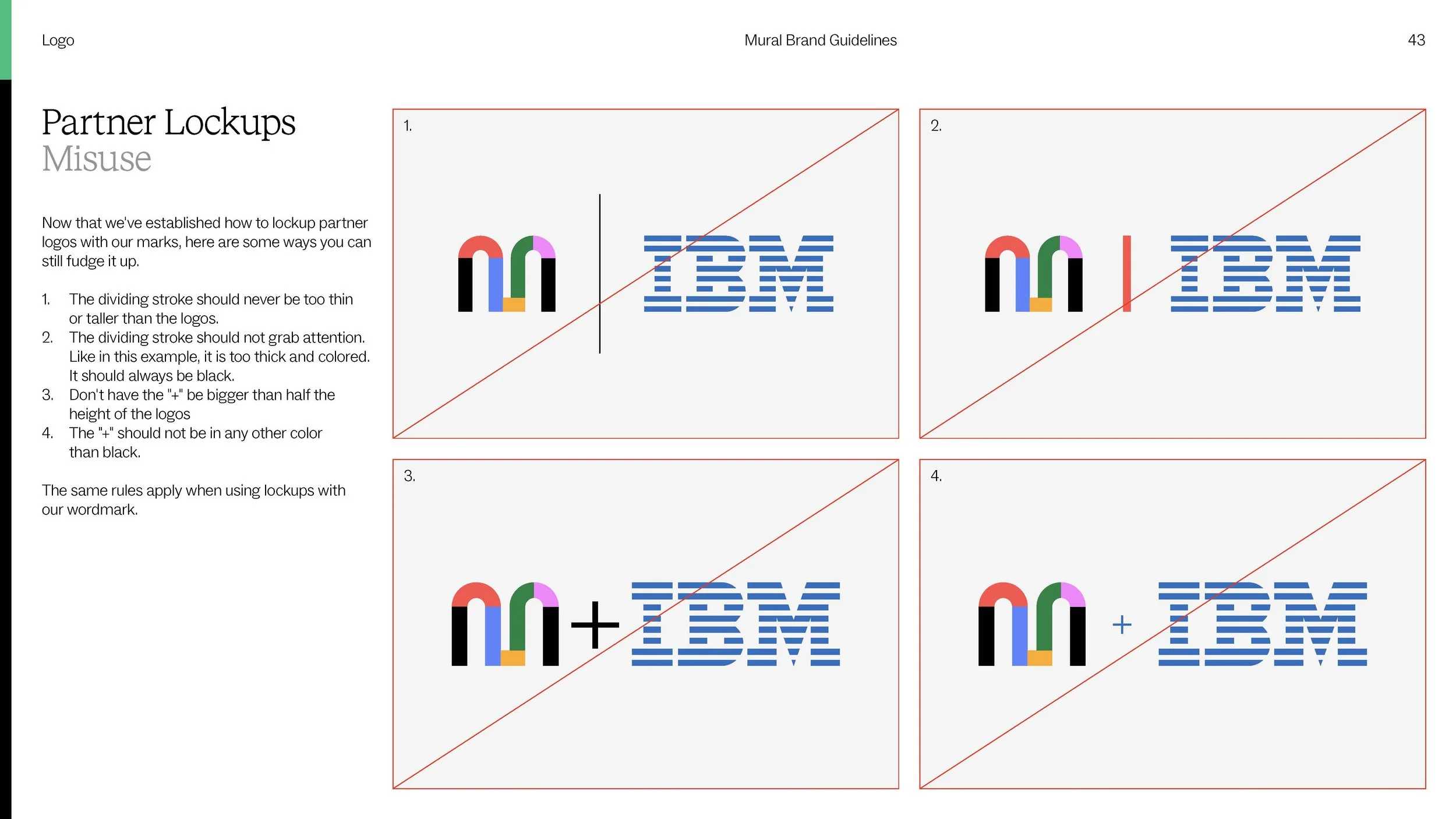
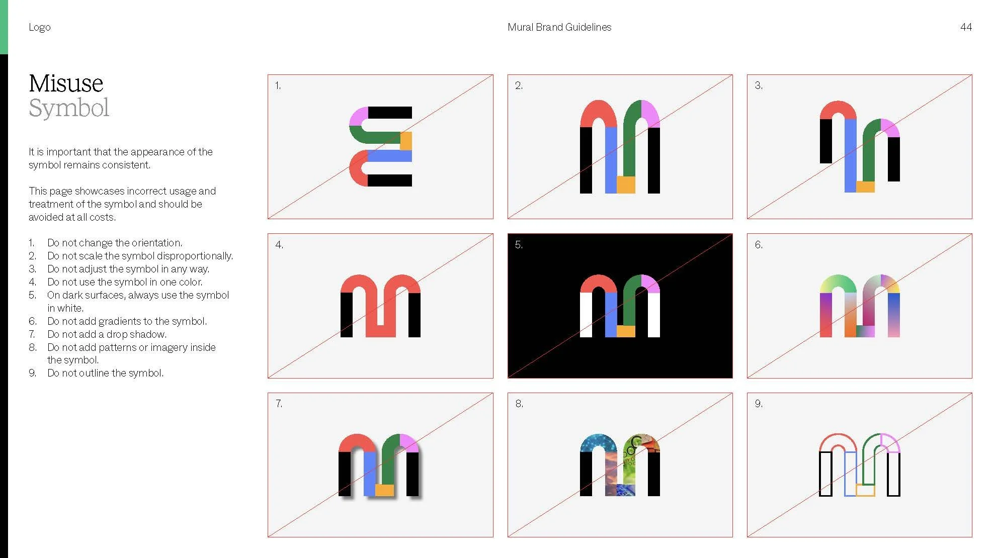
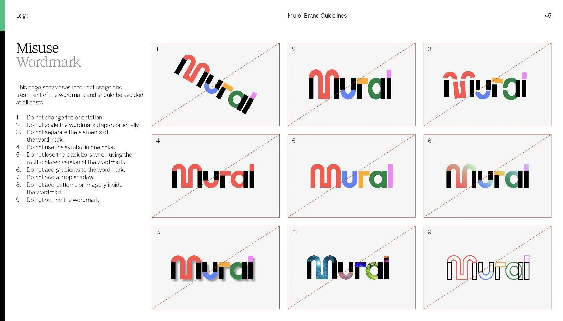
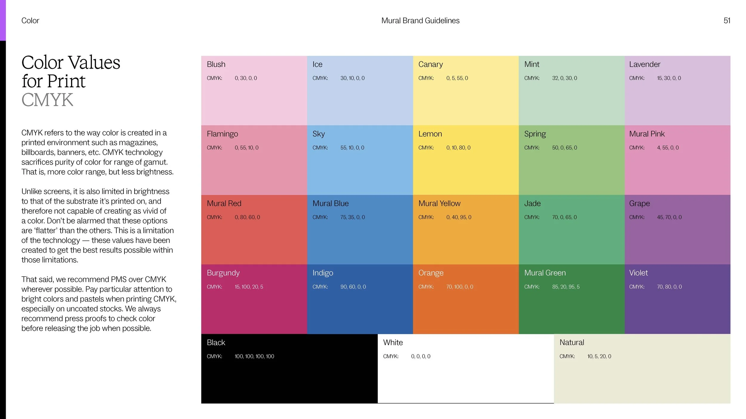
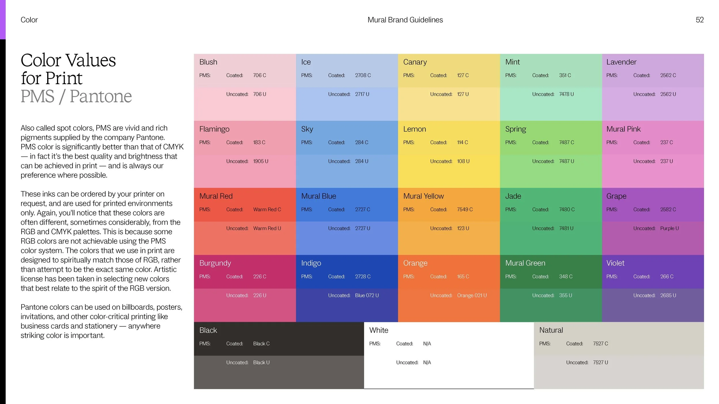
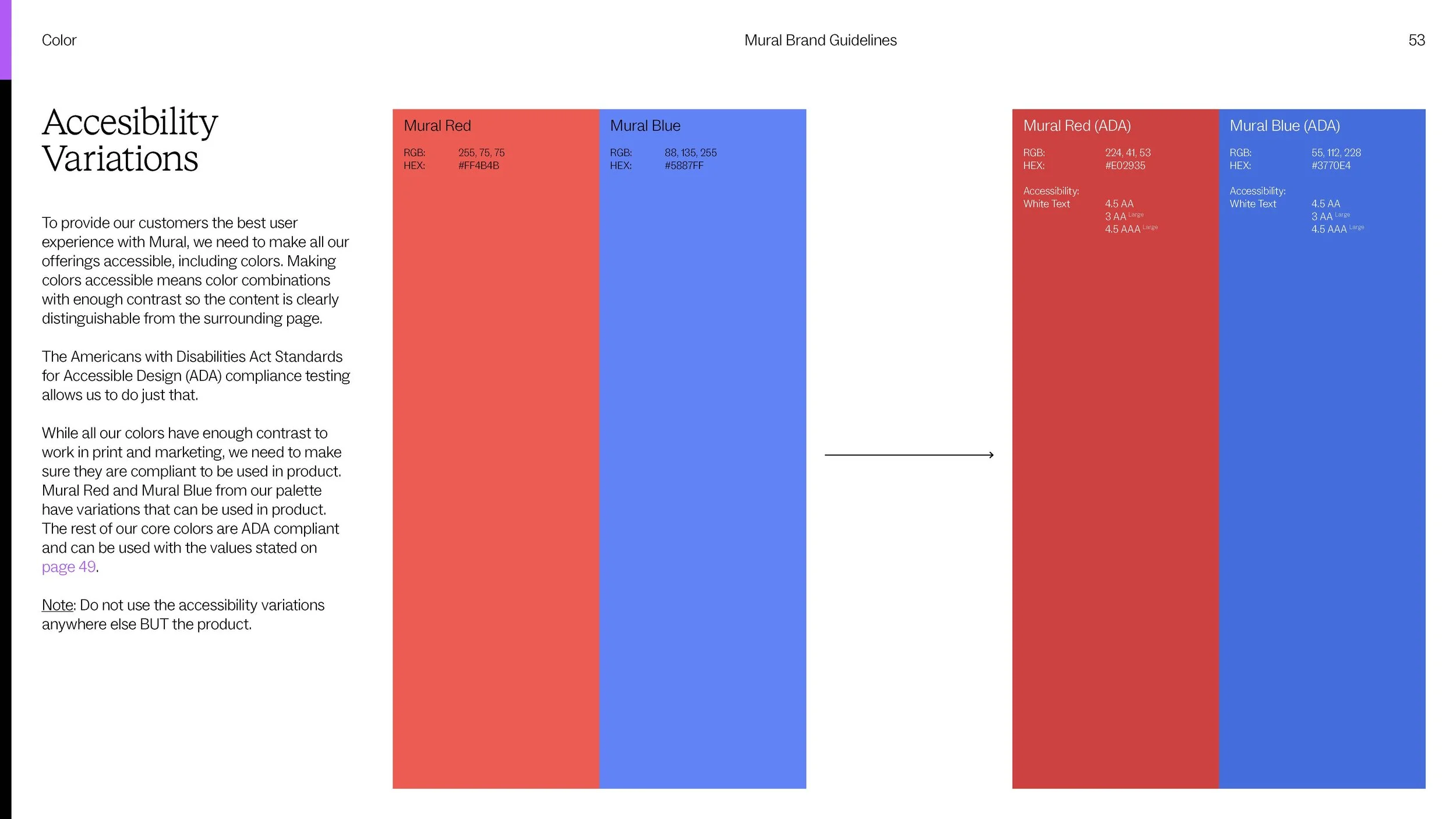
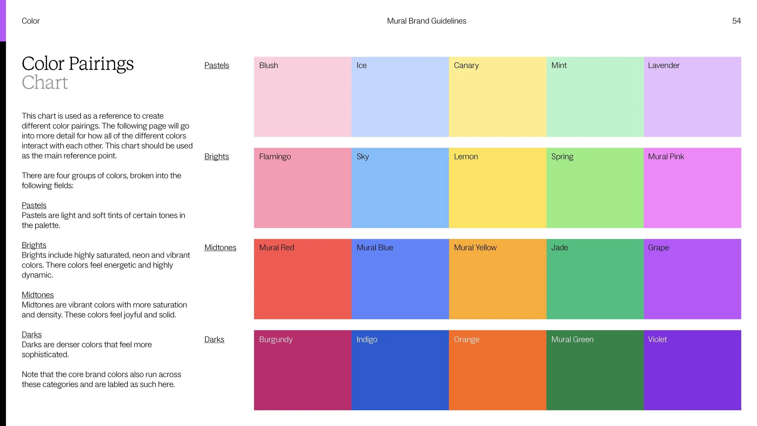
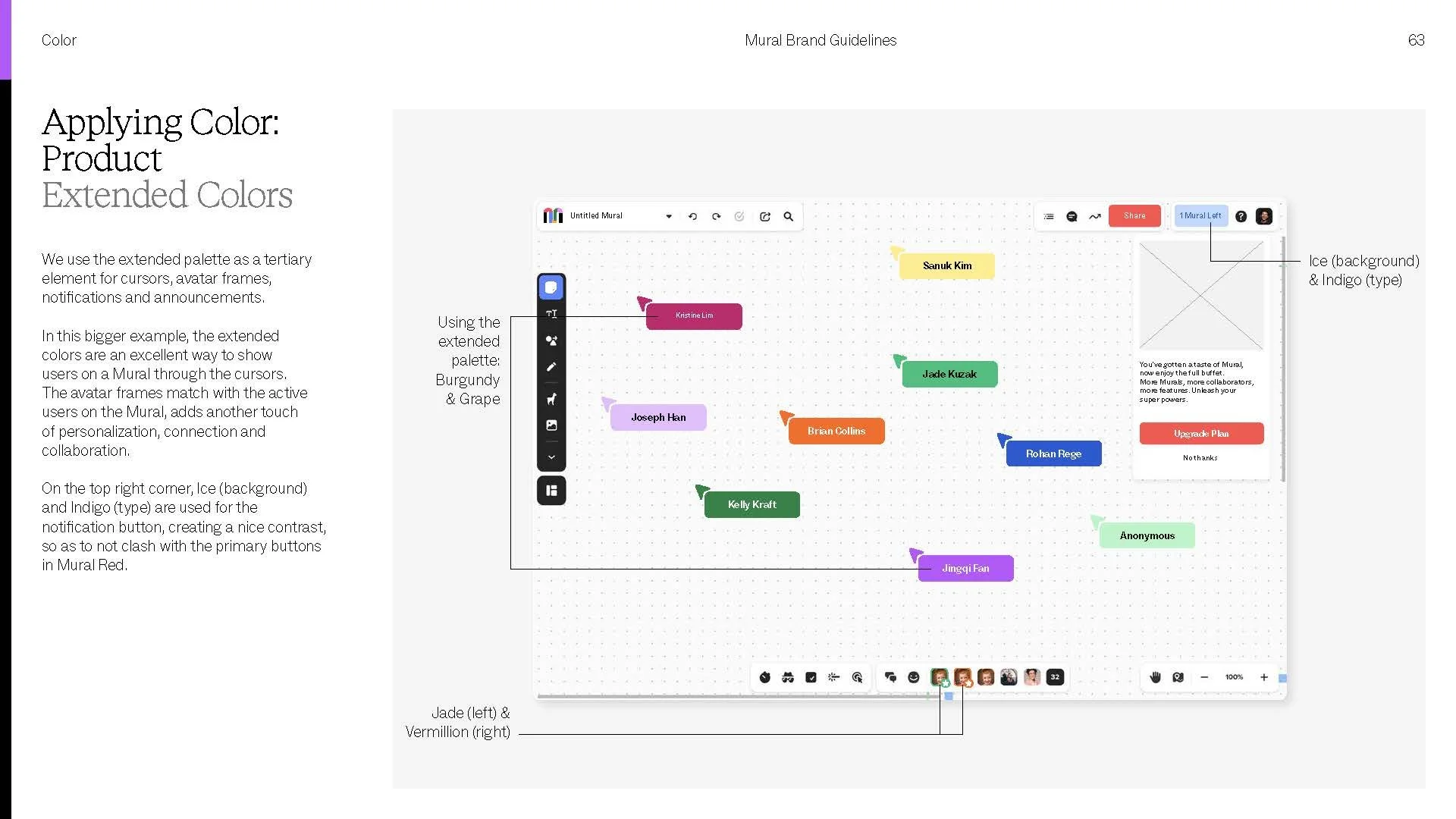
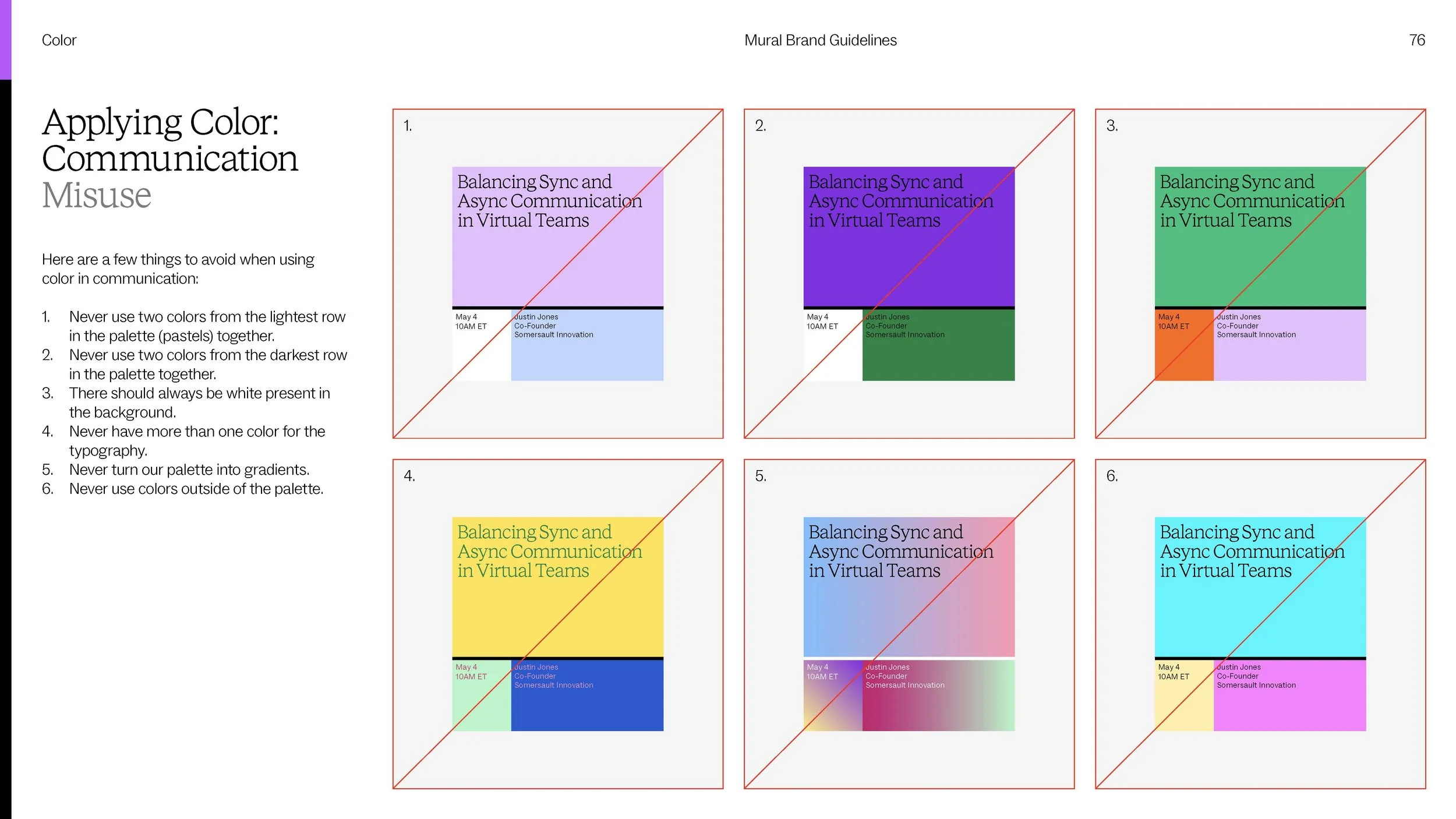
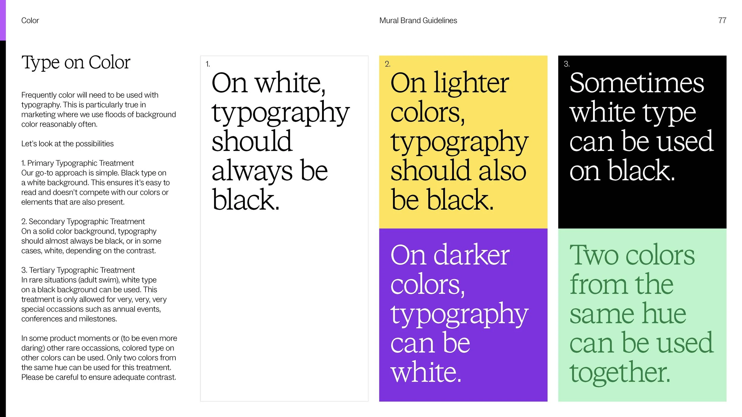
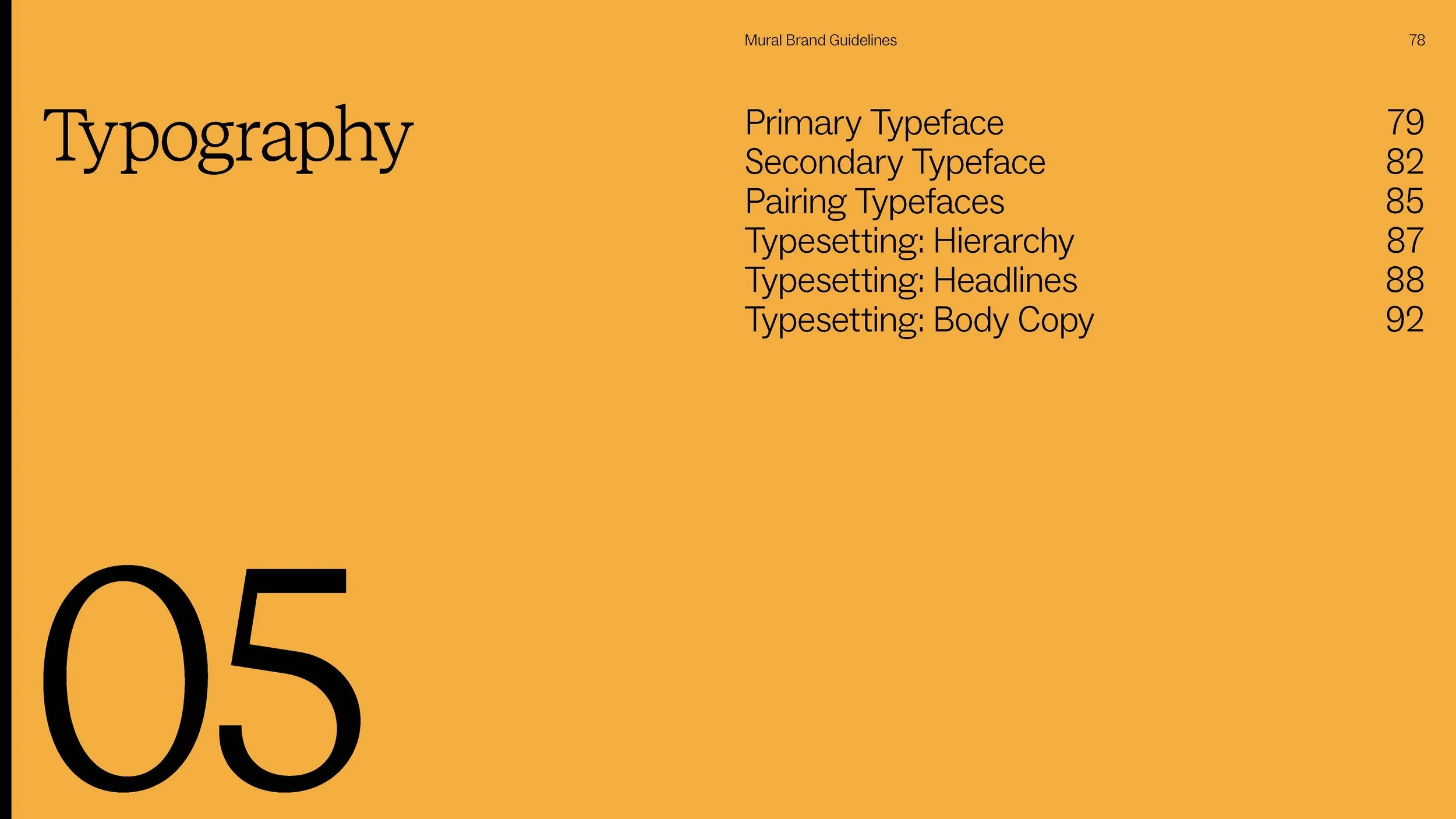
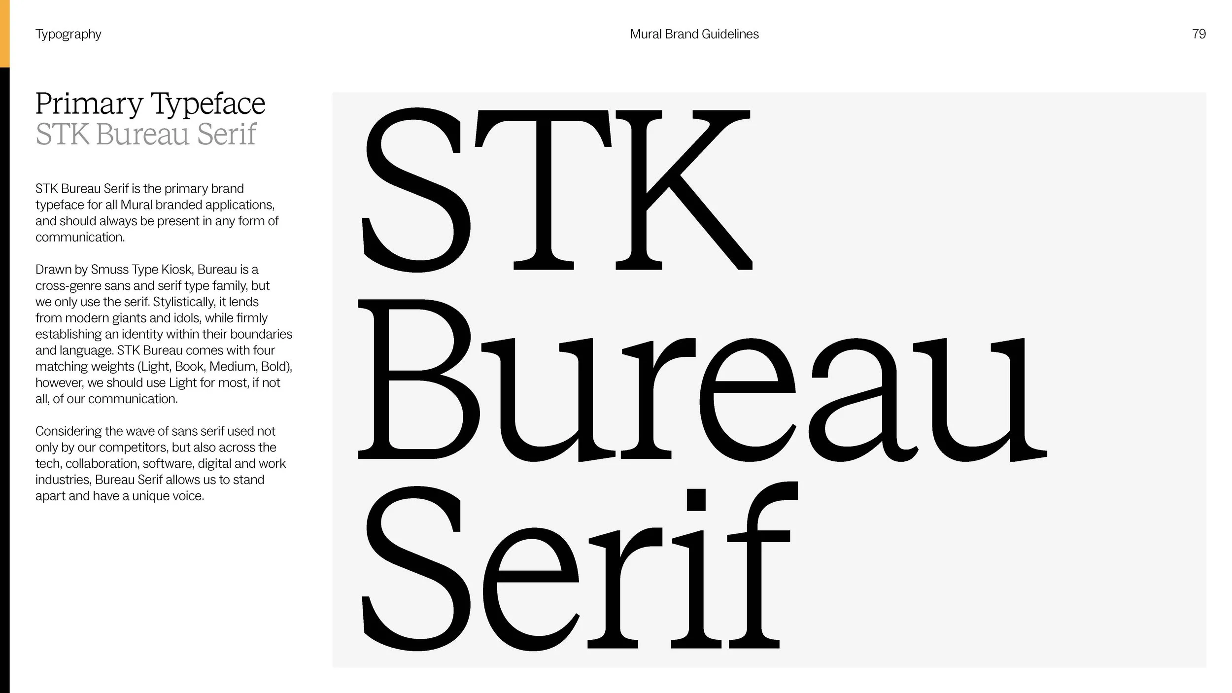
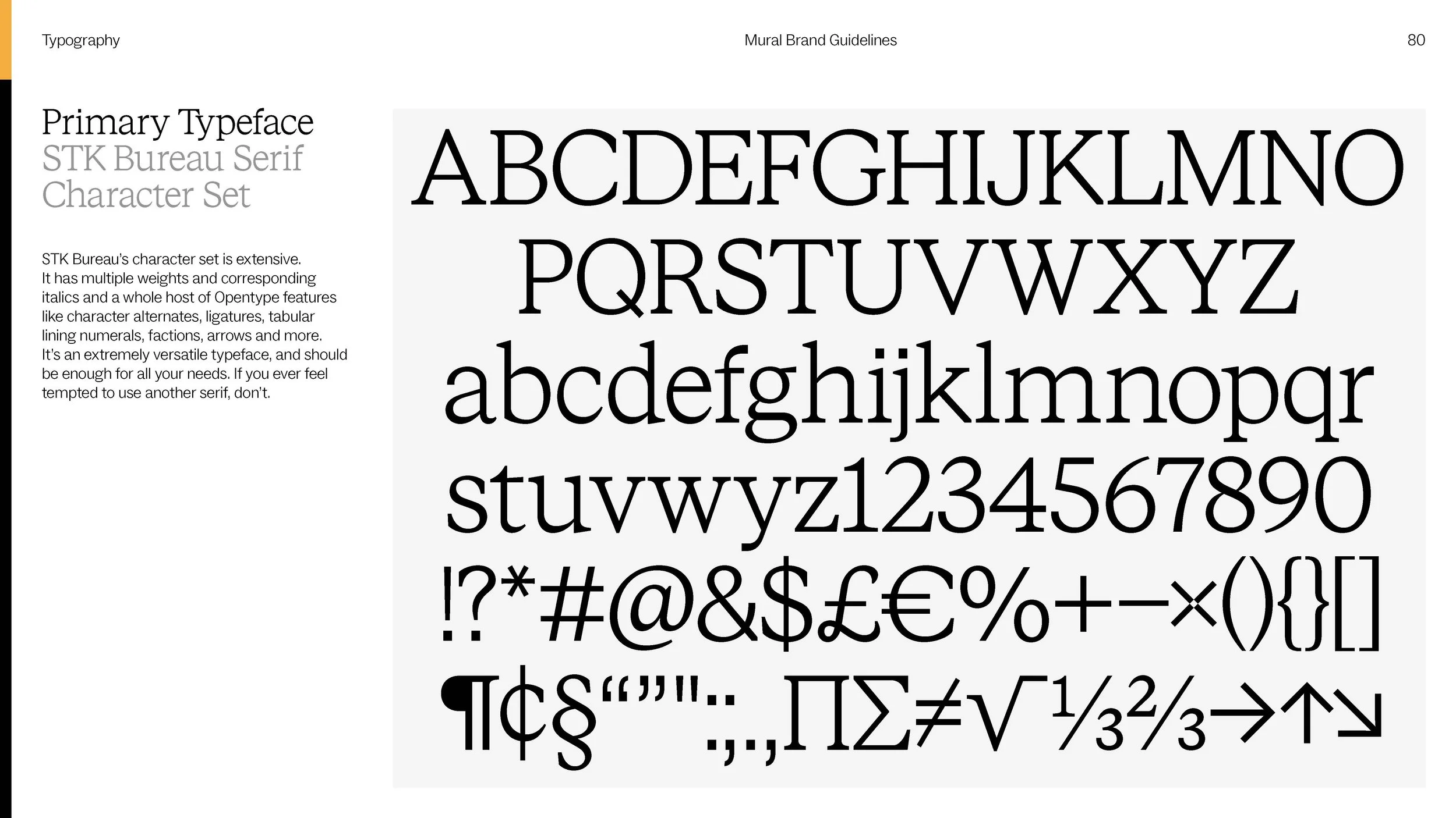
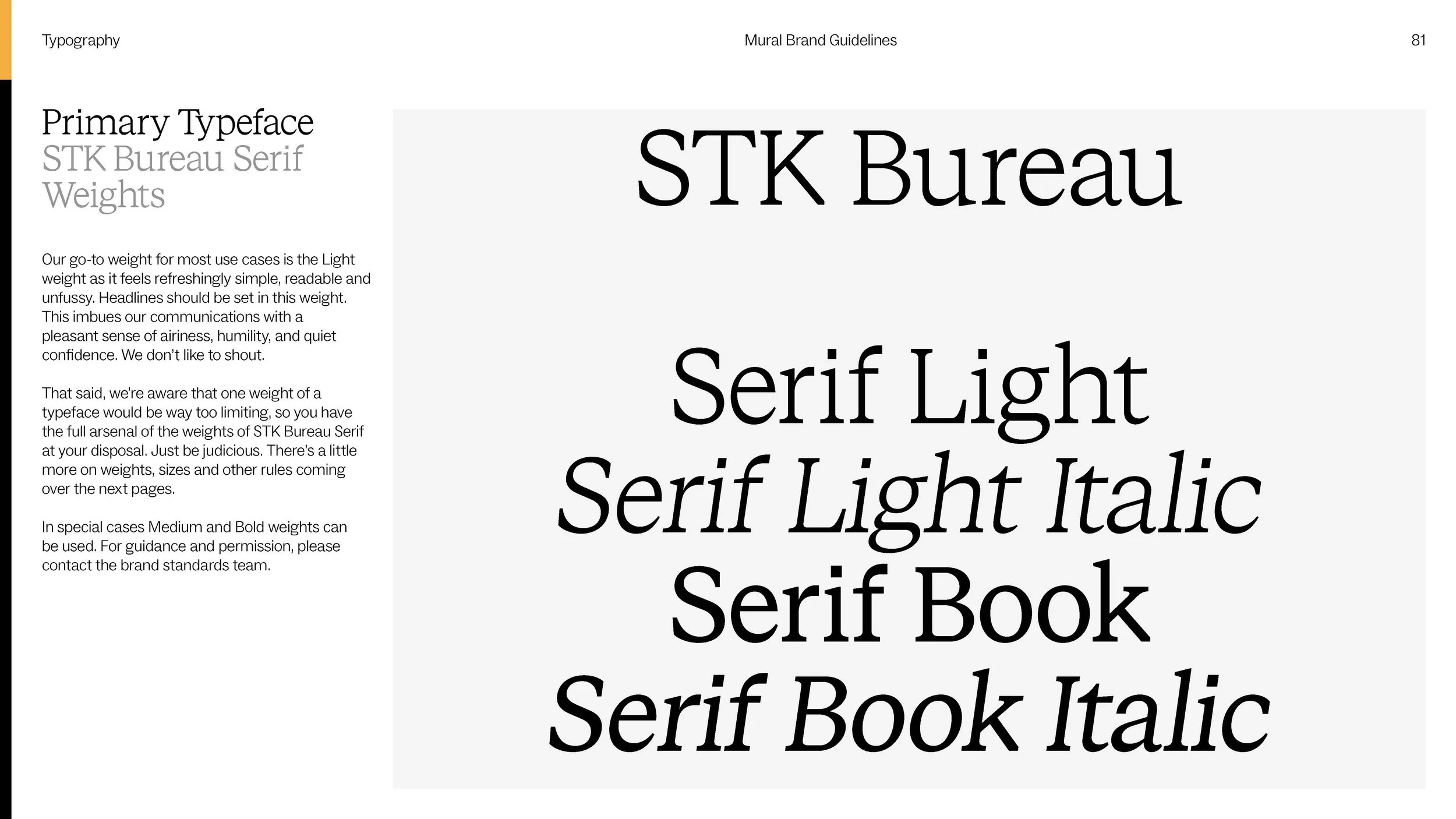
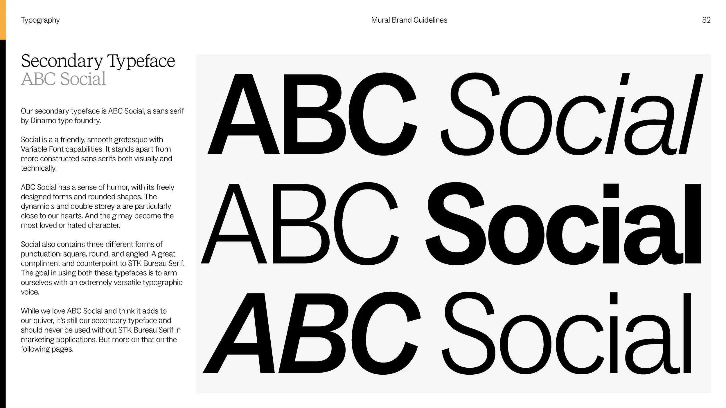
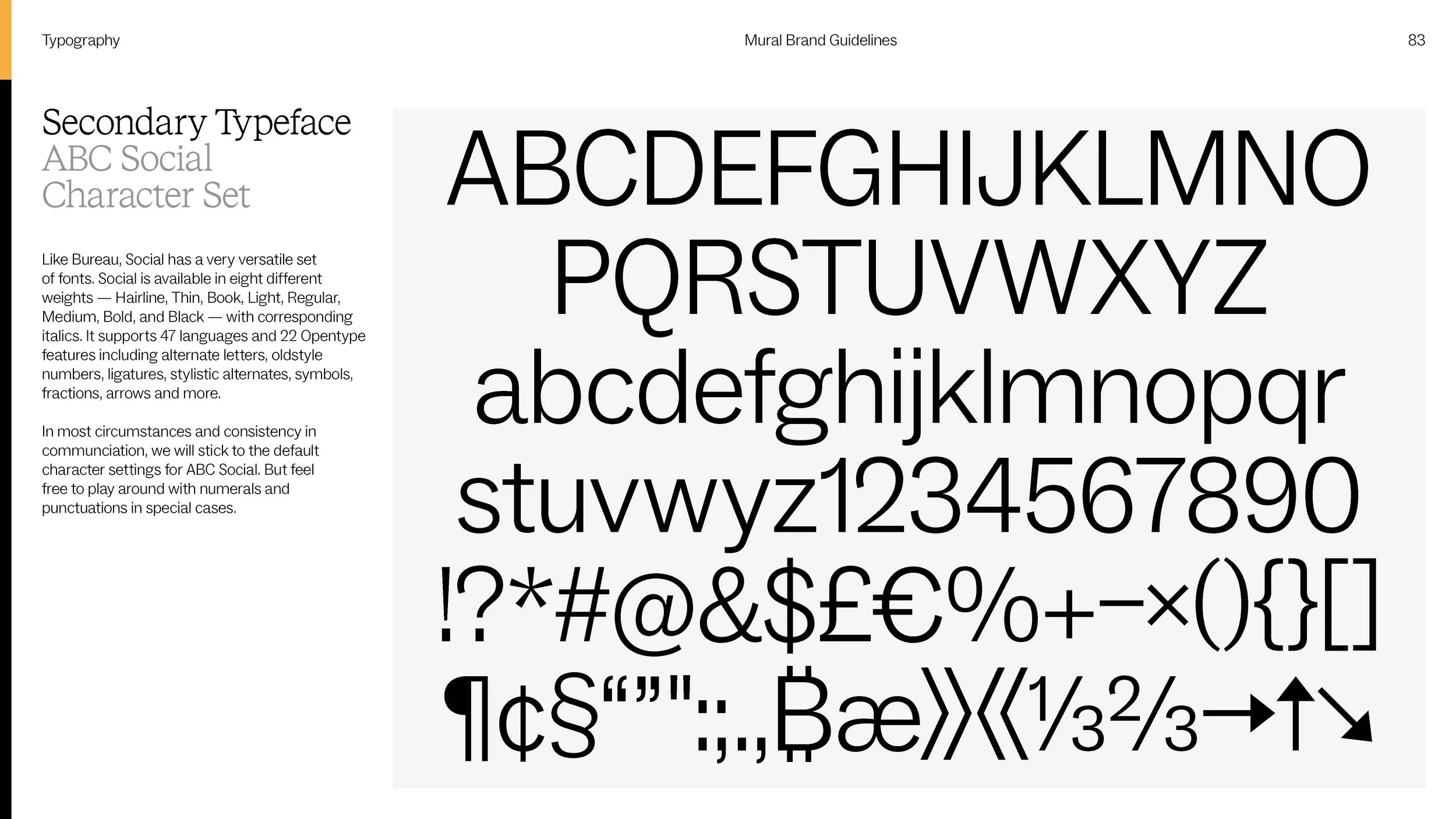
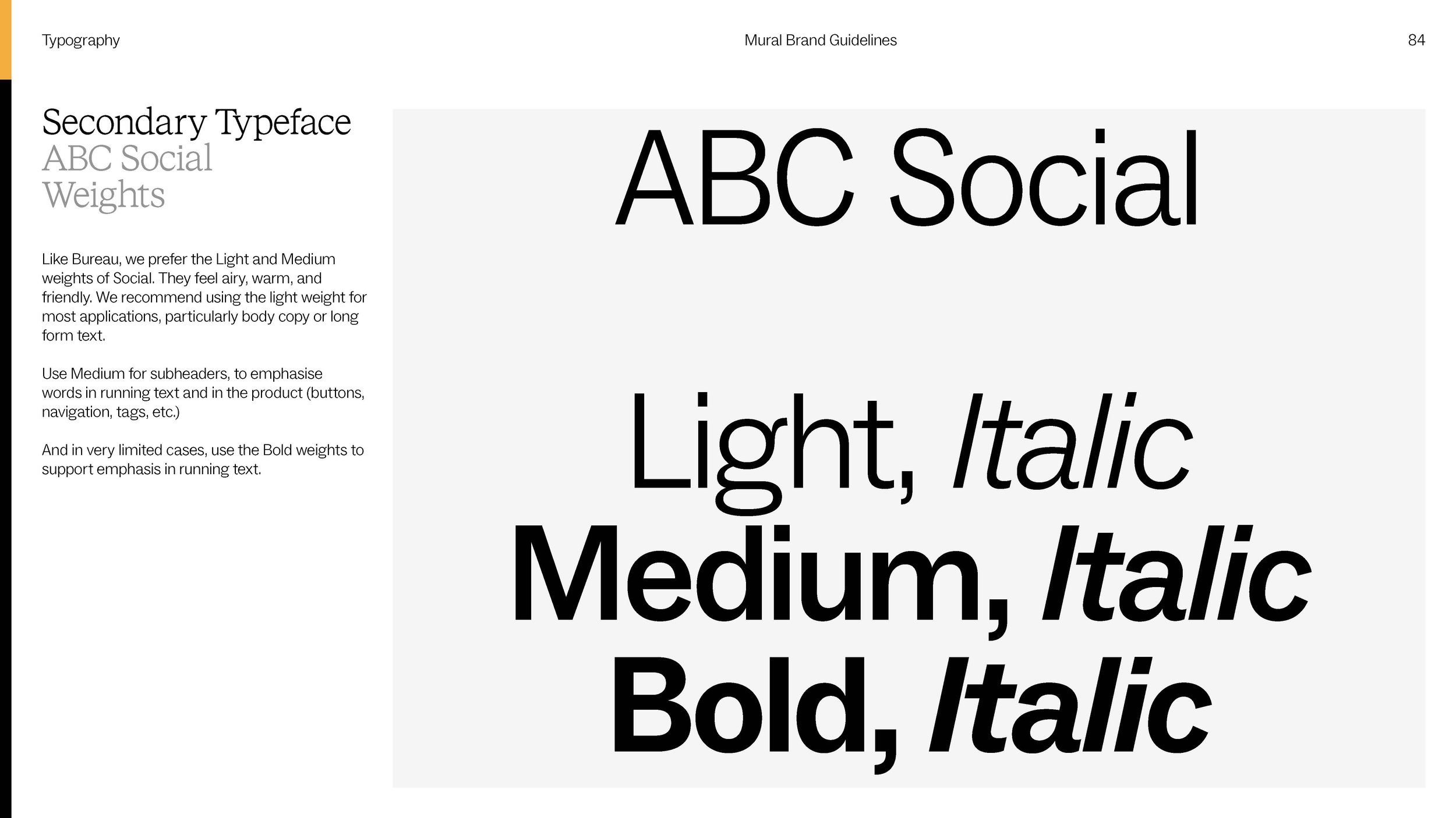
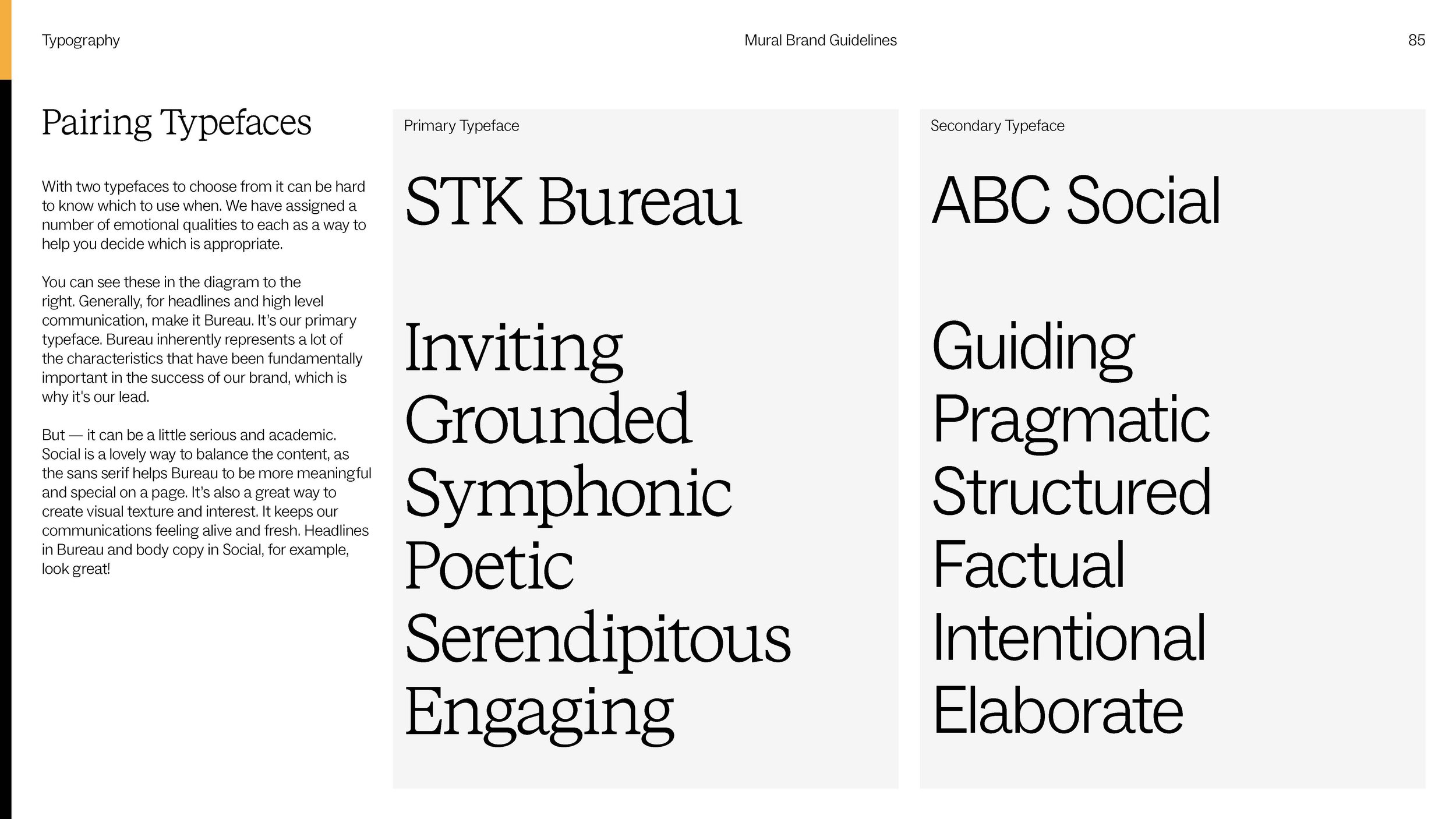
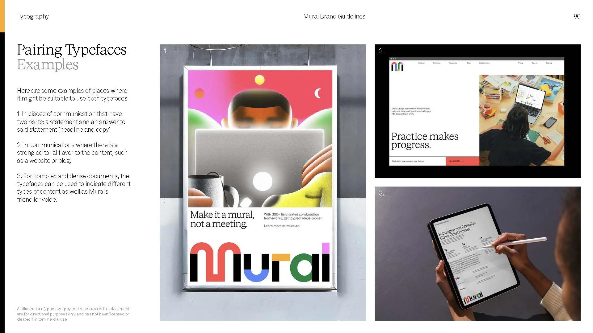
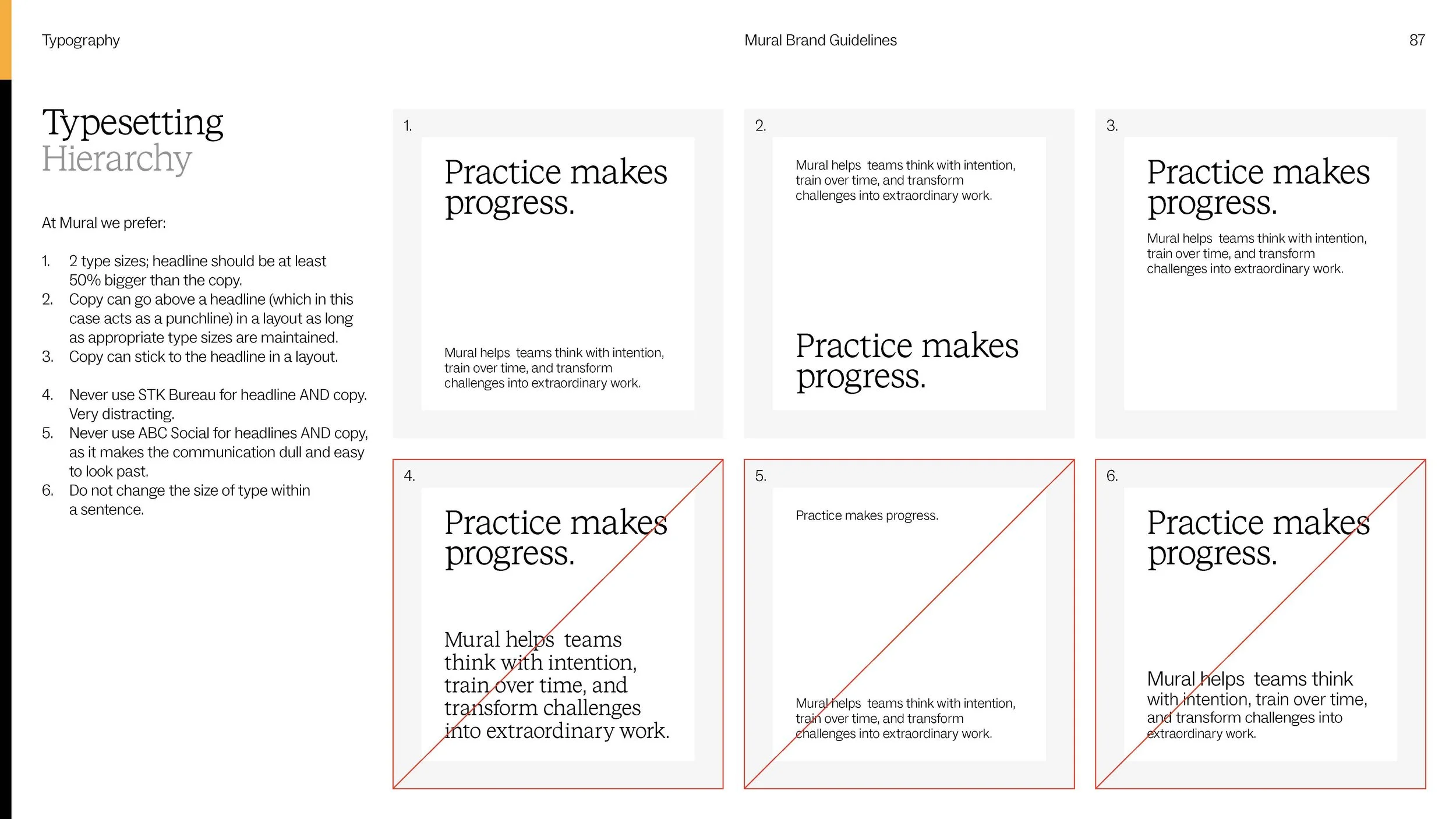
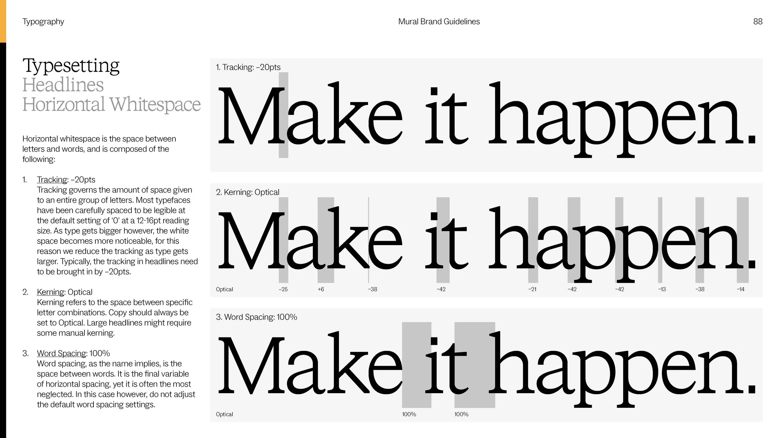
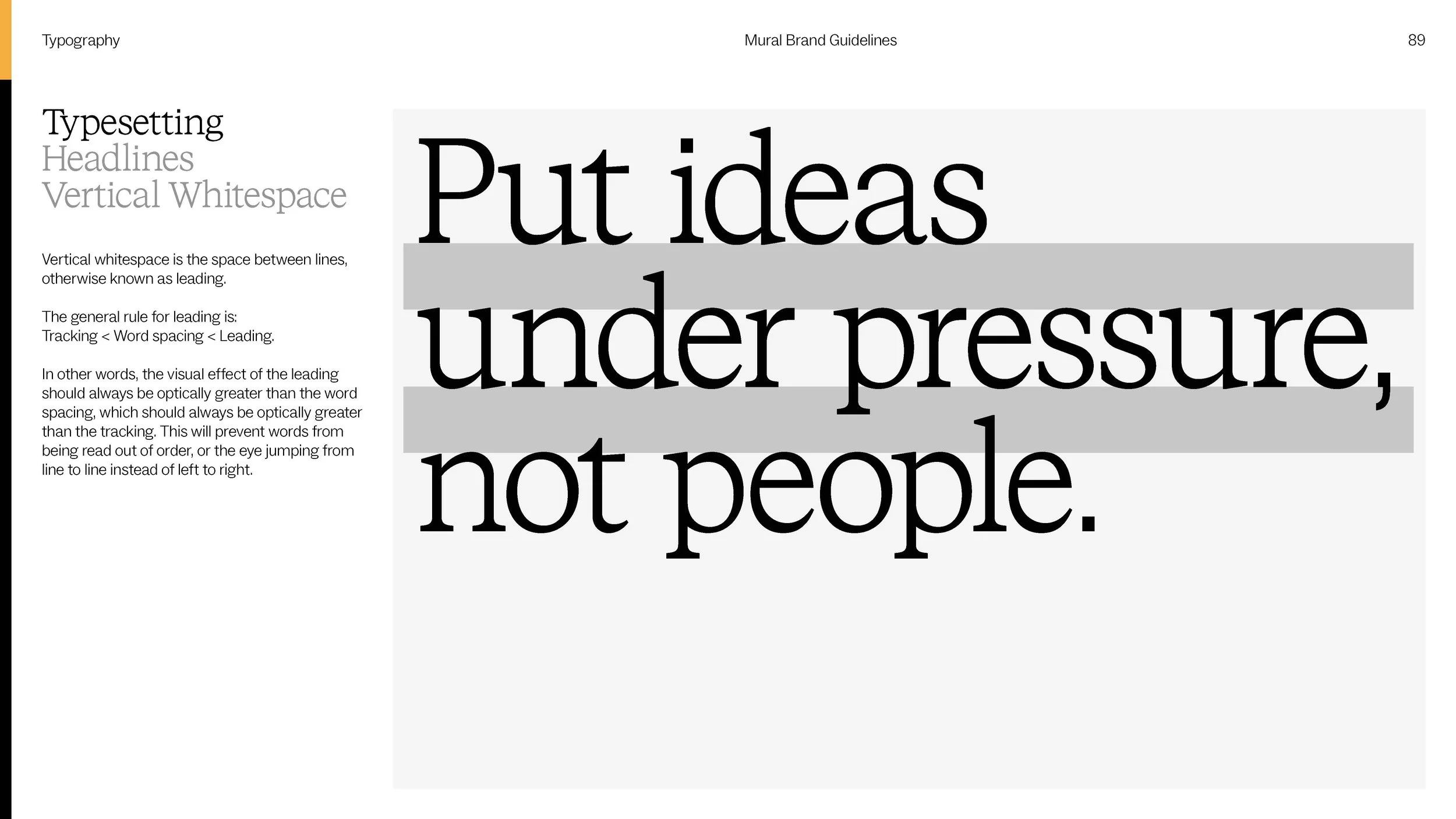
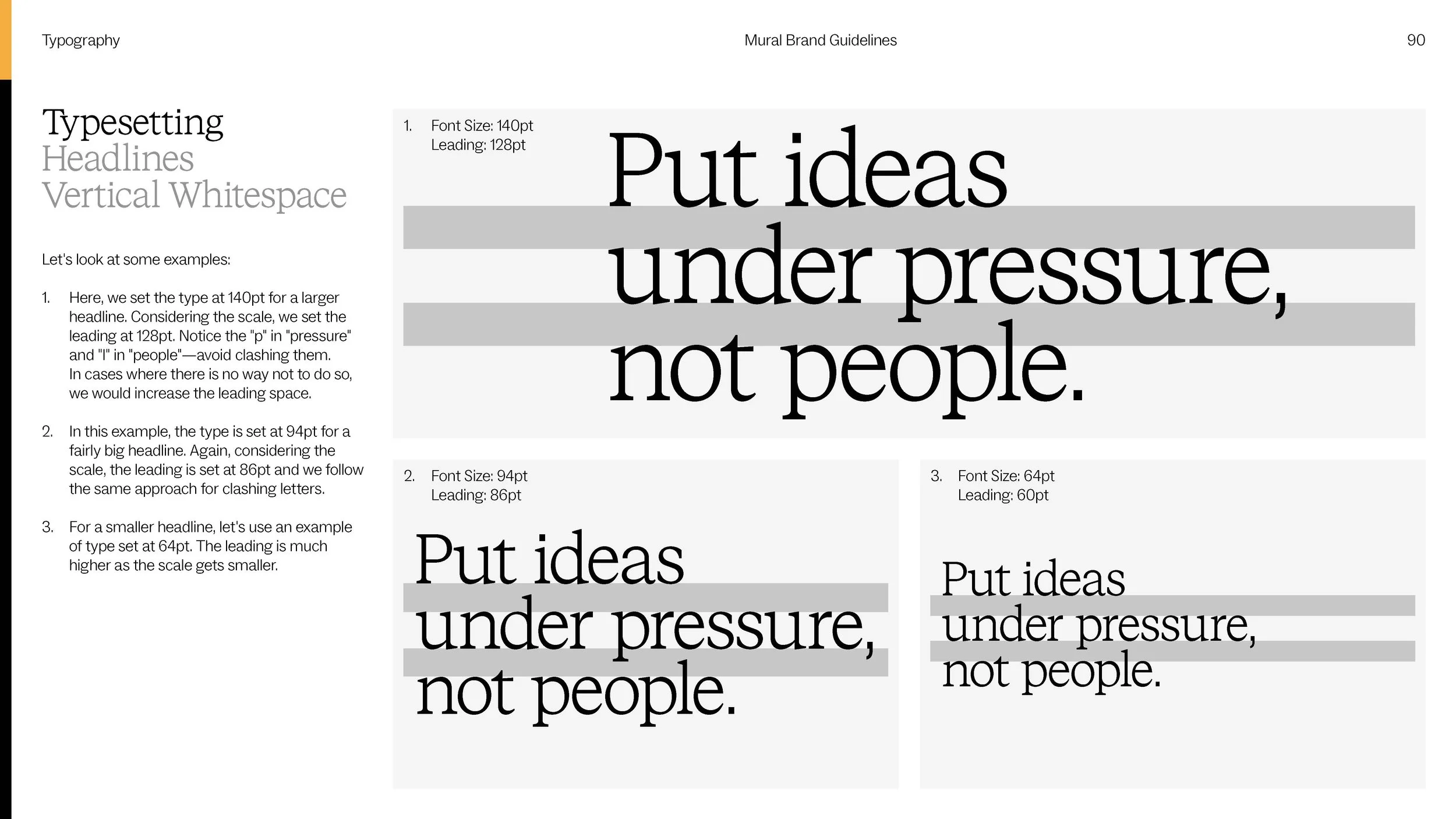
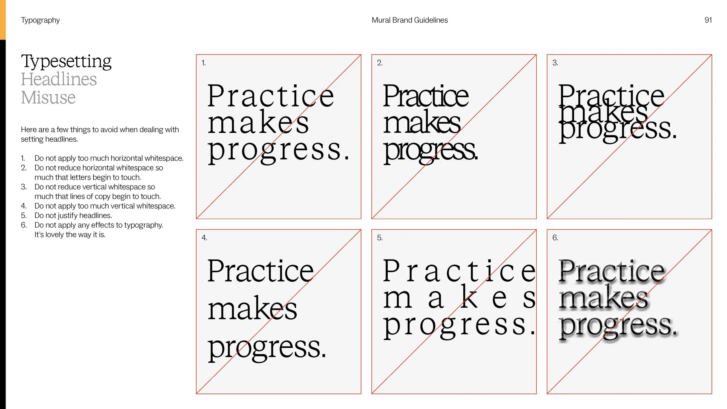
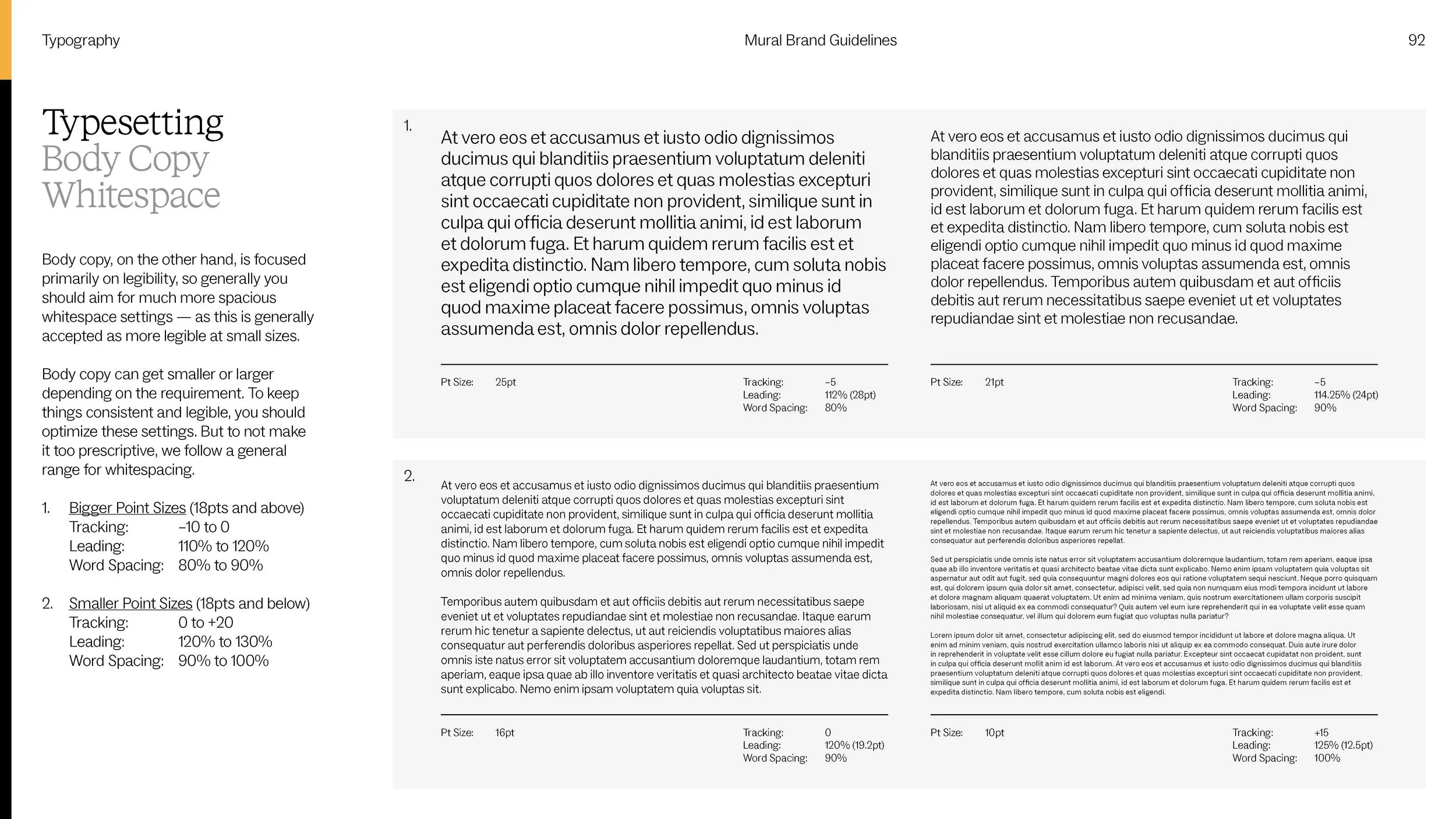
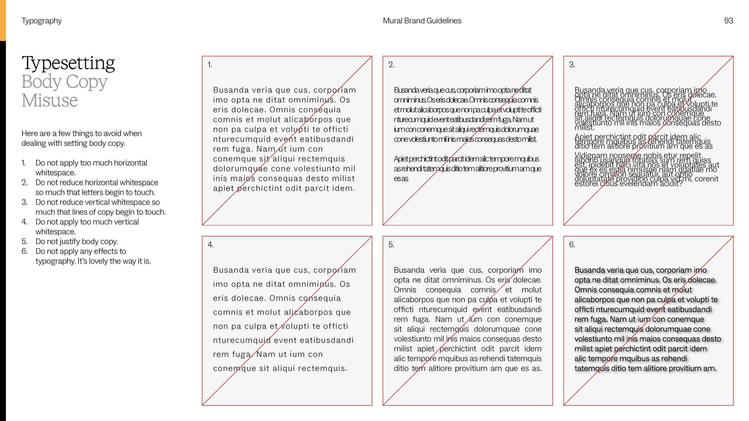
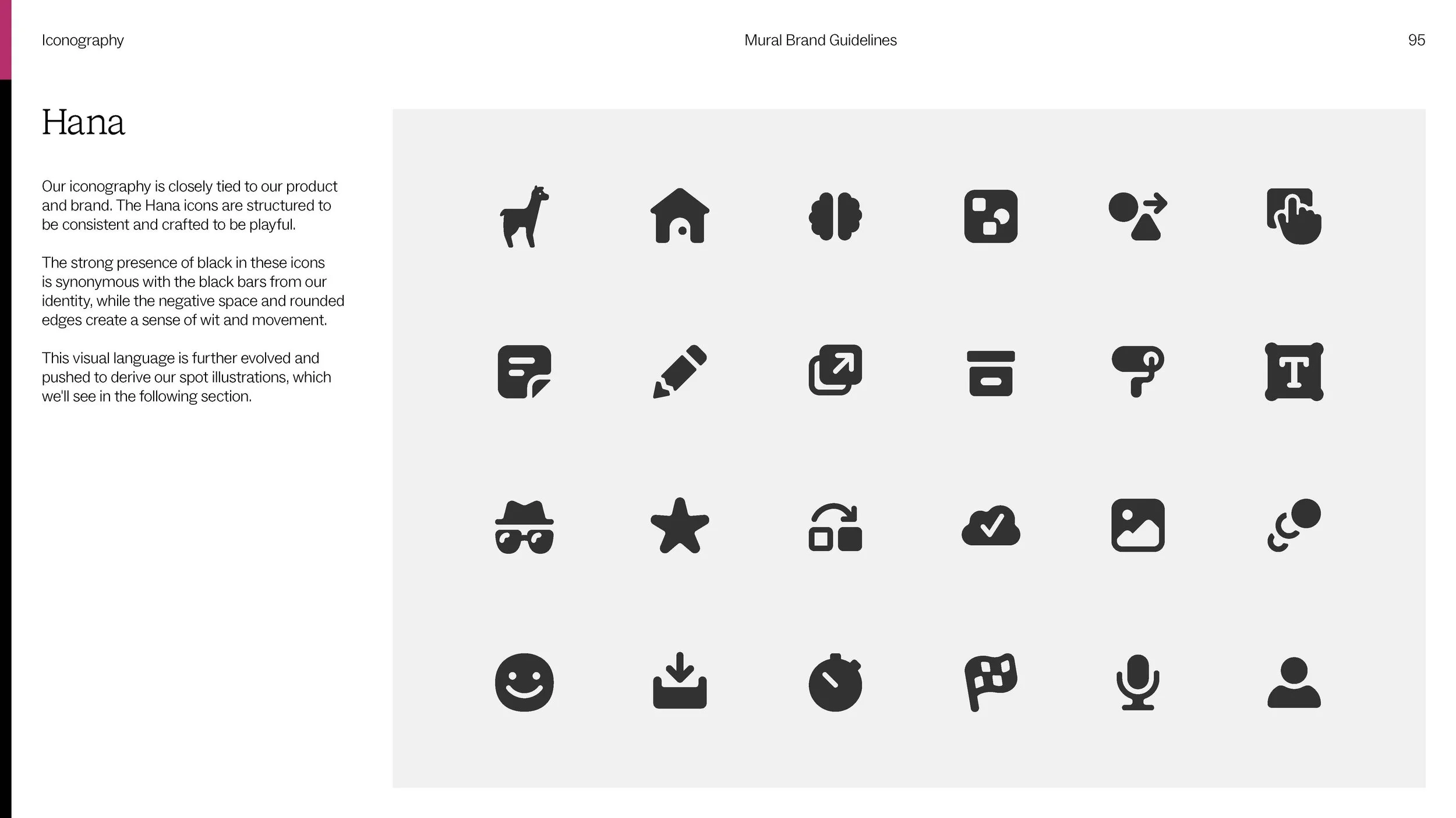
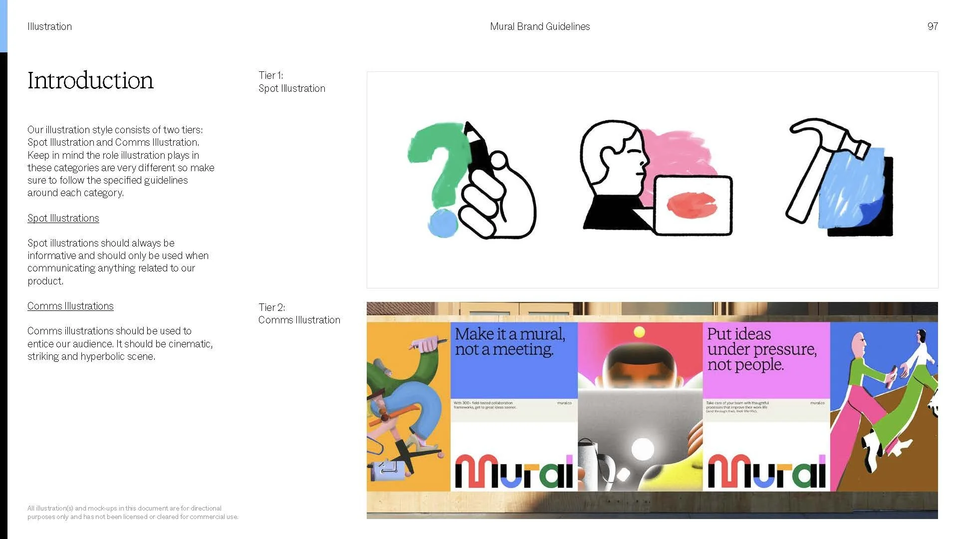
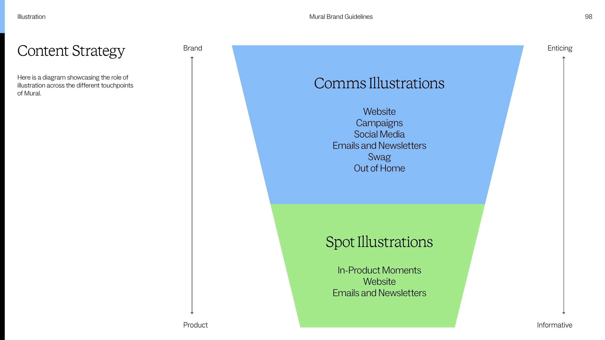
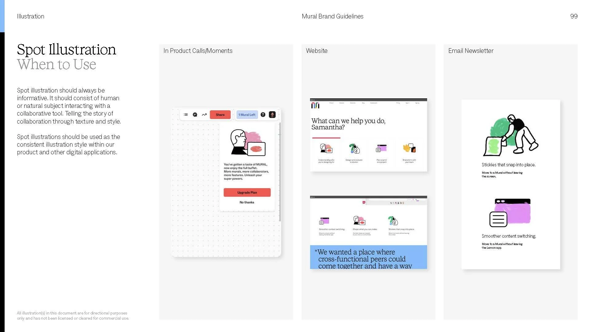
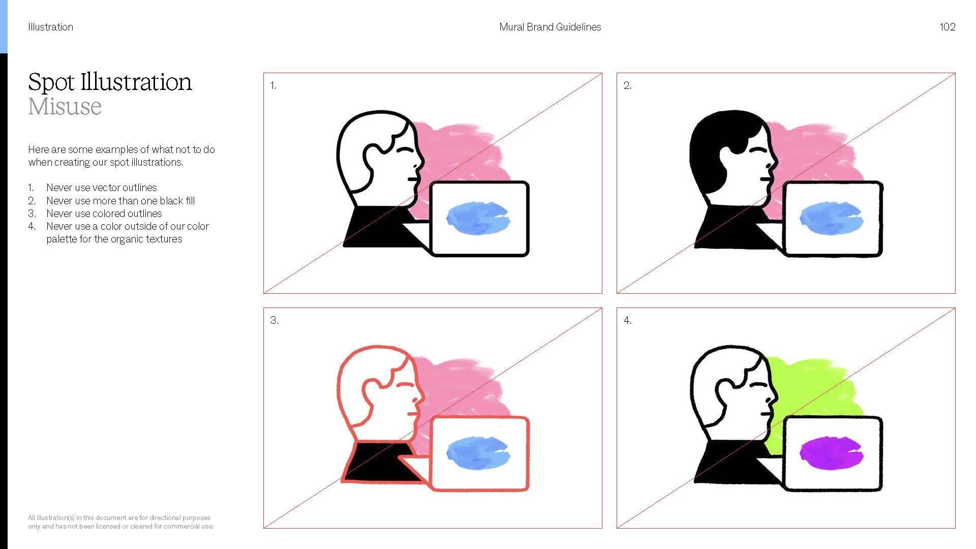
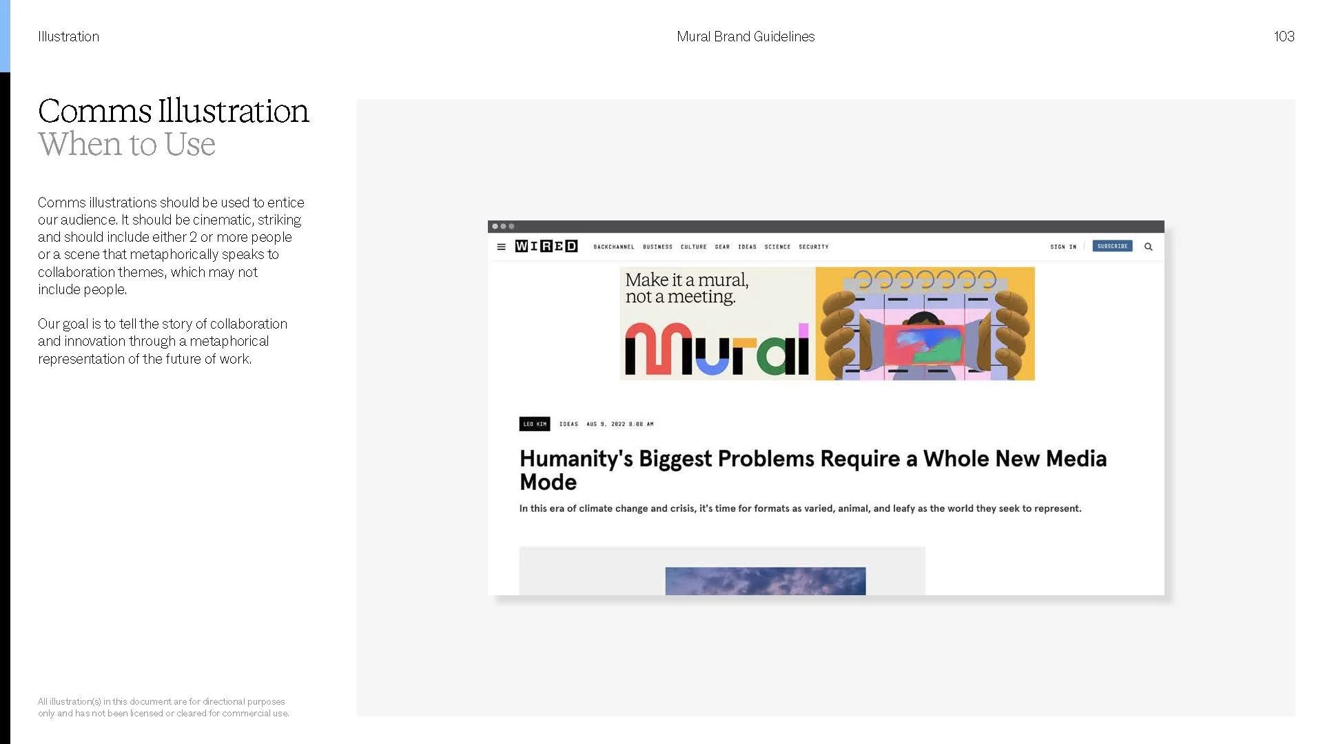
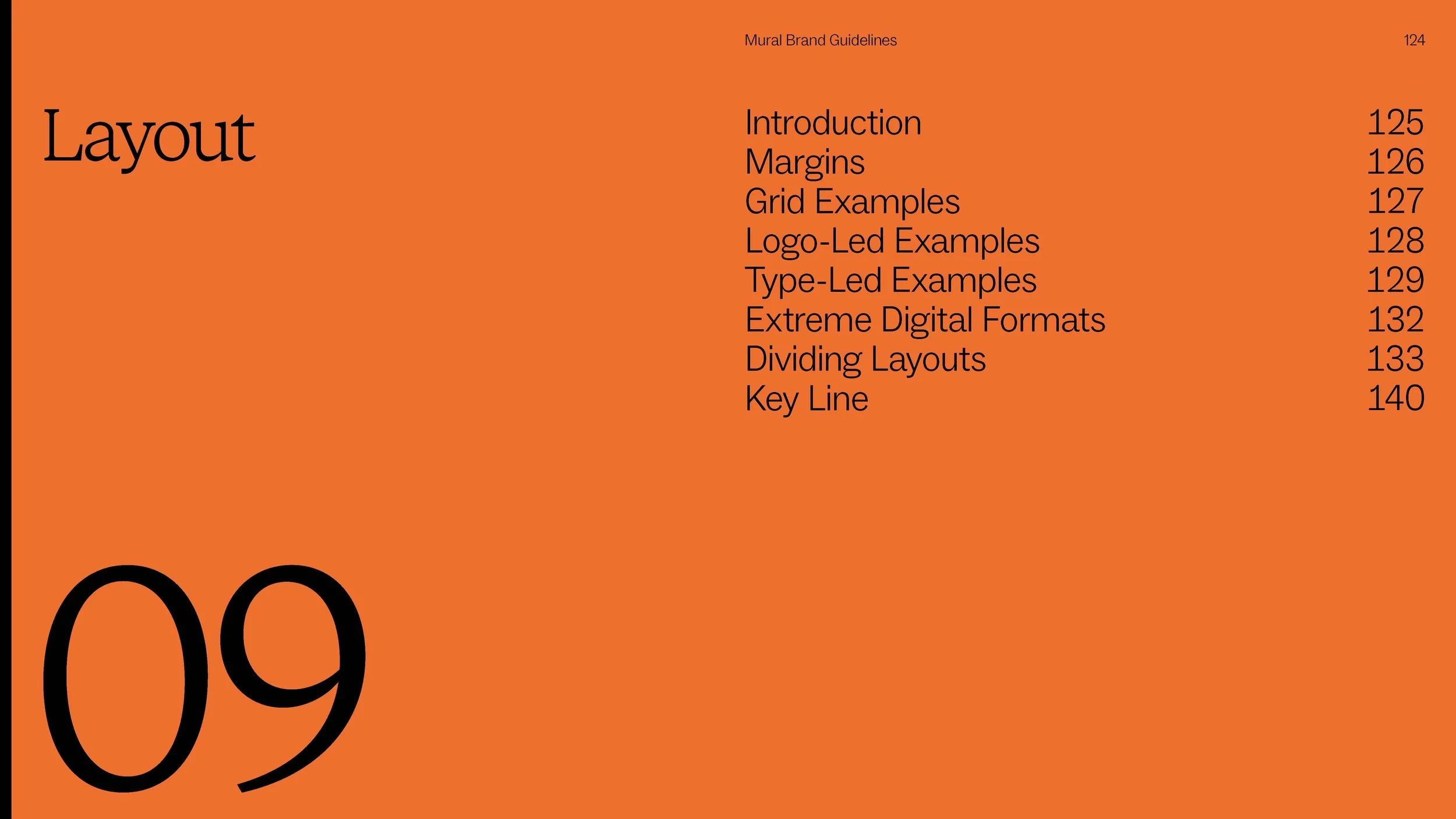
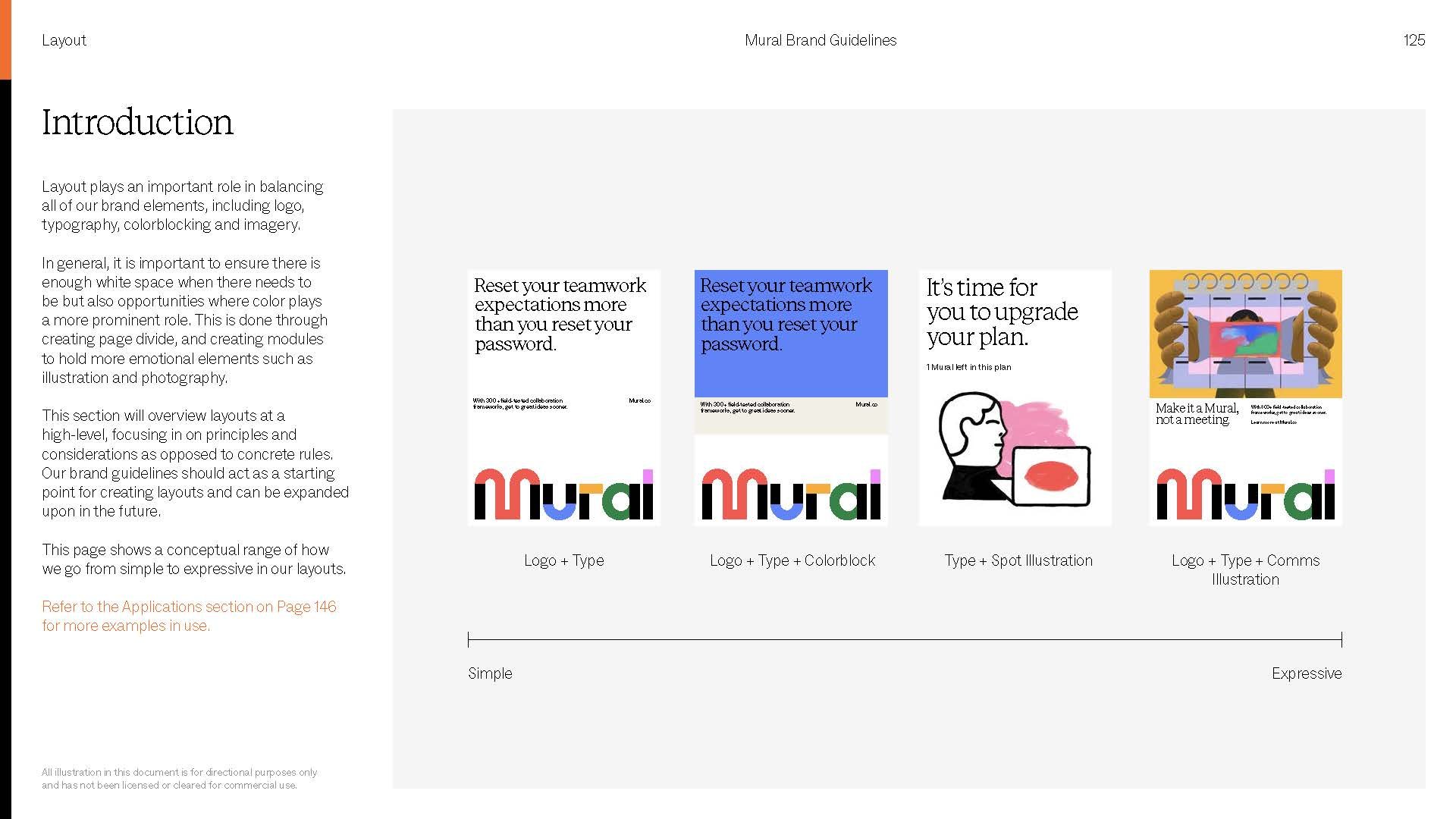
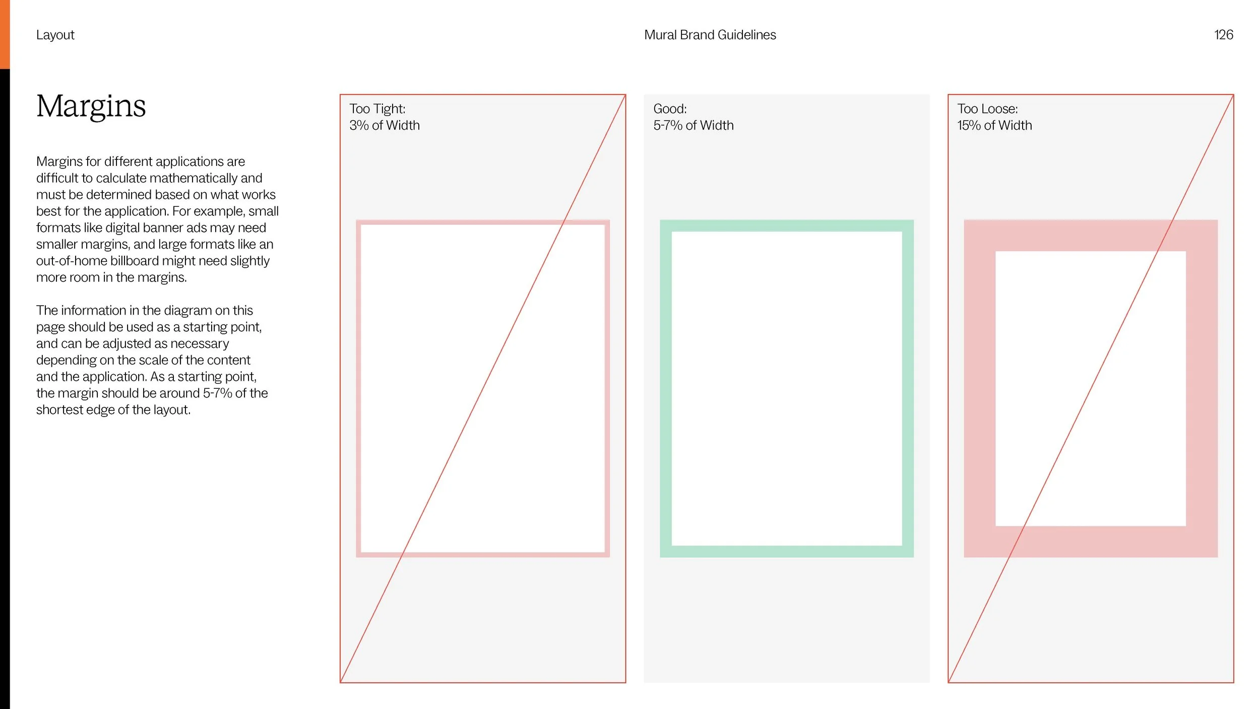
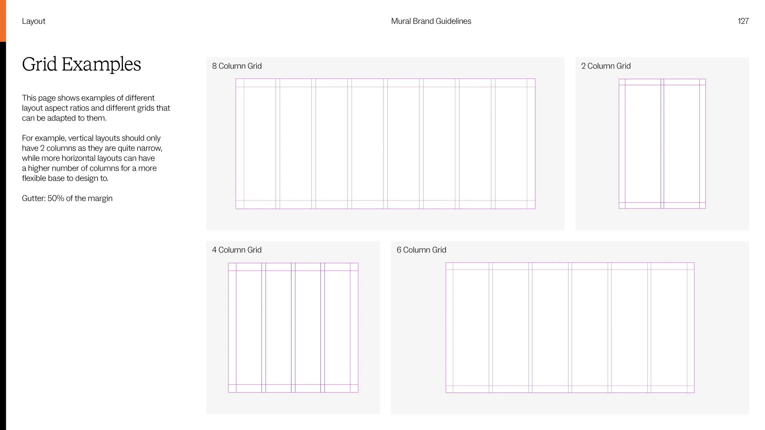
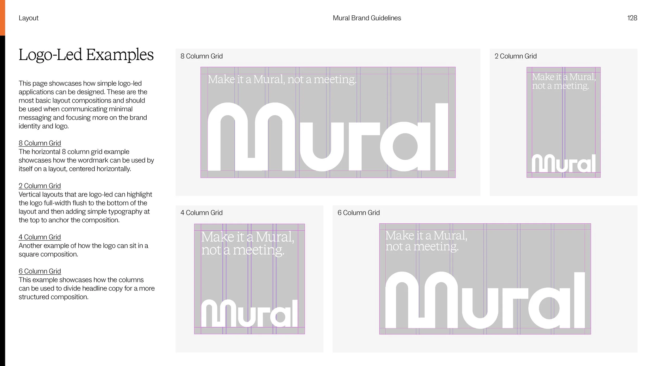
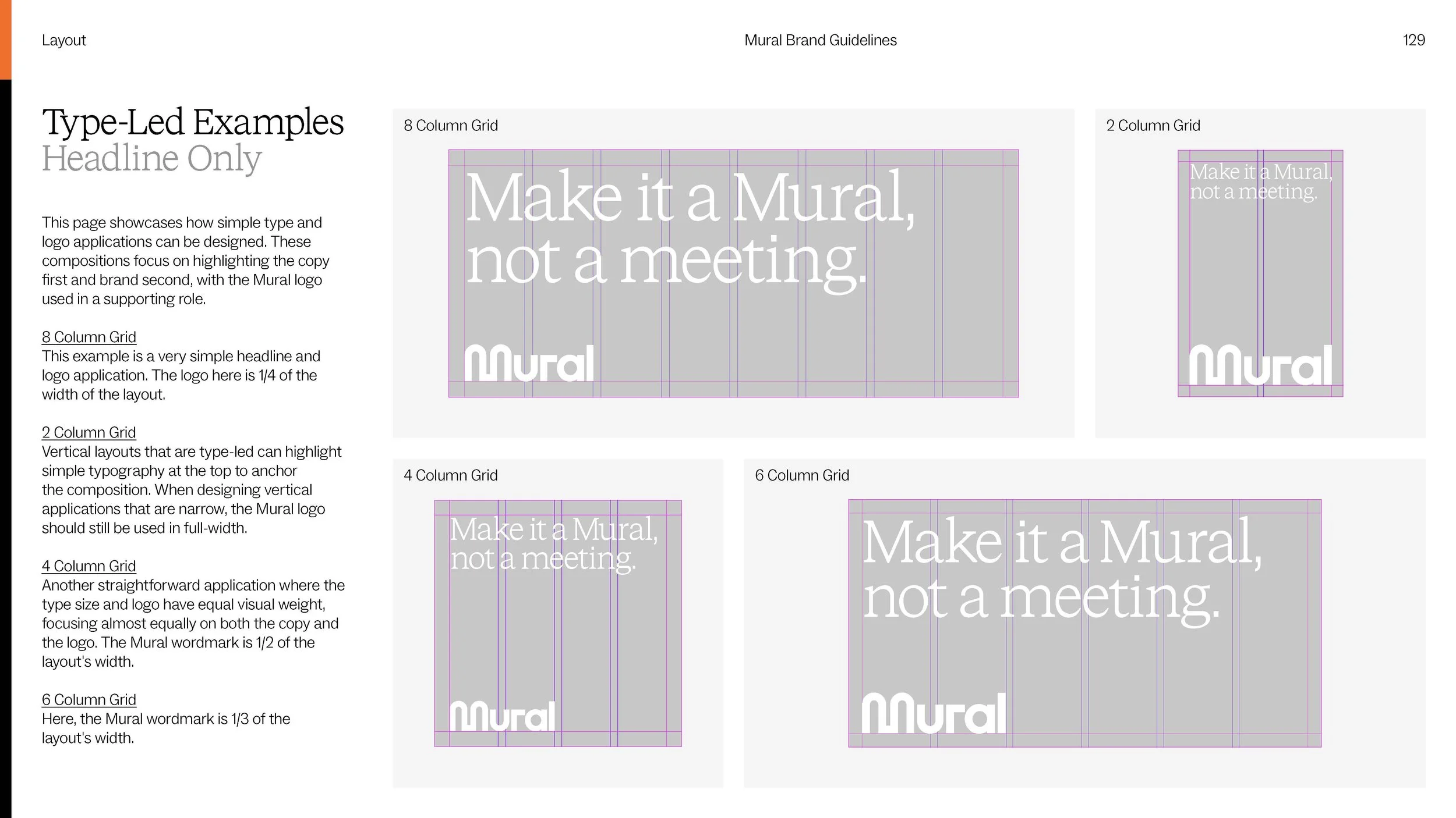
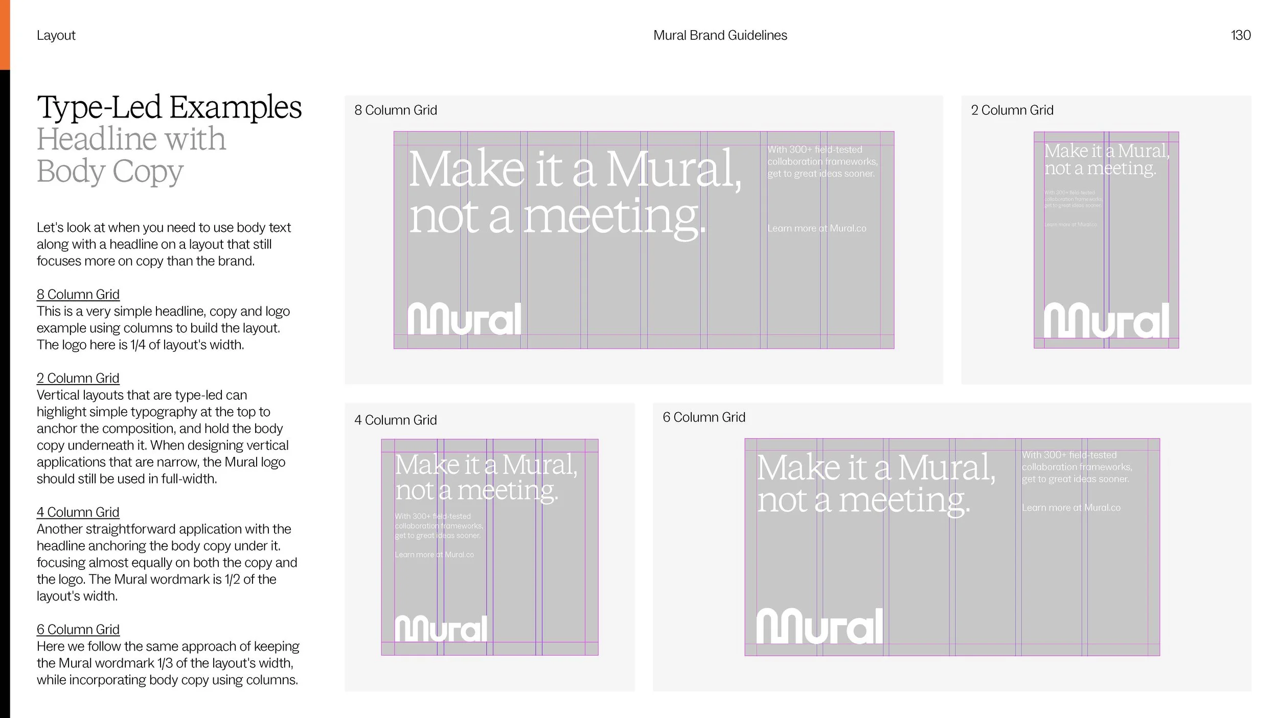
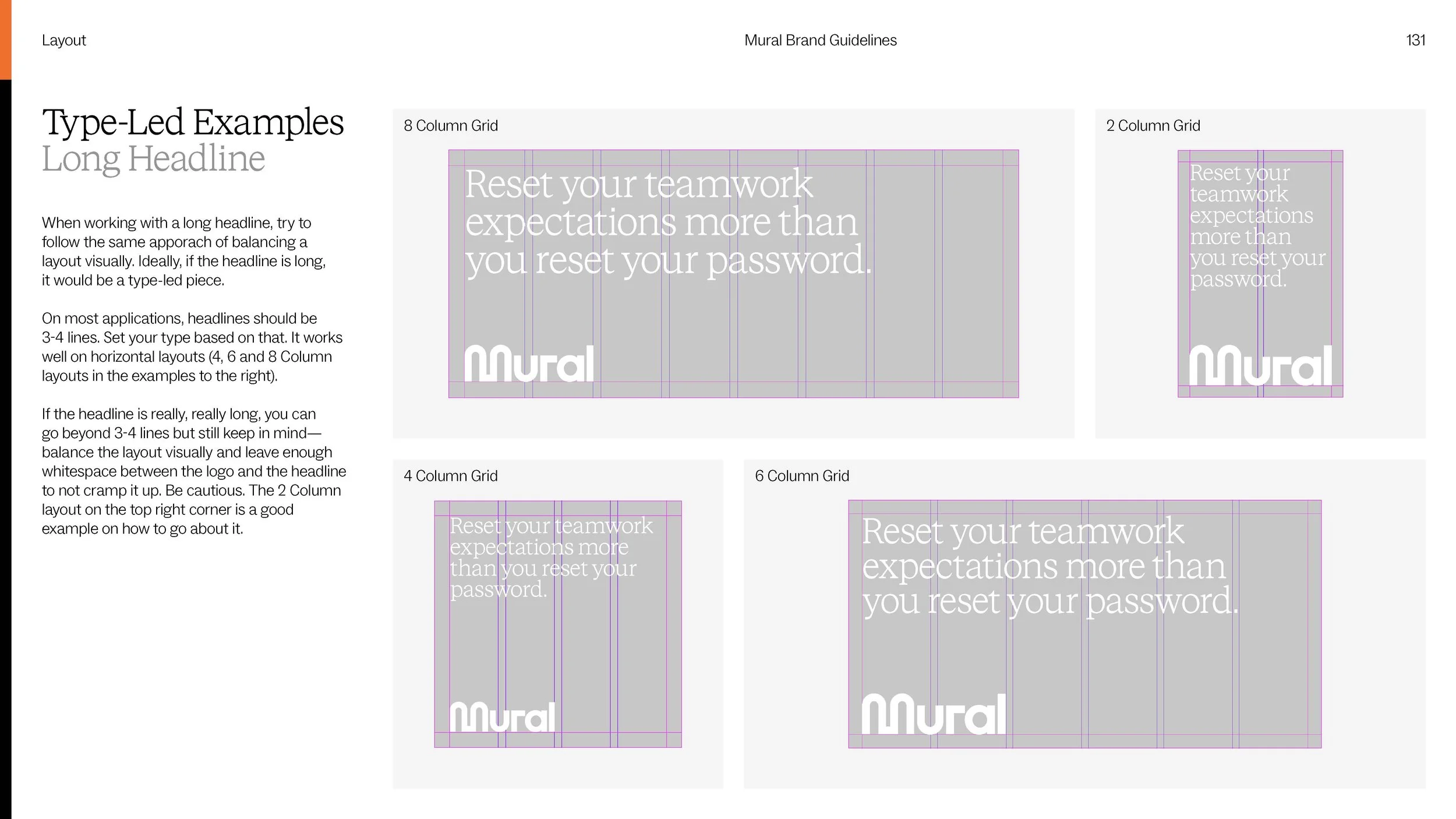
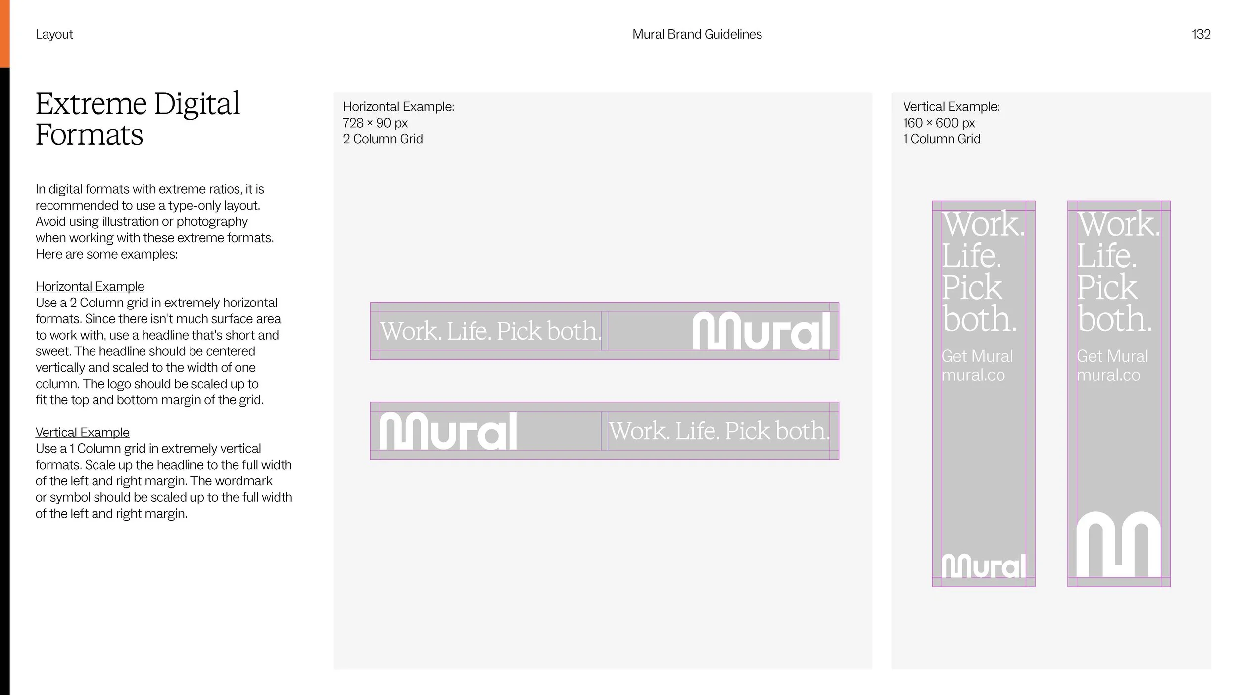
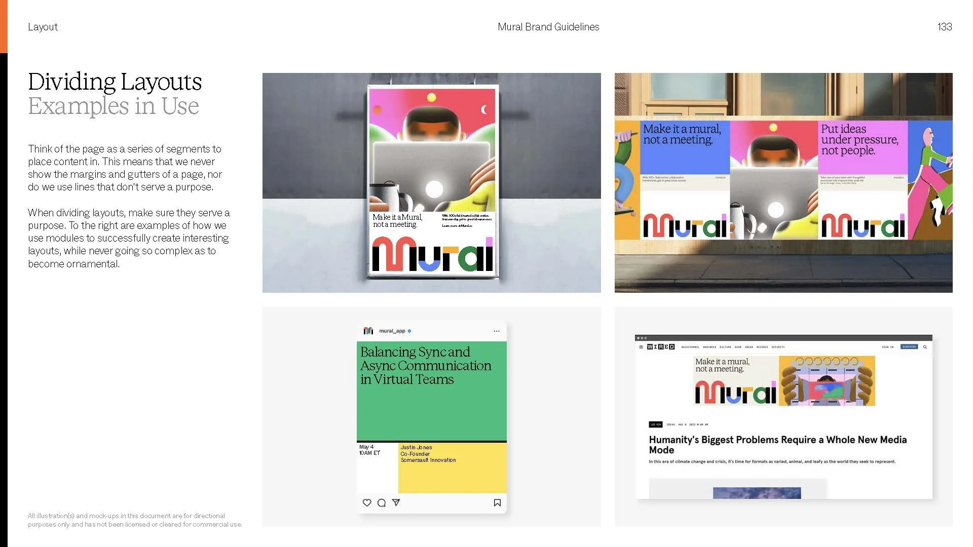
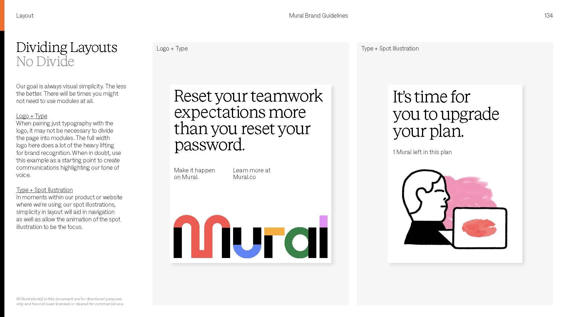
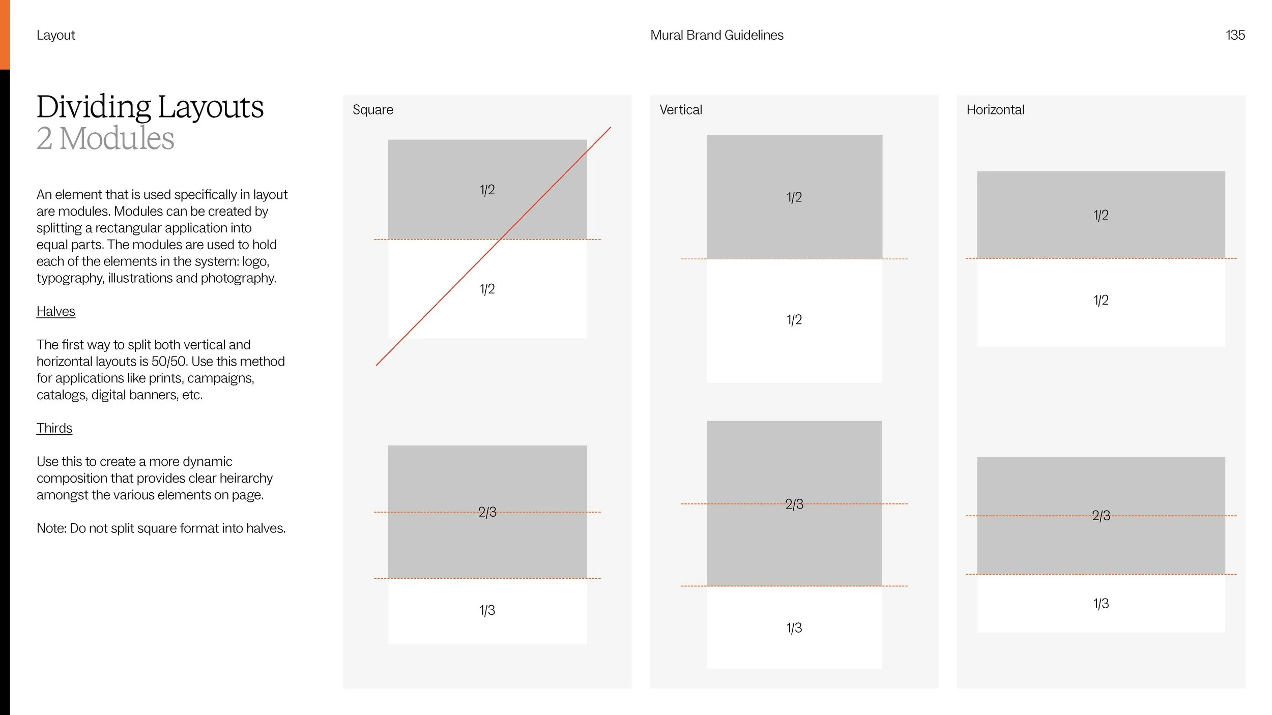
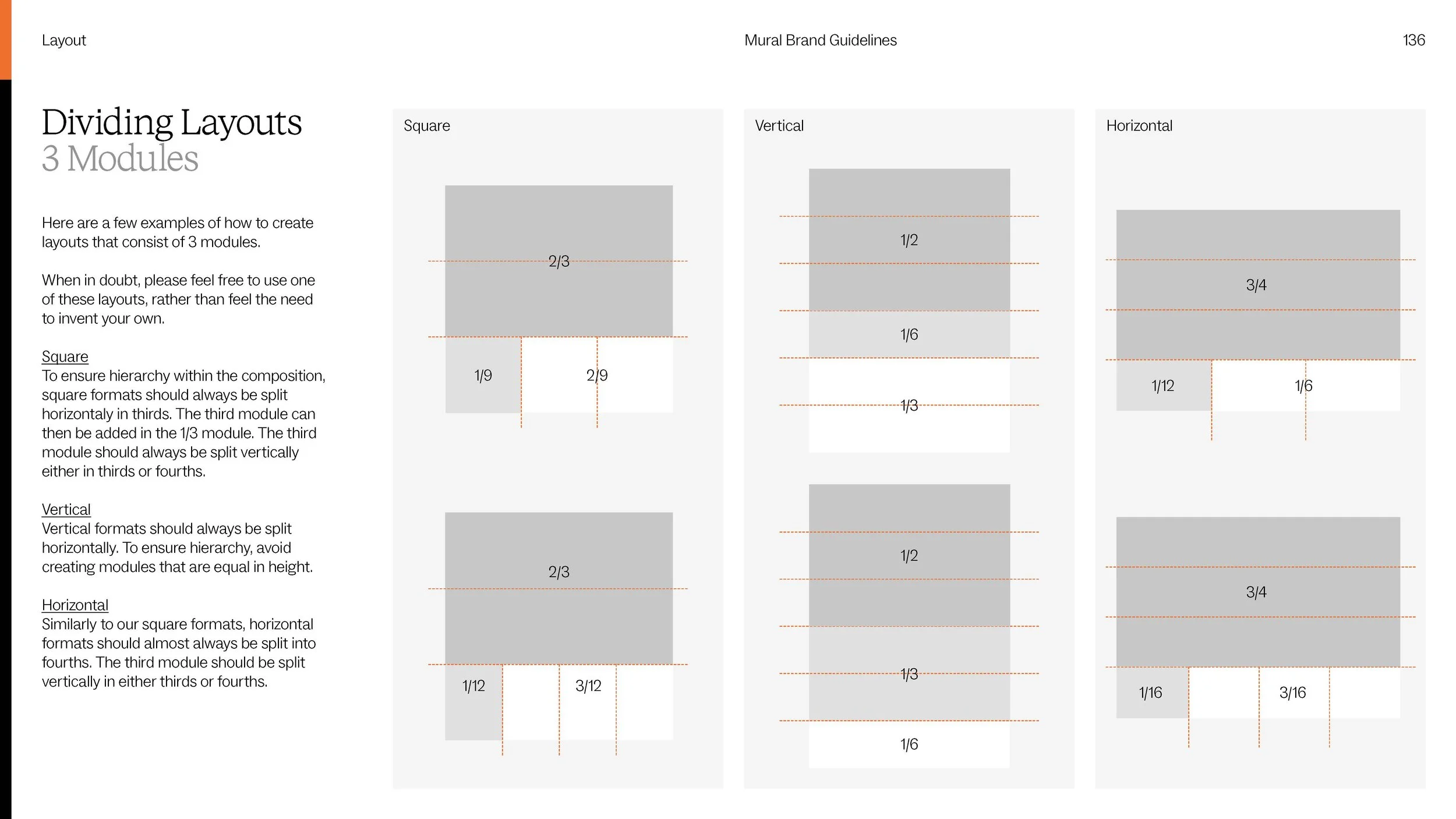
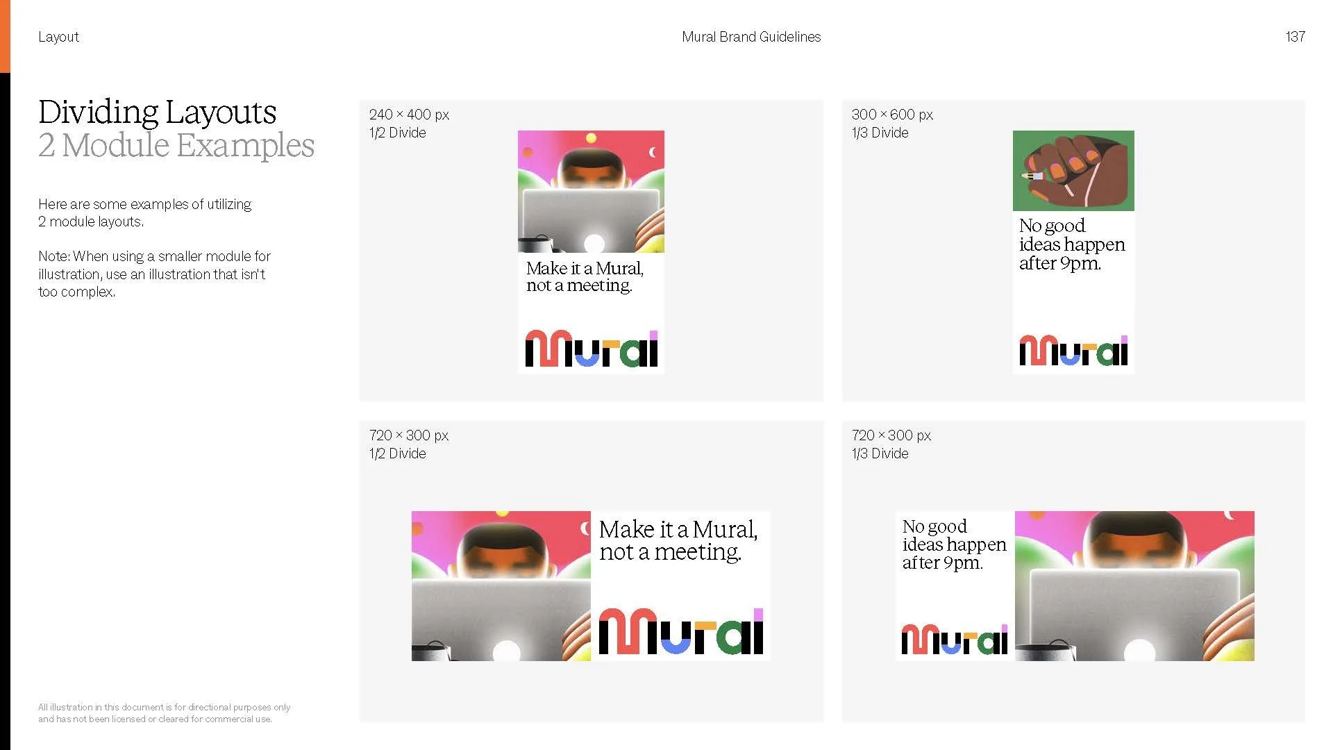
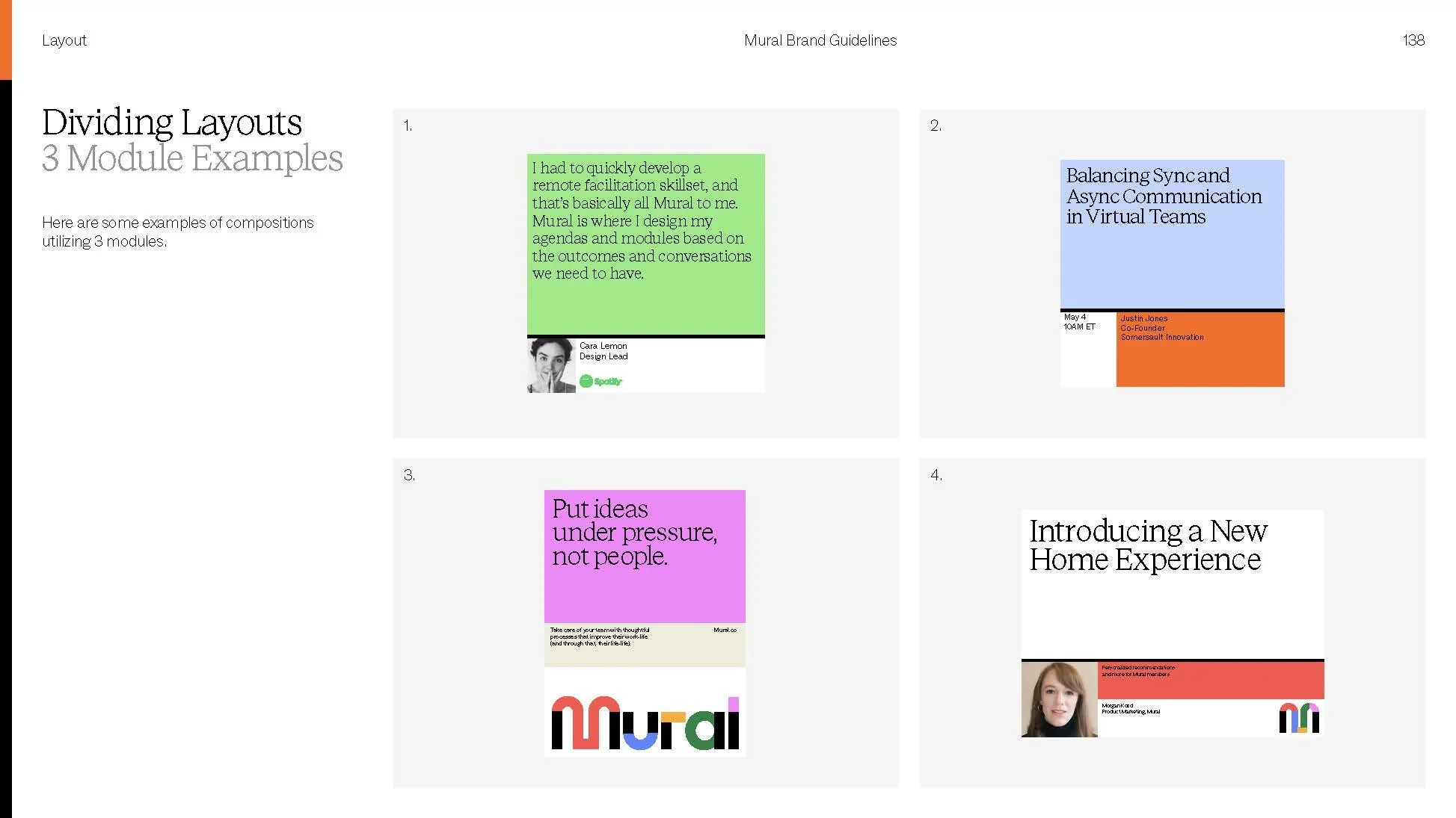
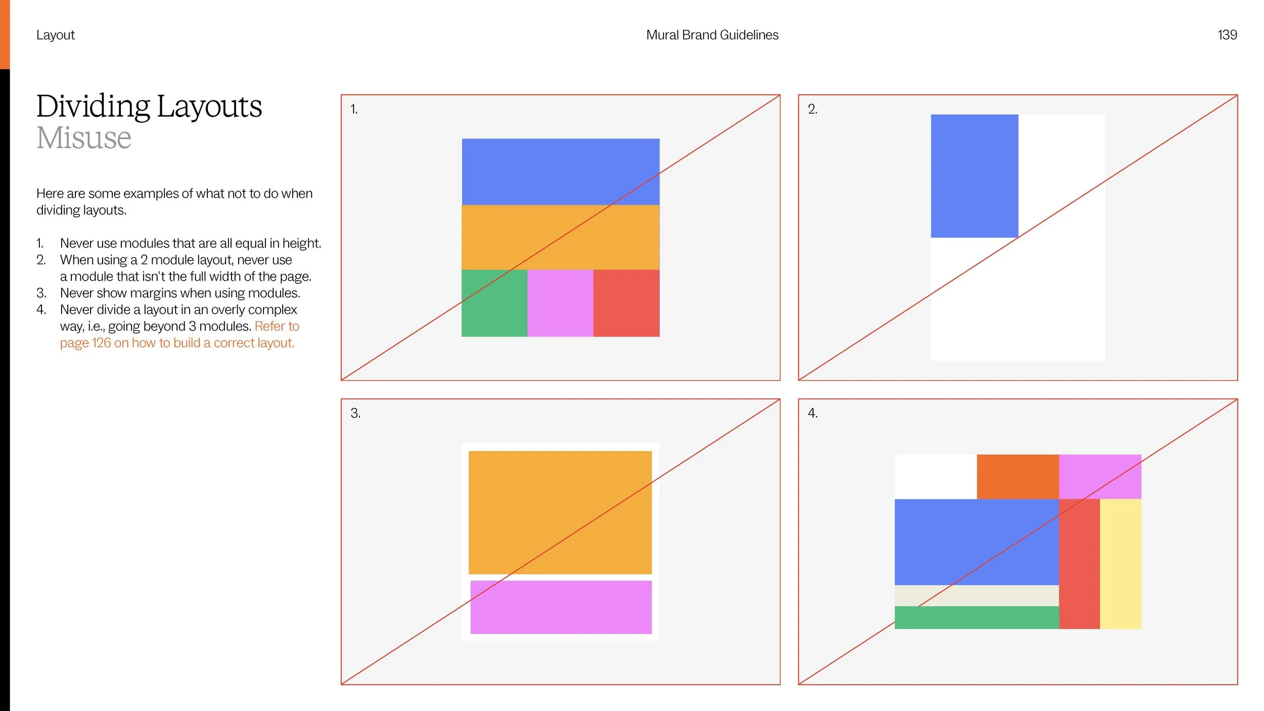
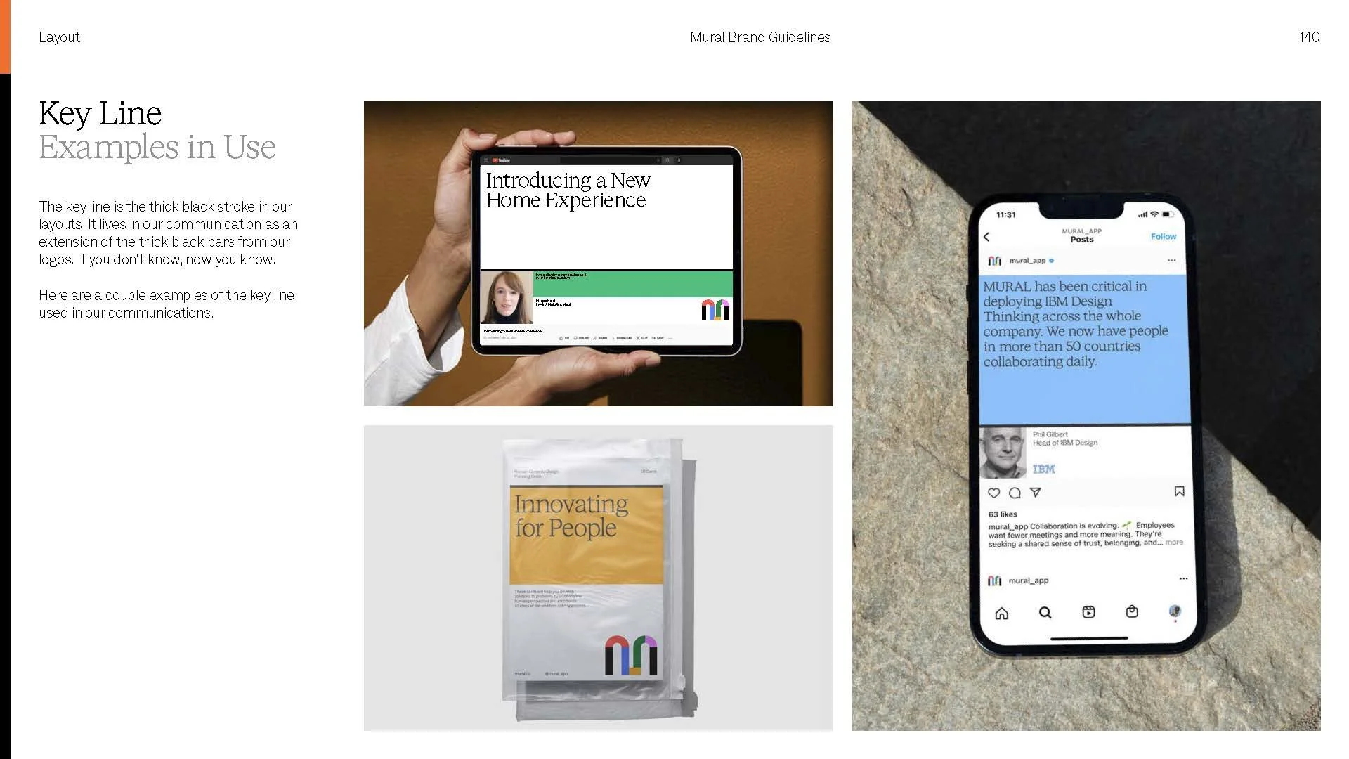
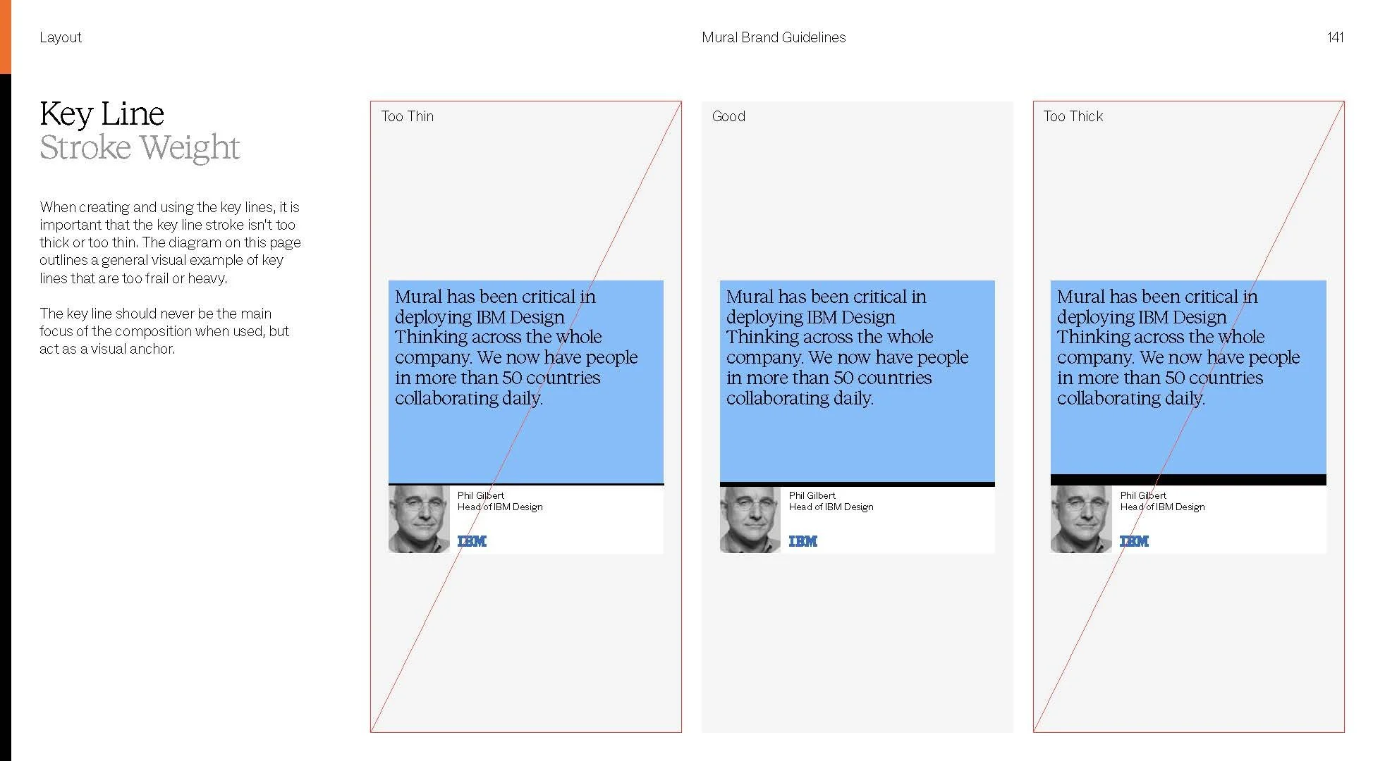
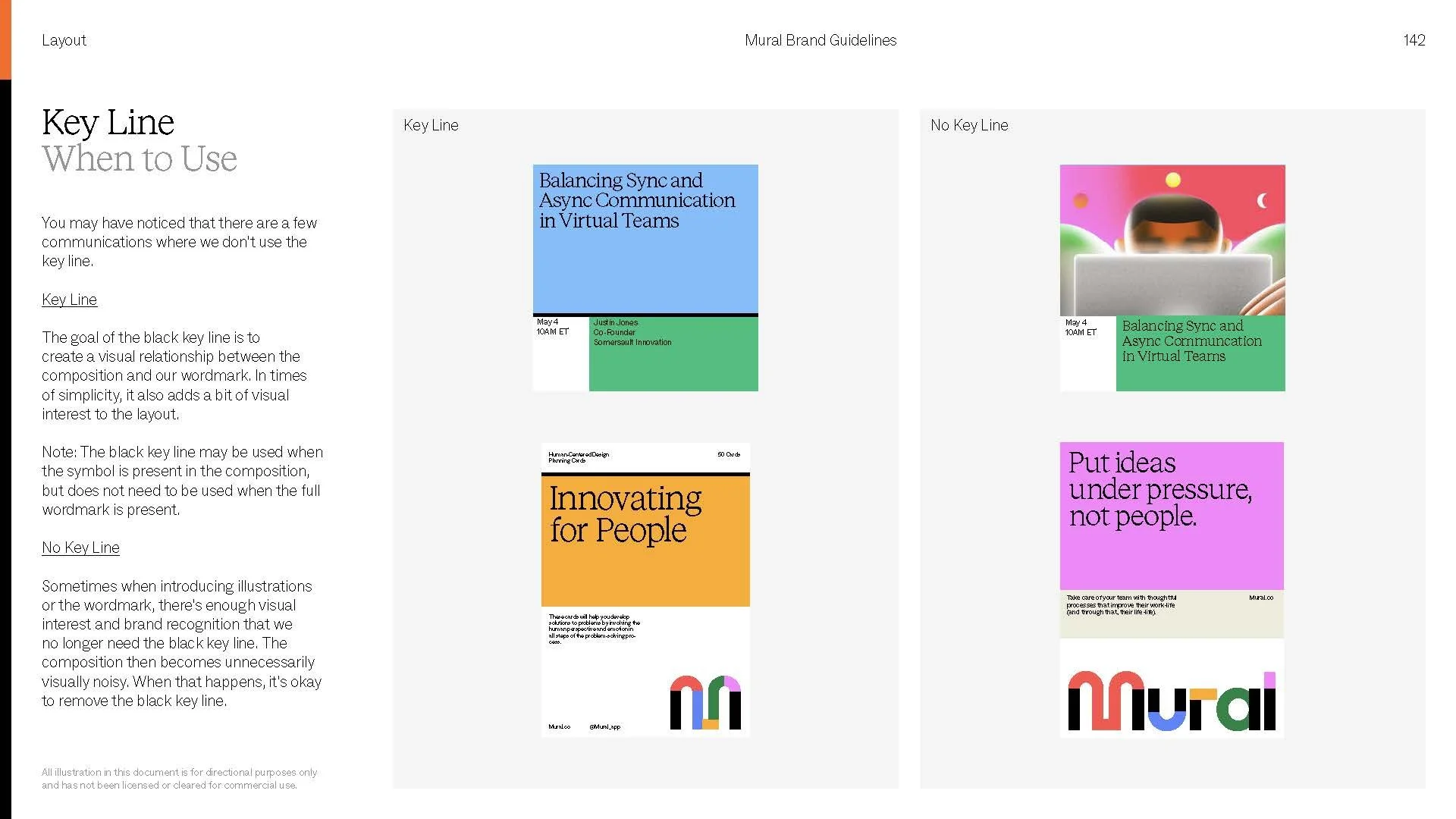
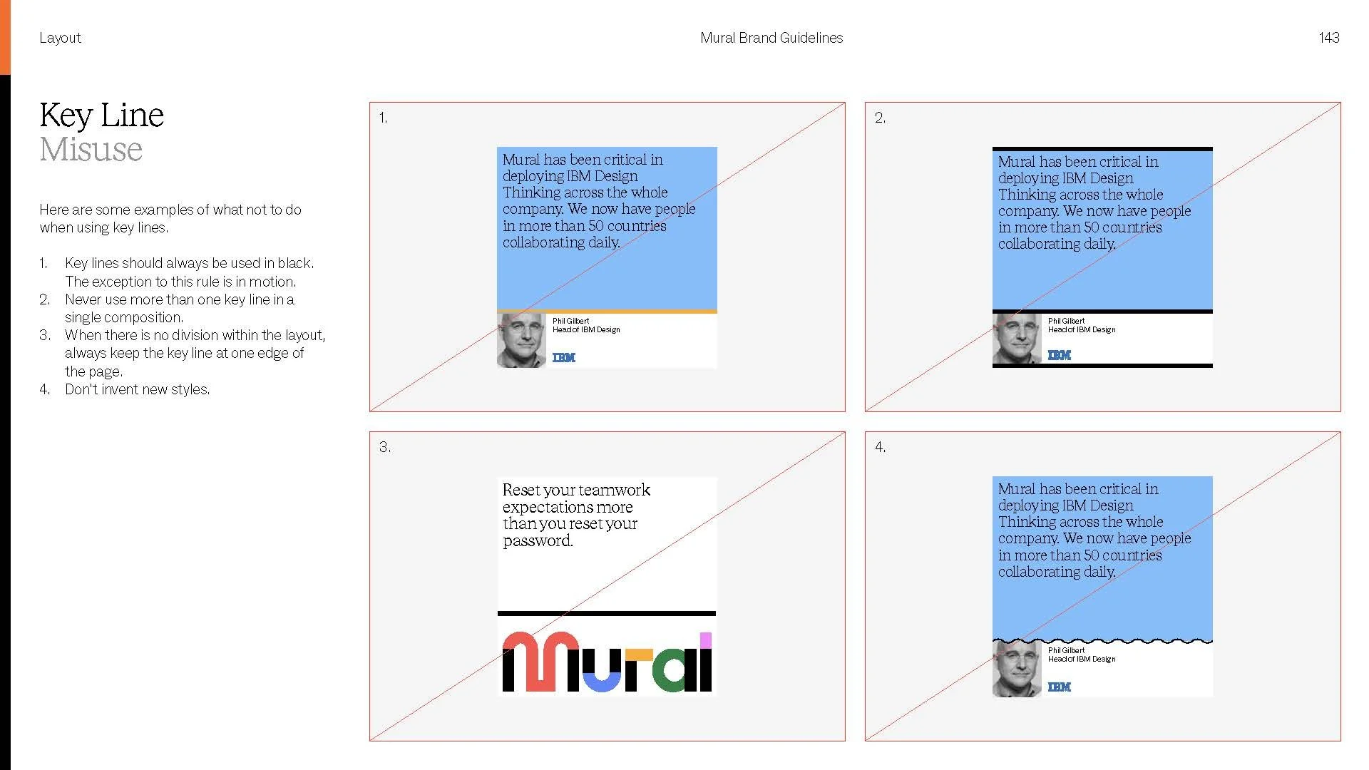
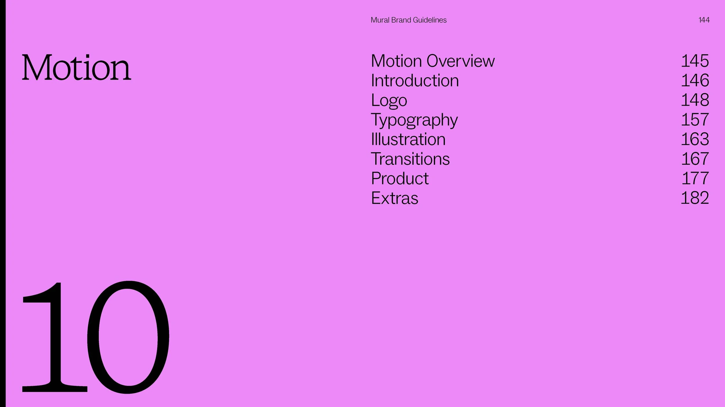
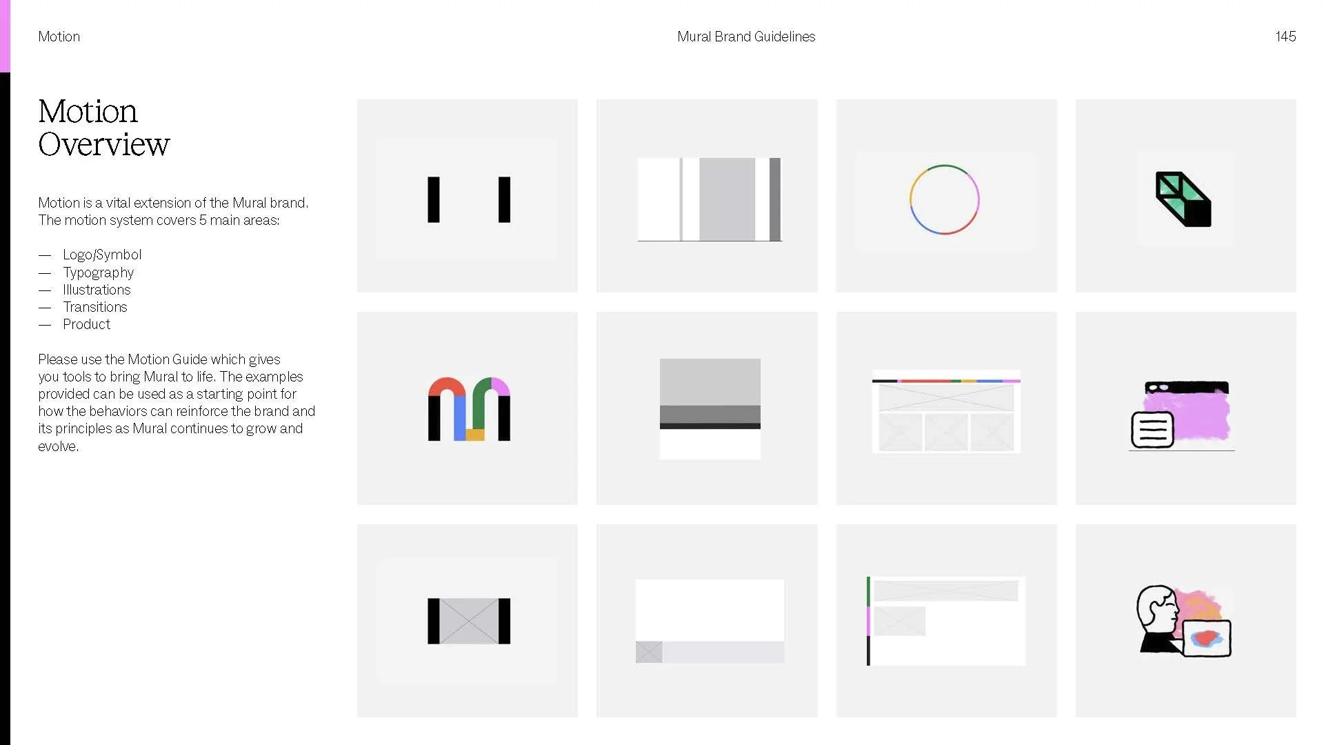
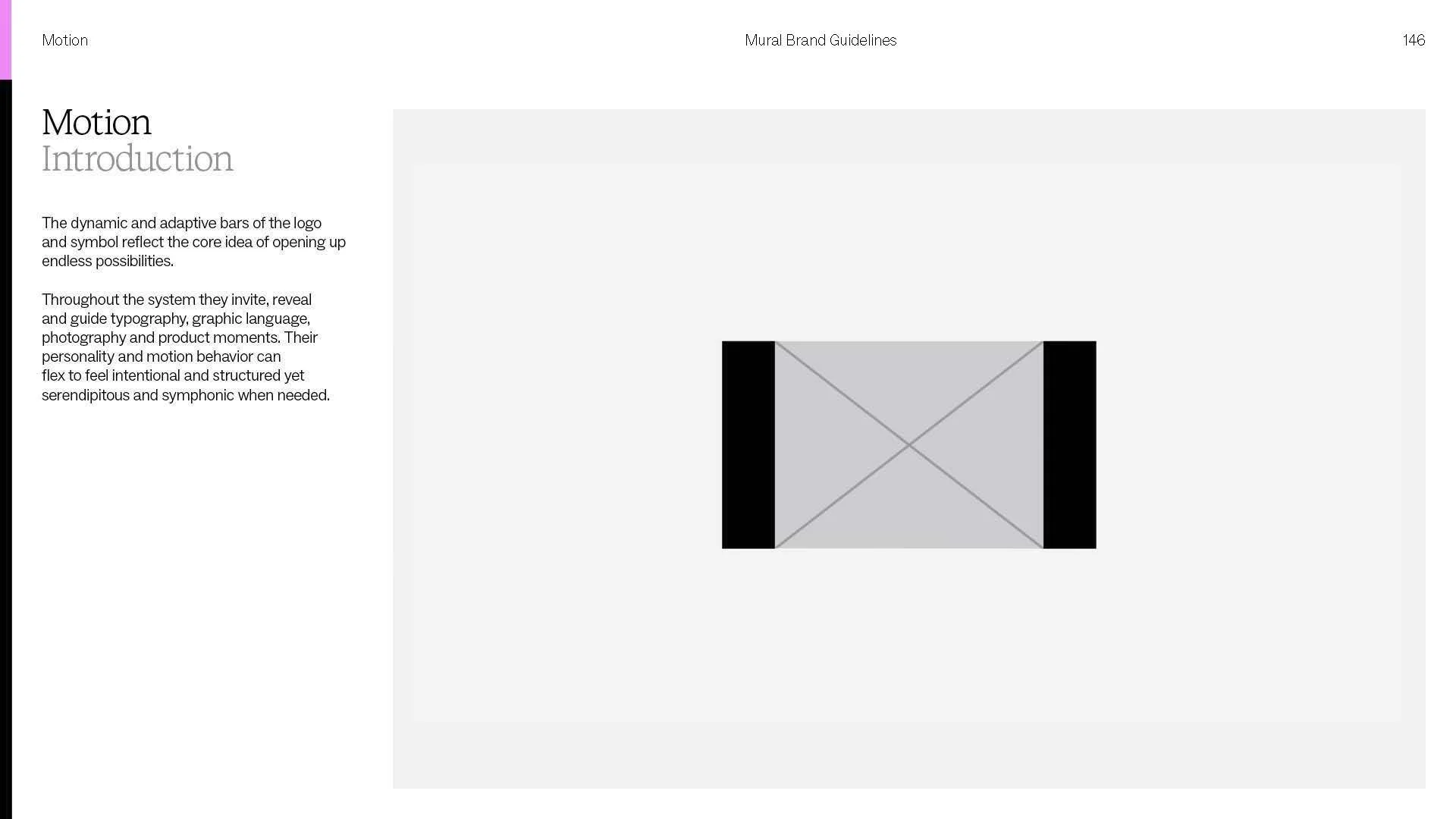
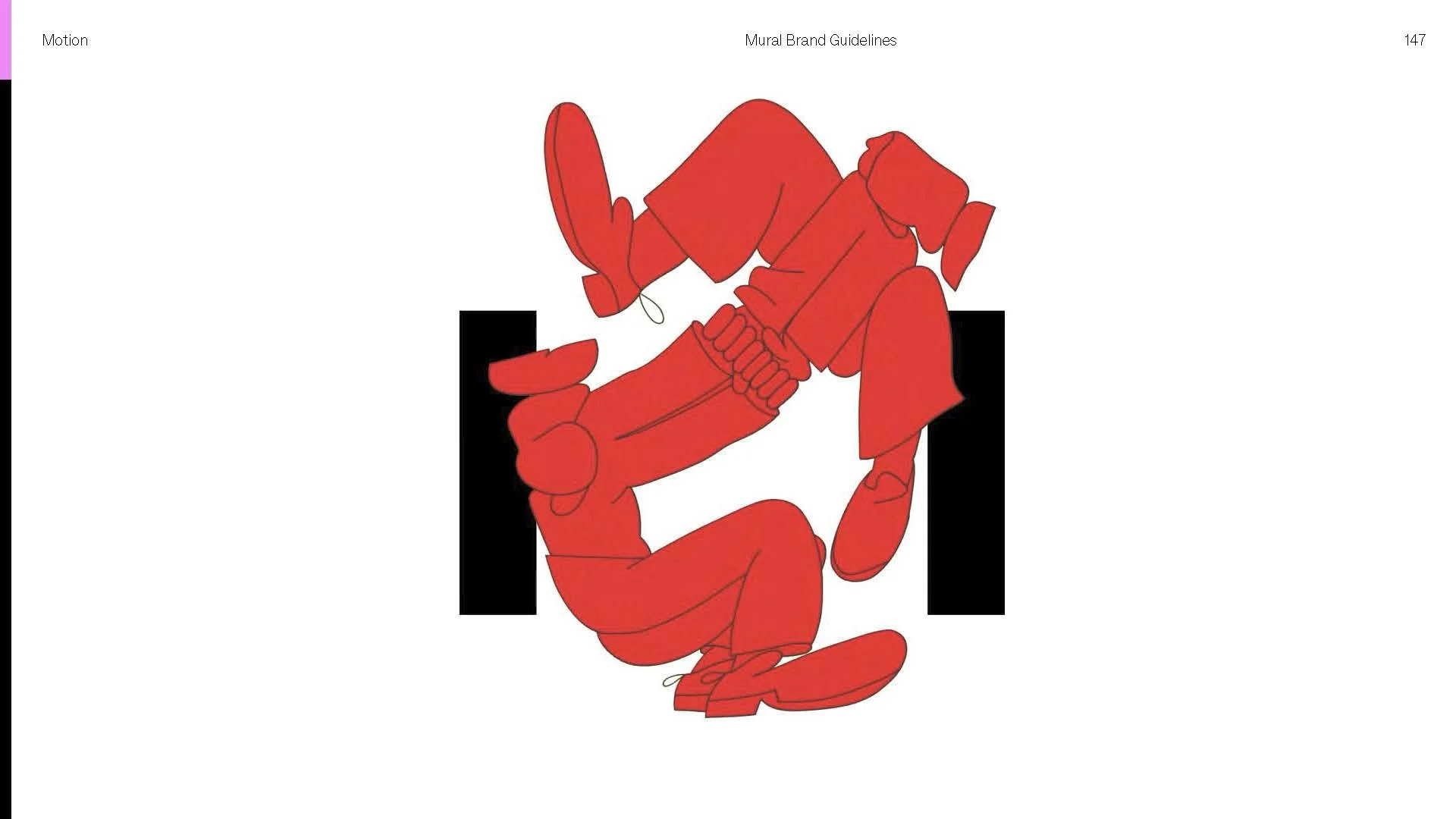
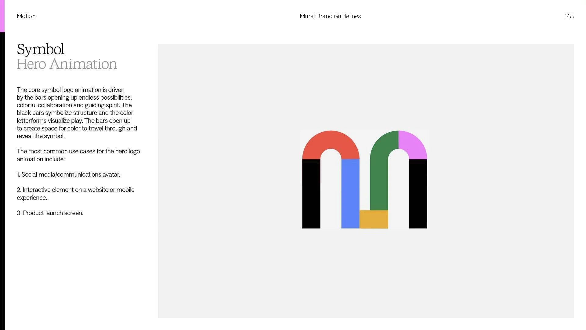
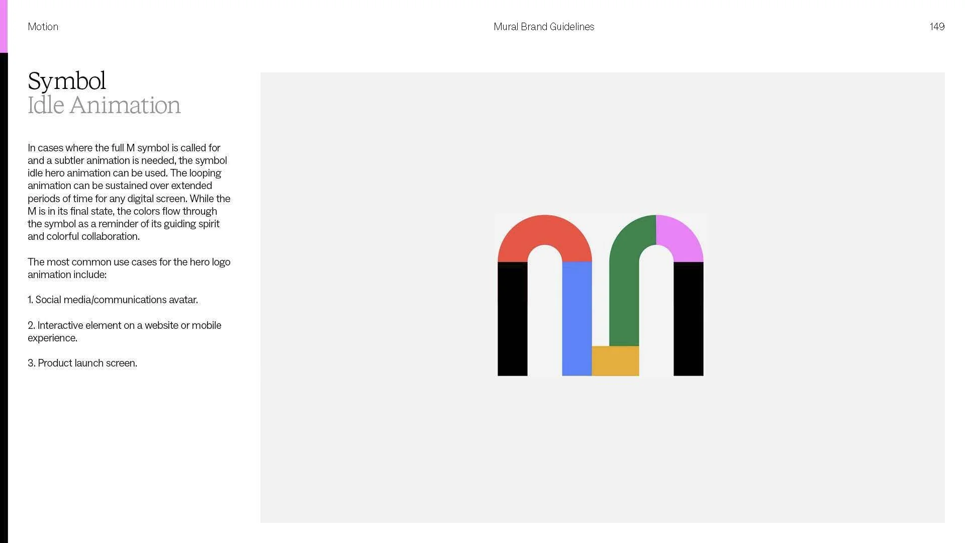
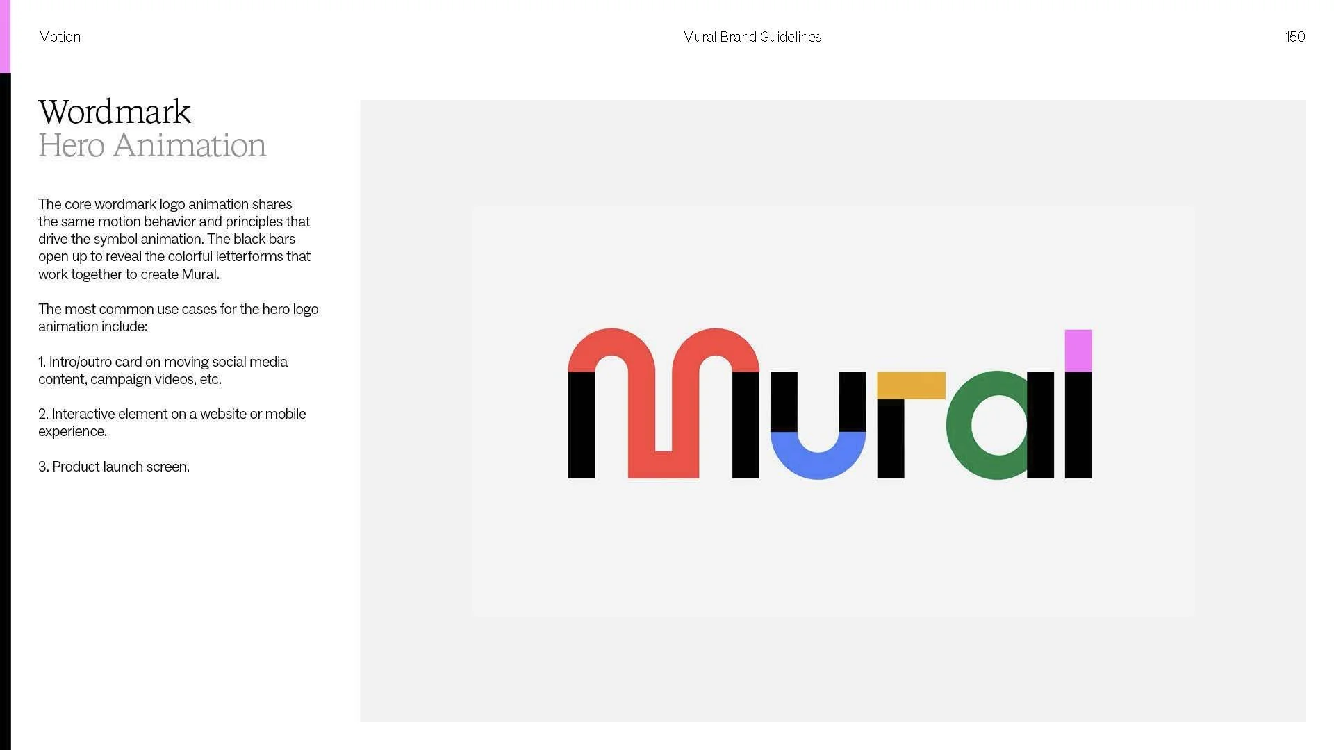
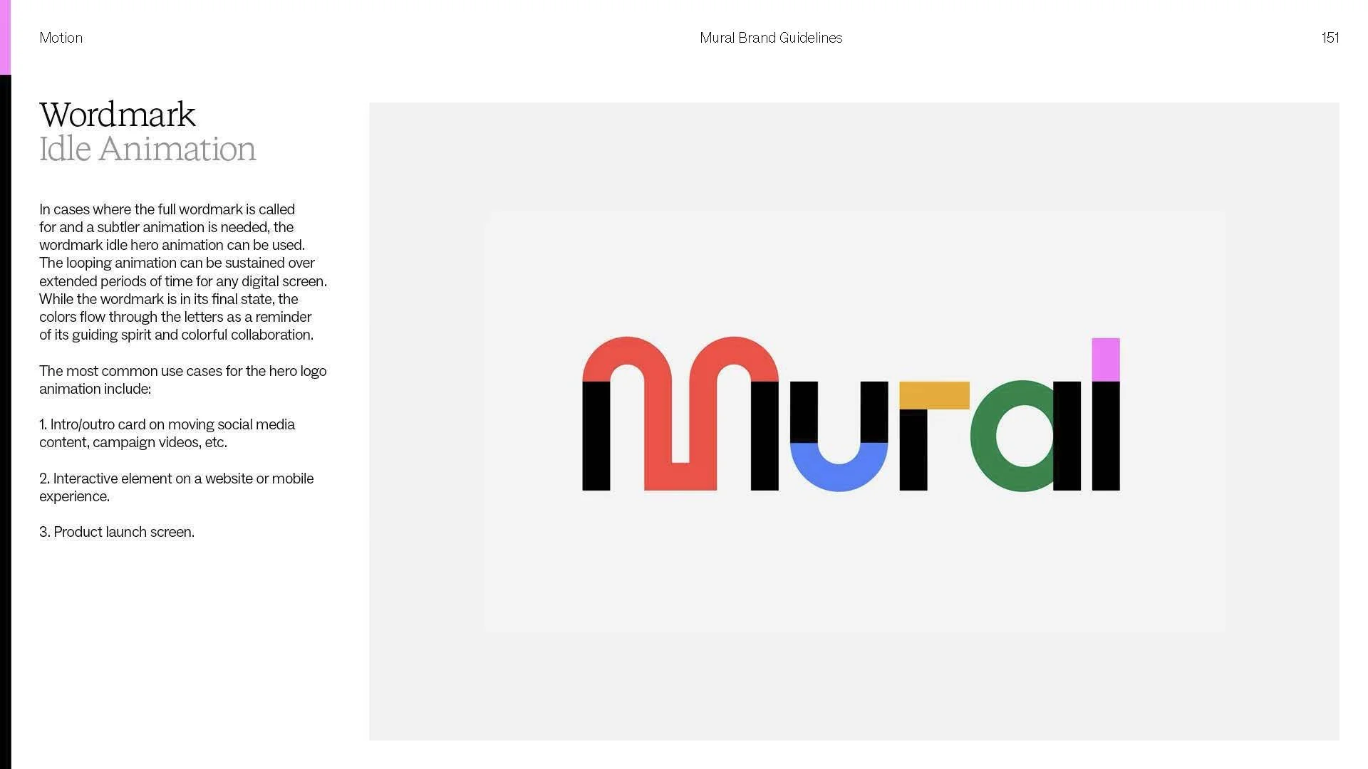
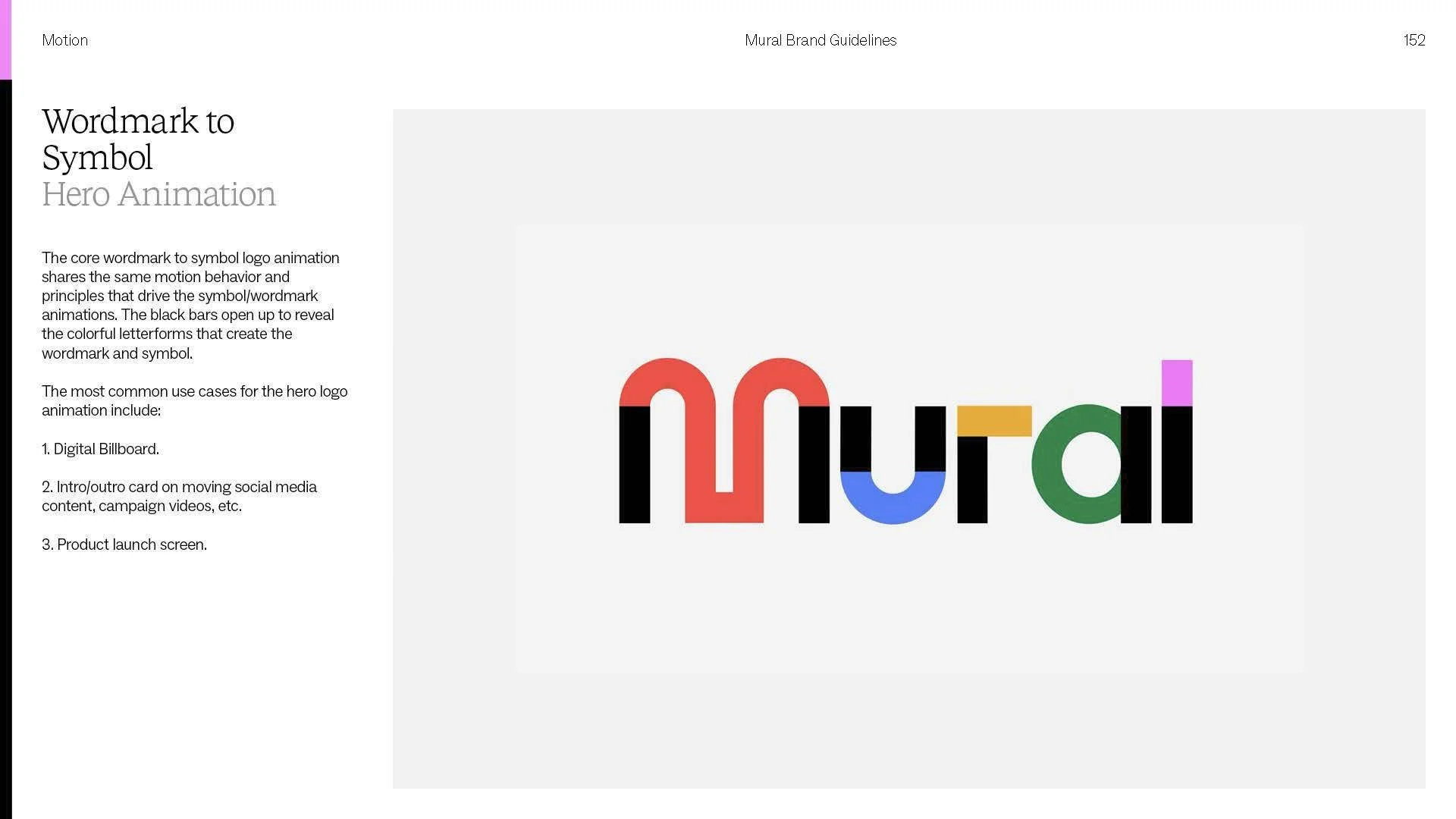
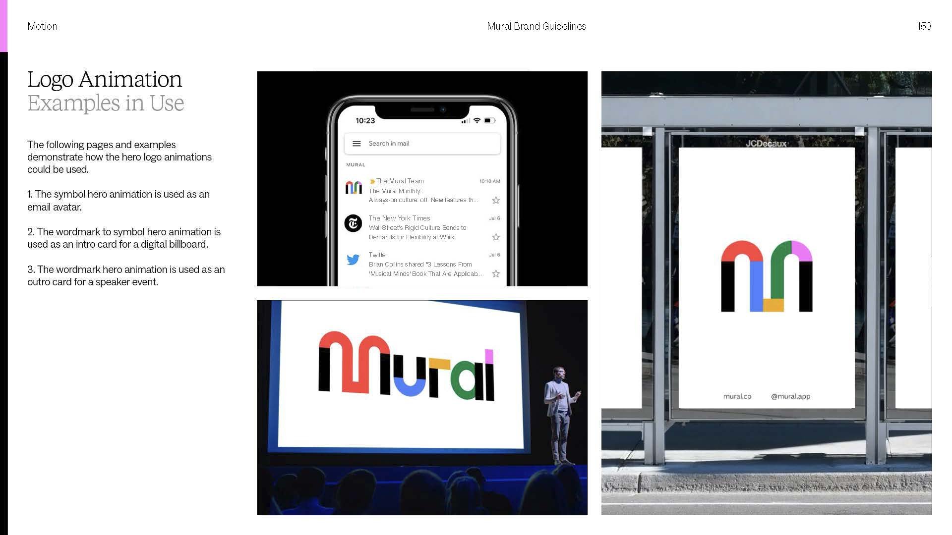
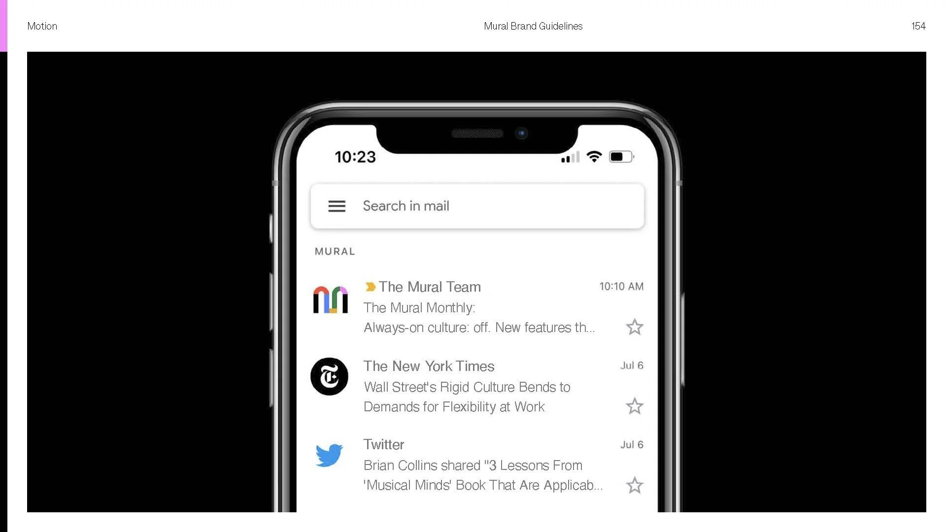
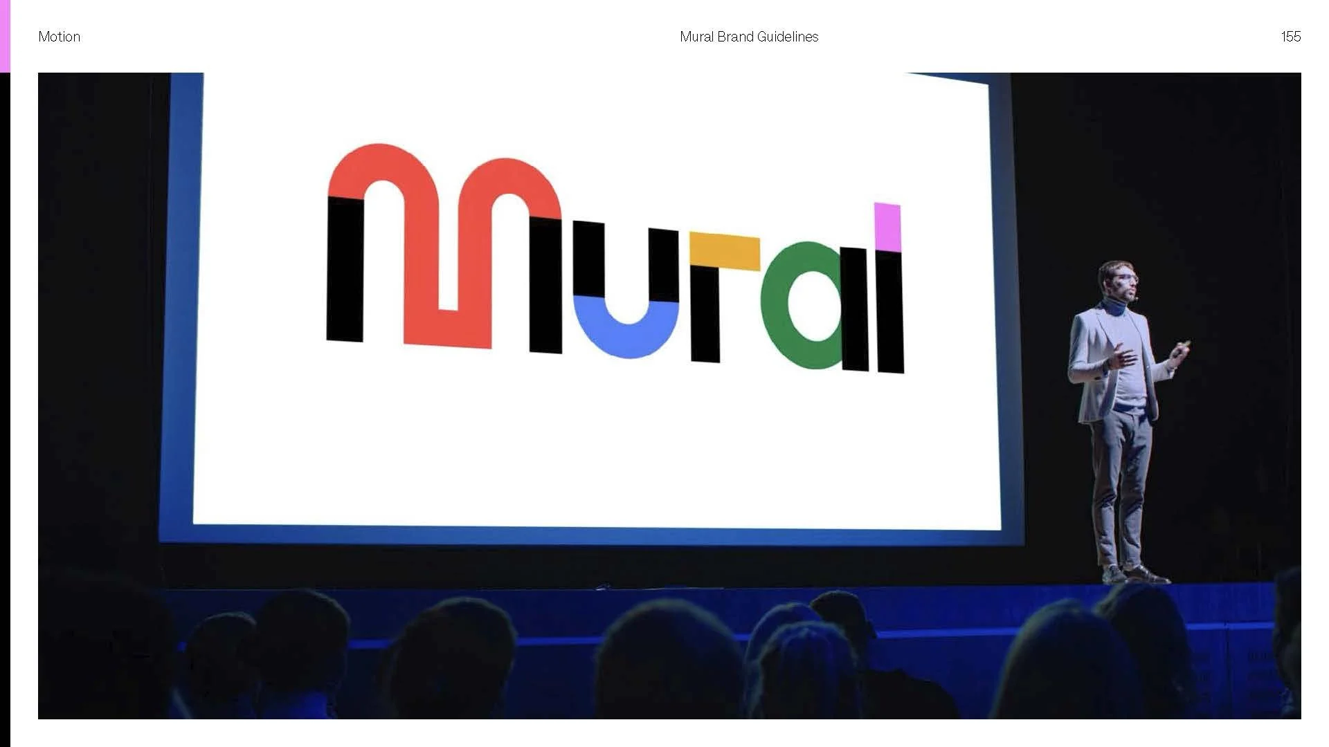
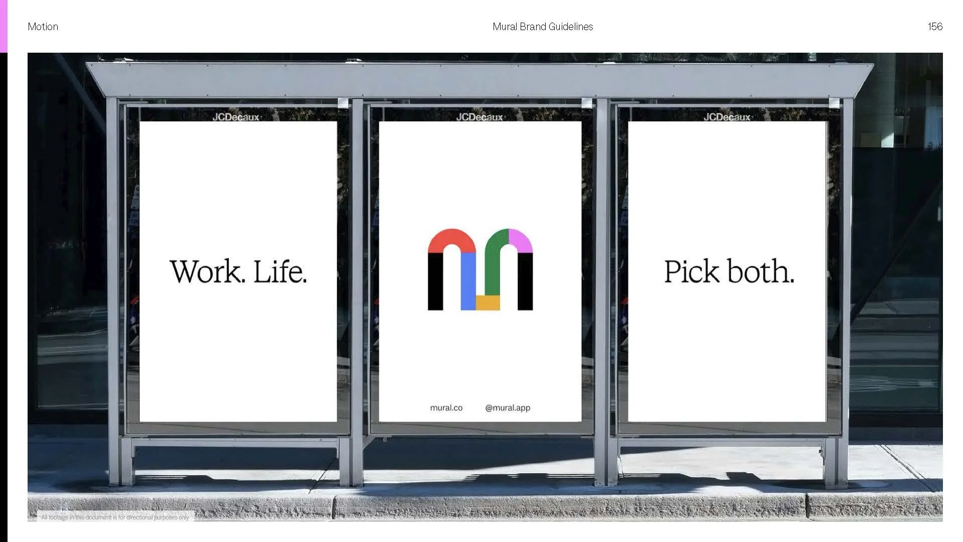
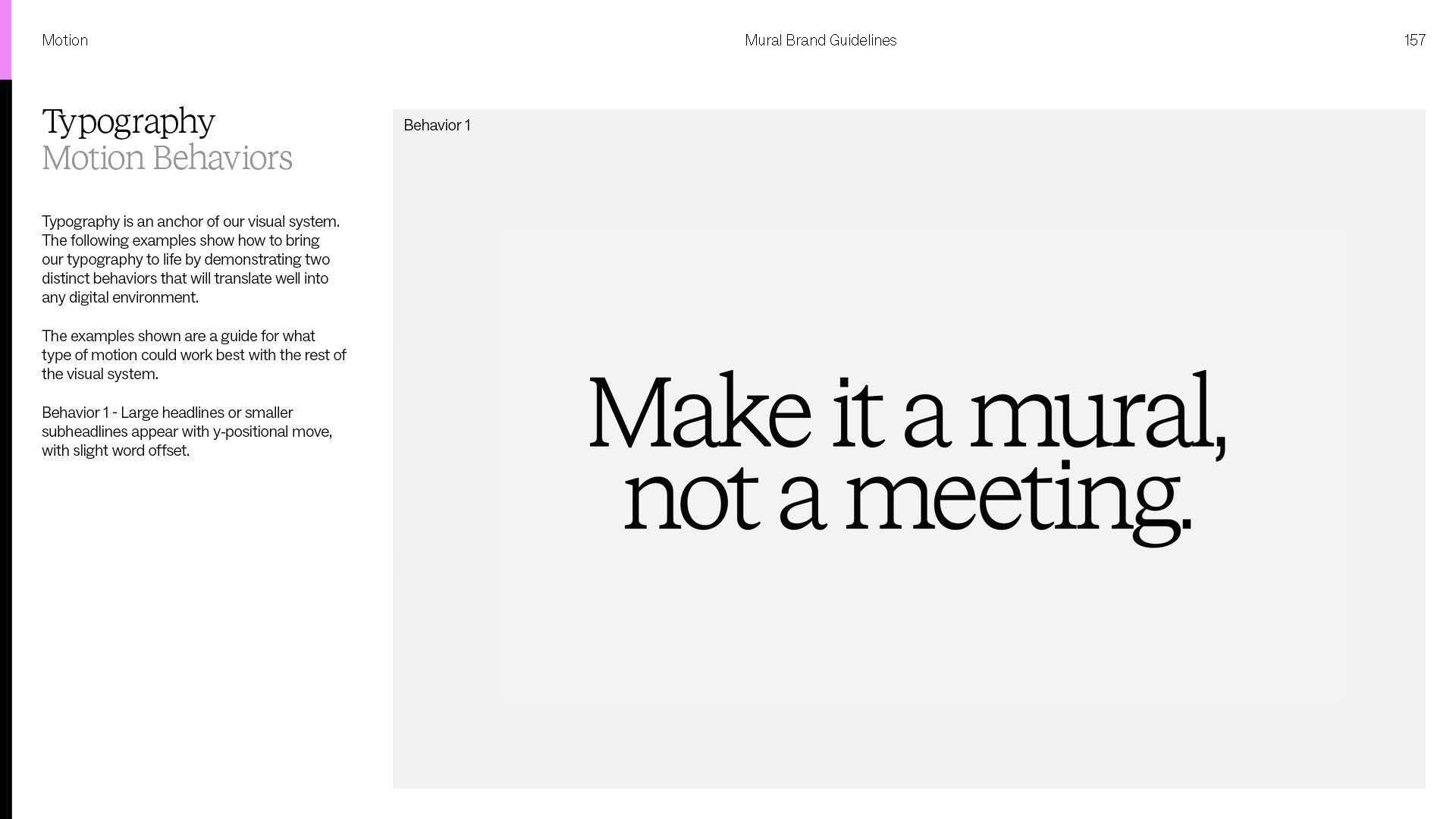
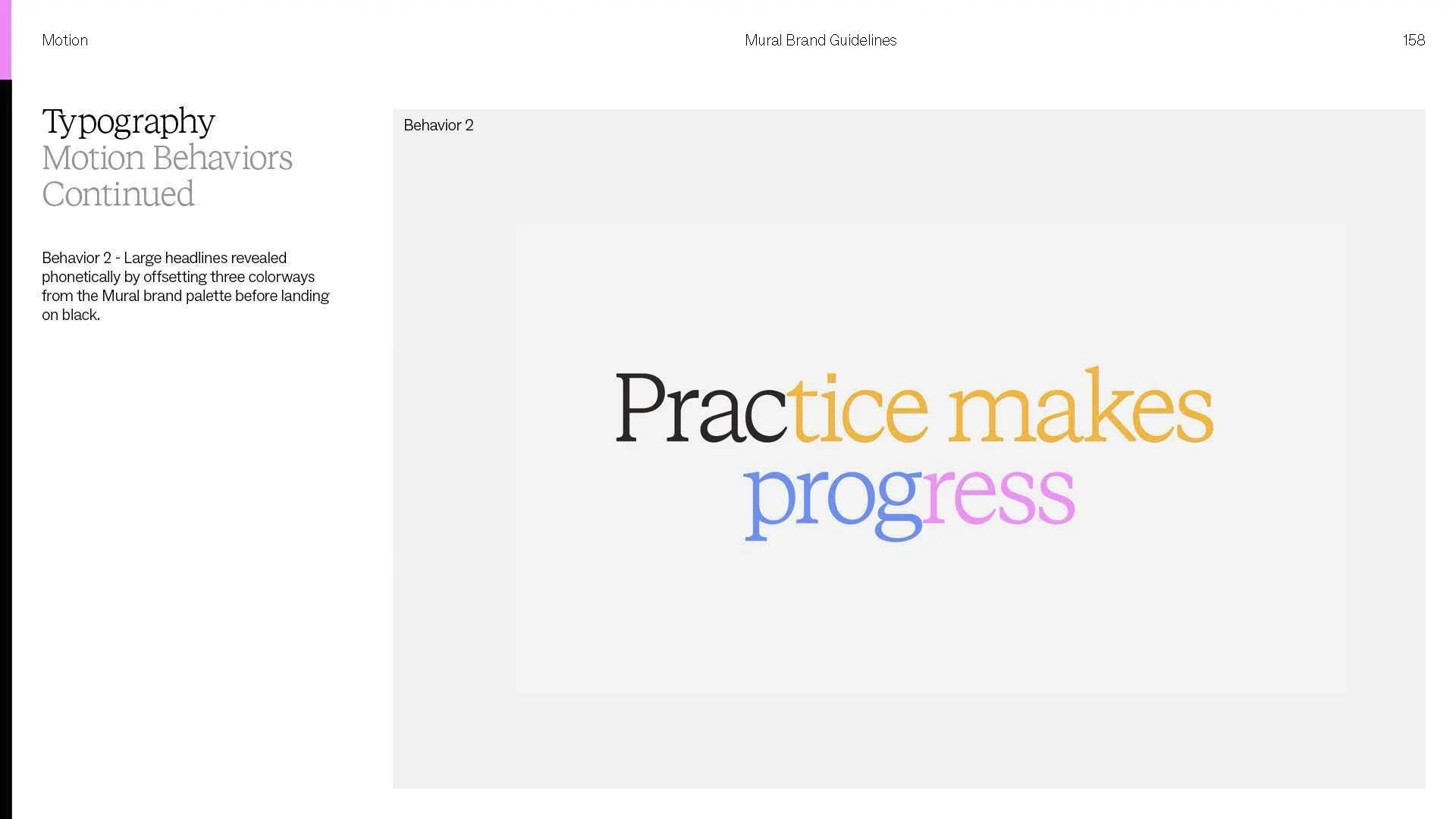
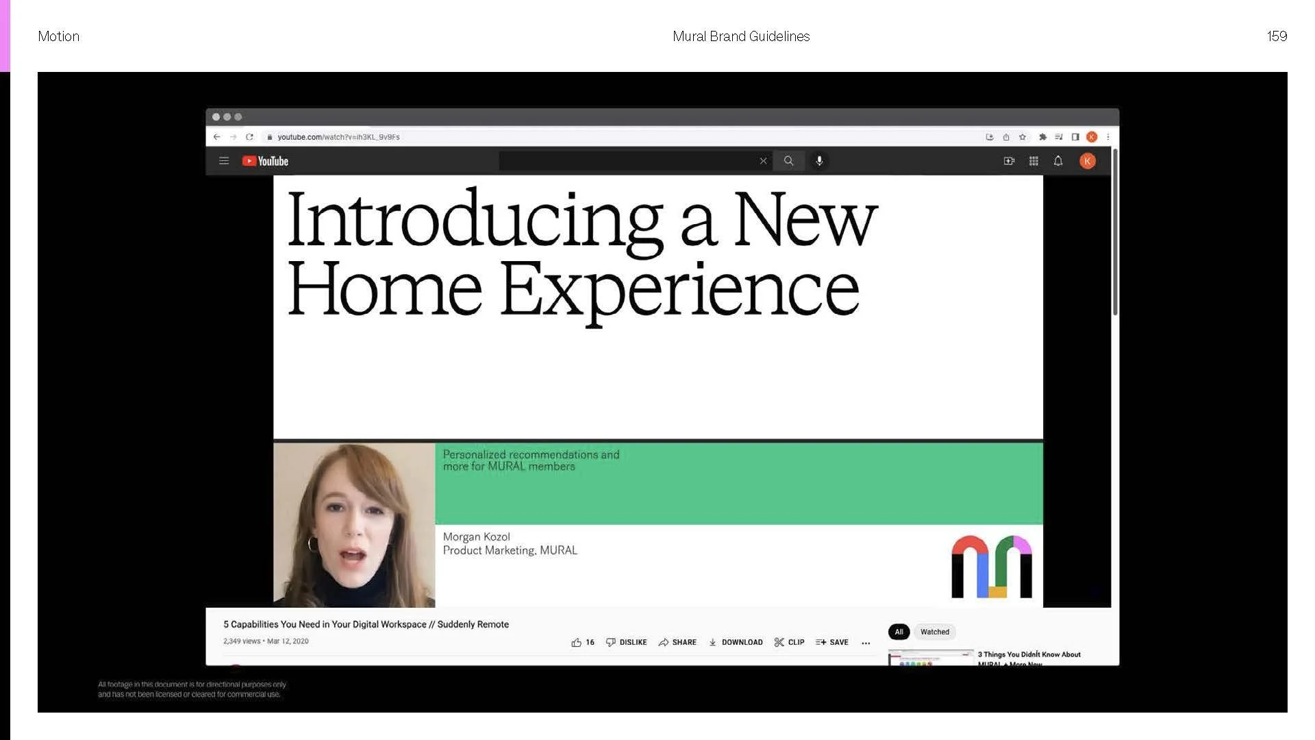
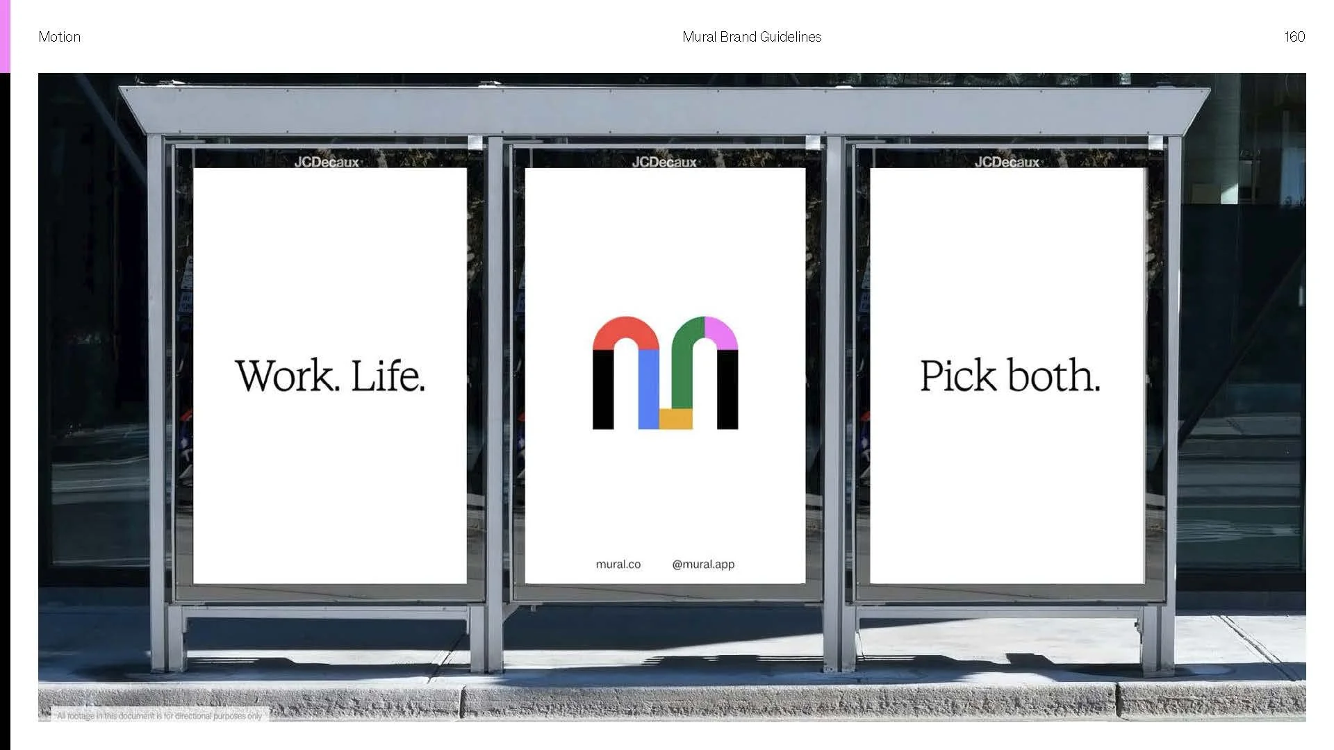
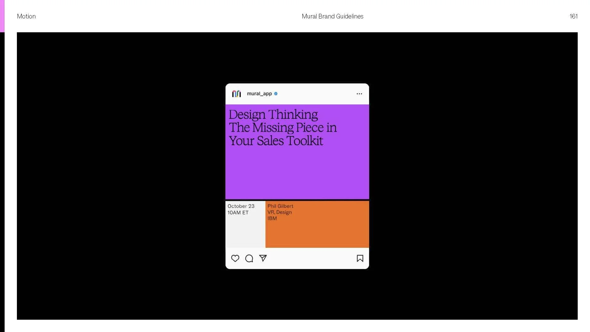
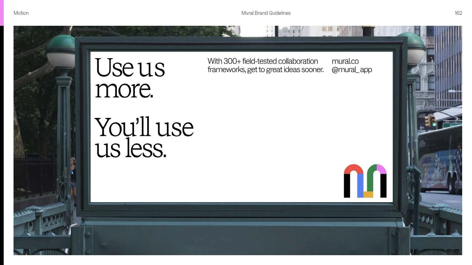
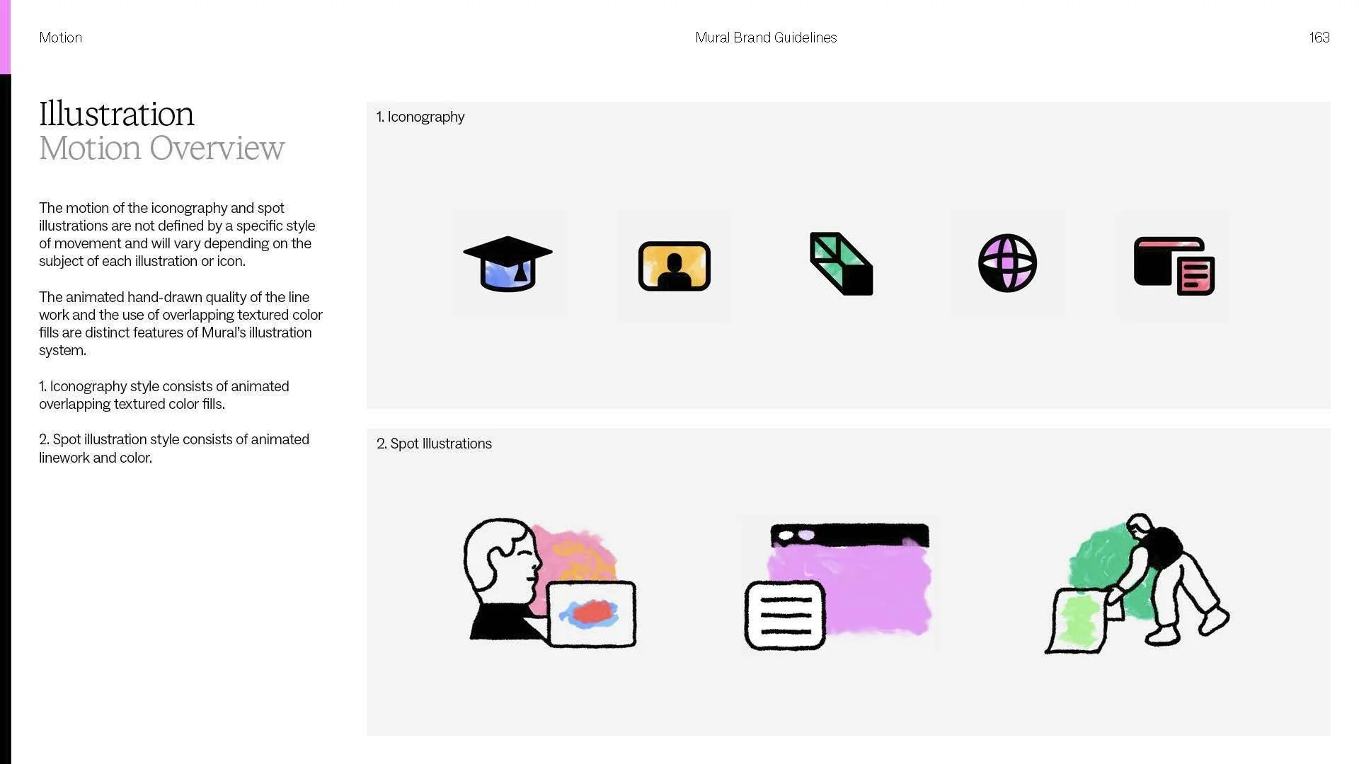
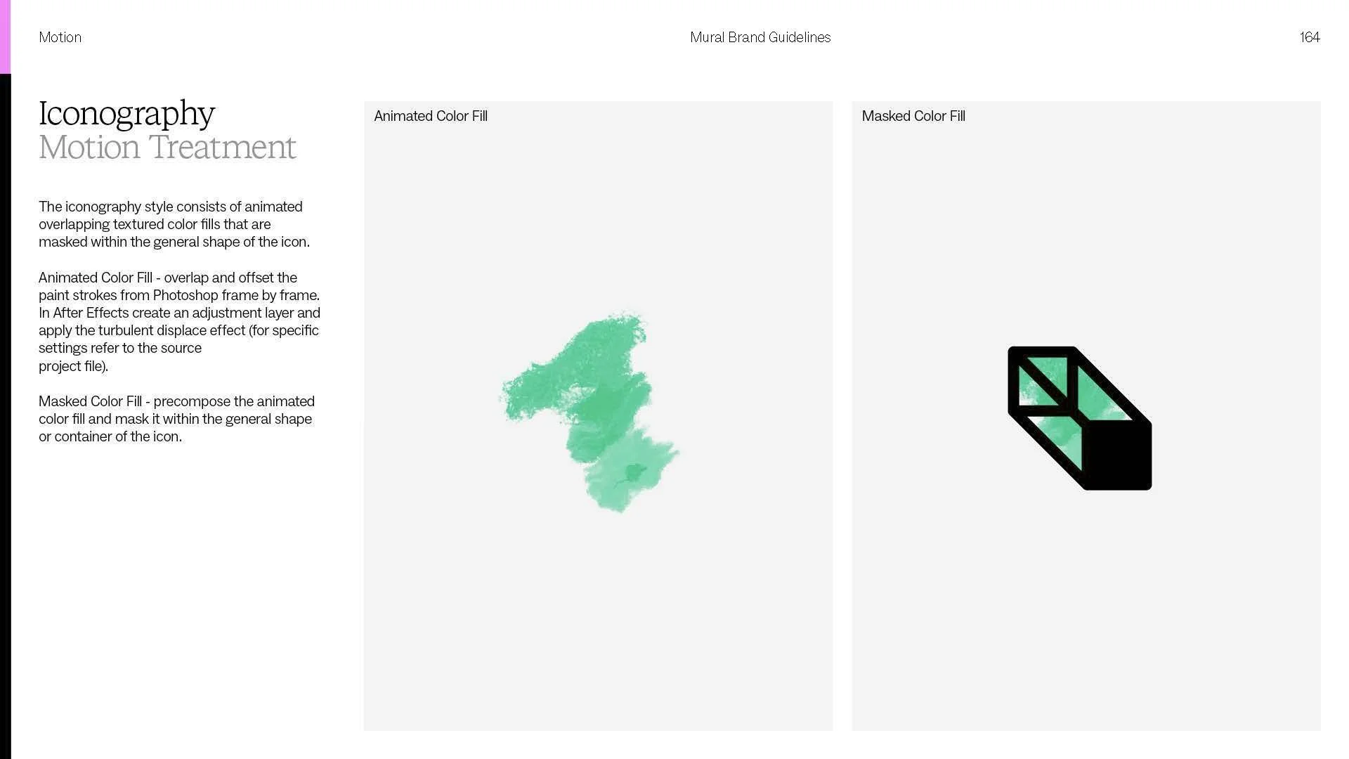
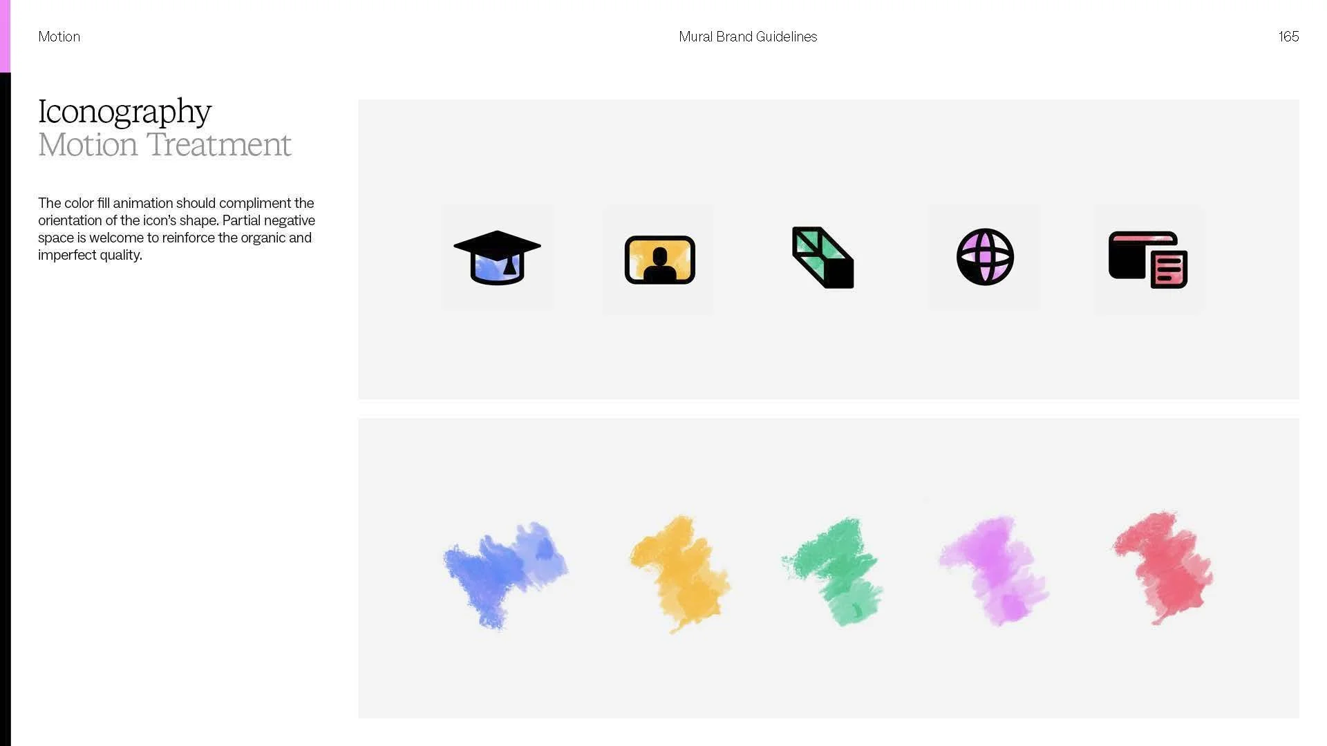
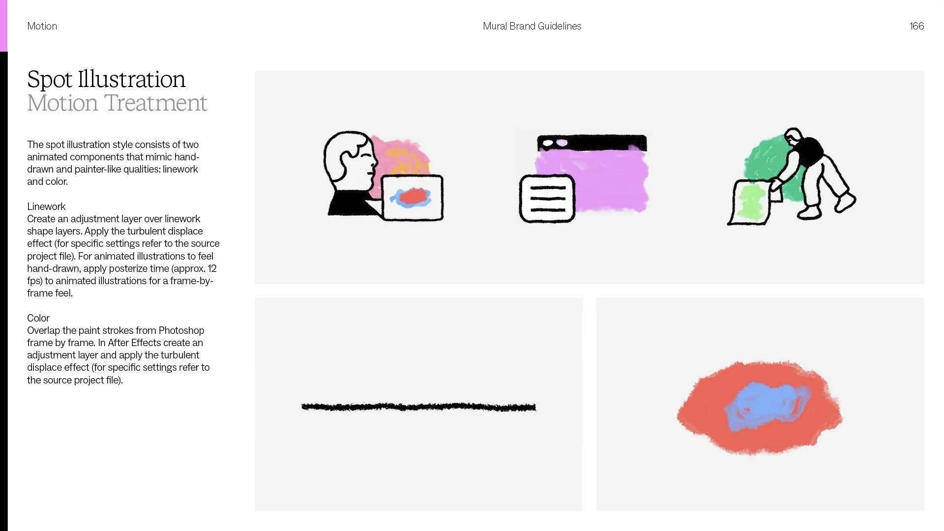
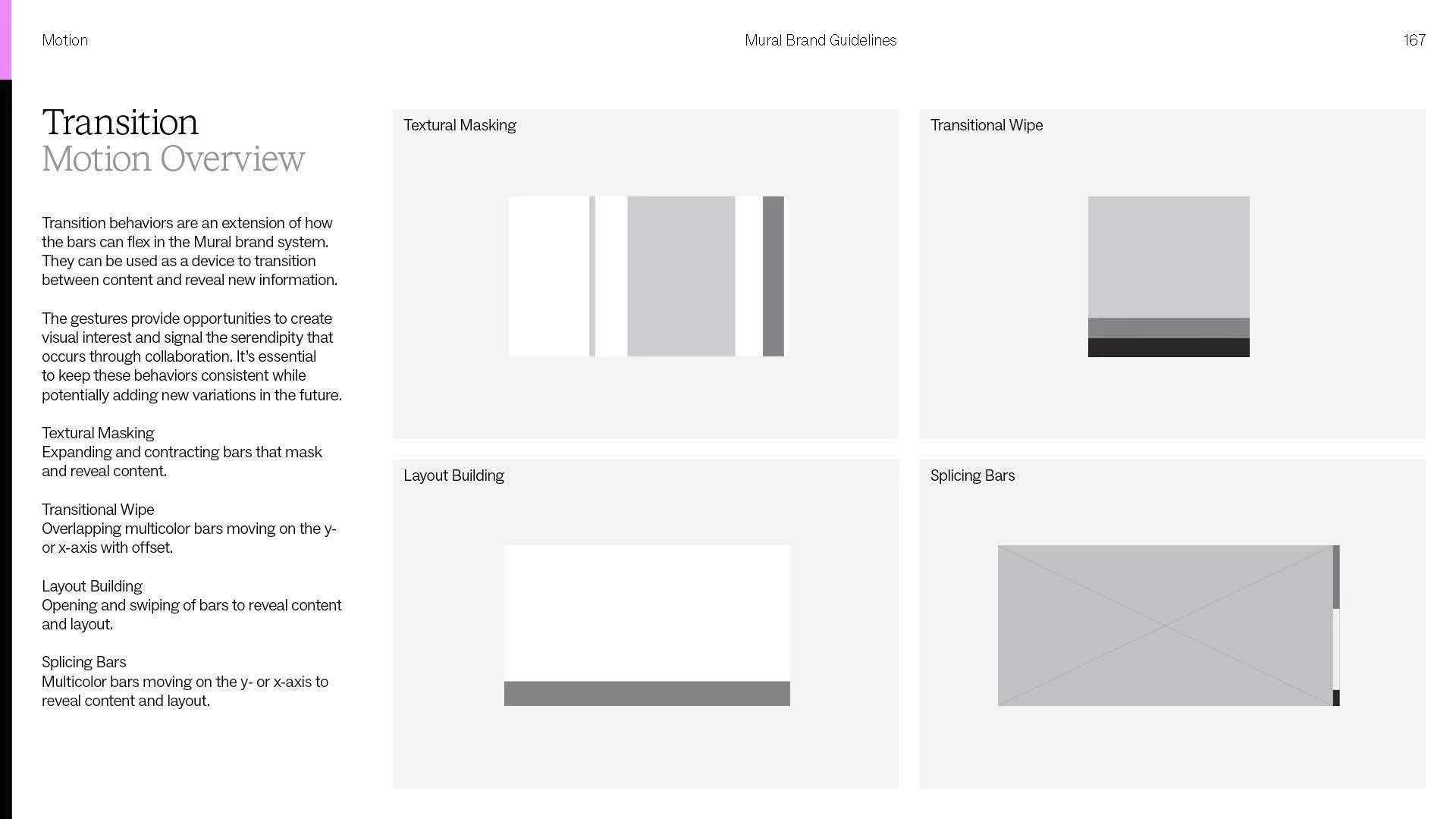
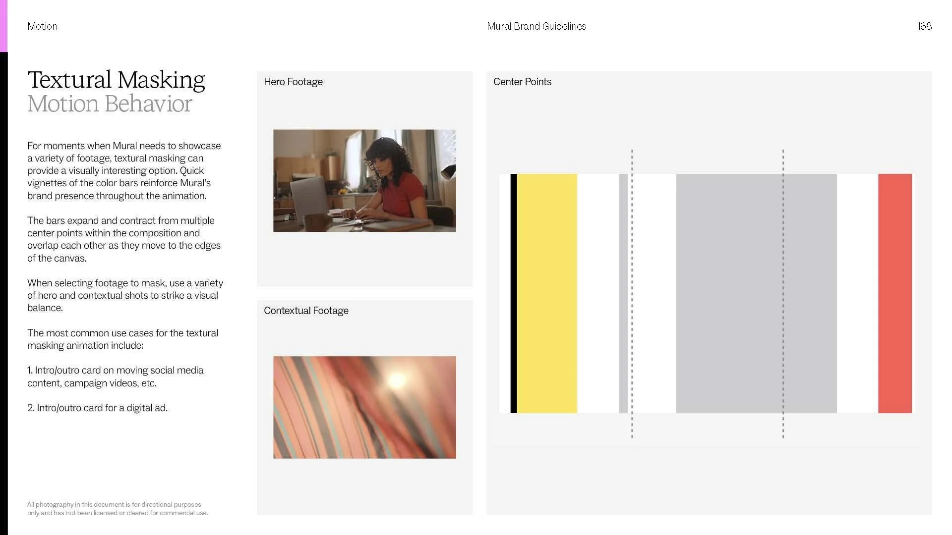
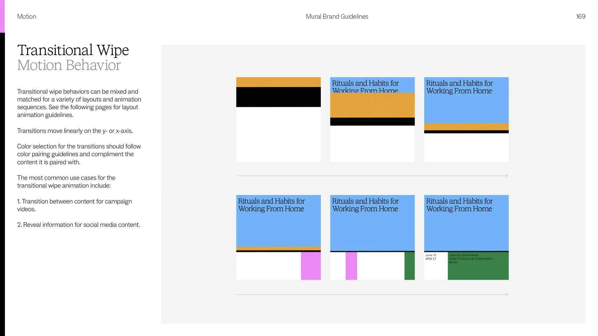
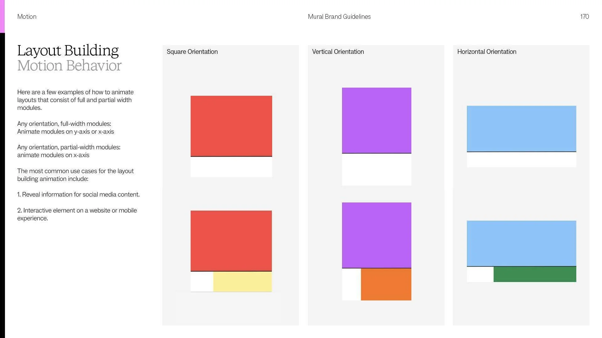
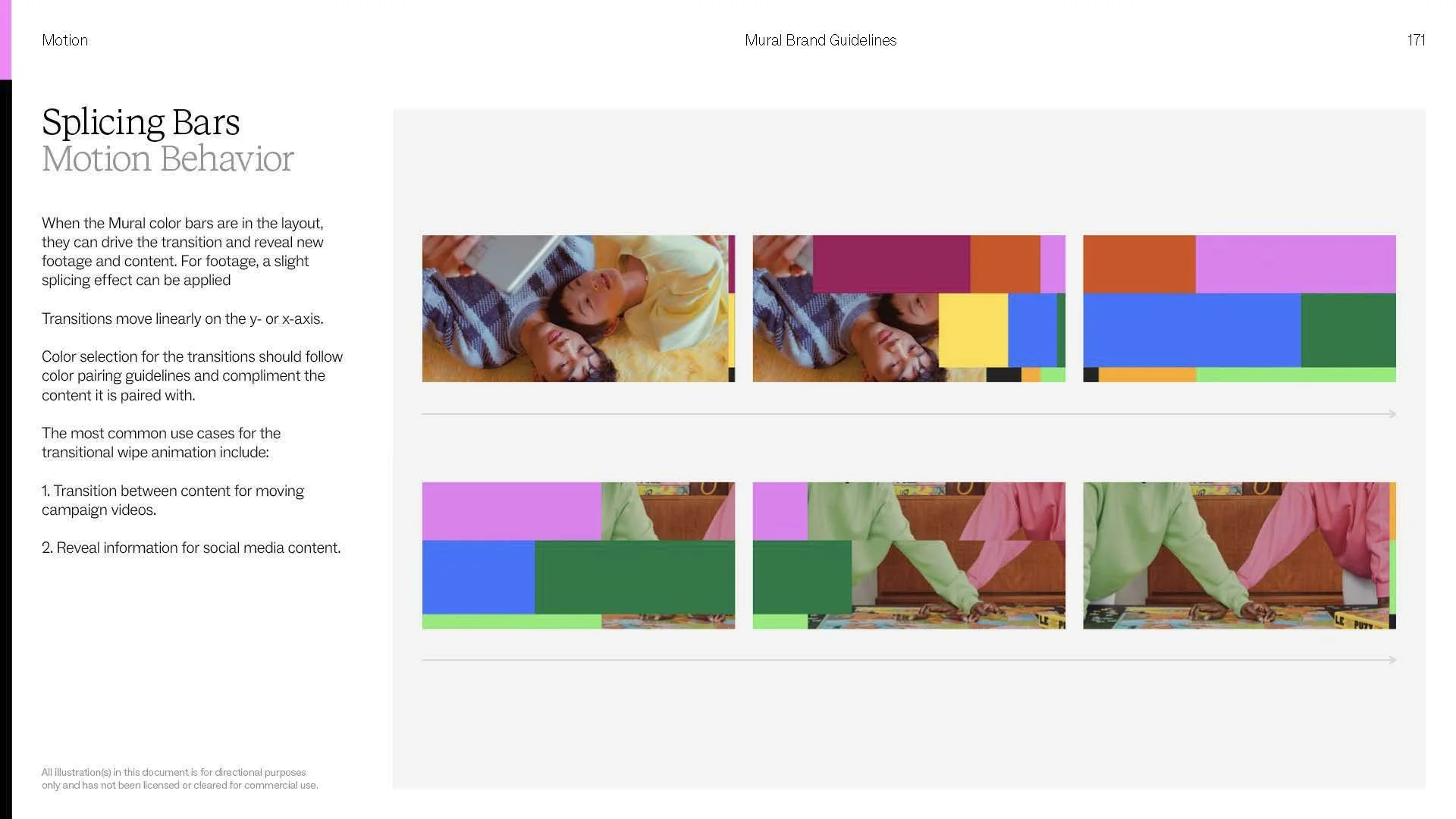
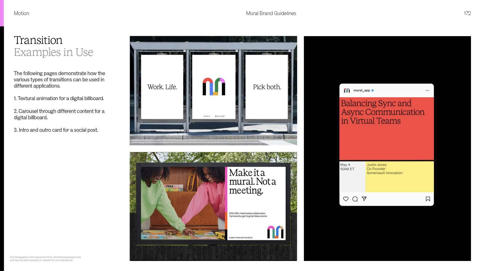
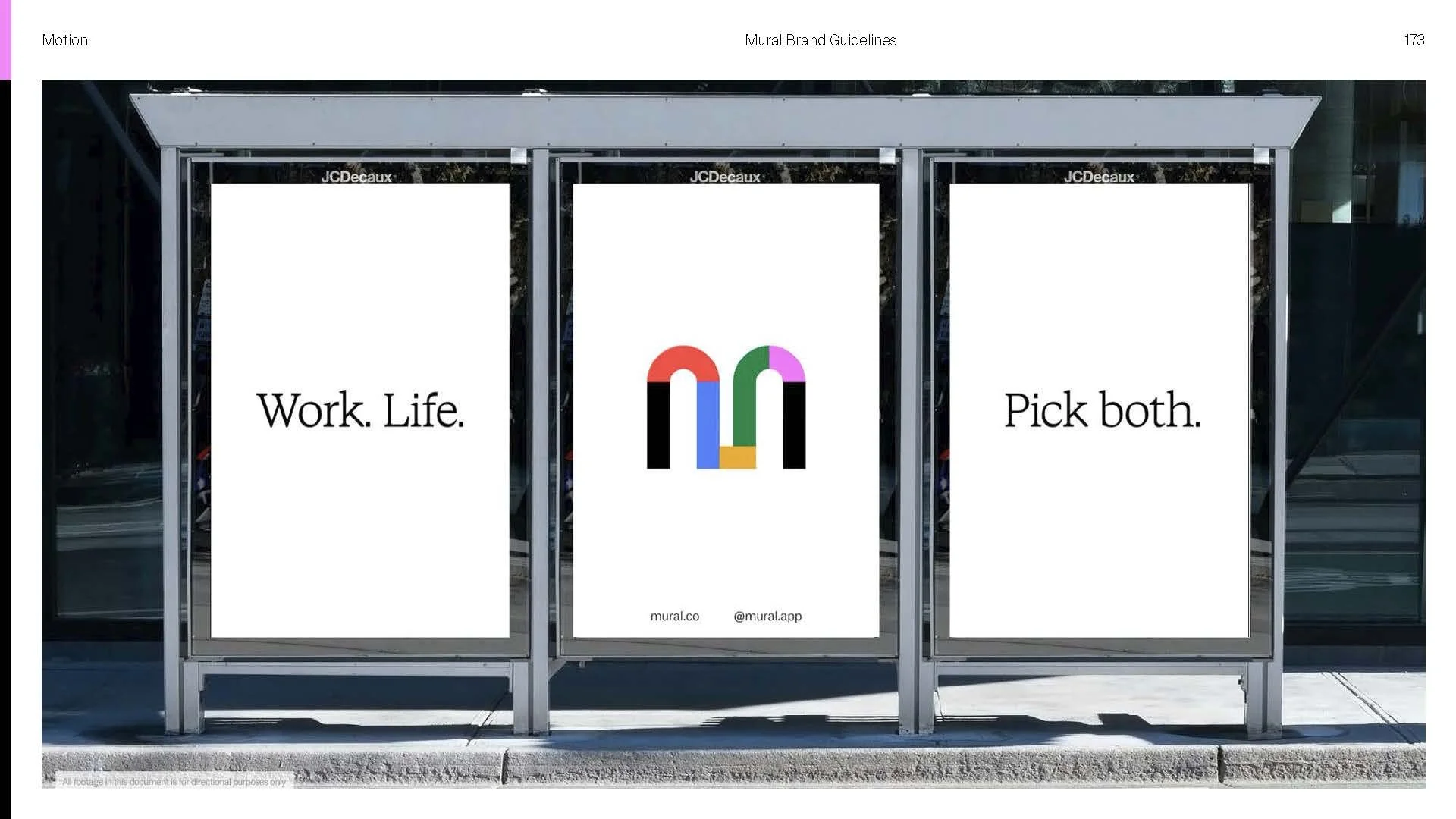
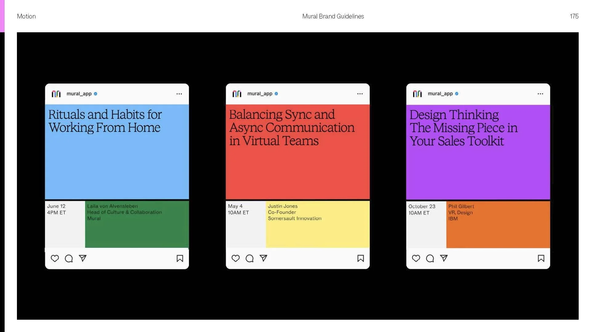
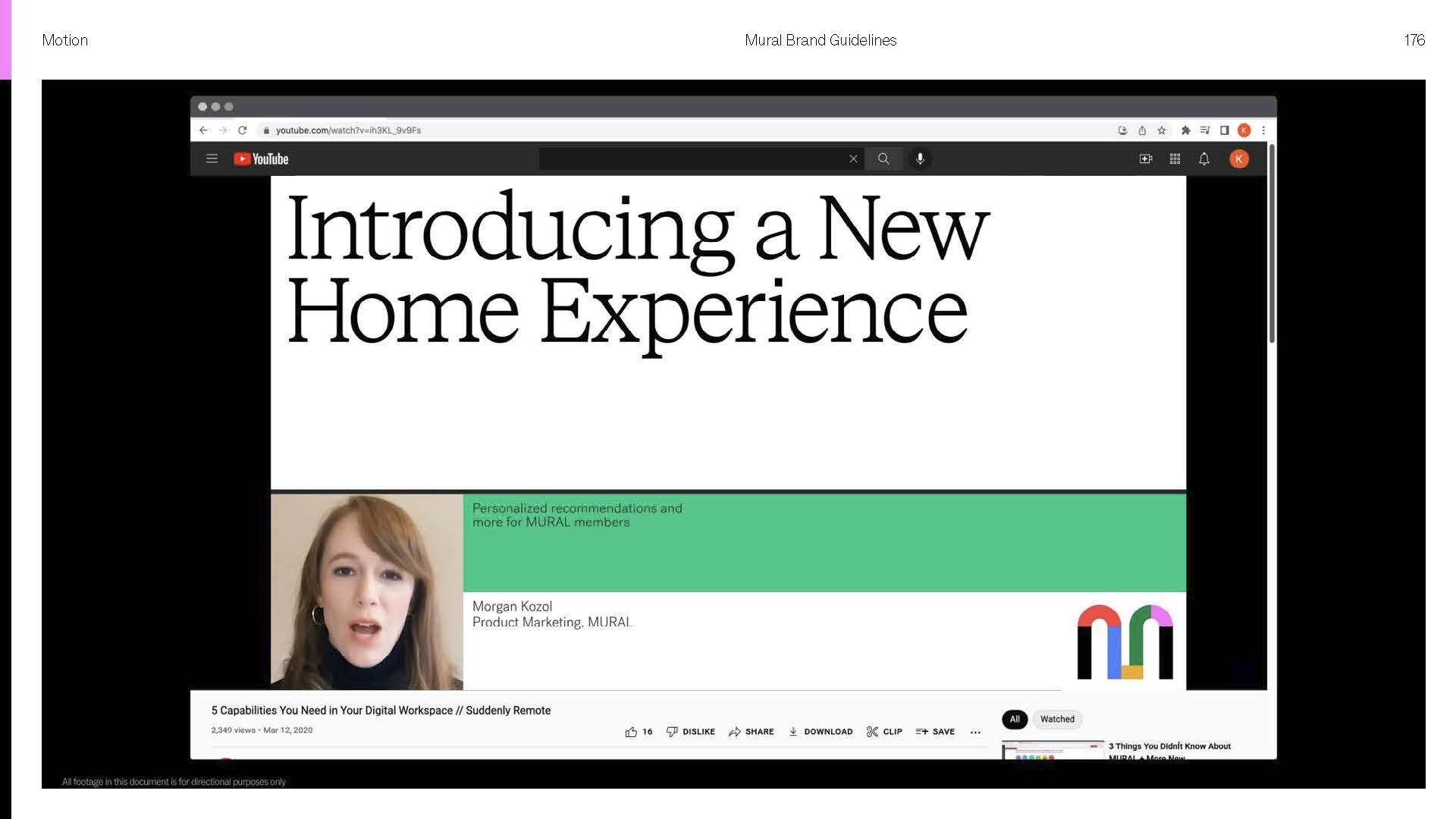
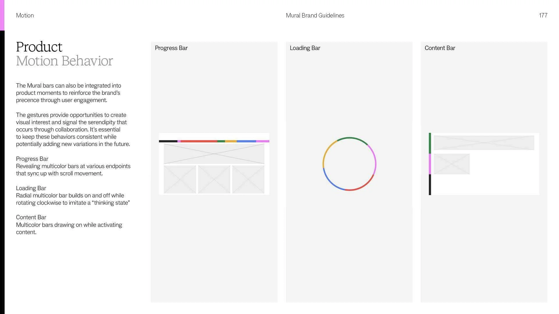
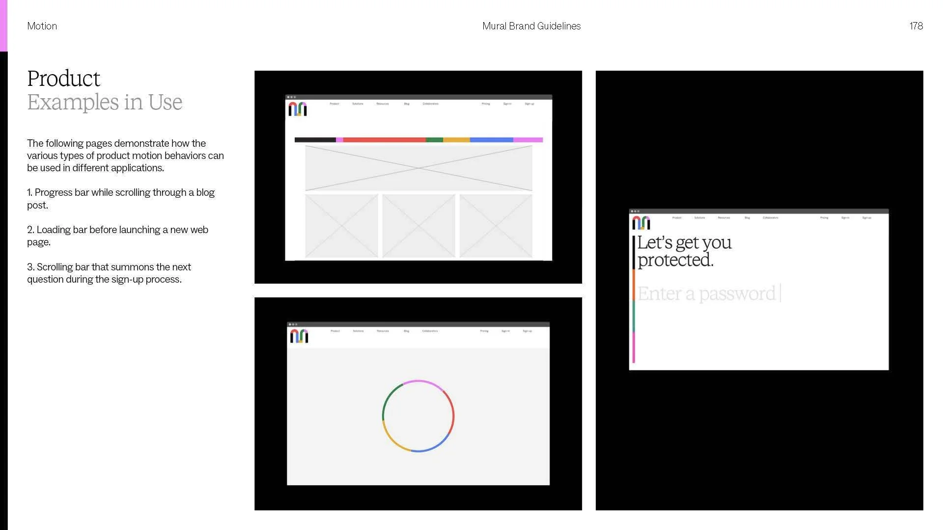
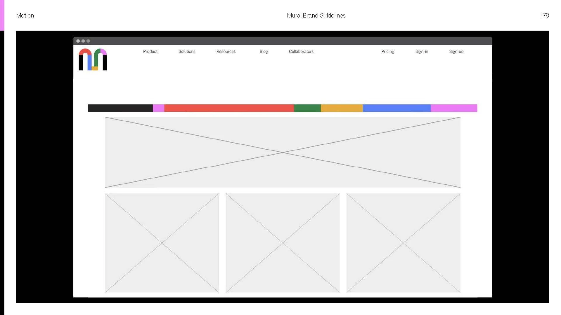
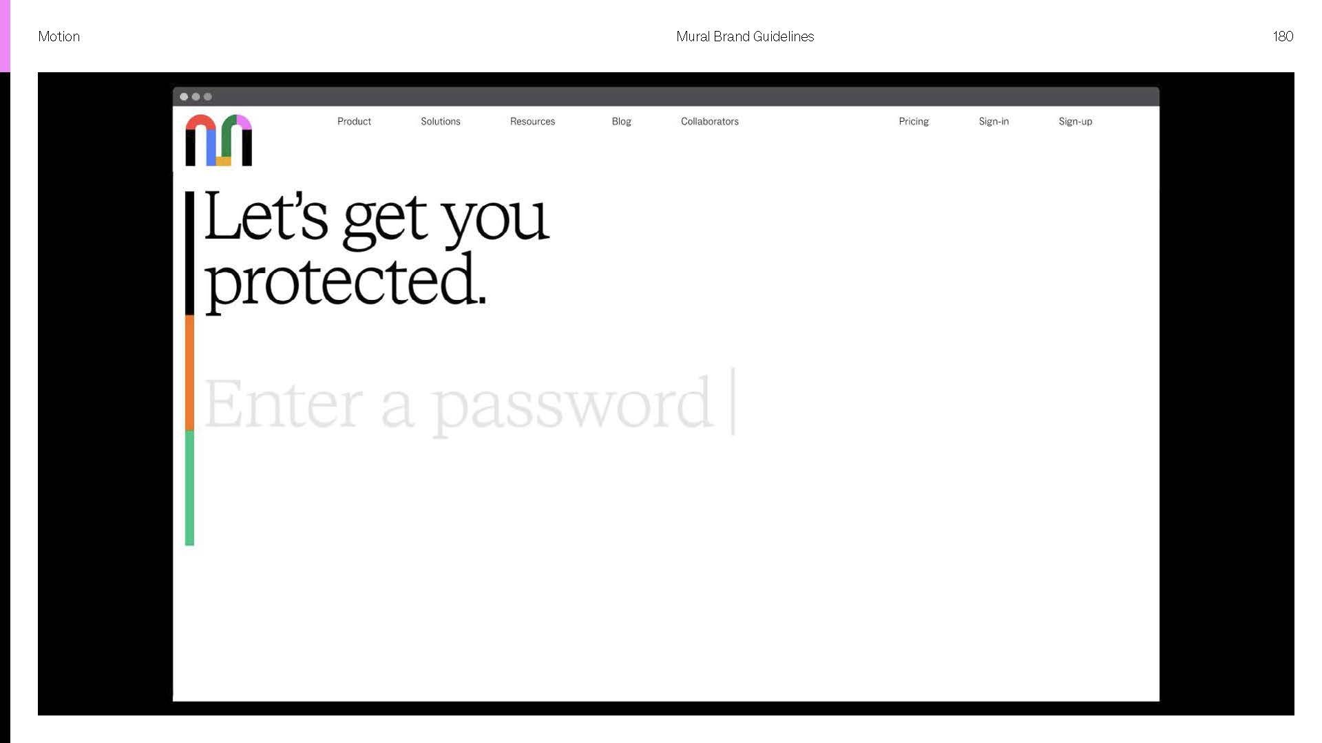
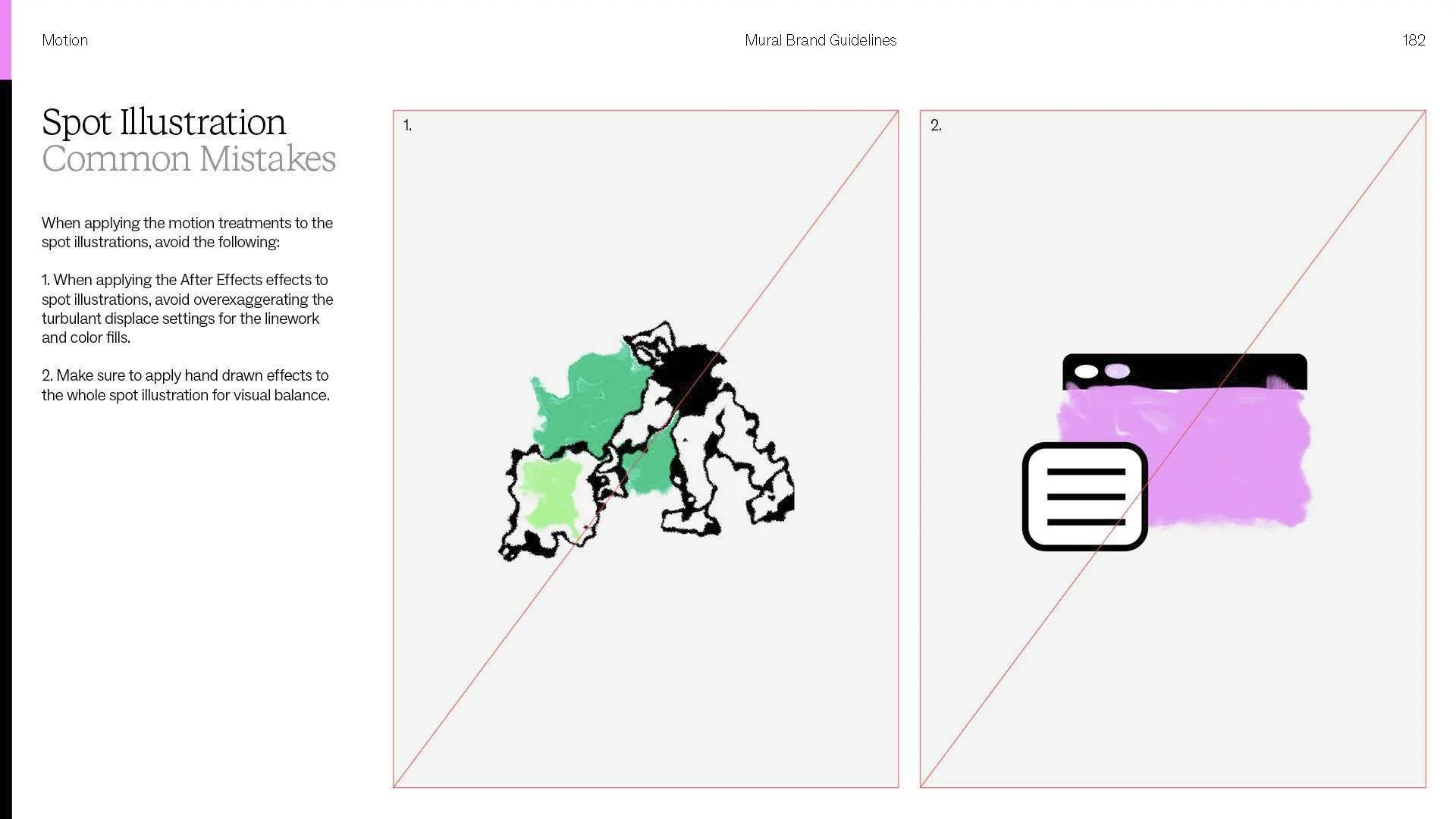
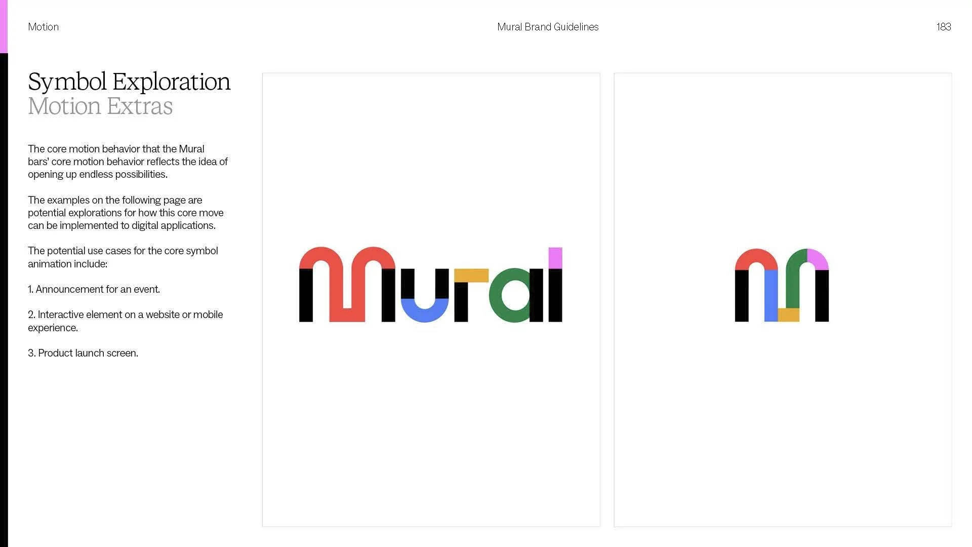
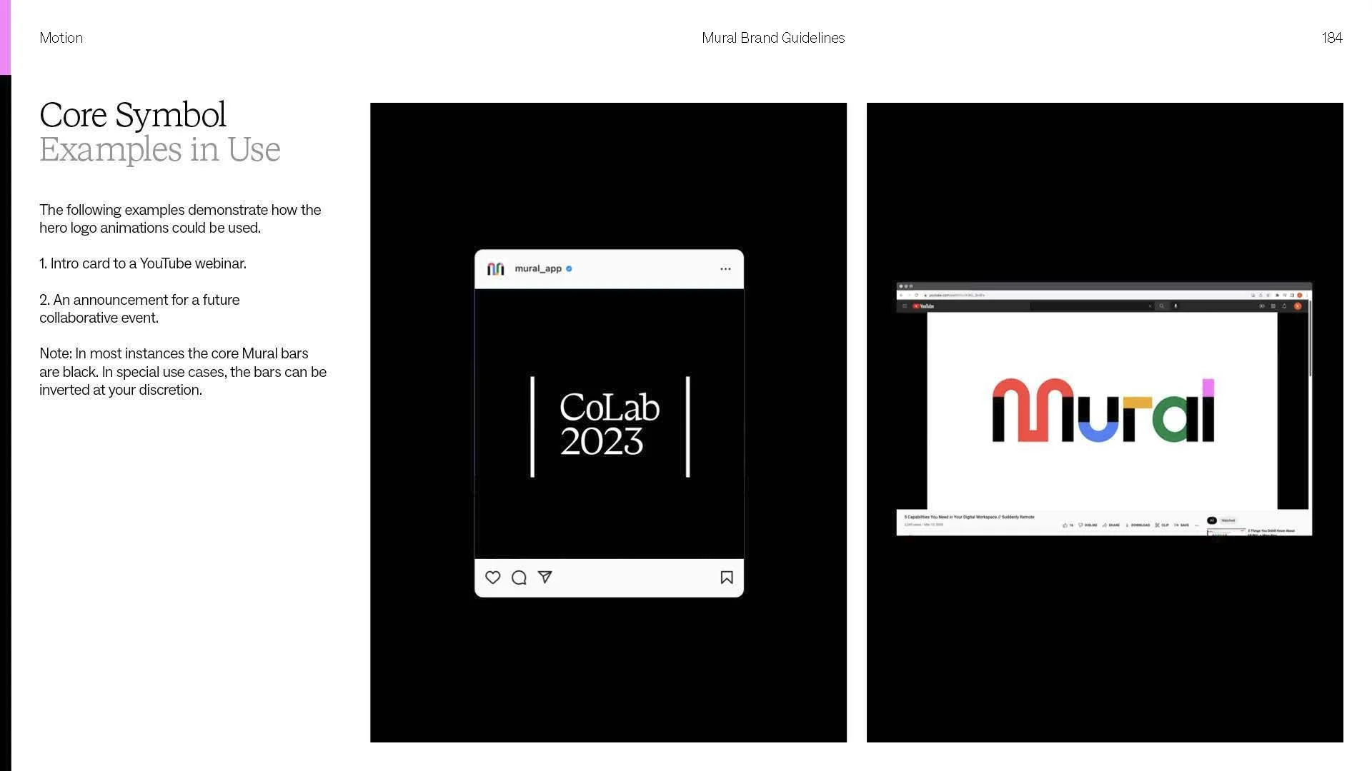
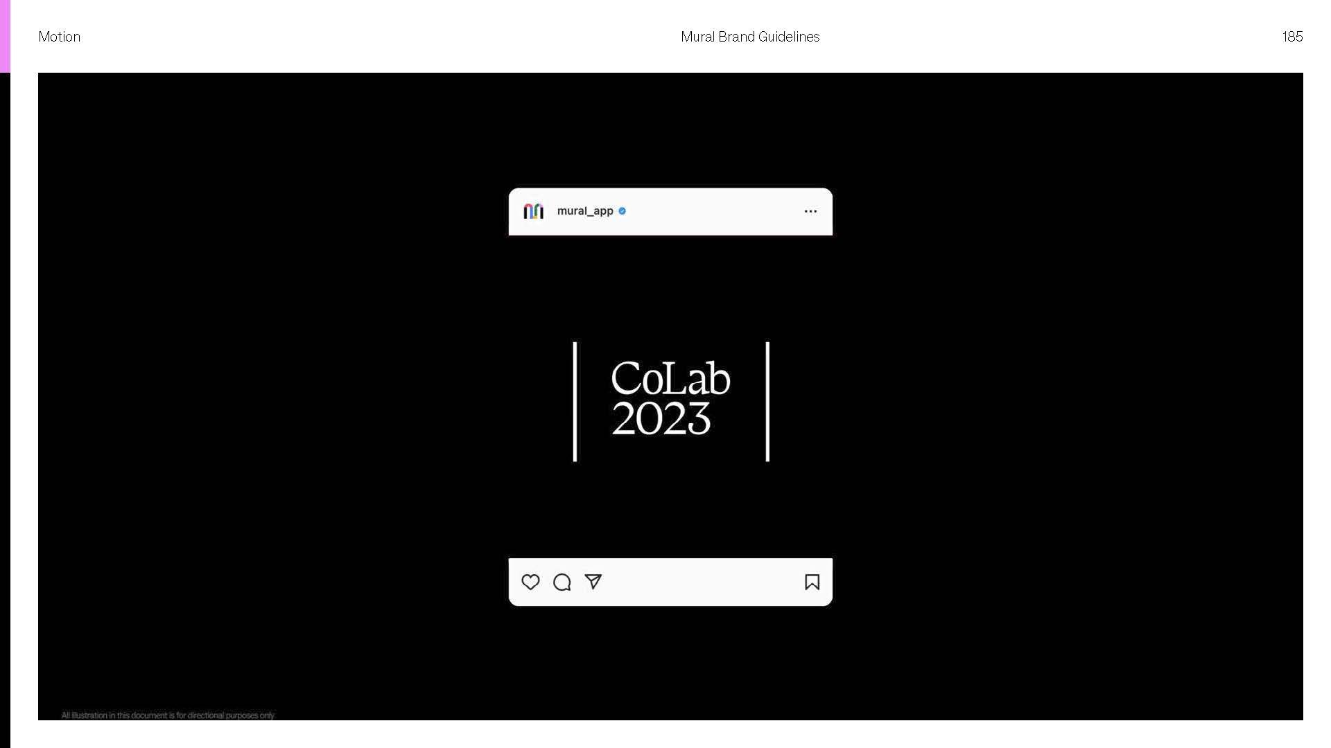
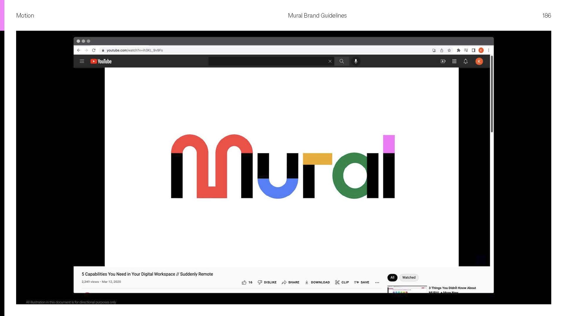
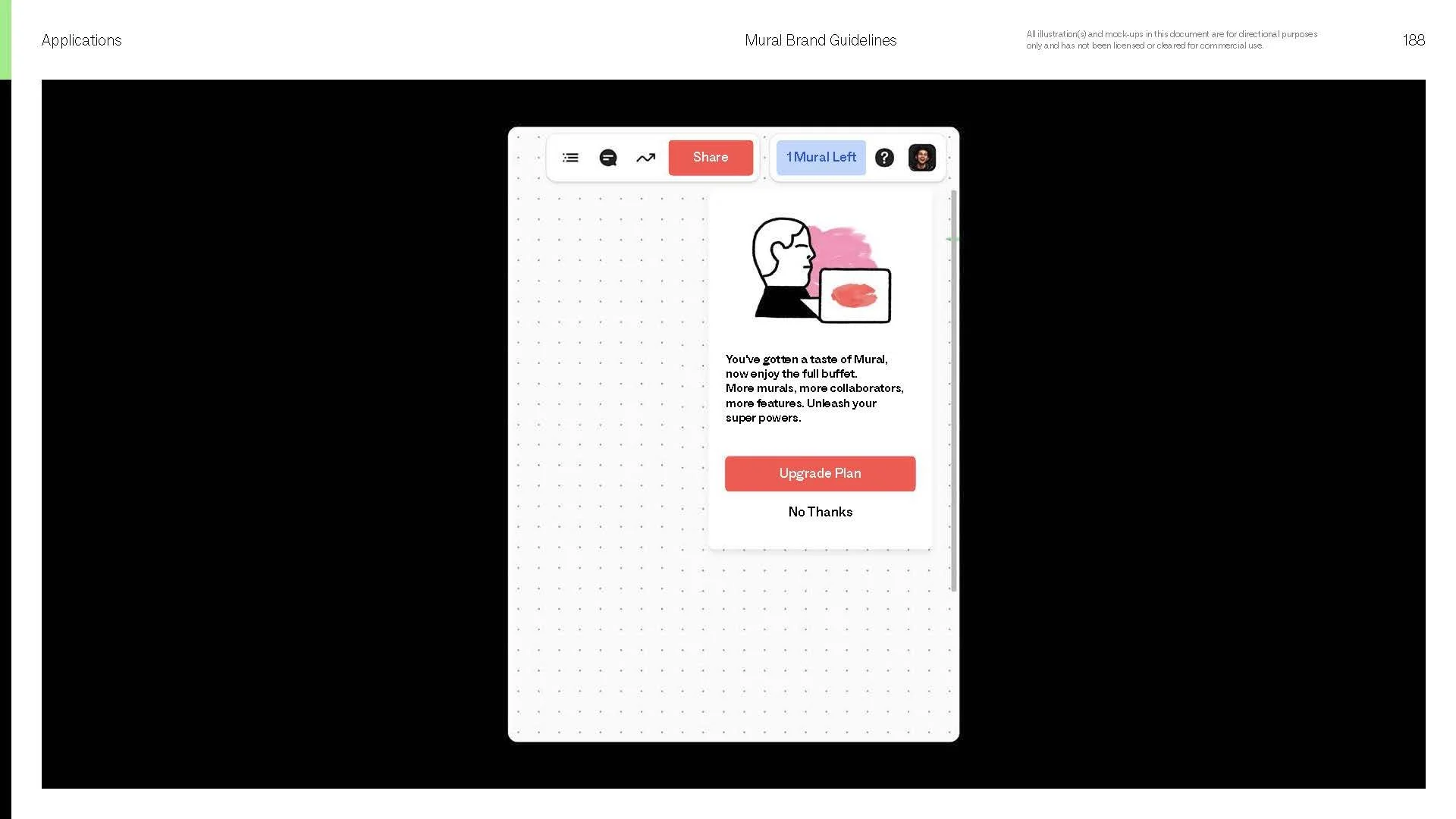
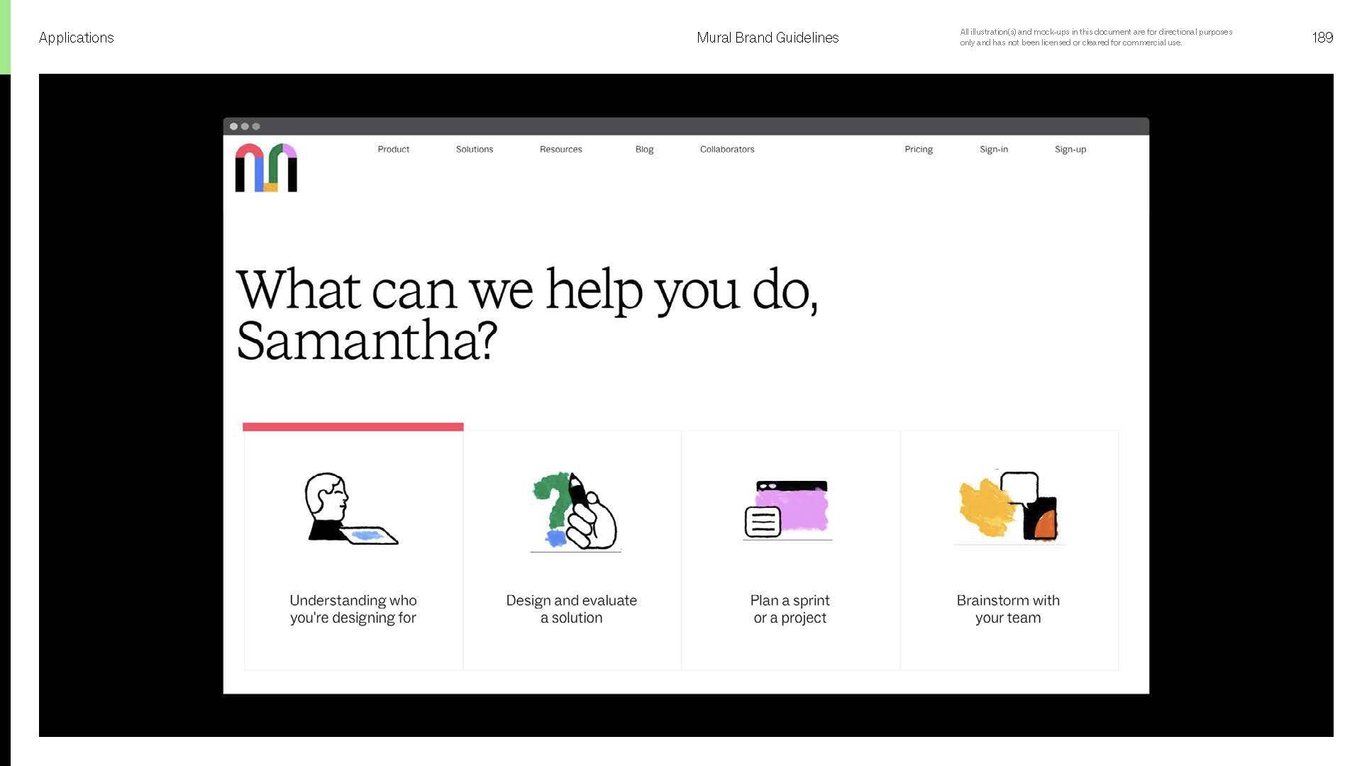
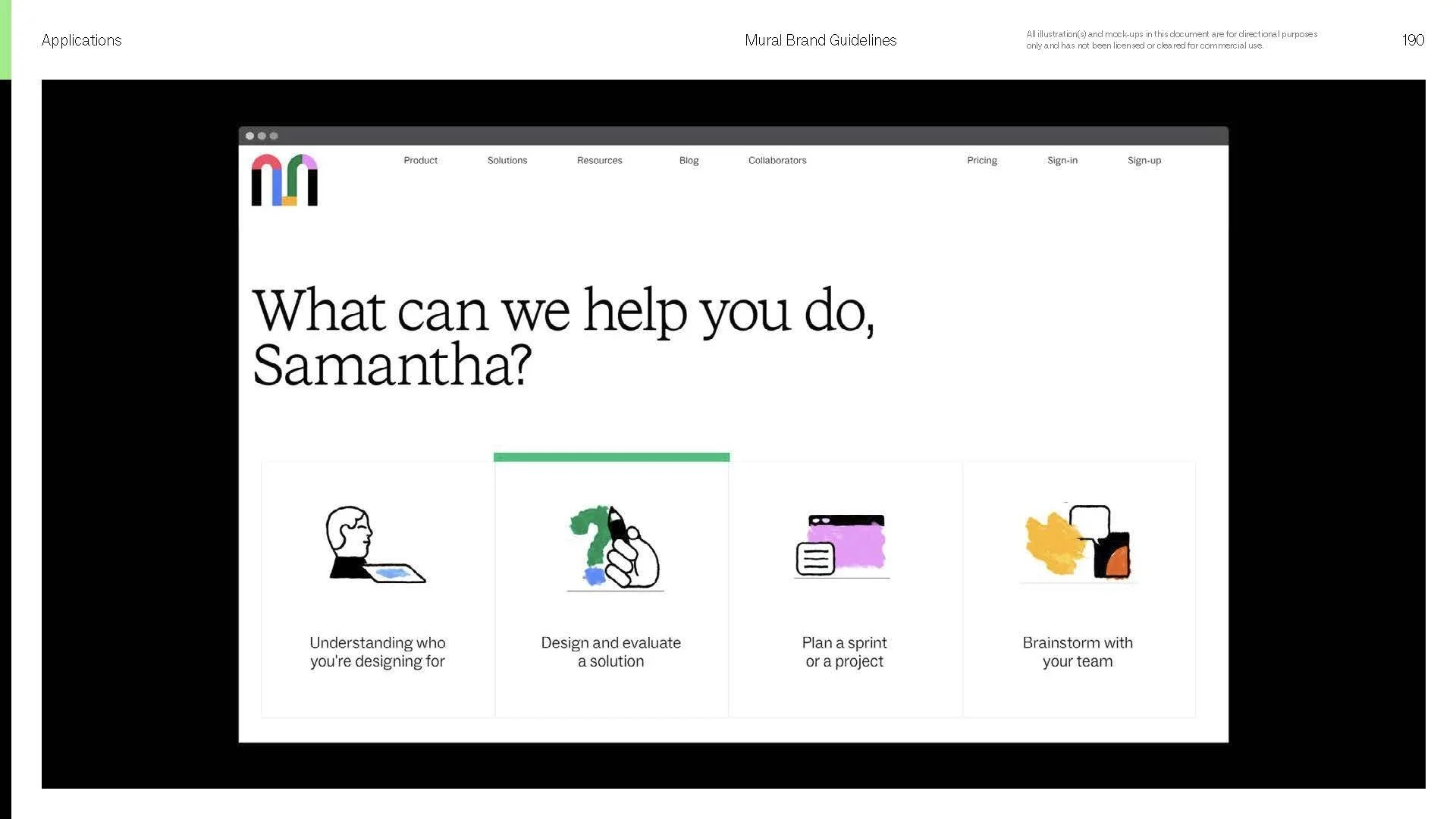
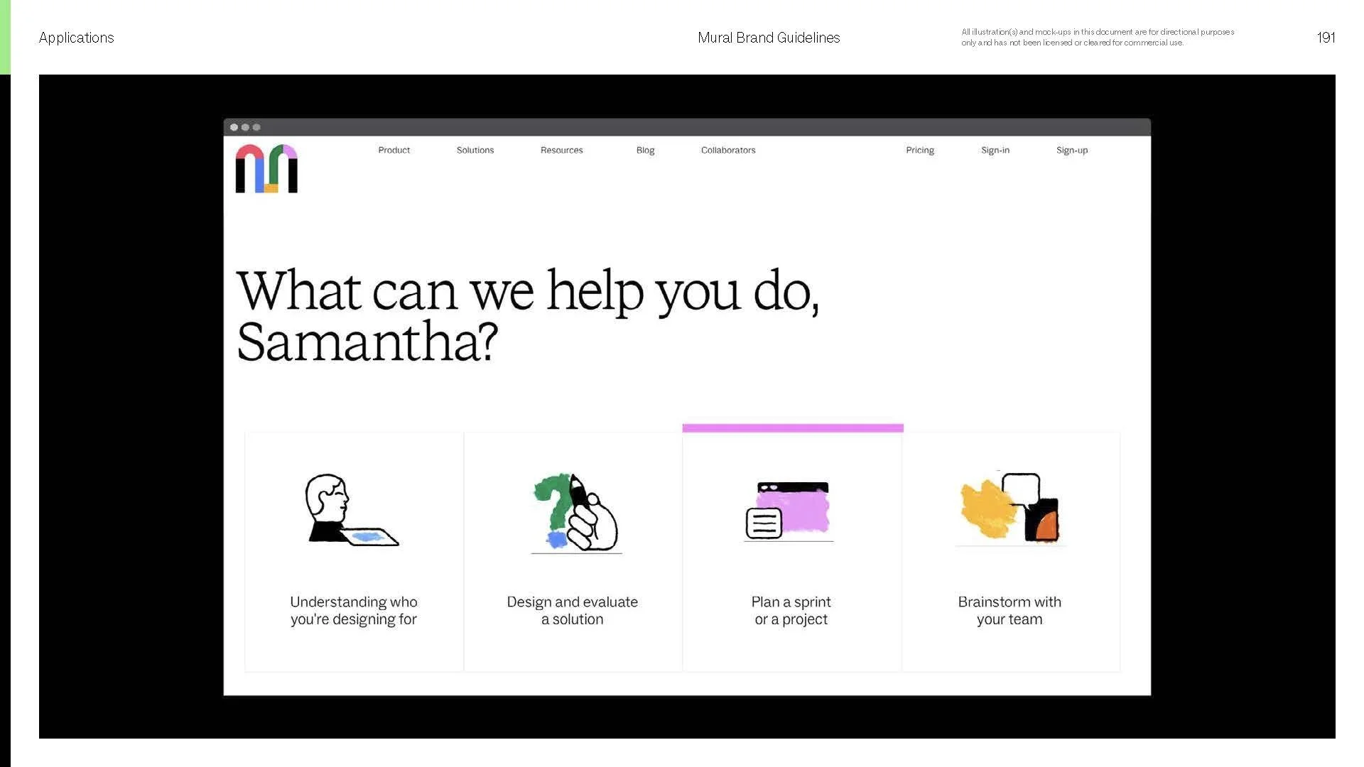
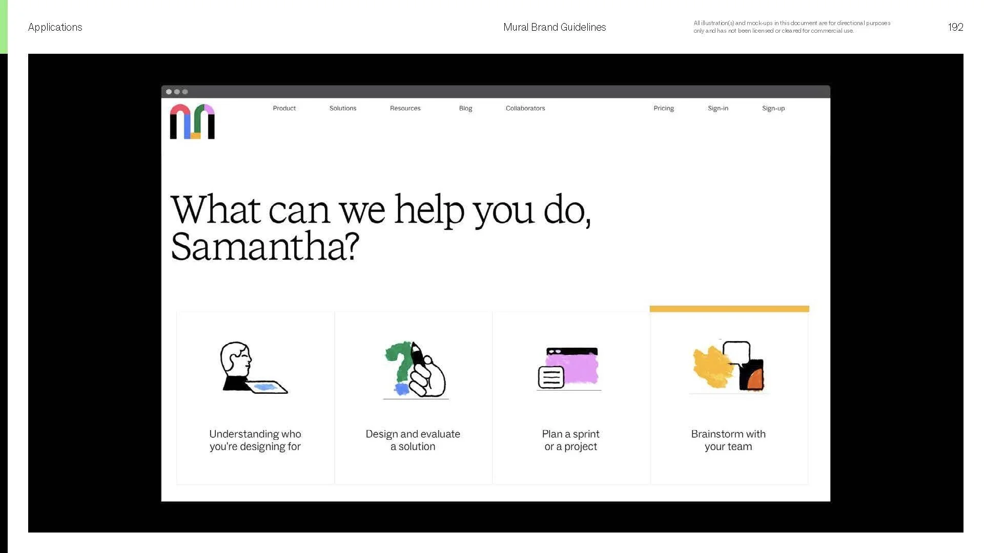
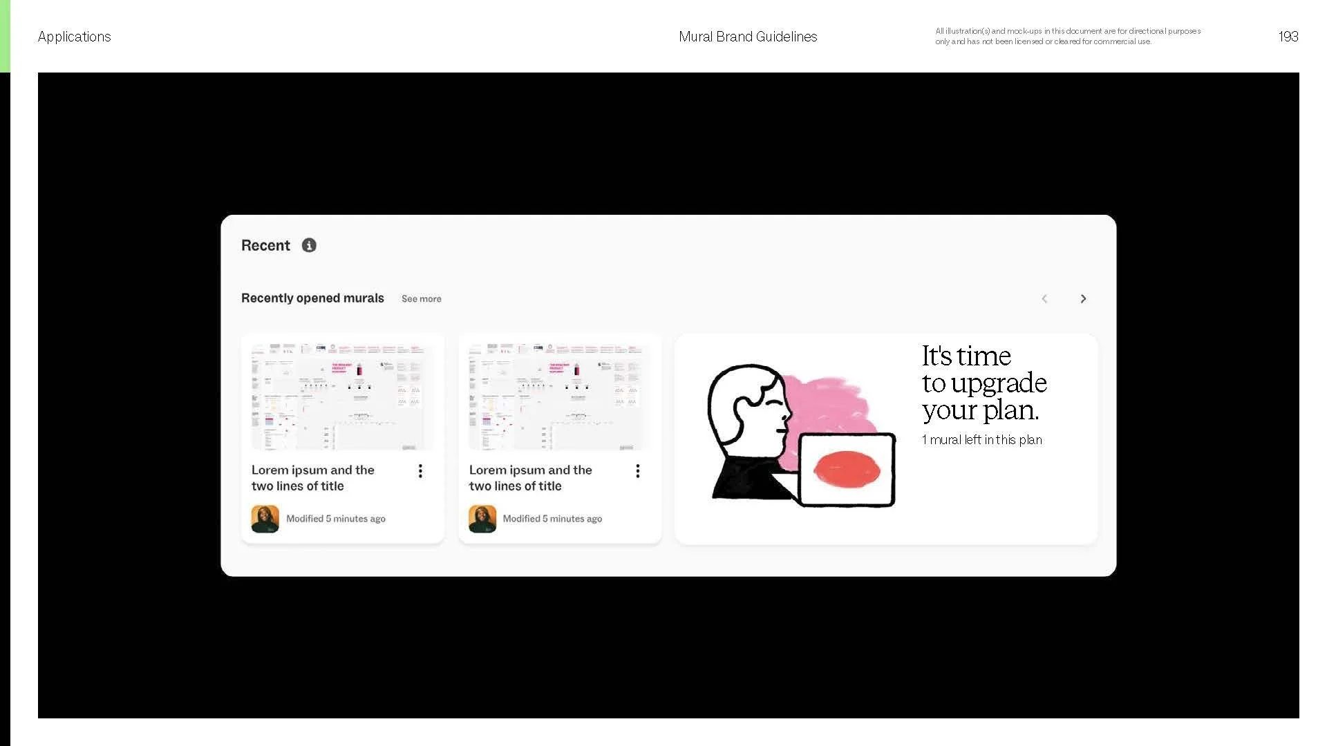
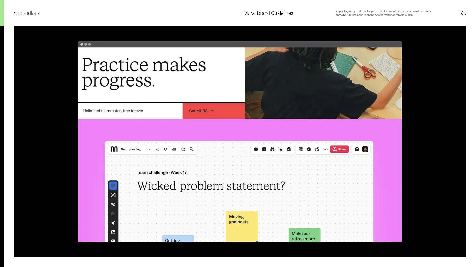
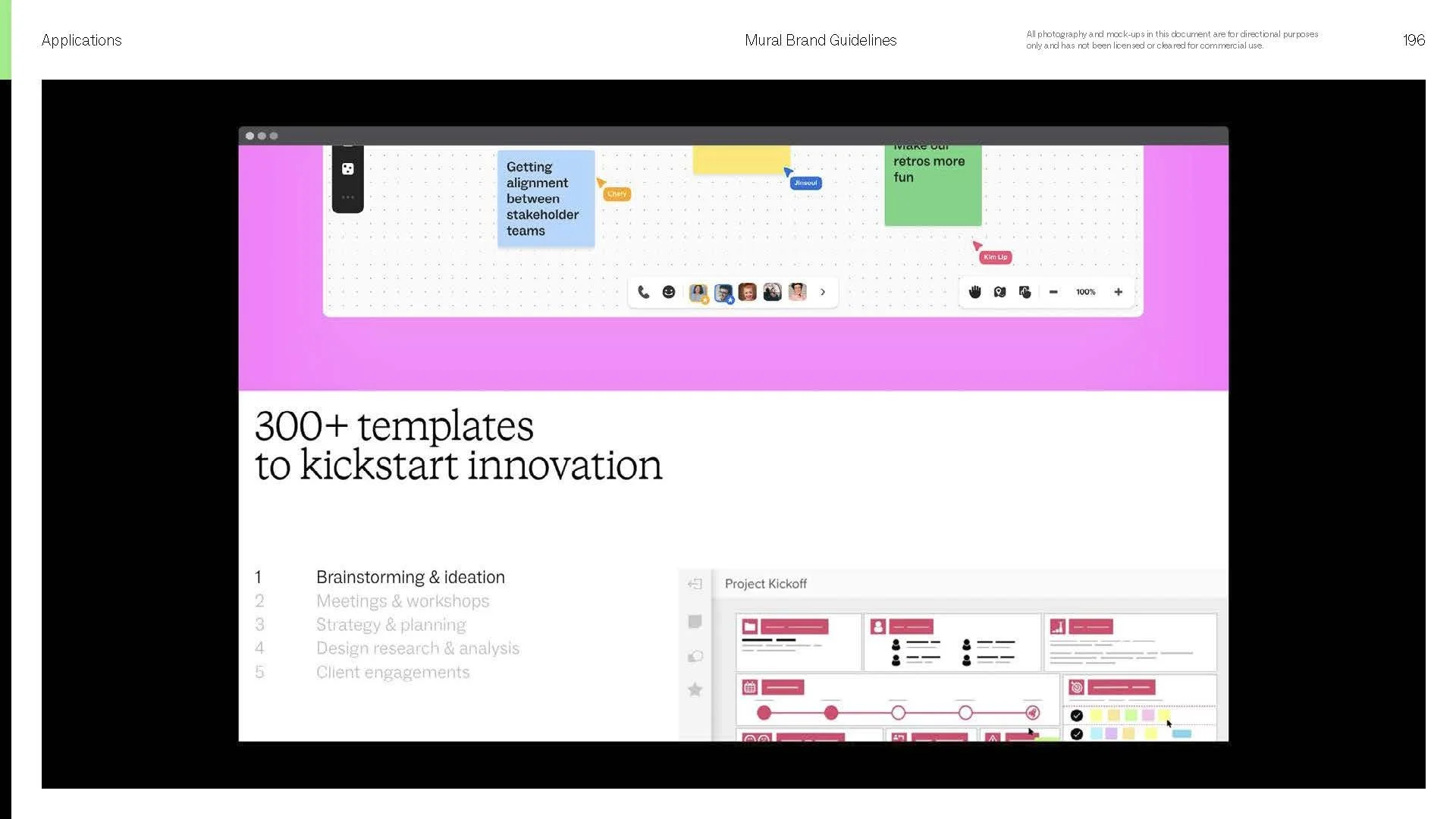
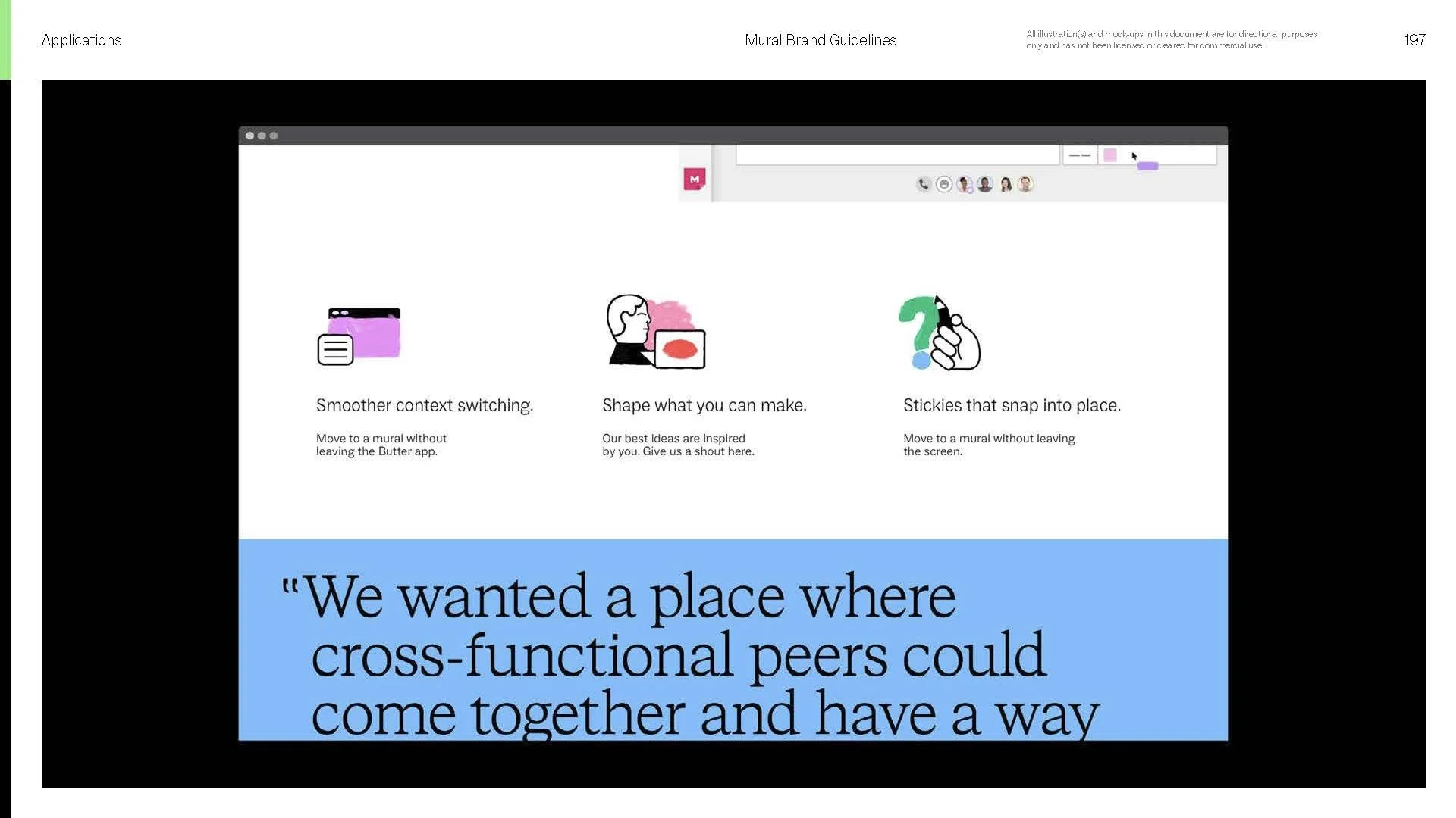
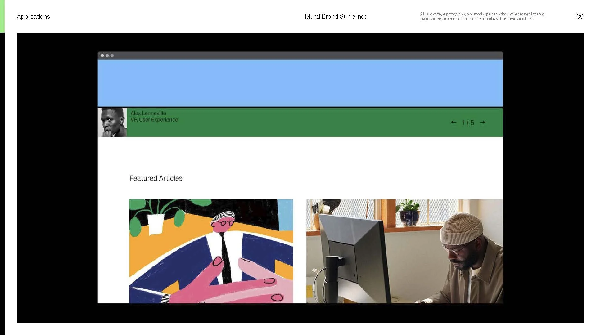
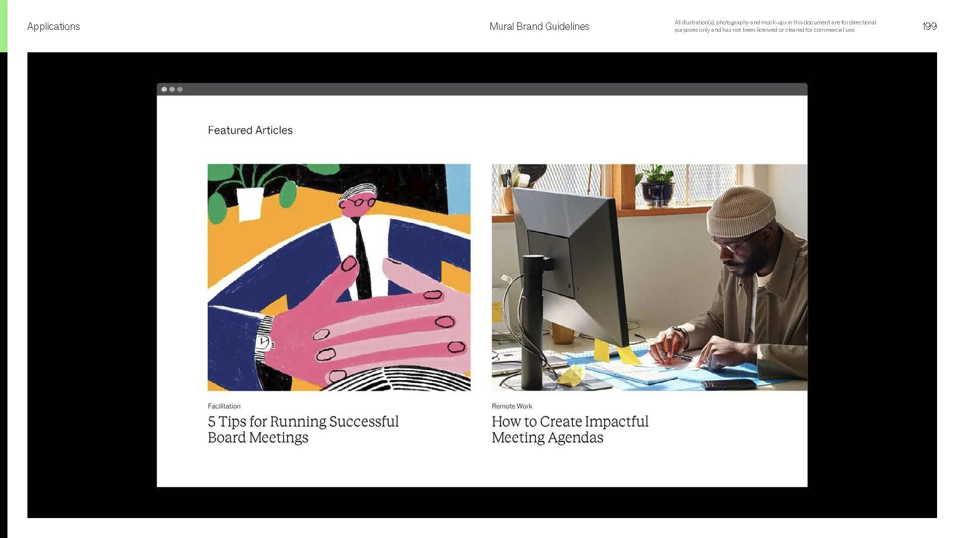
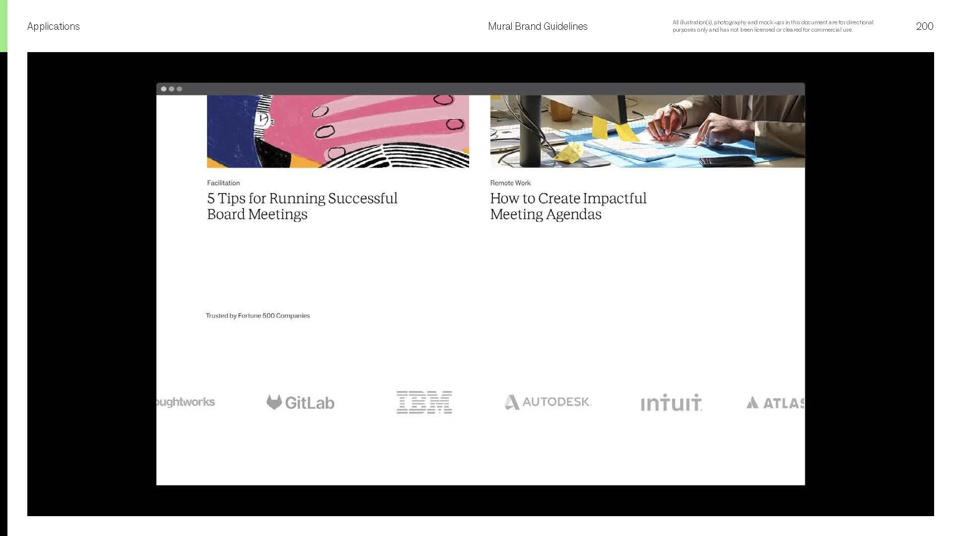
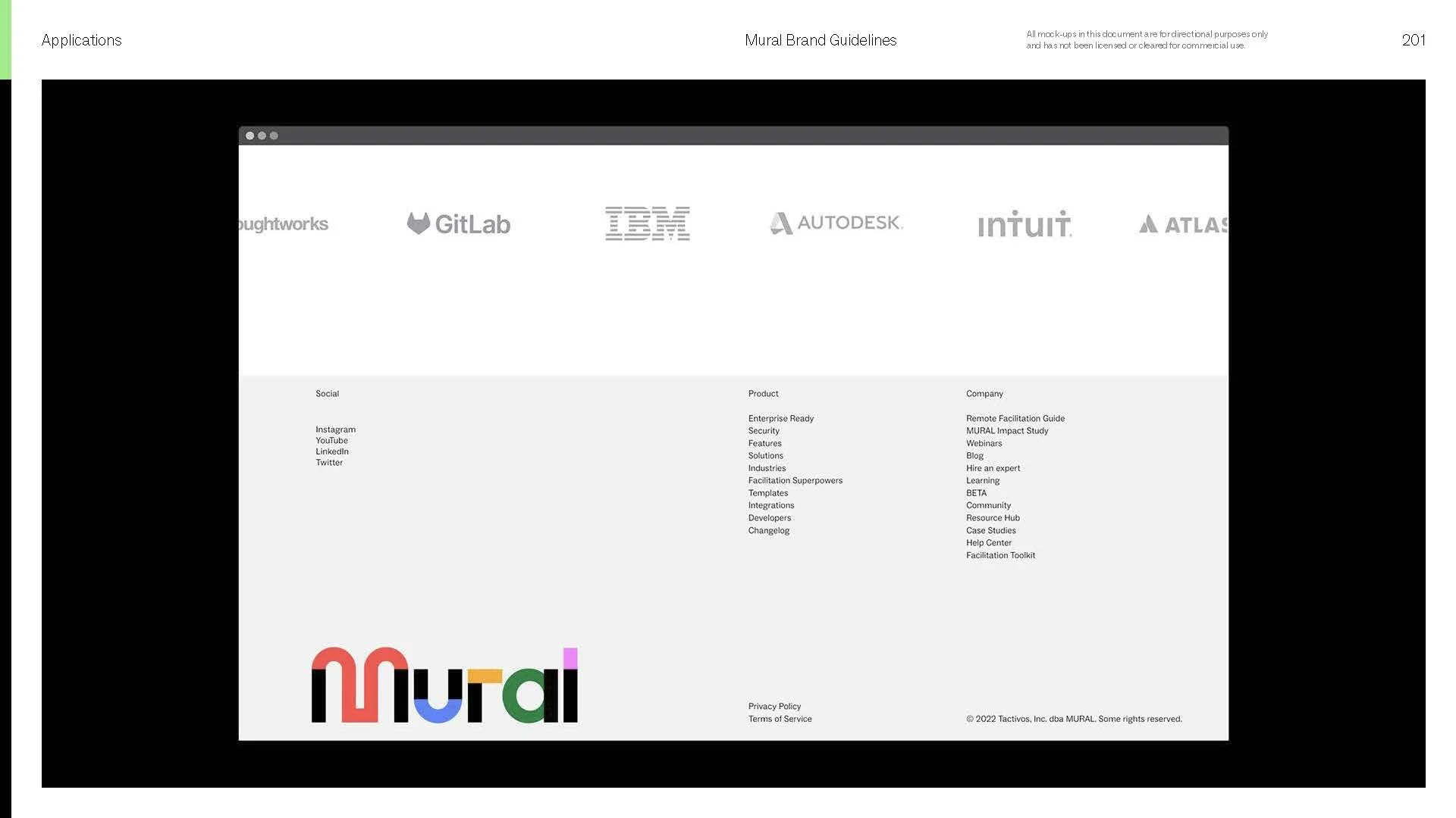
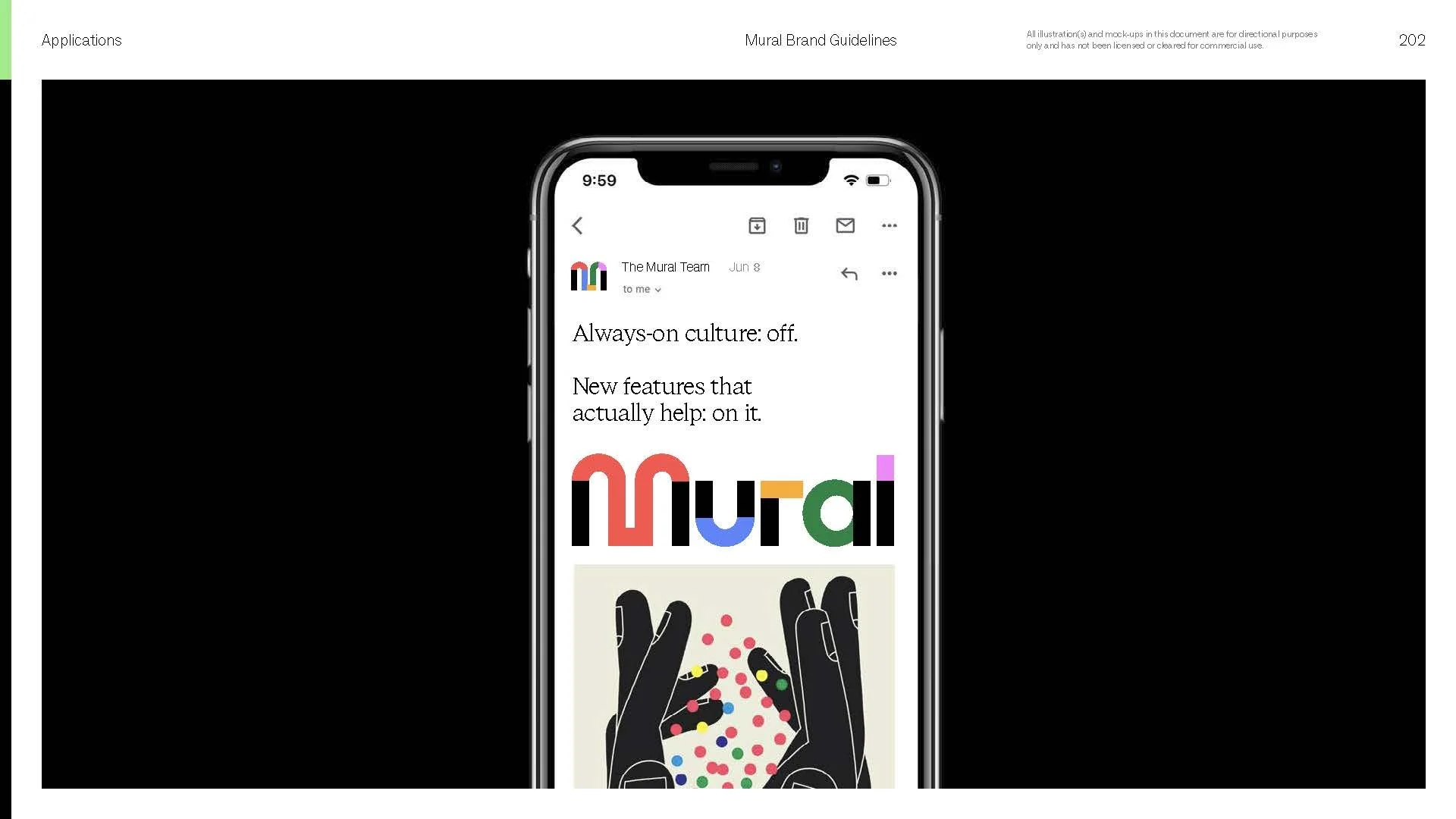
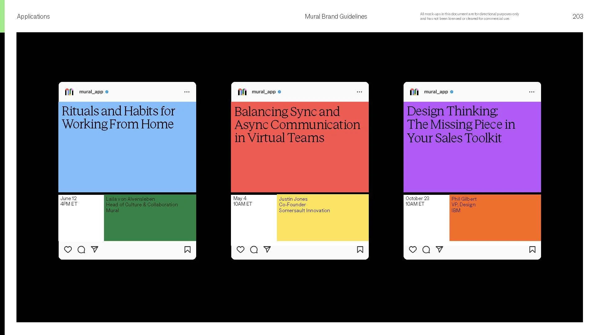
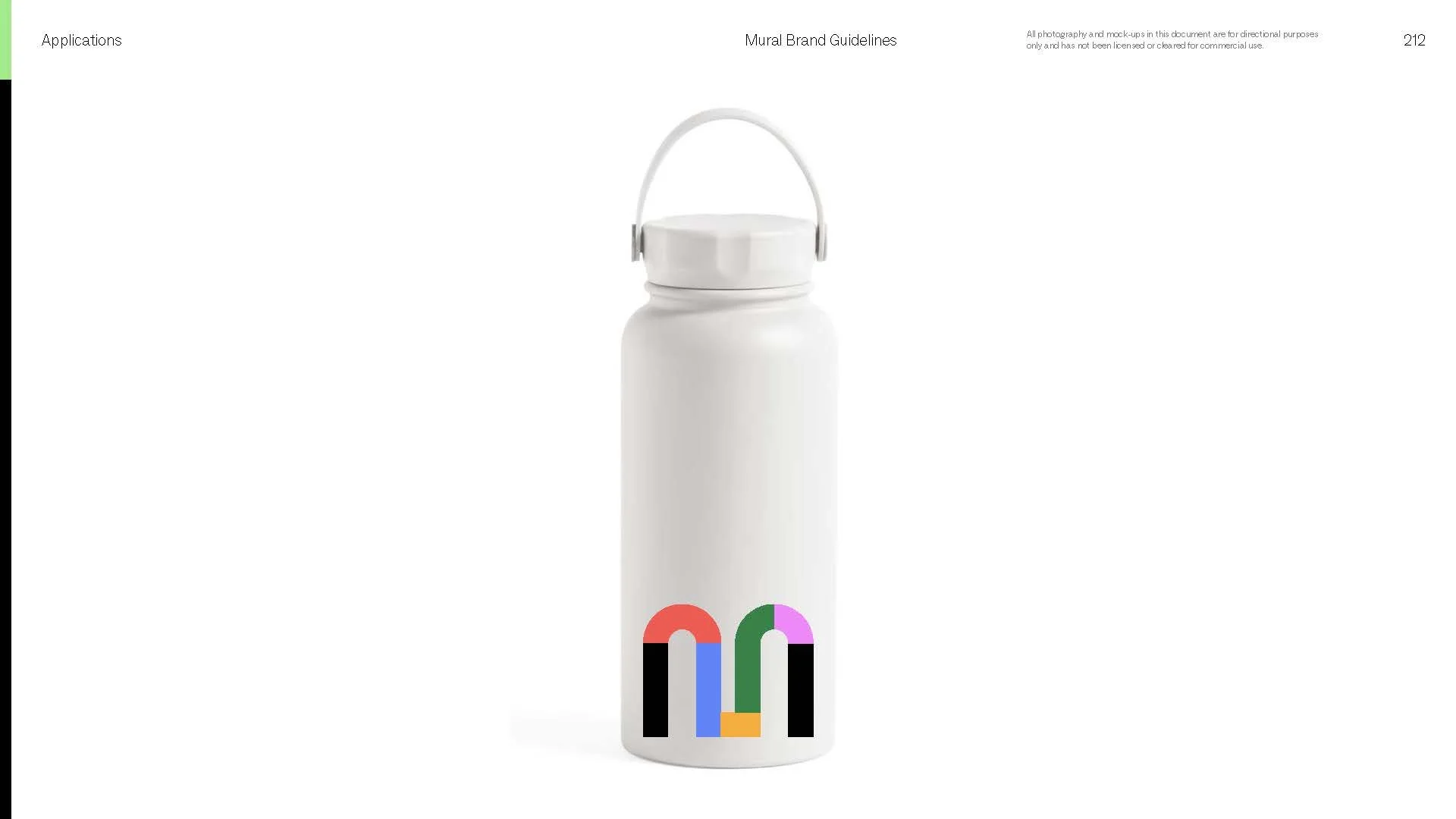
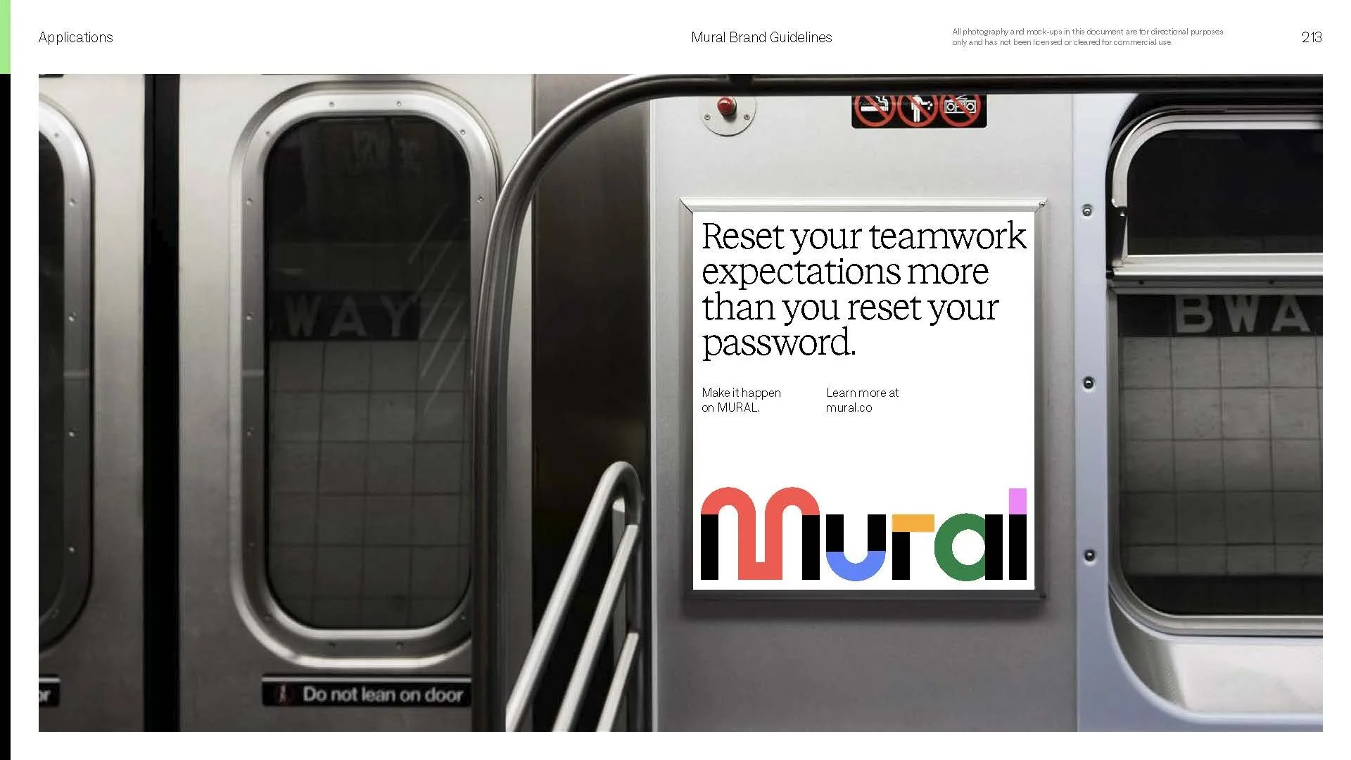
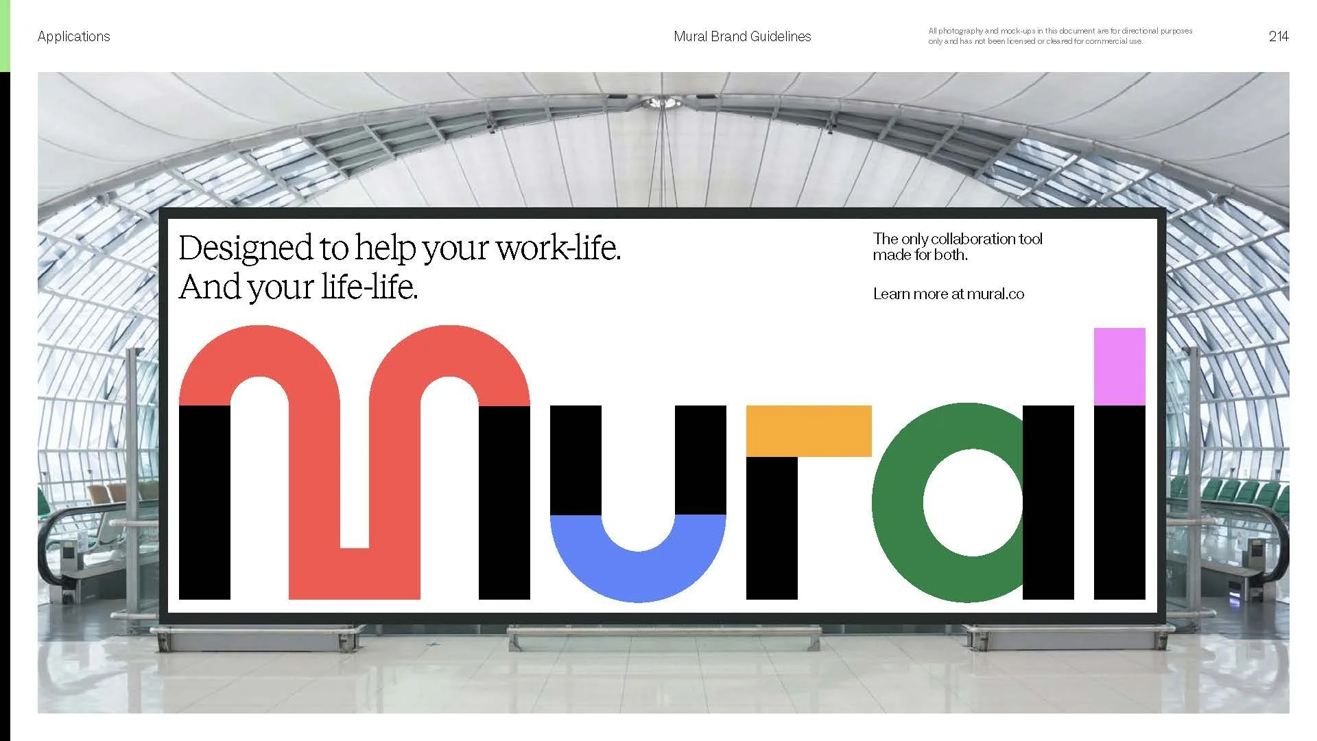
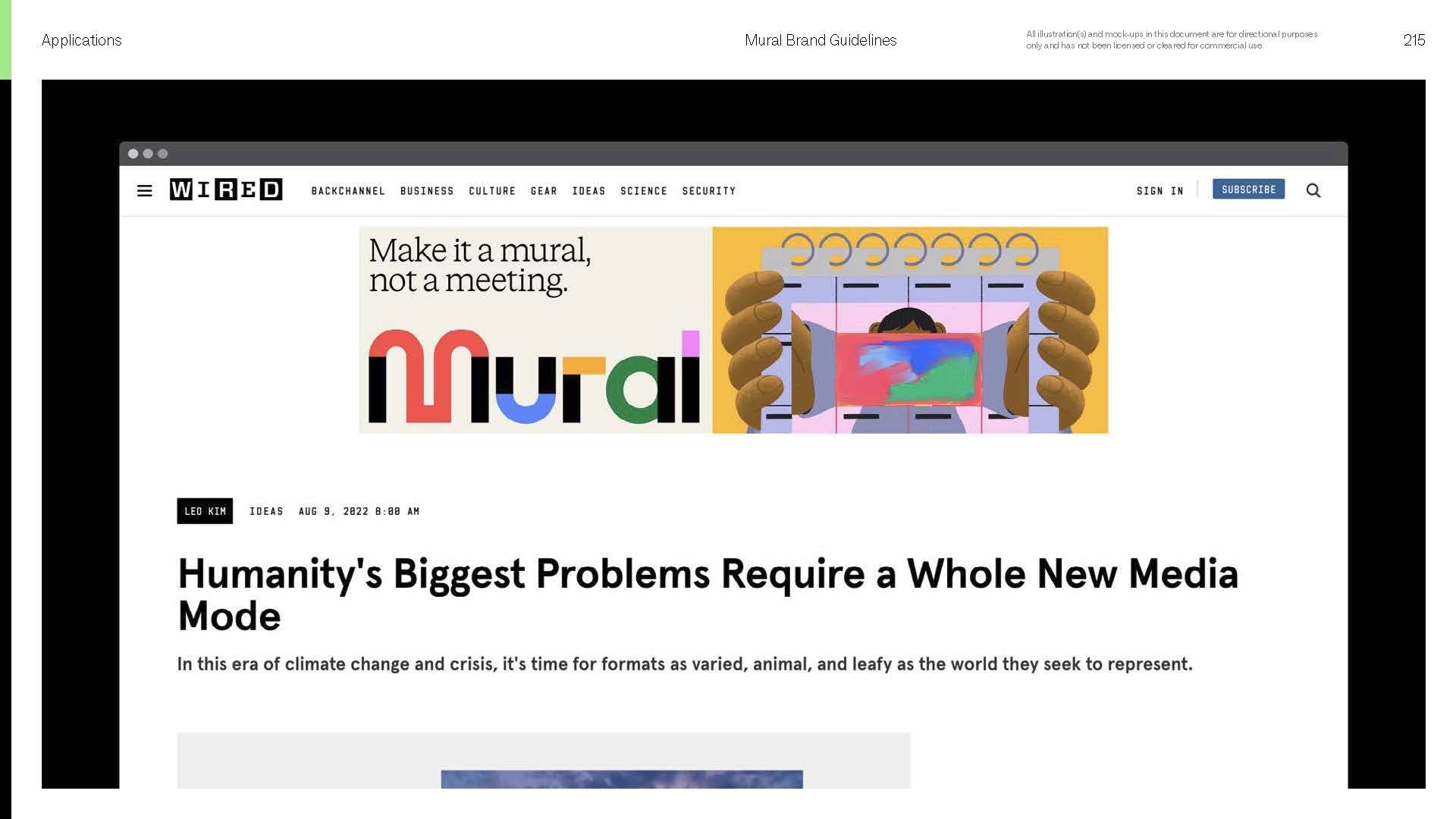
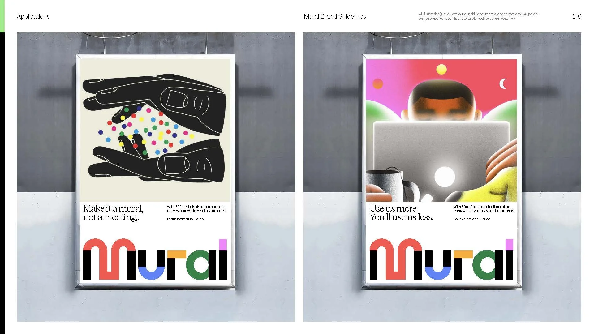
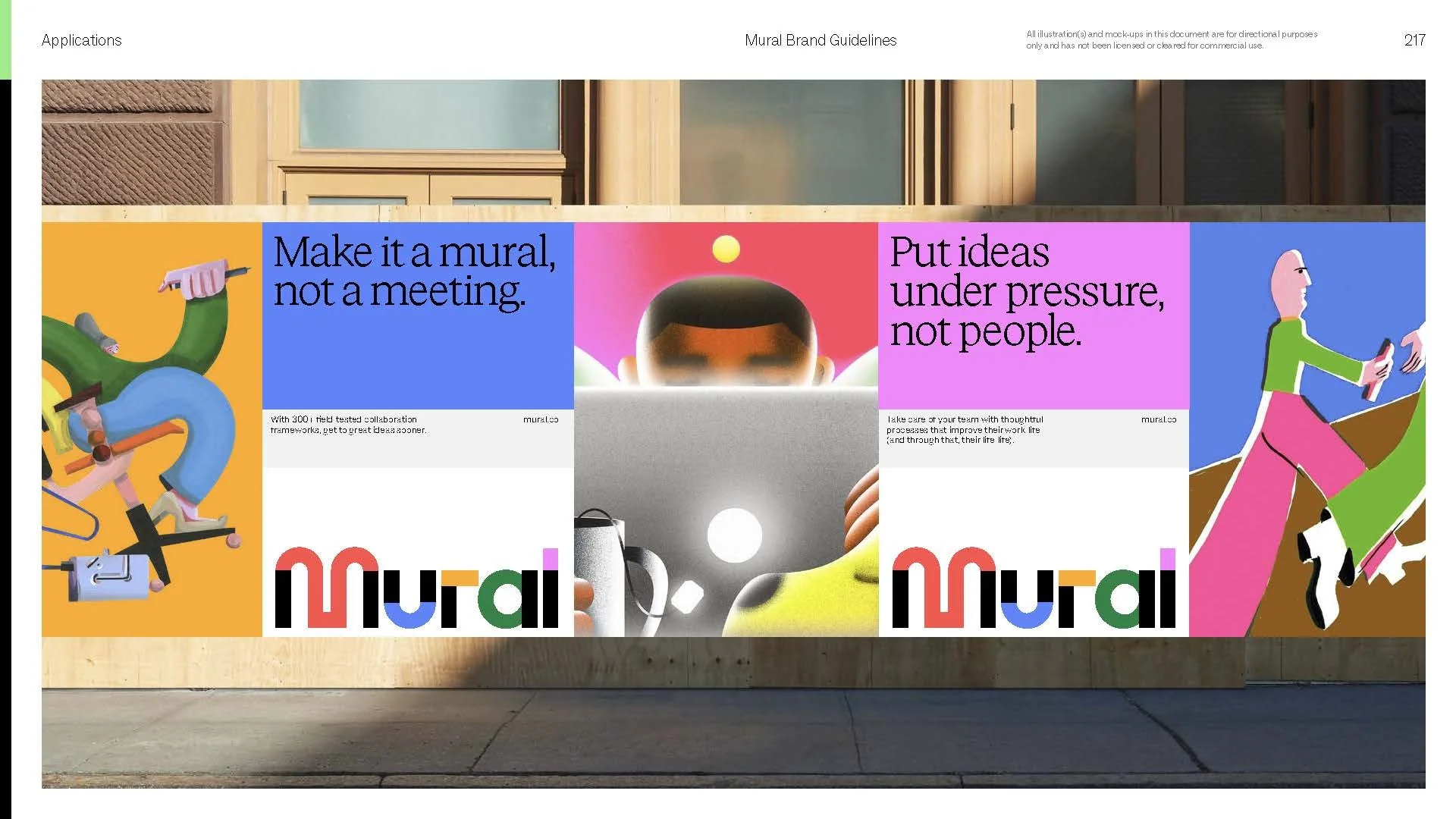
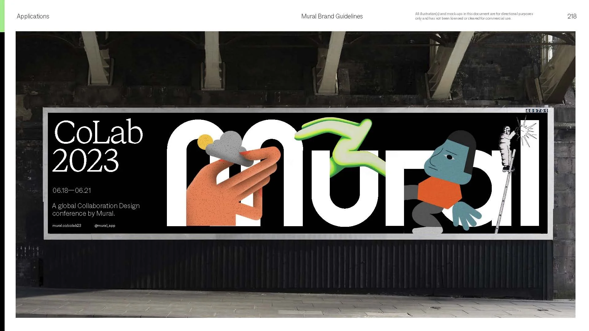
Please note that motion guidance starting on page 144 was originally presented with GIFs, but have been included as static images in this portfolio.

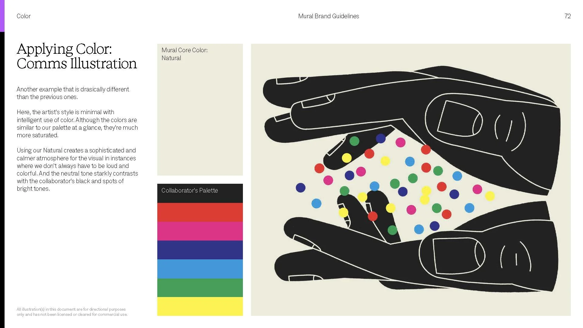
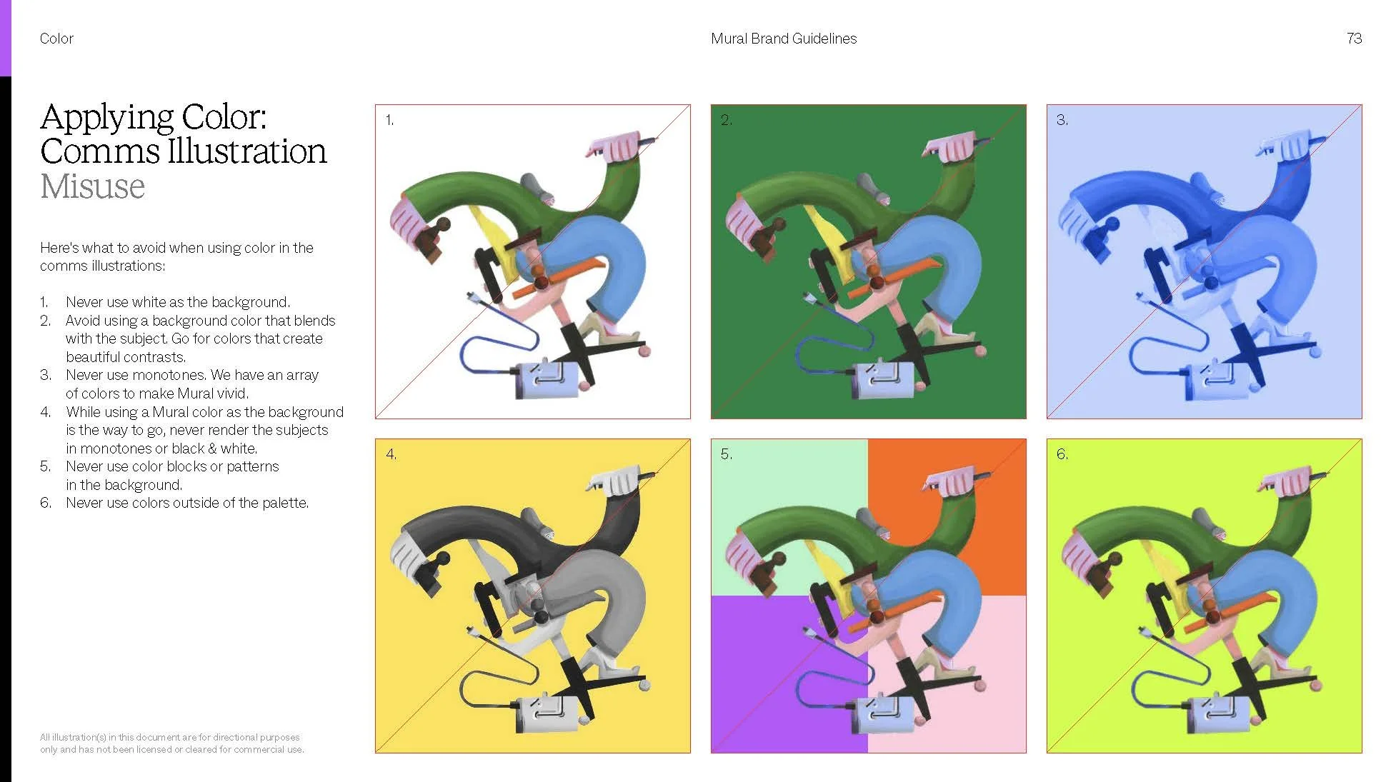
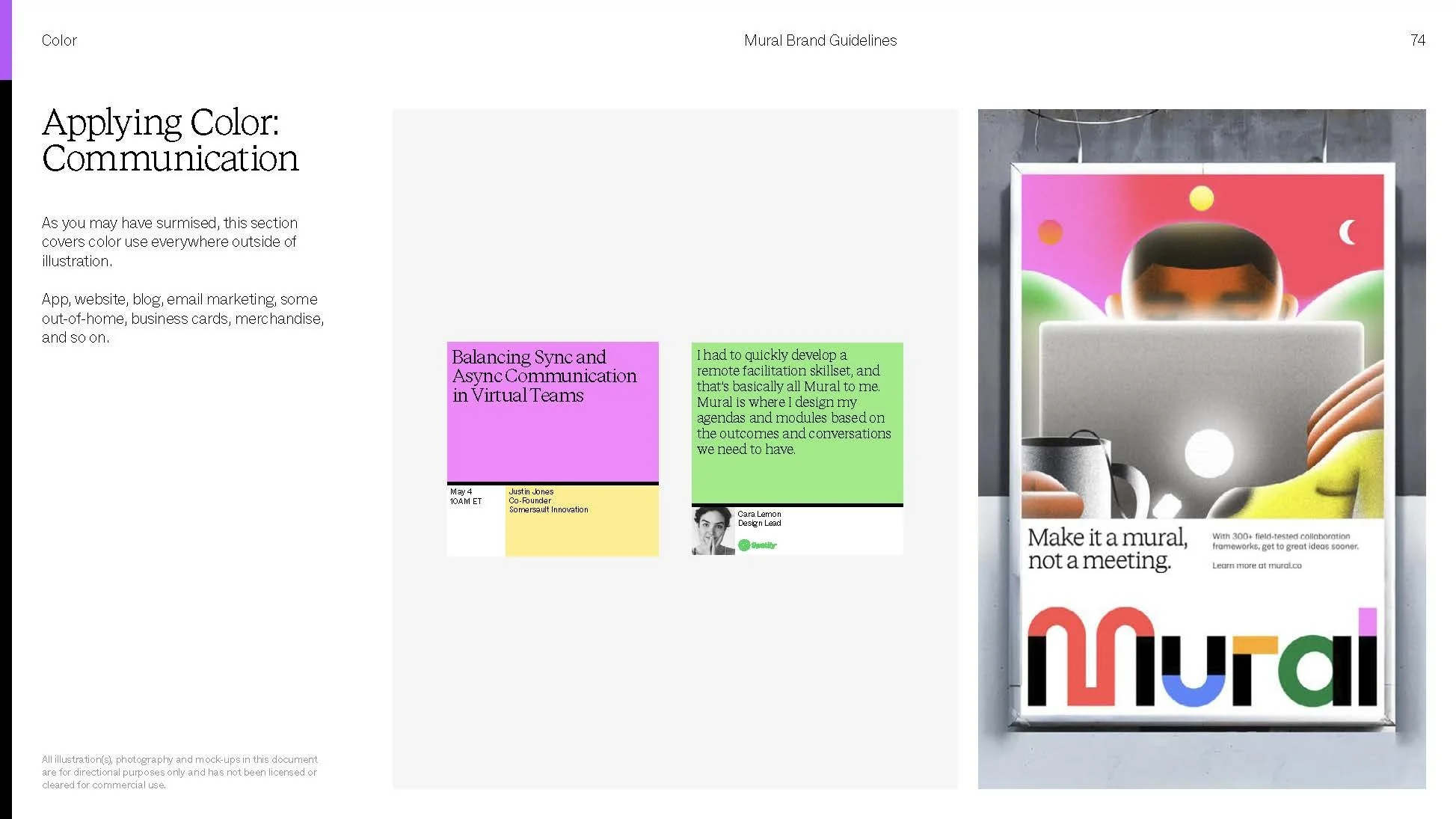
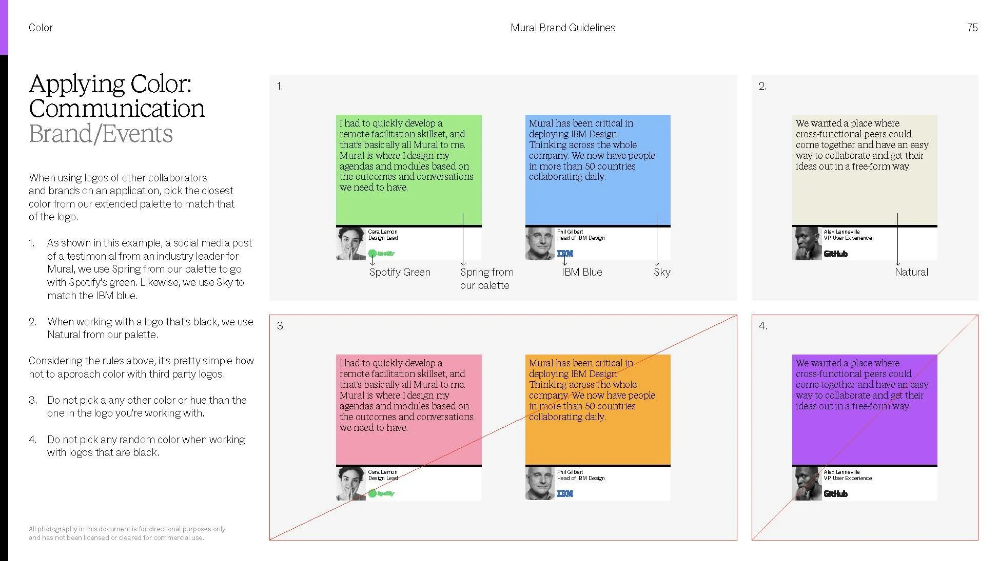
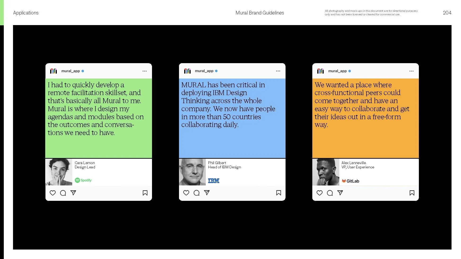
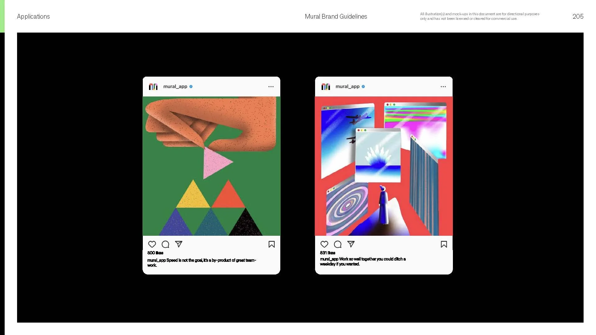
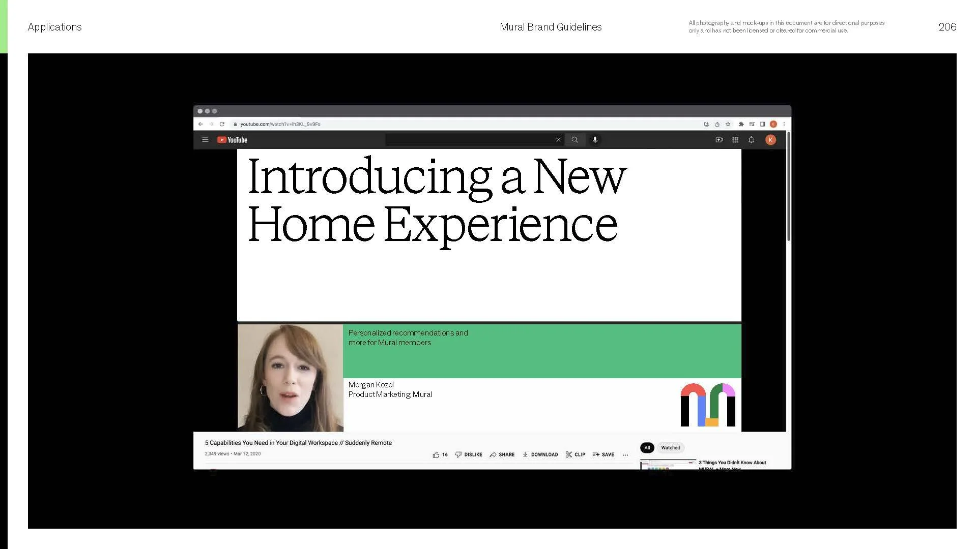
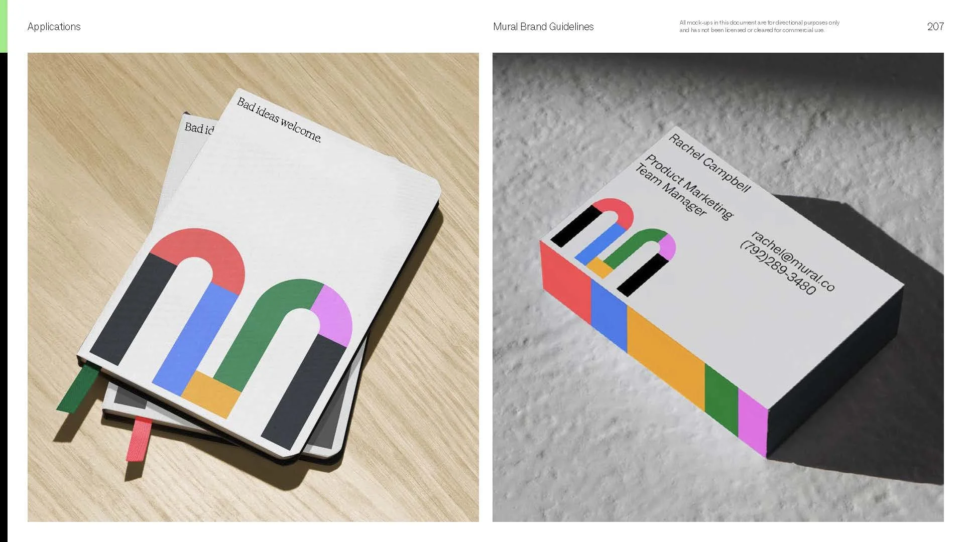
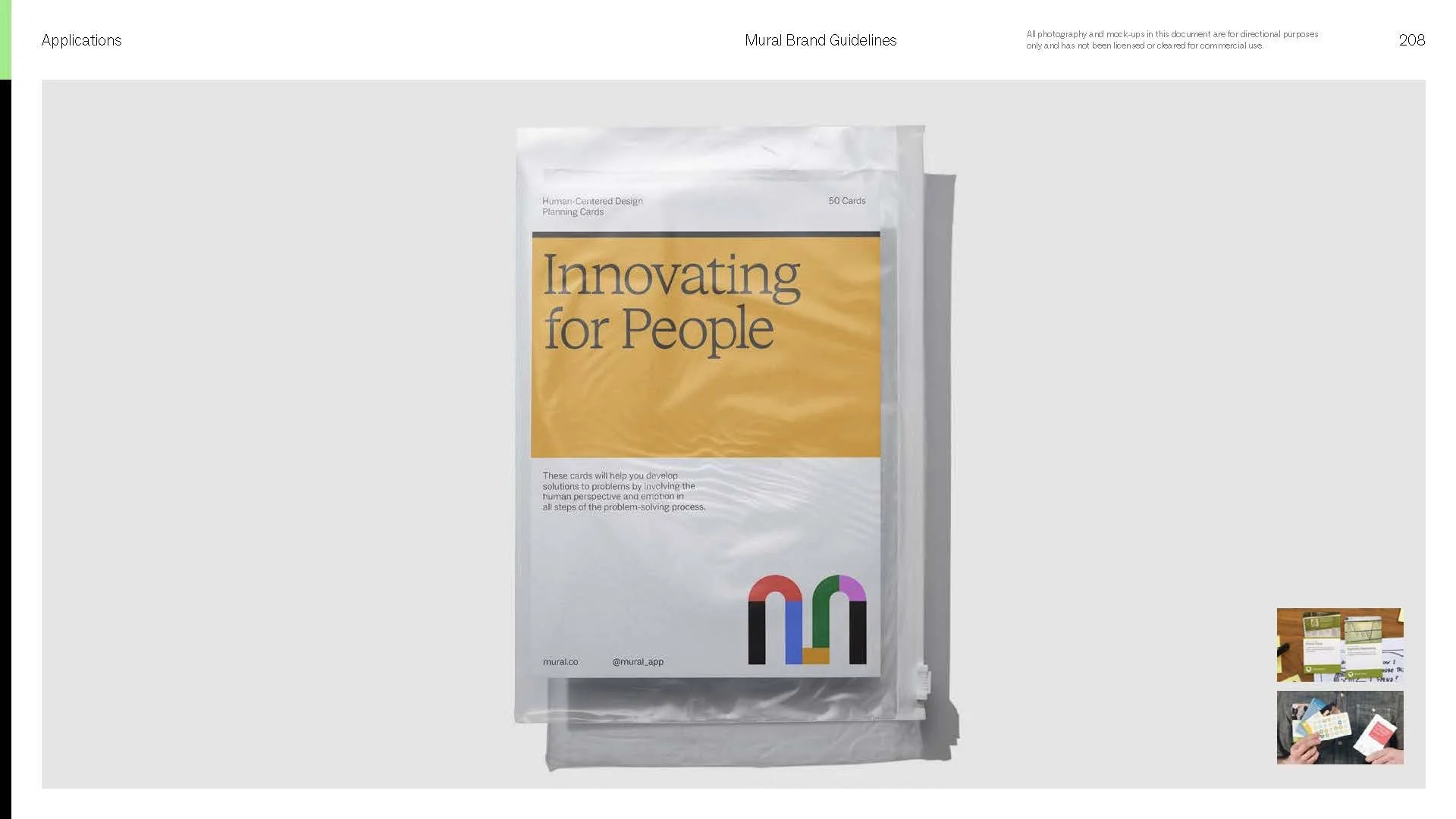
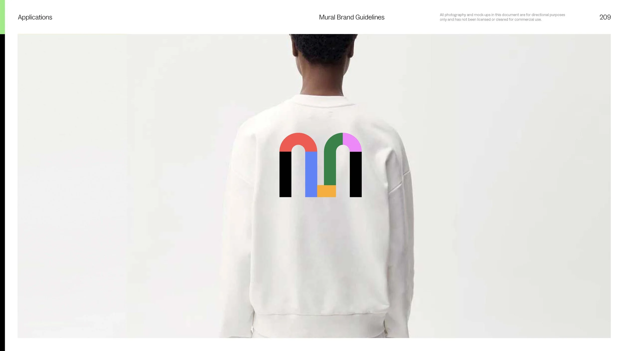
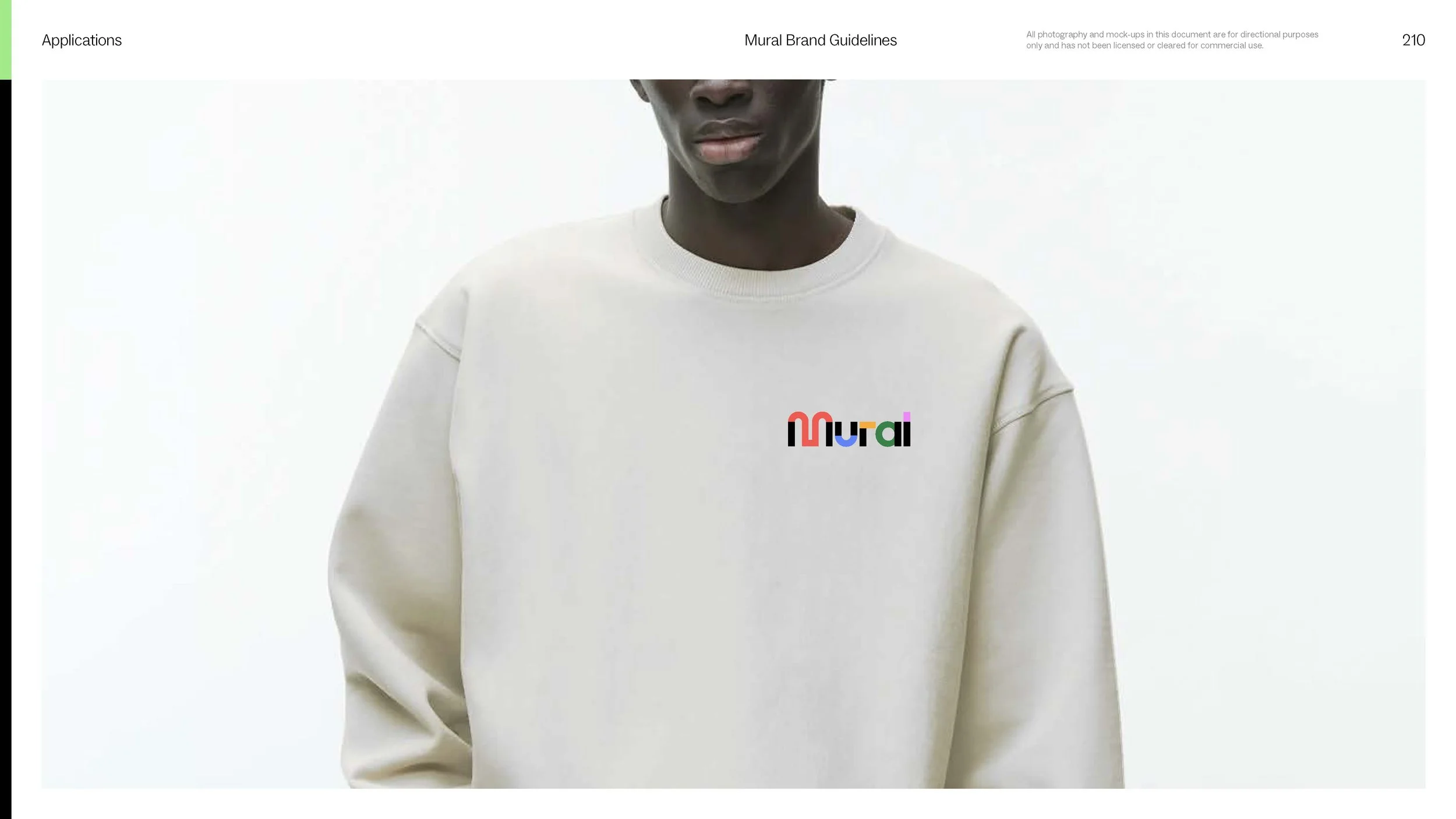
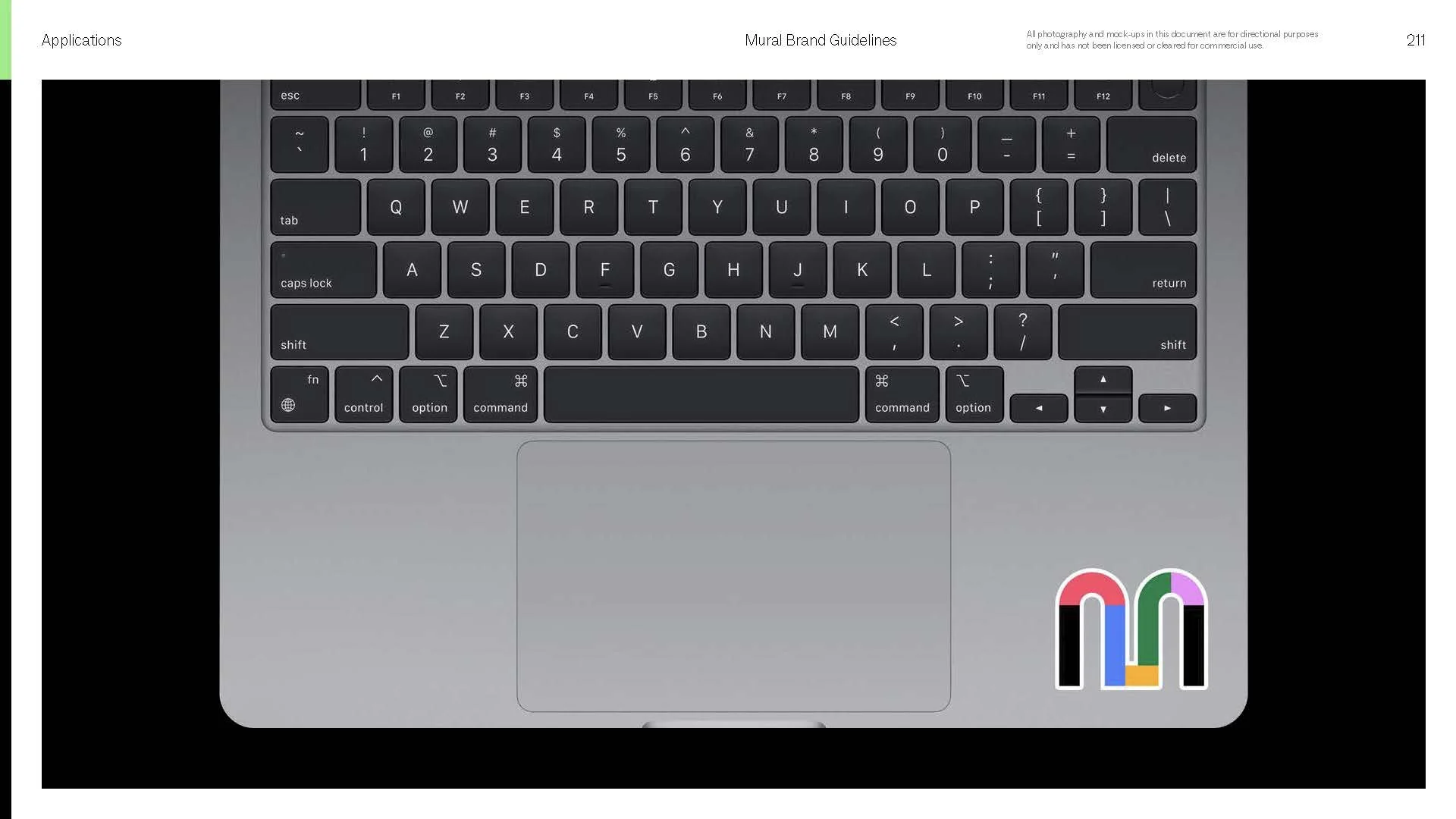
The Outcome
This is where the system pays off. House style animation, motion language, and cinematography, all pulling in the same direction. The build took a couple of months of upfront effort. Every project after got that time back, with interest. The foundational decisions were already made, so briefs skipped the blank page and went straight to execution. What it produced was a workhorse: a studio shipping quick, confident work across every medium without a drop in craft. That's the trade I'll make every time. Invest in the system early, and speed stops costing quality.
Thought Leadership
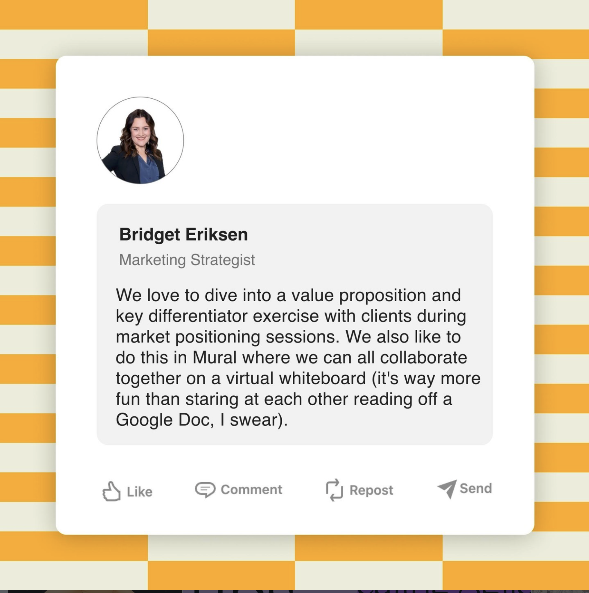
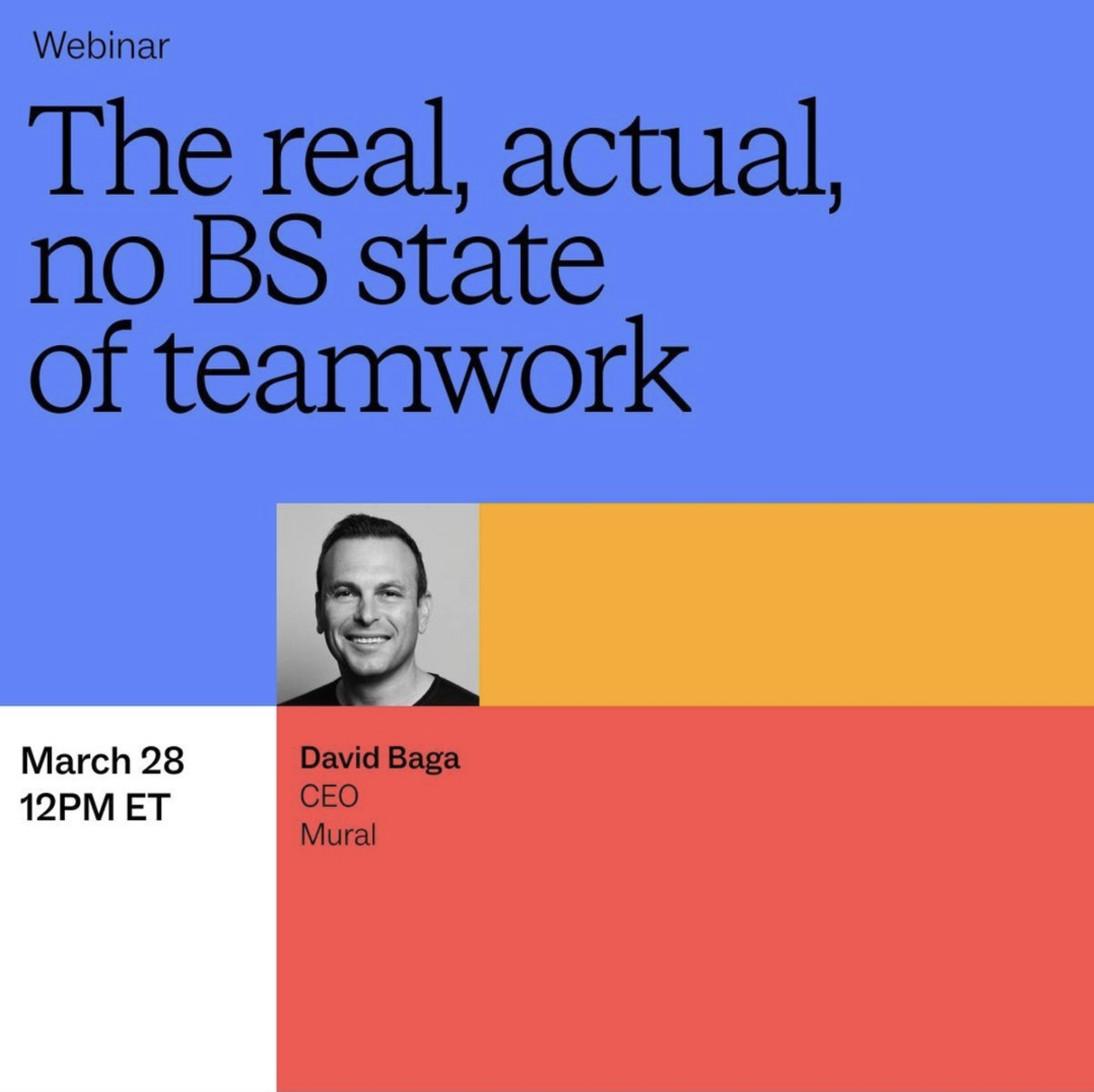
Where our animated house illustration style came to life.
Digital Ad (Animation)
Our systems hard at work. A majority of this was produced through templates.
Digital Ads
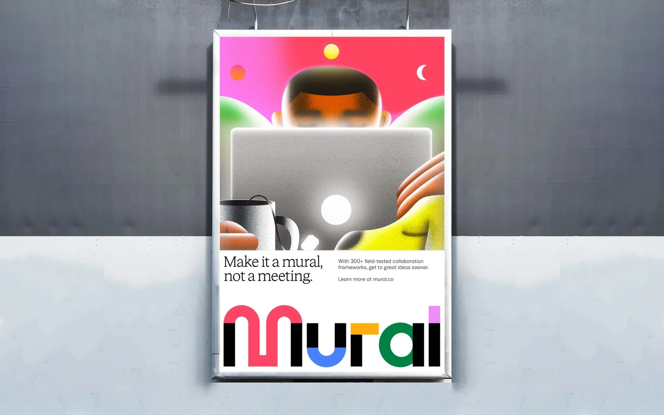
Where our cinematography and product exploration came together.
Product Marketing
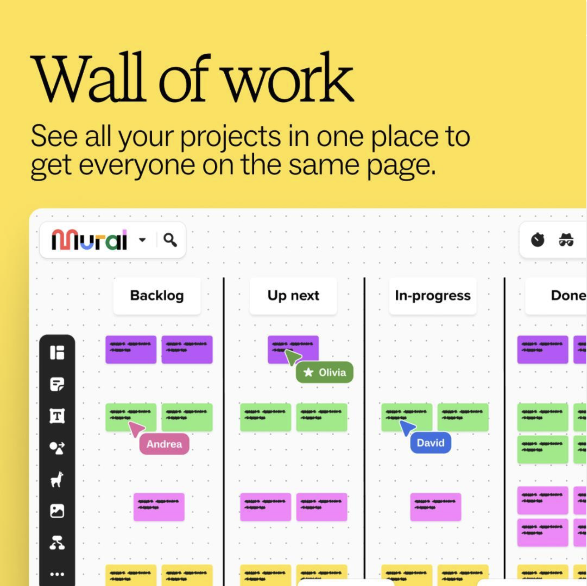
Our language and product animations working together to meet the audience where they are.