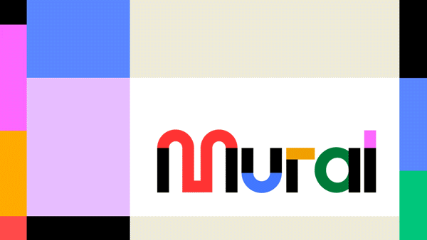
Rebranding Mural
To craft a contemporary brand identity for Mural, we collaborated with the acclaimed agency Collins. Building on their foundational work, I spearheaded translating their brand principles and static concepts into dynamic motion and video elements.
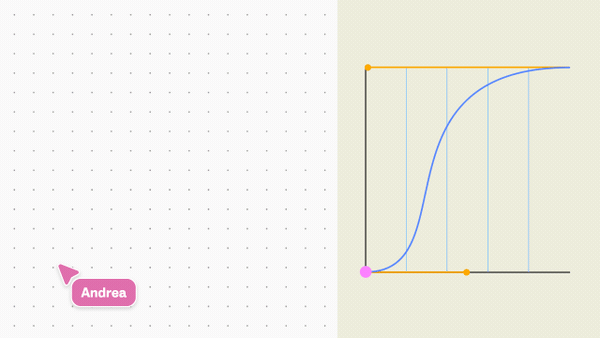
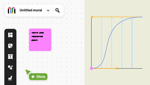
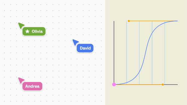
The motion framework
I led development of Mural's comprehensive motion identity system in partnership with Collins, establishing a visual language that expresses joyful collaboration and creative possibility. The system leverages dynamic wordmark elements, hand-crafted animation principles, and vibrant brand colors to create a cohesive experience across marketing motion graphics and product UI animations. This versatile framework empowered design and product teams to maintain brand consistency while scaling content production across web, product, and campaign applications.
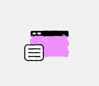
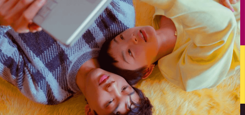
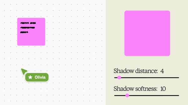
Video and Motion exploration
The conclusion of our partnership with Collins marked the beginning of our true brand evolution. Like automotive enthusiasts customizing a stock vehicle, we set out to make the Mural brand distinctively our own. The following examples showcase my explorations in refining our brand identity, each iteration bringing us closer to an aesthetic that is unmistakably Mural.
When your company is literally named after collaborative art, why wouldn't you use actual murals to show how collaboration works? This art direction leans into the obvious (in the best way), creating a visual metaphor we can own that demonstrates teamwork through, well, teamwork on walls.
My next challenge was bridging product video sequences with live footage. I experimented with visual transitions that seamlessly blend these elements, showcasing how Mural enables fluid collaboration across virtual and physical spaces.
The Mural brand thrives on collaborative partnerships with diverse independent artists and makers. To showcase this vibrant ecosystem, we developed a visual concept using the black bars of our wordmark as an expanding frame, revealing a rich tapestry of creative collaborations and endless possibilities.
Our team worked closely with our roster of independent artists to transform their artwork into motion while preserving the integrity of their original pieces. The animation showcased here breathes dynamic movement into a compelling illustration by artist An Chen, demonstrating our commitment to honoring each artist's work.
When creating longer video content, we needed to incorporate our product into the story. We asked ourselves: How do you translate "gathering around a campfire to tell stories" for people who work in sweatpants from three different time zones? Answer: Position Mural as the digital campfire. Same communal storytelling energy, now with infinite whiteboards and zero bug spray.
To further enhance our visual storytelling, we developed a unique set of in-house animated 'mini people.' These charming characters extend our hand-crafted aesthetic while allowing for expressive and abstract representation. Despite their diminutive size, they effectively depict human diversity and enable us to tell a wide array of stories in a playful, meaningful way.
Video is a cornerstone of our out-of-home marketing strategy. We experimented with accommodating a wide variety of display types to optimize for maximum impact and memorability.
We extended our dynamic color system through varied linear wipe animations to create impactful transitions. Our photography evokes pseudo-retro nostalgia using bold, saturated colors and thoughtful styling. This cohesive aesthetic reflects Mural's fusion of technology and creativity, creating a distinctive look that's both fresh and familiar.
This opening and closing animation concept captures the burst of ideas and creativity that Mural enables. To evoke traditional hand-drawn animation, we deliberately reduced the frame rate of our brand animations. This technique creates a distinctive, slightly choppy motion that harkens back to hand-crafted frame-by-frame animation, adding a nostalgic feel to our modern digital designs.
This opener, a key element in our webinars and digital communications, showcases the seamless integration of typography within our motion design system. The design harmonizes with our overall brand tone while maintaining its distinctive character. To ensure scalability, we templated this treatment as a .mogrt file, enabling our webinar team to efficiently create on-brand videos across various contexts.
Our signature closing sequences showcase our logo at a bold, confident scale as a powerful brand statement. This distinctive closer was integrated into our motion graphics template kit and featured prominently across all marketing assets.
We developed templatized title cards to streamline video production across product marketing, professional services, and learning materials. These versatile designs maintained brand consistency while efficiently scaling our video content creation and balancing professionalism with Mural's dynamic, playful personality.
Motion guidance excerpt: "Cursor Curves: Emulate natural cursor movement with swift initial acceleration followed by gradual deceleration. When appropriate, incorporate a subtle arched trajectory to enhance realism."
Motion guidance excerpt: "Canvas Panning: Similar to the cursor curve, begin pans with a swift acceleration, and a gradual deceleration."
Motion guidance excerpt: "Canvas zoom: Zoom using a pronounced curve, balancing the motion with equal parts easing in and out, akin to the natural flow of a pinch-zoom"
Motion guidance excerpt: "Object interaction: Unlike our standard cursors that scale when clicked, our colorful facilitator cursors visually signal interactions through the UI's responsive states."
Motion guidance excerpt: "Stay dynamic: A lot is happening in a mural. Use the camera to guide the storytelling"
Motion guidance excerpt: "Keep blocking clean: Be intentional with cursor interactions and ensure proper blocking to reduce cognitive load on the viewer."